About Author:
Agnese Jaunošāne is the co-founder and COO of Ajelix, a bootstrapped AI platform used by 320,000+ people worldwide. She leads all marketing, growth, and distribution, and writes daily on LinkedIn about the real side of building a startup from zero.
Full Author Bio
Before building Ajelix, Agnese cut her teeth at some of the most demanding environments in the business world, starting her career at Accenture and Deloitte, then joining Printful, where she got her first real taste of what it looks like to build a globally ambitious unicorn from a small country. That experience became the blueprint: build something people actually use, and let the product do the talking.
In 2022, she co-founded Ajelix alongside technical co-founder Artūrs Jaunošāns. From day one, Agnese owned everything the customer sees before they ever touch the product: SEO strategy, content, UI/UX, web, social, and PR. With zero paid ads and no external investment, she grew Ajelix to over 320,000 registered users entirely through organic channels. The core of that strategy was simple but disciplined: obsess over the exact problems users search for, earn trust through genuinely useful free tools, and build SEO as infrastructure rather than an afterthought.
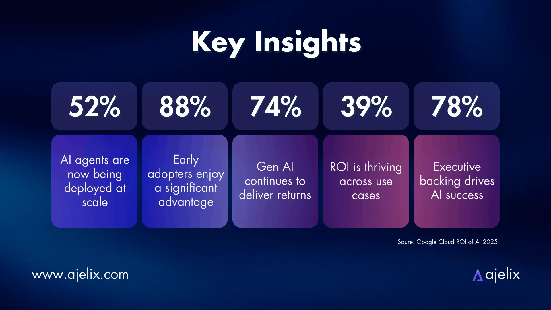
Her focus has always sat at the intersection of marketing and analytics. She believes the gap between raw data and a decision a manager can act on is where most businesses lose time, and that’s exactly the problem Ajelix is built to close. Today, Ajelix has evolved into an agentic AI platform: one that doesn’t just answer questions, but autonomously completes work: generating reports, cleaning data, building visualizations, and delivering ready outputs directly to the people who need them.
Agnese writes daily on LinkedIn & ajelix.com about the founder journey, what organic growth actually looks like, how to build marketing without a budget, and what it takes to stay sane while doing it. She also speaks at startup and marketing events across Europe, and mentors women entering the tech industry.