How To Create Operational Dashboard? Guide With Examples
An operational dashboard is a digital tool that displays key performance indicators (KPIs) to monitor the health of a company’s day-to-day operations.
Do you ever feel like you’re being bombarded by information, but struggle to extract the insights that truly matter? Are key metrics scattered across different platforms, making it difficult to get a holistic view of your operations? 📈
Think of operational dashboards as your personal mission control center, offering a real-time snapshot of your operations and highlighting critical information at a glance.
This guide will equip you with the knowledge and steps to create your own powerful KPI dashboard, no matter your technical expertise. We’ll delve into defining your goals, choosing the right tools, and designing for clarity.
Quick overview of topics:
- Definition
- Operational dashboard benefits
- Create your dashboard in 6 steps
- 5 dashboard types
- Dashboards for different industries
- 7 tools for dashboard creation
Change the way you work with agentic AI
One-click dashboards,KPI tracking, and AI-powered insights—for work that actually gets done.

What is Operational Dashboard?
An operational dashboard is a visual tool that displays key metrics and data points that provide real-time insights into the performance of specific business operations. The operational dashboard encompasses several key objectives:
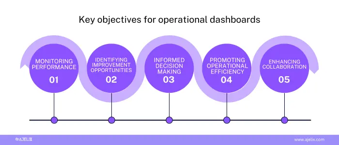
Infographic with key objectives for operational dashboard, made by author
- Monitoring Performance: quickly identify trends, potential issues, and areas exceeding expectations.
- Identifying Improvement Opportunities: streamline processes, allocate resources more effectively, or adjust strategies based on data-driven insights.
- Facilitating Informed Decision-Making: eliminate the need for extensive data analysis and promote proactive rather than reactive decision-making.
- Promoting Operational Efficiency: measure proactively and ensure smooth operations and optimize resource utilization.
- Enhancing Communication and Collaboration: stakeholders can access the same data, leading to aligned discussions, shared understanding, and more effective collaboration.
What are the benefits of operational dashboards?
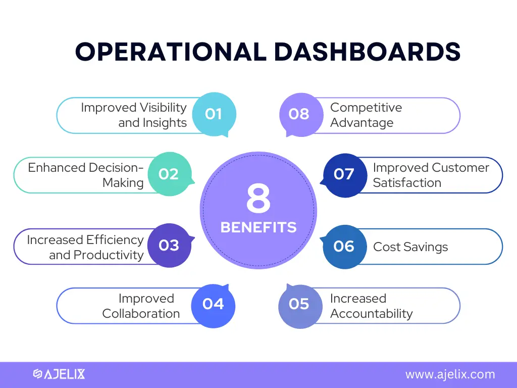
Operational dashboards offer a multitude of benefits that can significantly enhance your business operations. Here are some of the key advantages:
1. Improved Visibility and Insights
They provide a centralized view of critical metrics, giving you a clear understanding of how your operations are performing at a glance. This allows you to easily identify trends, track progress towards goals, and uncover potential issues before they escalate.
2. Enhanced Decision-Making
By making data readily available and understandable, dashboards empower you to make informed decisions based on concrete evidence rather than intuition or guesswork. This leads to more strategic and effective decision-making across all levels of the organization.
3. Increased Efficiency and Productivity
Dashboards help you identify bottlenecks and inefficiencies within your processes. By pinpointing areas for improvement, you can streamline operations, optimize resource allocation, and boost overall productivity. For businesses with vehicle fleets, maintenance is a critical efficiency factor — understanding how to fix vehicle rust can prevent small issues from escalating, saving both time and money.
4. Improved Communication and Collaboration
With a shared source of data, dashboards facilitate communication and collaboration across teams. Everyone can access the same information, leading to aligned understanding, better decision-making, and more effective collaboration.
8 benefits of operational dashboards infographic made by author
5. Increased Accountability and Ownership
By making performance metrics readily available, dashboards foster a culture of accountability and ownership. Each team or individual can track their progress and see how their efforts contribute to the overall goals.
6. Cost Savings
Operational dashboards can help you optimize resource allocation, identify areas for cost reduction, and proactively address potential issues that could lead to financial losses.
7. Improved Customer Satisfaction
Dashboards can help you track key customer service metrics like average wait times and resolution rates. This allows you to identify areas for improvement and ensure a positive customer experience.
8. Competitive Advantage
By leveraging data-driven insights from your operational dashboards, you can gain a competitive edge by optimizing your operations, making strategic decisions faster, and adapting to changing market conditions more effectively.
Overall, operational dashboards offer a powerful way to leverage data and gain valuable insights that can transform your business operations. By implementing them effectively, you can achieve greater efficiency, make better decisions, and ultimately drive positive outcomes for your organization.
How To Create Operational Dashboard?
Most important thing in creating dashboard is to pick the right tool that will ease the visualization and analytics tasks. However, here are the 6 steps that helps in creating good dashboards.
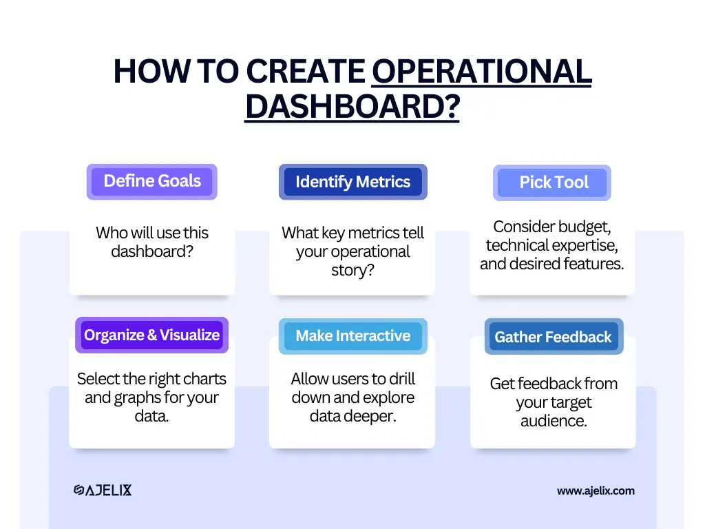
Infographic on how to create an operational dashboard in 6 steps, made by author
Time needed: 1 hour
Ready to build your own dashboard? Buckle up! Here’s your step-by-step guide:
- Define Your Goals and Audience
Who will use this dashboard? Executives, managers, or specific teams?
What questions should it answer? Sales trends, customer satisfaction, or resource allocation?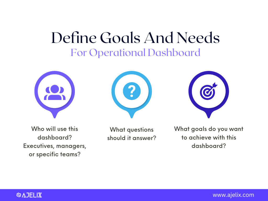
- Identify Metrics and Data Sources
What key metrics tell your operational story? Sales figures, conversion rates, website traffic?
Where does this data live? CRM systems, website analytics, internal databases?
- Choose Data Visualization Tool
Consider budget, technical expertise, and desired features. Popular options include Ajelix, Tableau, Power BI, and Looker Studio.
- Organize and Visualize
Prioritize clear layout and visual appeal. Use grid systems, white space, and color effectively.
Select the right charts and graphs for your data. Bar charts for comparisons, line graphs for trends, pie charts for proportions. You can also generate dashboards using an Ajelix AI agent capabilities.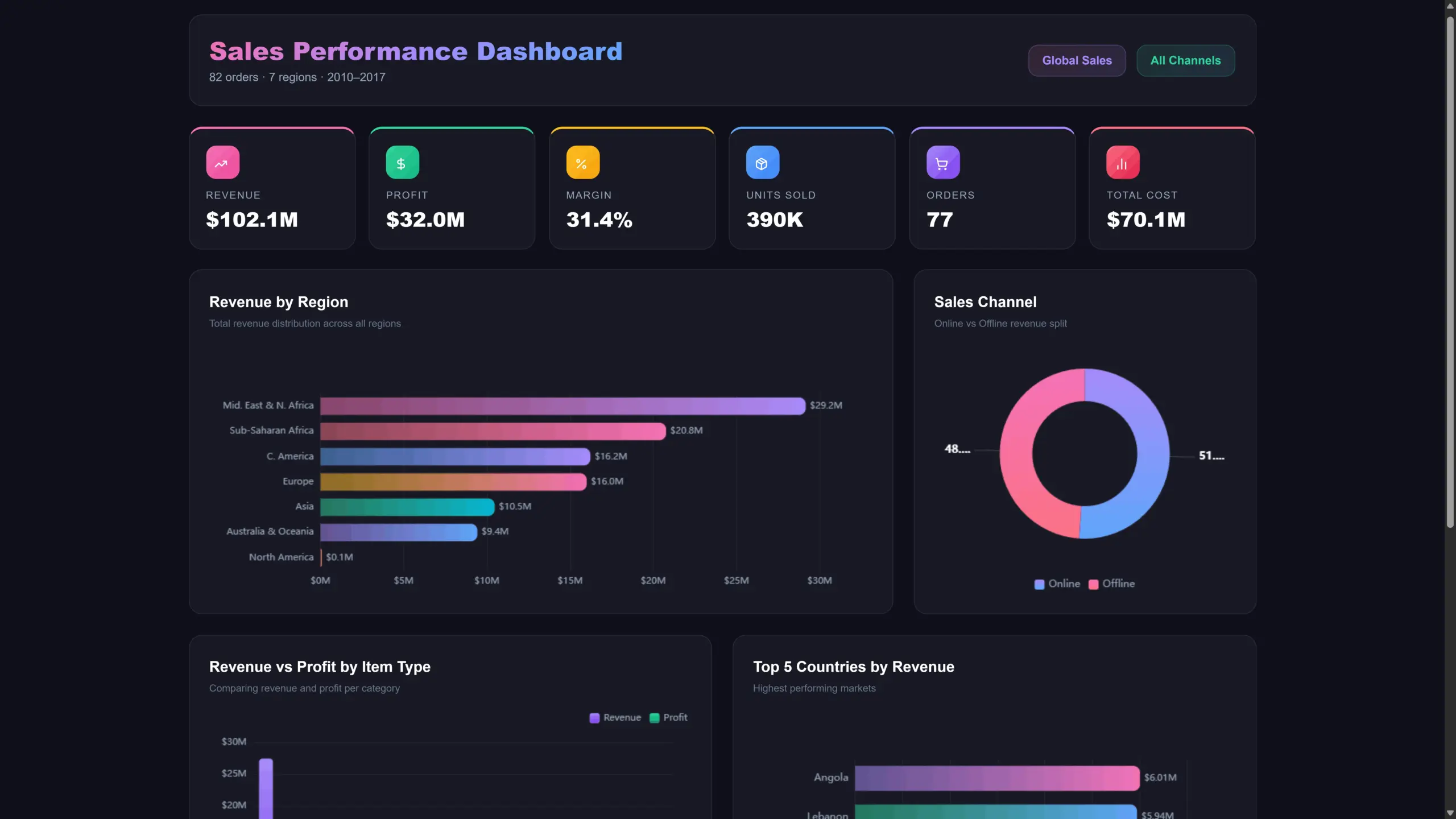
- Make it Interactive
Allow users to drill down and explore data deeper. This empowers informed decision-making.
- Gather Feedback and Iterate
Get feedback from your target audience. Refine your design based on their input. Maintain and update your dashboard regularly to ensure it remains a valuable resource.
Ready to see it in action? Check out real-world examples in the next section, or try Ajelix to create more engaging dashboards that tell a story.
Remember, your dashboard is a journey, not a destination. As your needs evolve, adapt and update it to continue steering your business towards success.
Difference Between Strategic and Operational Dashboard
When it comes to monitoring business performance, two key dashboard types emerge: operational and strategic. Understanding the key differences between these dashboards is crucial for selecting the right tool for the job. While operational dashboards focus on real-time data, strategic dashboards often rely on long-term projections. To achieve seamless integration between these dashboard types, many businesses turn to software development companies in Europe for their expertise in bridging data systems and creating cohesive solutions.
Here’s a table summarizing the key distinctions between operational and strategic dashboards:
| Feature | Operational Dashboard | Strategic Dashboard |
|---|---|---|
| Focus | Short-term performance, day-to-day activities | Long-term goals, overall business health |
| Timeframe | Real-time, current data | Past data & trends, future projections |
| KPIs Tracked | Efficiency metrics (e.g., production speed, defect rates) | Strategic objectives (e.g., market share, customer satisfaction) |
| Purpose | Monitor real-time performance, identify operational issues | Make strategic decisions, track progress towards goals |
| Analogy | Cockpit view of a plane | Navigational chart for a ship |
By effectively utilizing both operational and strategic dashboards, businesses can gain a comprehensive view of their performance. Operational dashboards ensure smooth day-to-day operations, while strategic dashboards guide long-term decision-making and goal achievement.
5 Types Of Operational Dashboard
There can be many digital dashboards and they can vary based on business needs. In this section we will name few most popular dashboards that can be used in every business or organization.
1. Sustainability-Driven Operations Dashboard
This type focuses on metrics related to environmental impact, resource usage, and overall sustainability efforts. Main metrics:
- track energy consumption
- waste generation
- recycling rates
- carbon footprint
- you can add other traditional operational metrics
The sustainability dashboard helps organizations monitor progress toward sustainability goals, identify areas for improvement, and demonstrate environmental responsibility. It’s also great for collaboration with stakeholders to show the impact your organization is making.
2. Supply Chain Management Dashboard
Gain real-time visibility into your supply chain by tracking supplier performance, lead times, inventory levels, and potential disruptions. Monitor key metrics like:
- Inventory turnover
- Days of inventory on hand (DOH)
- Stock-out rate
- Inventory accuracy
- On-time delivery rate
- Purchase order lead time
- Perfect order fulfillment rate
- Order cycle time
- Cash-to-cash cycle time
- Return on investment (ROI) for supply chain initiatives
Gain valuable insights into your supply chain performance and make informed decisions to improve efficiency, reduce costs, and enhance customer satisfaction.
3. Marketing Dashboard
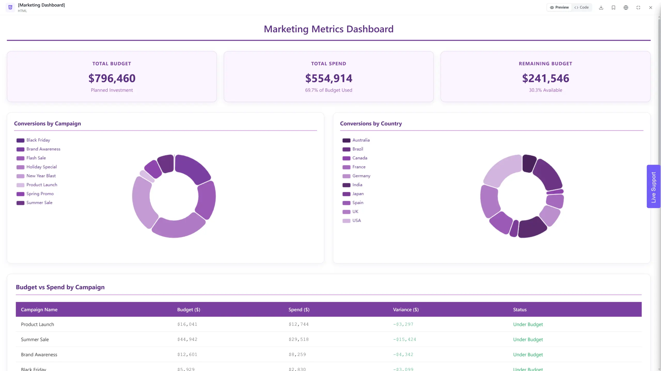
Screenshot of marketing dashboard created with Ajelix
Understand the true impact of your marketing channels by tracking campaign performance across different platforms. Visualize data such as:
- website traffic sources
- lead generation attribution
- conversion rates from each channel
- return on investment (ROI) metrics
- campaign reach
- engagement
- brand mentions
- net Promoter Score (NPS)
- customer lifetime value (CLTV)
By tracking and analyzing the right marketing KPIs, your dashboard can become a powerful tool for understanding your audience, measuring campaign performance, and optimizing your marketing efforts for maximum impact.
4. Risk Management Dashboard
Proactively identify and mitigate potential risks by tracking key risk indicators across various operational areas. Monitor metrics like:
- customer complaints
- safety incidents
- financial risks
- compliance violations
- frequency of risk reporting
- loss ratio
- risk prioritization scores
- time to risk assessment completion
Your risk management dashboard can become a valuable tool for proactively identifying and mitigating risks, optimizing risk mitigation strategies, and demonstrating progress towards risk management goals.
5. Product Development Dashboard
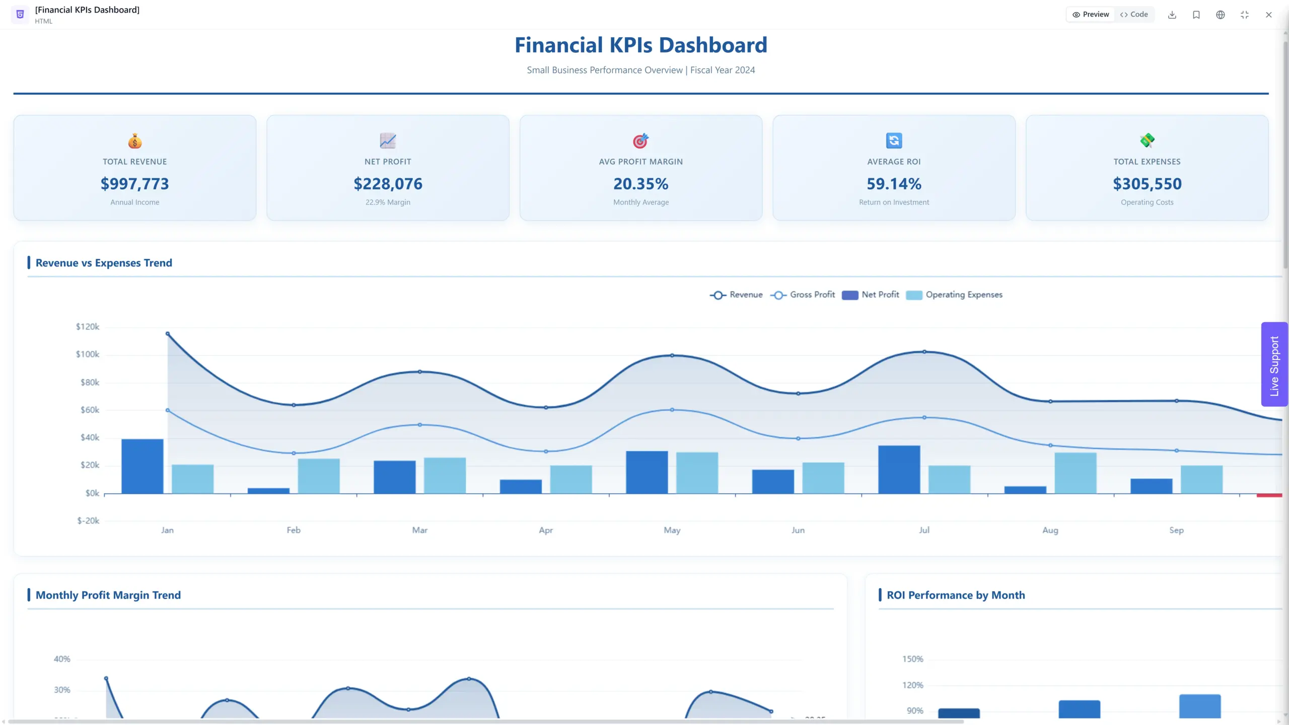
Screenshot of small business operational dashboard with financial metrics created with Ajelix
Gain insights into the performance of your product development process by tracking key metrics like:
- time to market
- defect rates
- customer feedback
- product adoption
- monitor progress through development stages
- time to launch
- release frequency
- cost per feature
- number of iterations
- active users
- conversion rate
Remember, your product development dashboard should be a dynamic tool that evolves with your product and your needs. Regularly reassess the chosen KPIs and make adjustments as necessary to maintain its effectiveness in guiding your development efforts towards success.
Reporting gives you a headache?
Upload your data and create professional reports with agentic AI
Start free
Try free and upgrade whenever
Operational Dashboards Based On Industry
| Industry | Dashboard Types | Metrics |
|---|---|---|
| Healthcare | – Patient Care, – Financial Performance | Track patient wait times, appointment adherence, treatment progress, key financial metrics like insurance payments, reimbursements, cost per patient, and revenue by service line. |
| Retail | – Inventory Management, – Customer Acquisition and Retention | Track stock levels, sales trends, product performance, demand forecasting, marketing campaign performance, customer acquisition costs, customer lifetime value, and churn rate. |
| Logistics | – Shipment Tracking, – Fleet Management | Track shipment location, delivery status, potential delays, estimated arrival times, fuel consumption, vehicle performance, maintenance schedules, and driver behavior. |
| Manufacturing | – Production Efficiency, – Supply Chain Management | Track production output, machine downtime, quality control metrics, and production yield, supplier performance, inventory levels, lead times, and potential disruptions. |
| Technology | – Software Development, – Website Performance, – Customer Support | Track development progress, bug reports, code quality metrics, deployment success rates, website traffic, user engagement, conversion rates, server uptime, support ticket volume, resolution times, and customer satisfaction scores. |
| Hospitality | – Guest Satisfaction, – Revenue Management, – Staff Performance | Monitor guest reviews, feedback surveys, and key performance indicators like occupancy rates, room service response times, room reservations, revenue trends, pricing strategies, staff training needs, scheduling efficiency, and key performance metrics. |
| Finance | – Financial Performance, – Investment Performance, – Fraud Detection | Track key financial metrics like revenue, expenses, profit margins, cash flow, portfolio performance, asset allocation, individual investment returns, suspicious transactions, risk indicators, and fraud alerts |
Tools For Operational Dashboard Creation
With the right tools and insights, you can transform your data into a powerful driver for business success. Here’s a list with 7 best data visualization tools for operational dashboard creation:
- Ajelix: easy to use AI agent chat interface. This tool is perfect for simple data visualization tools and KPI creation. Start free and upgrade any time.
- Tableau: Industry leader with powerful visualization capabilities, ideal for complex dashboards and data analysis.
- Microsoft Power BI: Paid version with advanced features, extensive data source integrations, and collaboration tools.
- Looker: Cloud-based platform with robust security and governance features, perfect for enterprise-wide dashboards.
- Klipfolio: Focuses on real-time data visualization and mobile dashboards.
- Cyfe: Easy-to-use tool for creating marketing and sales-specific dashboards.
- Datadog: Ideal for IT operations and infrastructure monitoring dashboards.
Conclusion
Operational dashboards are a visual tool that provide real-time insights into the performance of specific business operations. They offer benefits such as improved visibility and insights, enhanced decision-making, increased accountability and ownership, cost savings, improved customer satisfaction, and a competitive edge.
The most important thing in creating an operational dashboard is to define your goals, choose the right tools, and design for clarity. This guide will equip you with the knowledge and steps to create your own powerful operational dashboard.
FAQ
An operational dashboard is a digital tool that visually displays key performance indicators (KPIs) and other important data points, providing real-time insights into the performance of specific business operations.
Choosing dashboard metrics depends on your specific goals and context. However, a good starting point is to focus on KPIs directly linked to your objectives. Such as efficiency, performance, compliance, and growth metrics.
Some of the best tools for dashboard creation are Ajelix, Klipfolio, Power BI, Tableau, and Looker Studio.
Ready to build your operational dashboard with Ajelix?
From data to report in one minute or less with Ajelix AI Agents