Top 10 Best Business Intelligence Tools Comparison 2026

Business intelligence tools are software applications that collect, process, analyze, and visualize data to help businesses make informed decisions. BI tools convert raw data into meaningful insights that can be used to identify trends, patterns, and opportunities.
Every organization needs data to understand where’s “this ship sailing”. Whether it’s financial data, sales, marketing, employee data, or anything that makes sense and helps you understand if “we’re better or worse than yesterday”.
This is the _____ space where BI tools come in handy. It can help you visualize data tables, create correlations, and show the big picture behind the data rows. If you’re looking to fill out the blank space, you’re in the right place as this article will review the best BI tools in the market.
Let’s get to business and compare the top 10 business intelligence software of 2026.
Change the way you work with agentic AI
One-click dashboards,KPI tracking, and AI-powered insights—for work that actually gets done.

Best Business Intelligence Tools 2026
There are so many BI software in the market that it’s hard to keep track. However, here’s our paid & free data visualization tools pick, to help you choose the best platform.
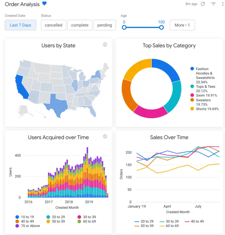
1. Ajelix
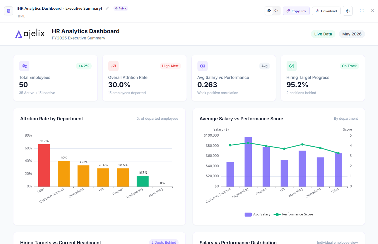
Ajelix HR analytics dashboard screenshot.
If you are looking for a Business intelligence tool that is easy to use and provides powerful data visualization capabilities then Ajelix is a great option. It is a valuable tool for businesses of all sizes that want to make better use of their data.
| Feature | Pros | Cons |
|---|---|---|
| AI chat interface | Natural language commands, no learning curve, generates working assets instantly | Less manual control over design compared to traditional drag-and-drop BI tools |
| Persistent workspace | Files up to 1GB stay ready across conversations; no re-uploading | Workspace storage limits vary by plan (20MB to 10GB) |
| Data import | Google Sheets, Excel, PDFs, CSVs, presentations, images; automatic data cleansing | Requires file upload rather than live database connections for some sources |
| Asset generation | Creates dashboards, Excel files, PowerPoints, web apps – production-ready and shareable | |
| Effortless sharing | Instant links for dashboards and apps; embeddable assets | Limited permission controls compared to enterprise BI platforms |
| Seamless collaboration | Multiple users can edit reports simultaneously | Not suited for large organizations or teams with complex workflows |
| Asset & Prompt Library | Reuse charts, reports, and saved workflows across chats | |
| AI insights | Automatic trend detection, KPI calculations, and data explanations | AI-generated analysis may require human verification for critical decisions |
| Pricing | Free trial available; paid plans from $39-$199/month | |
| Collaboration | Multiple users can access shared assets | Real-time collaborative editing not available; best for individual workflows |
This platform is a great fit for small to medium businesses, that need to visualize data and migrate from spreadsheet applications. It’s also very budget-friendly and offers freemium.
Reporting gives you a headache?
Upload your data and create professional reports with agentic AI
Start free
Try free and upgrade whenever
2. Tableau
Tableau dashboard example screenshot from Tableau website
You’ve probably heard about Tableau before as it’s one of the biggest business intelligence tools in the market. Tableau is the first business intelligence platform that strived for innovations and data analysis. Now let’s take a look at the pros and cons to help you understand if this is the right choice for you.
| Feature | Pros | Cons |
|---|---|---|
| Advanced AI & ML integration | Leverage AI and machine learning to gain insights from data | May require additional expertise or third-party tools for more complex analyses |
| Provides embedded analytics | Integrate Tableau visualizations into websites and applications | Require additional coding or development expertise |
| Can handle large amounts of data | Efficiently process and visualize large datasets | You may experience speed issues when working with large amounts of data |
| You can create complex data flows | Build complex data pipelines to connect to and analyze data from various sources | May require additional expertise or third-party tools for more complex data manipulation tasks |
| Mobile friendly application | Access and view visualizations on mobile devices | Not feature-rich or interactive as the desktop app. May experience some issues. |
| Doesn’t provide live data refreshing | Data refreshes at scheduled intervals or manually | It is not as feature-rich or interactive as the desktop app. May experience some issues. |
| Requires SQL and VizQL knowledge | Users need to have some understanding of SQL and VizQL to fully utilize the platform’s capabilities | Limits the accessibility and usability of the platform for non-technical users |
| Limited visualization options | While Tableau offers a variety of visualization options, it may not be as comprehensive as platforms with a wider range of chart types and customization options | Not suitable for users with specific visualization requirements or no coding knowledge. |
| Steep learning curve | The platform has a steep learning curve, requiring users to invest time and effort in training and experimentation | Not suitable for organizations with limited resources for training or onboarding new users |
| Doesn’t have version control | No built-in version control system | Difficult to track changes and revert to previous versions of visualizations or dashboards |
| Dashboards are not responsive | Dashboards may not be responsive to different screen sizes or devices | Result in inconsistent or distorted visualizations |
| Pricing | Clear pricing plan is separated into 3 sections: viewer($15), explorer(45$), and creator($75). | Can get pricy for large organizations |
We’ve also covered more detailed guides about Tableau’s advantages and disadvantages with customer reviews.
3. Zoho Analytics
Dashboard example screenshot from Zoho analytics webpage
Zoho Analytics is another great platform that is modern and created for non-technical teams. However, you will still need some IT knowledge and a lot of patience at the start to create dashboards.
| Feature | Pros | Cons |
|---|---|---|
| Data sources | Connect to a wide range of data sources, including spreadsheets, databases, and cloud-based platforms | Requires additional setup or configuration and IT knowledge |
| Prepare and cleanse data prior to creating reports | Data preparation tools can help clean, filter, and transform data | Not as powerful or flexible as dedicated data preparation tools |
| Embed analytics into your applications using no-code solutions | Integrate Zoho Analytics visualizations into your websites or applications | Platform is intuitive, especially for experienced BI users |
| Learning curve | The user interface may not be as intuitive as some other BI platforms | More comprehensive onboarding materials could make the platform more accessible to new users |
| Lack of intuitiveness and IT specialist assistance required for certain reports | The platform is intuitive, especially for experienced BI users | May require IT support for complex or specialized analyses |
| Embedded charts may experience delays in loading | Embedded charts may not always load quickly or reliably | Impact the user experience and reduce the effectiveness of embedded analytics |
| Requirement to acquire proficiency in SQL | SQL knowledge is required for advanced data manipulation and analysis tasks | On-premise subscription is much cheaper than on-cloud |
| Pricing | Flexible pricing plans created to suit different needs | On-premise subscription is much more cheaper than on-cloud |
4. Looker Studio
Looker studio dashboard example screenshot from webpage
This platform is also known as Google Data Studio as Google recently renamed this Business Intelligence tool. What’s interesting is that Google has created two solutions Looker which is an advanced analytics platform for enterprises, and Looker Studio more easier and cheaper tool.
| Feature | Pros | Cons |
|---|---|---|
| Premade Templates | Many pre-made templates are available for purchase, offering a starting point for data visualization. | Limited data branding options. |
| Data Sources | Connects to a wide range of data sources, including Google Analytics 4 and Google Ads Manager. | Easy setup for pre-made templates, but adding data from other sources will require additional knowledge. |
| Setup | Relatively easy setup for pre-made reports with pre-made integrations. | User management can be complicated for team projects. |
| Data Blending | Blending different data sources can be challenging and may require additional IT knowledge. | Speed issues and lag problems can occur when making changes to the platform. |
| Embedding Functionality | Report embedding is available, allowing for integration into websites and applications. | Limited embedding functionality compared to other BI platforms. |
| Freemium Plan | Offers a freemium plan, providing access to basic features for free. | Customer support is lacking and guides can be unclear. |
5. Klipfolio
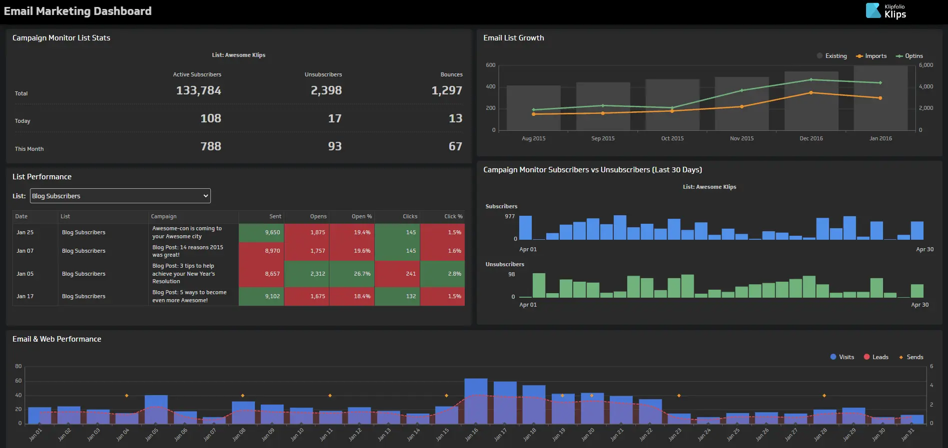
Klipfolio dashboard example screenshot from website
This platform is pretty new in the market, however, it’s a great solution for non-technical teams and those who like pretty visualizations. Klipfolio is a more metric-centered business intelligence tool, once you want to create a dashboard you have to start with metrics. A little different approach than the rest of the tools.
| Feature | Pros | Cons |
|---|---|---|
| Create your own metrics | Users can create custom metrics to track key performance indicators (KPIs). | Requires technical knowledge to create complex metrics. |
| Integrate data from over 100 sources | Connects to a wide range of data sources, including spreadsheets, databases, and cloud-based platforms. | Requires setup or configuration for some data sources. |
| Use pre-made dashboards for live data | Leverage pre-built dashboards to visualize data in real time. | Not suitable for all use cases and may require customization. |
| Generate data feeds using SQL or other methods | Extract and transform data using SQL or other methods. | Requires technical expertise to write SQL queries. |
| Prepare data before reporting | Clean, filter, and transform data to ensure accuracy and consistency. | Requires manual data preparation for complex datasets. |
| Performance | Similar to other BI platforms, occasional delays and performance issues. | Occasional delays and performance issues |
| Interactivity features | Lack of drag-and-drop functionality and other user interactivity features. | Limits the ability to create interactive dashboards and visualizations. |
| Support documents | There is support documentation | Support documents may be difficult to navigate and not always accurate. |
| Backend dashboard creation | There is a support documentation | The dashboard offers many features |
| API connection setup and renewal | Offer many connections with business applications. | Setting up and renewing API connections may necessitate the assistance of an IT professional. |
6. Qlik Sense
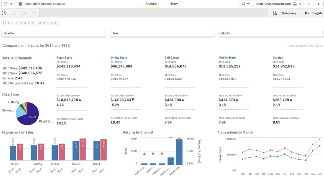
Dashboard example screenshot from Qlik Sense webpage
Qlik Sense stands out for its innovative AI-powered insights and actions derived directly from your data. It provides a comprehensive suite of data visualization tools, AI models, active analytics capabilities, and a hybrid cloud platform.
| Feature | Pro | Con |
|---|---|---|
| Self-service Visualizations | Empowers users of all skill levels to create insightful visualizations without requiring extensive technical expertise | Limited range of visualizations compared to some competitors |
| Interactive Dashboards | Provides dynamic dashboards that respond to user interactions, enabling real-time data exploration and decision-making | Basic charts are the primary visualization type, limiting the ability to create complex or visually appealing visualizations |
| Advanced and Predictive Analytics | Offers advanced analytics capabilities, including predictive modeling and machine learning, to uncover hidden patterns and trends in data | Requires advanced data analytics capabilities to use these features |
| Reporting | Enables comprehensive reporting capabilities, providing a variety of report formats and data delivery options | Performance may suffer when dealing with large datasets, especially when using complex visualizations |
| Pricing | Simple pricing | Expensive and non-flexible pricing plans that requires big budget |
Related Article: 8 Best Business Intelligence (BI) Tools For Small Businesses
7. Power BI
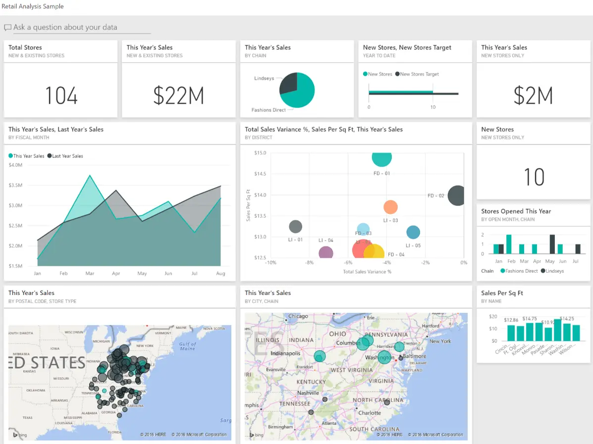
Dashboard example screenshot from Microsoft webpage
Microsoft Power BI stands as a premier data visualization and analytics platform, empowering organizations to cultivate a data-driven culture.
| Features | Pros | Cons |
|---|---|---|
| Variety of Data Connections | Seamless integration with various data sources, enabling access to a comprehensive range of data for analysis. | Complex setup requires advanced knowledge in DAX function writing and expertise from data analysts. |
| DAX Formulas | Powerful DAX formulas enable the creation of custom calculations and data transformations, enhancing the analytical capabilities of Power BI. | You will need to learn these functions or hire a specialist to create reports for you. |
| Data Transformations through Queries (Power Query Editor) | Power Query editor facilitates data transformation and cleansing, ensuring data consistency and accuracy for analysis. | Steep learning curve can be challenging for users unfamiliar with data transformation techniques. |
| Integration into Microsoft’s Ecosystem | Integration with other Microsoft products, such as Excel and SharePoint, simplifies data sharing and collaboration. | Dependency on the Microsoft ecosystem may limit its adoption by organizations with existing data infrastructure in other platforms. |
| Scheduled Data Refresh | Scheduled data refresh ensures that Power BI dashboards and reports remain up-to-date with the latest data, providing real-time insights. | Refresh frequency may not be sufficient for organizations requiring immediate data updates. |
| Custom Visualizations (for developers) | Developers can create custom visualizations to tailor reports to specific needs and enhance data storytelling. | Requires expertise in web development and visualization design principles. |
We’ve covered a detailed guide on Power BI advantages and disadvantages.
8. Databox
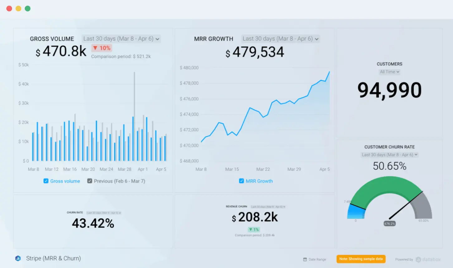
Dashboard example screenshot from Databox website
Databox offers a similar set of features to other business intelligence tools, with a user-friendly interface, automated reporting, and data dashboard capabilities. It provides a wide range of integrations and data sources, but has faced criticism for occasional bugs and limited integrations.
| Feature | Pro | Con |
|---|---|---|
| Tracking Metrics and Business Goals | Enables organizations to monitor key performance indicators (KPIs) and track progress towards strategic goals. | Requires users to manually enter data or connect to external data sources, which may be time-consuming and error-prone. |
| Access to Over 100 Data Sources | Seamless integration with a wide range of data sources, including popular marketing platforms, CRM systems, and social media analytics tools. | Limited availability of integrations with some specialized data sources, such as on-premises databases or custom data feeds. |
| Collaboration Capabilities | Enables users to collaborate on dashboards and reports, sharing insights and ensuring data accuracy. | Real-time collaboration may not be supported for all features, potentially causing delays in data updates and decision-making. |
| Numerous Dashboard Examples | Provides a collection of pre-built dashboard templates for various industries and use cases, facilitating rapid visualization creation. | Templates may not always align with specific business requirements, requiring customization efforts. |
| User-friendly Data Visualization Features | Offers a drag-and-drop interface and intuitive design tools, enabling users with varying technical expertise to create visually appealing visualizations. | Limited customization options for advanced users who may require more control over chart types and data transformations. |
9. Domo
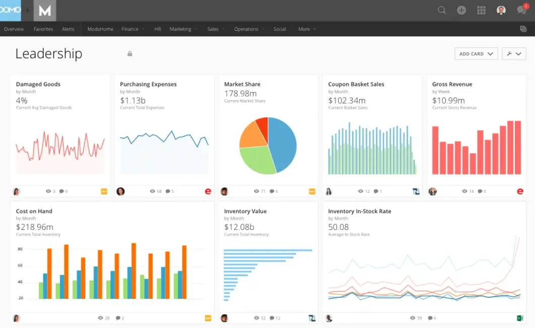
Dashboard example screenshot from Domo website
Domo is a powerful business intelligence platform that helps companies connect all their data in one central location, making it easier to manage business processes and make informed decisions. Domo helps organizations organize their data and turn it into actionable insights that can be shared across teams.
| Feature | Pro | Con |
|---|---|---|
| Connect all your data in a single dashboard | Simplifies data consolidation and analysis | Requires significant setup effort |
| Live Data Integration and Refreshing | Ensures real-time data updates | Real-time data streaming may incur additional costs, and performance may be impacted by high data volumes. |
| Self-service BI | Empowers users to create data visualizations without coding | Self-service may not fully support advanced analysis |
| Metrics to measure business data | Enables KPI tracking and goal measurement | Custom metrics may require assistance from data analysts |
| Mobile access | Enables data access from anywhere | Mobile app may not offer full functionality |
| Steep learning curve | Complex features may be challenging to master | Onboarding documents may not be comprehensive |
| Outdated visualizations | Visualization options may be less modern than competitors | Customization may be required |
10. Metabase
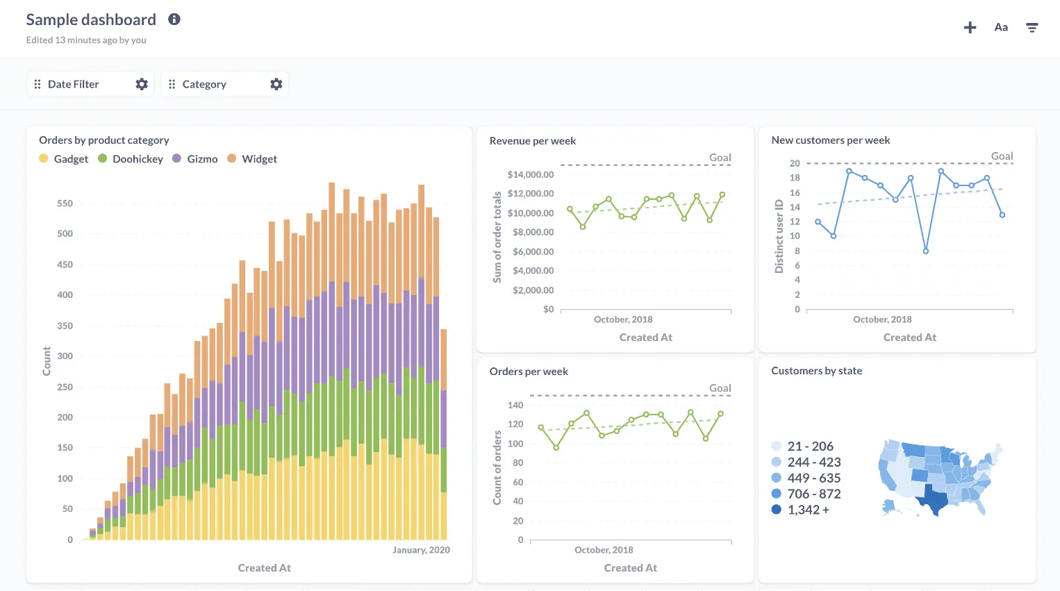
Dashboard example screenshot from Metabase webpage
Metabase is an open-source business intelligence (BI) platform that provides a simple and user-friendly interface for creating and sharing data visualizations, dashboards, and reports.
| Feature | Pro | Con |
|---|---|---|
| Collaborative dashboards: | Users can create and share dashboards. | Data sharing may not be as granular or secure. |
| Real-time data updates: | Connects to real-time data sources. | Real-time data streaming may require infrastructure. |
| Mobile access: | Access dashboards and reports from any device. | Mobile app may not offer desktop functionality. |
| Cost-effectiveness: | Open-source platform, cost-effective. | Organizations may need support for development and maintenance. |
| Limited support for advanced analytics: | Focus on self-service data exploration, limited to advanced analytics. | Organizations may need additional tools. |
| Limited customization for data sources, visualizations, and dashboards: | Customization options may not be as extensive. | Organizations with data integration, visualization, or dashboard requirements may need other options. |
| Performance issues with large datasets: | Performance slowdowns with large datasets. | Organizations with high-volume data processing needs may need scaling or more robust BI platform. |
Summary
As you can see the market is flooded with different BI tools that are created to help you analyze data and make lasting visualizations. Every organization needs to understand its needs before searching for the right software. Hope this list gave you an extensive overview of business intelligence platforms. In case you’re still confused try reading other articles, such as Power BI alternatives or self-service BI platforms, or give it a go to Ajelix platform below.
FAQ’s
There are two main types of BI tools: self-service BI tools and enterprise BI tools. Self-service BI tools are designed for users with limited technical expertise, while enterprise BI tools are more complex and are typically used by large organizations.
1. Ajelix
2. Tableau
3. Zoho Analytics
4. Looker Studio
5. Klipfolio
6. Qlik Sense
7. Power BI
8. Databox
9. Domo
10. Metabase
From data to report in one minute or less with Ajelix AI Agents