8 Best Business Intelligence (BI) Tools For Small Businesses
Any organization has KPIs to keep them measured and stay focused. That means that all organizations need someone or something to help them analyze and visualize data in a way that’s easy to grasp. Otherwise, how can you make data-driven decisions if you don’t have data that implies that something is wrong or right? This is where the BI software comes in handy.
There are hundreds of data visualization platforms in the market, and it can be hard to pick the right tool for your needs. The most popular platforms in the market, such as Power BI, Looker, and Tableau, are, although great tools, not entirely designed for small businesses or solo entrepreneurs. However, they will insist that these tools are great for SMBs. But, can you afford to hire an analytics expert who will manage API’s, SQL’s and advanced setup settings just to get a few reports?
Change the way you work with agentic AI
One-click dashboards,KPI tracking, and AI-powered insights—for work that actually gets done.

This list will give you a detailed comparison with best BI software for small to medium business owners that are cost-efficient and don’t require IT or advanced analytics knowledge.
8 Best BI Tools for Small to Medium Business Owners
Here’s our pick with the most affordable and easy-to-use tools for small entrepreneurs:
1. Ajelix
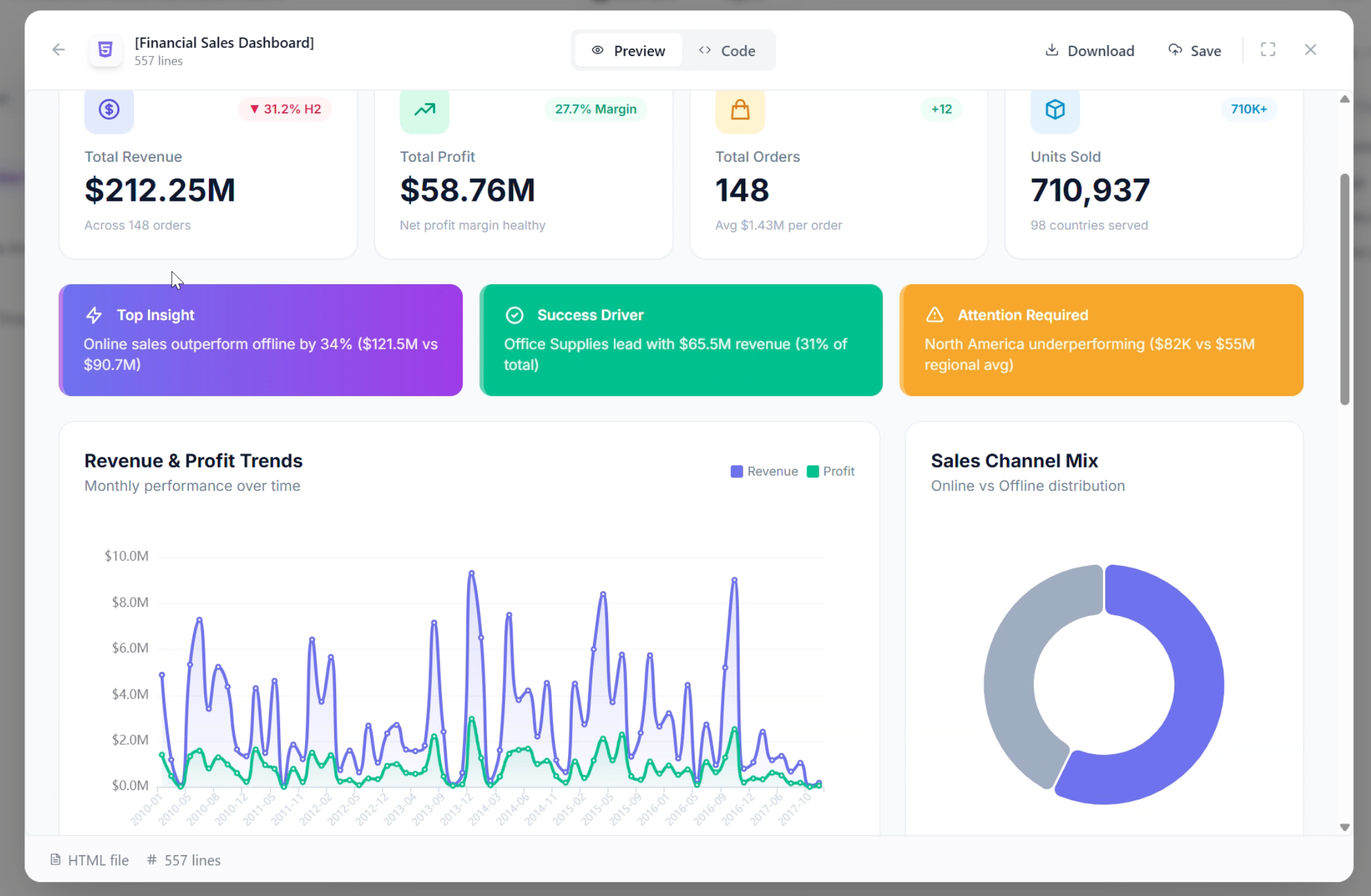
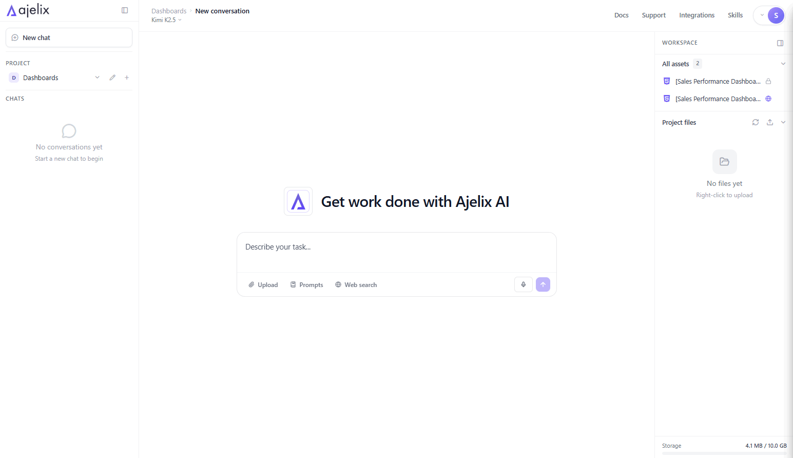
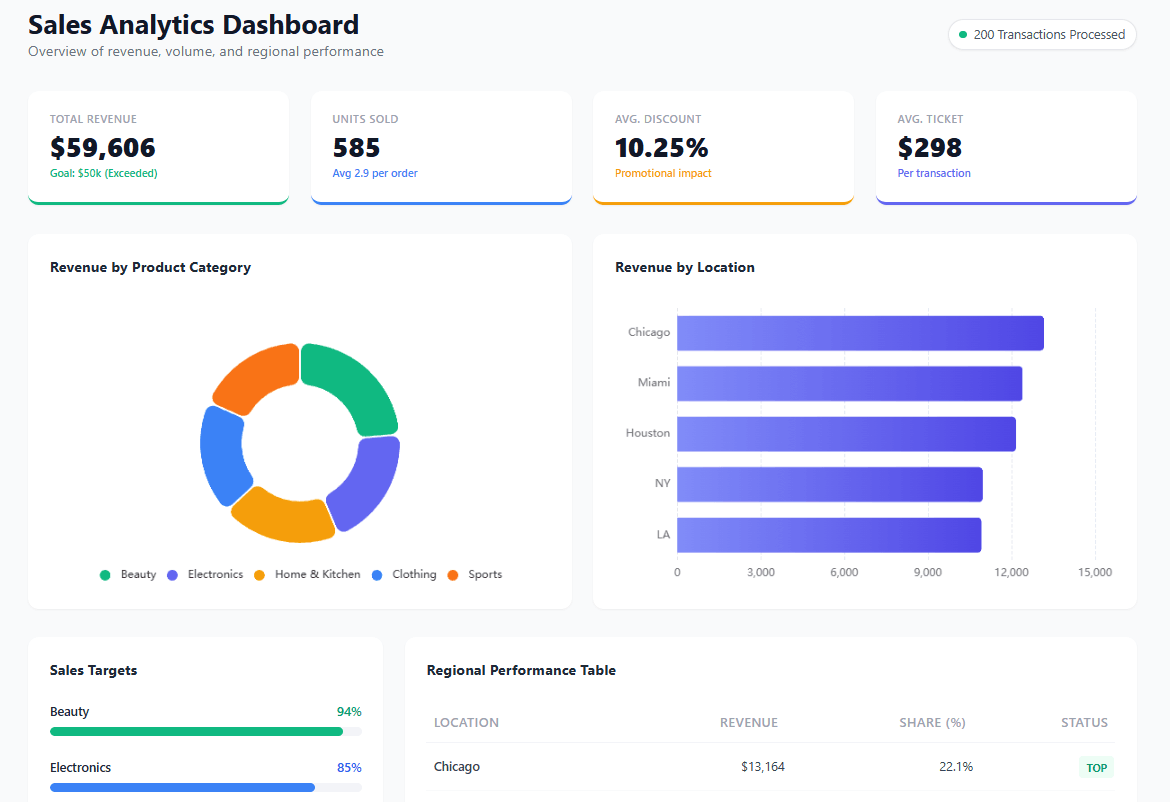
When it comes to easy setup and great visualization, Ajelix is one of the data visualization software you should consider. Designed specifically for solo entrepreneurs and small to medium businesses, this platform comes with seamless data connections and drag-and-drop editing. You don’t need to be a data ninja or IT specialist to set up your reporting, and it doesn’t have to cost a fortune. This is why Ajelix is so great for small businesses.
What can I do in Ajelix?
- Easy to use AI Agent that lets you build working assets fast and intuitively. Just describe what you need and get production-ready deliverables instantly.
- No training or hard setups. The platform is designed so you can sign up and immediately start creating dashboards, reports, and apps.
- Conversational AI lets you explore your data in detail using natural language. Ask questions and get insights, analysis, and visualizations instantly.
- Generate reports from multiple data sources. Import Google Sheets, Excel files, PDFs, CSVs, presentations, and documents.
- AI dashboard generator turns raw data into leadership-ready reports in seconds. Upload files up to 1GB and get interactive dashboards without manual formatting.
- AI data preparation and KPI creation. Automatically cleanse messy files, extract data from PDFs and images, and calculate metrics without manual work.
- Easy sharing with instant links. Share dashboards, apps, and reports with one click -embedded and ready for collaboration.
- Persistent workspace remembers your context across conversations. Your files, assets, and history stay ready, no need to re-upload or re-explain.
- AI-powered insights explain the story behind your data. Get automatic analysis, trend detection, and actionable recommendations.
- Create working dashboards, Excel files, presentations, and web apps with AI. Describe what you need and get production-ready assets in one click.
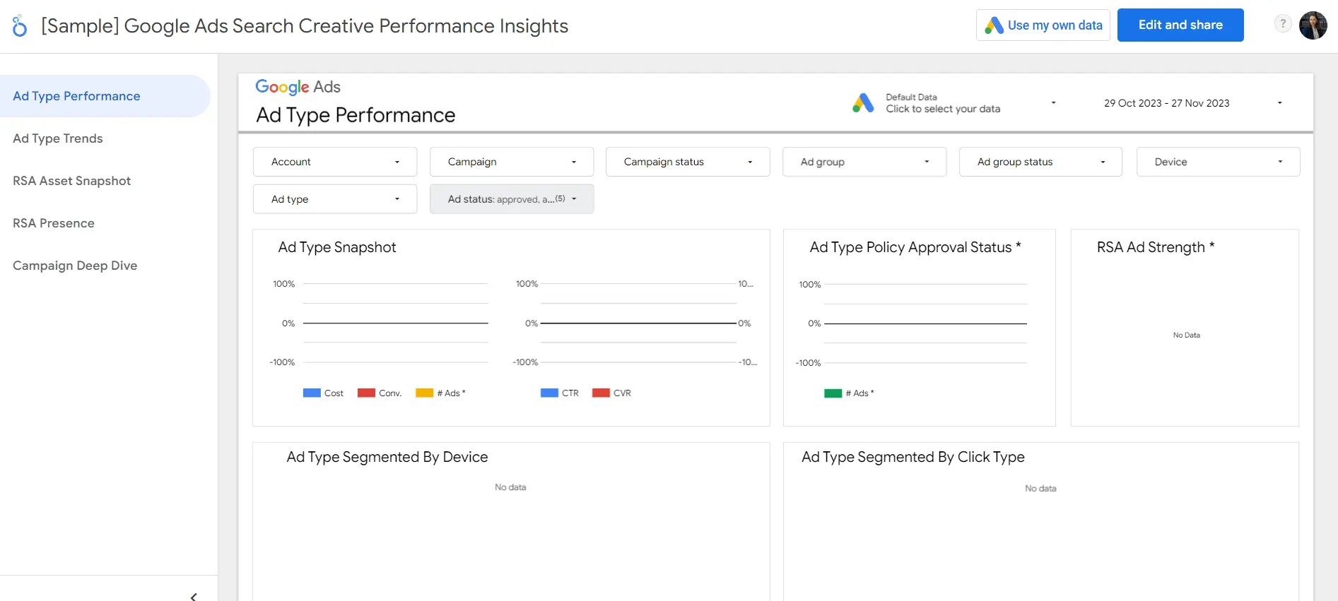
Take a look at the tool👇
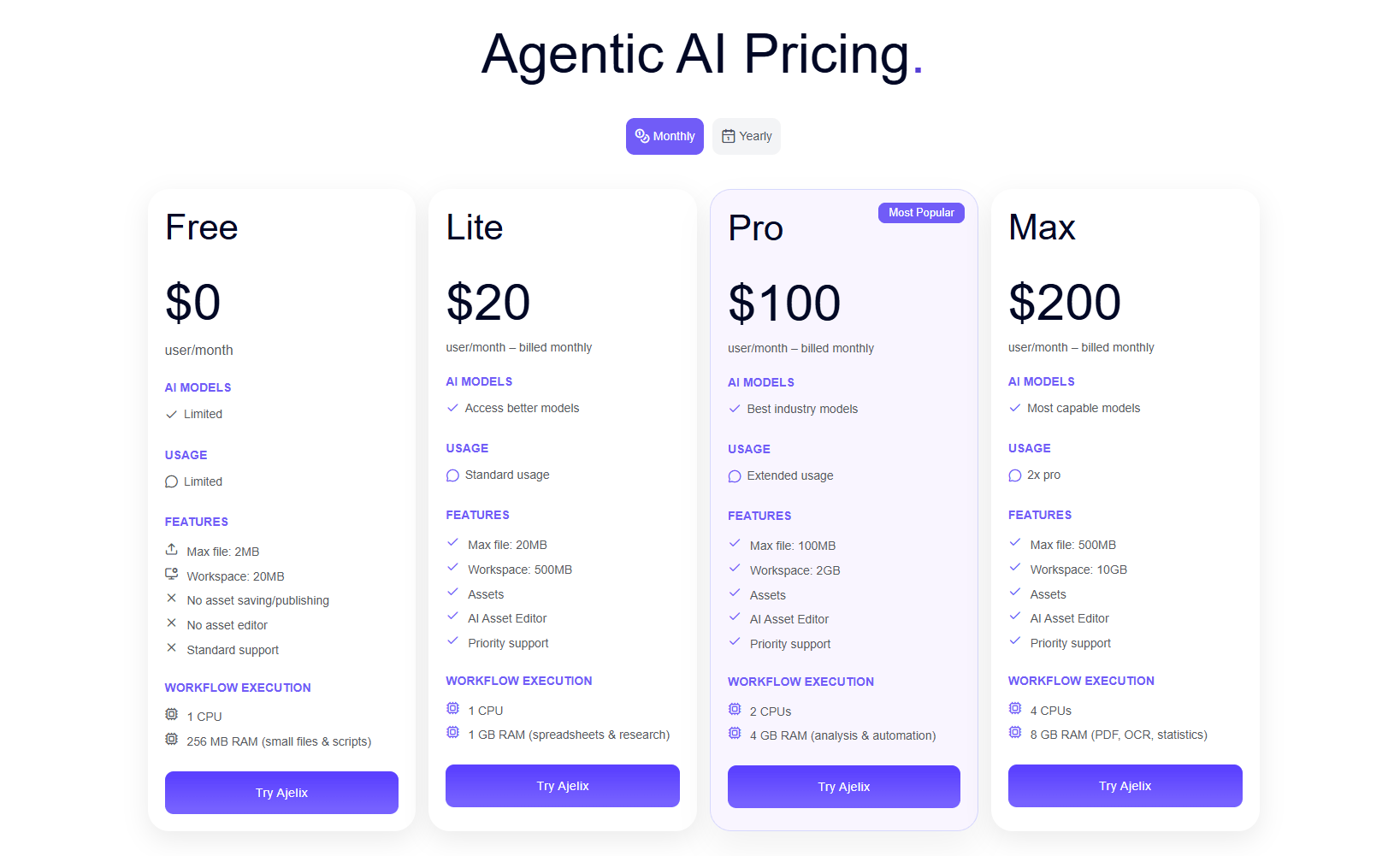
Ajelix Pricing
This platform is separated into three sections:
- Join freemium and explore how easy it is to create reports. This plan is used only for testing purposes.
- The Lite plan is $20/month for individuals who need more power – 20MB files, 500MB workspace, and asset creation.
- The Pro plan at $100/month unlocks the full experience with best-in-class models, 100MB files, 2GB workspace, and extended usage.
- The Max plan at $200/month is built for heavy workloads – 500MB files, 10GB workspace, and 2x the processing power.
By selecting Ajelix, you support individual developers and a bootstrapped tool that is updated with new functionality every week.
Ideal Users
- Small to medium businesses
- Non-technical teams
- Solo entrepreneurs
- Freelancers
- Founders
- Start-ups
Reporting gives you a headache?
Upload your data and create professional reports with agentic AI
Start free
Try free and upgrade whenever
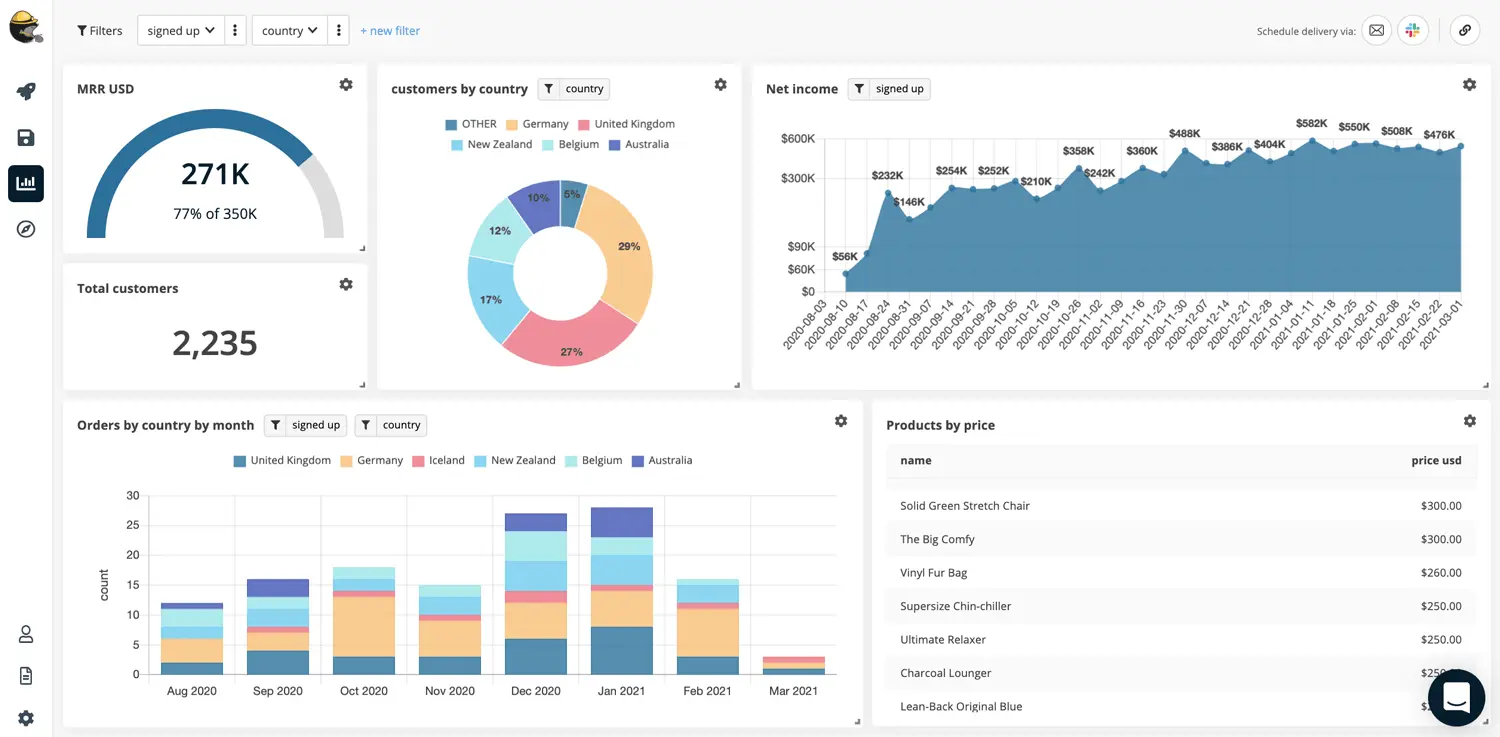
2. Trevor
Trevor offers fast set-up and no-code embedded dashboards to level up your non-tech teams. You don’t need SQL knowledge, and it is created to free up your engineers. Let’s take a look at the features this tool offers.
Trevor Features
- The BI platform caters to non-technical teams without SQL expertise. However, you might need help to connect data from the database.
- It facilitates the creation of dashboards and data visualization.
- Users can set up data alerts.
- It operates as a self-service platform with a no-code editor.
- Embedded dashboards for applications can be created without the need for coding.
- Installation is quick and straightforward.
- Various workflows are supported, allowing the transfer of data to other applications.
- Data sources can be accessed from different applications.
Pricing
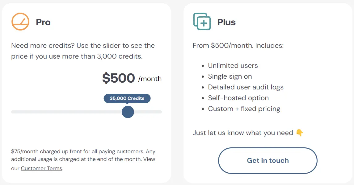
Trevor’s pricing plan is split into three sections:
- Freemium plan with 3000 credits per month with all core features included.
- Pro plan will cost you 75$ per month and includes 5000 credits. In this plan you will be billed at the end of the month for all the credits you’ve overused.
- Plus plan costs 500$ a month and includes unlimited users, single sign on, self-hosted option, custom pricing.
Trevor Limitations & Cons
- Manual data uploads via files are not supported; only database connections are allowed. It means that you still will need a help from tech.
- The options for data sources are highly restricted, preventing the combination of different databases.
- Editing options are limited, making it challenging to align or resize elements uniformly. Visuals have significant limitations.
Ideal Users
- Small organizations
- Non-tech teams
Related Article: Top 9 Data Visualization Trends
3. Zoho
Zoho Analytics is a self-service BI and data analytics software. The main goal for this platform is to analyze your data, generate compelling data visualizations, and uncover insights within minutes. It’s a great solution for non-tech teams; however, some setup from an experienced expert is needed.
Zoho Features
- Data sources: Connect to a diverse range of data sources, including popular business applications.
- Data cleansing and preparation: Get intelligent insights to cleanse data, removing duplicates and invalid entries.
- User-friendly editing: Create interactive dashboards effortlessly through a self-service drag-and-drop functionality.
- AI data analytics: Uncover insights by exploring data with AI. Utilize conversational analytics, predictive analytics, and conduct what-if analysis.
- Collaborate and share reports: Collaborate seamlessly with others and easily share your reports.
- Embed analytics: Integrate dashboards into your applications using no-code solutions.
Pricing
Zoho’s pricing is divided into two categories: Cloud and On-Premise. The On-Premise option is higher in cost and is further divided into four plans: Basic, Standard, Premium, and Enterprise.
- The Basic plan is priced at 30€ per month, providing coverage for 2 users and 0.5 million rows.
- The Standard plan is available at 60€ per month, offering access for 5 users and 1 million rows.
- The Premium plan, priced at 145€ per month, includes 15 users and 5 million rows.
- The Enterprise plan comes at a cost of 575€ per month, accommodating 50 users and 50 million rows.
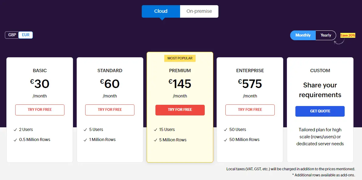
However, choosing the on-premise solution will lead to reduced expenses.
- Freemium Zoho is suitable for personal use.
- Professional plan is priced at 30€ per user per month if you add 5 users.
Zoho Limitations
- Customer feedback highlights the absence of learning videos and resources for the onboarding process.
- While costs can accumulate, they remain comparatively reasonable when compared to previous BI tools.
- A notable learning curve is present.
- The user experience lacks the necessary intuitiveness, and some reports may necessitate assistance from an IT specialist.
- The mobile version has certain drawbacks.
- Customers express dissatisfaction with the level of customer support.
- Loading times for embedded charts can be extended.
- A comprehensive understanding of SQL is still necessary for the full utilization of the platform.
Ideal Users
- Non technical teams.
- Users who are not fluent in data analytics.
- Small to medium businesses.
- Analysts who work with SQL.
Related Article: Why Business Intelligence Has Become Overwhelming
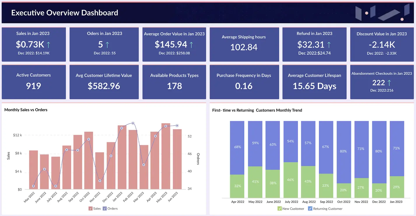
4. Datapad
Dataset is a tool designed for small organizations and non-technical teams, aiming to foster a data-driven culture. The tool is crafted to enable even individuals with minimal technical proficiency, such as grandmothers, to generate reports. Let’s explore the advantages and constraints associated with this tool.
Datapad Features
- No coding or intricate configurations are required.
- Access multiple pre-built integrations and data sources effortlessly.
- Choose from over a hundred pre-built KPI templates.
- Share reports with others through public links.
- Collaborate and comment on data collectively with colleagues.
- Enjoy automated reports and scheduled reporting emails.
- Utilize mobile applications for added convenience.
Pricing
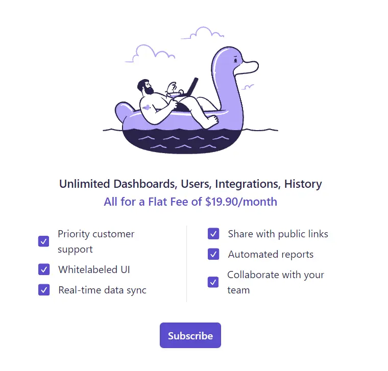
Datapad provides free trial and only one pricing plan for 19.90 per month a user.
Limitations
- Very simple tool with small customization opportunities
- Small amount of data sources
Ideal Users
- Solo entrepreneurs and individuals who need few visualizations
- Organizations with small amount of data
Related Article: Top 7 Power BI alternatives for data visualization
2. Klipfolio
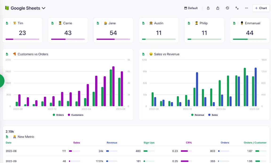
Klipfolio is a cloud-based application renowned for its impressive data visualization features and a diverse range of data connections. It provides robust capabilities for visualizing and monitoring key performance indicators (KPIs). The platform facilitates real-time data collection and sharing, allowing users to create visualizations seamlessly—from spreadsheets to SQL queries—by leveraging over 100 different data sources.
Klipfolio Features
- Formulate personalized metrics tailored to your specific needs.
- Connect data seamlessly from an extensive selection of over 100 data sources.
- Access ready-made data dashboards featuring live reporting.
- Generate custom data feeds using SQL and other tools.
- Prepare your data prior to crafting reports.
- Harness the power of data visualization.
- Foster collaboration and easily share insights with others.
Pricing
Klipfolio offers four pricing plans: Free, Go, Pro, and Business.
- The free version imposes limitations on user count, dashboards, and data sources, making it suitable for small businesses or those in the exploration phase. A 30-day trial of the Pro plan is available for testing purposes.
- The Pro version is priced at $300 per month and enables users to expand their capacity for users, dashboards, datasets, and more.
- For the Business plan, the monthly cost is $800. This plan provides flexible management of user count, datasets, etc. Additionally, it includes the option for a Custom Service Agreement and vendor assessment.
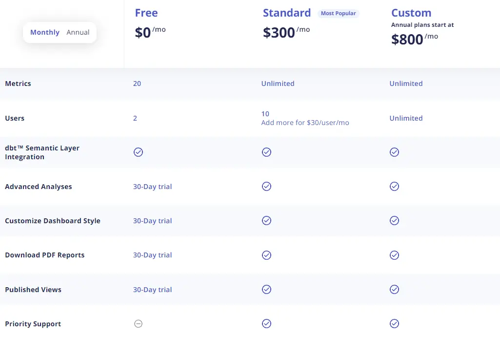
You have the option to tailor the plan to your needs by incorporating individual licenses at a rate of $30 per user per month.
Klipfolio Limitations & Cons
- Like other BI platforms, you may encounter delays and speed issues.
- There is a deficiency in user interactivity, such as the absence of drag-and-drop functionality.
- The support/help documents are challenging to navigate and do not consistently align with the actual product sessions.
- The process of creating dashboards in the backend is intricate.
- Several users have pointed out that it can be daunting to generate content outside of the pre-defined reports, requiring prior knowledge and some technical skills.
- The setup and renewal of API connections may necessitate the involvement of an IT professional.
ideal Klipfolio users
- Companies of small to medium size.
- Users with non-technical backgrounds.
- Well-suited for fundamental to intermediate levels of data analytics.
6. Looker Studio (Google Data Studio)
Looker data studio please note that Looker and Looker Studio are not the same tools. Looker is more advanced tool that provides advanced analytics for enterprise level companies, it requires complex setup with API’s and SQL. However, looker studio is a tool that has many premade reports that you can use for free.
Looker Studio Features
- Easy to use web interface that facilitates reporting
- There are many premade templates that are for free, as well as, template marketplace.
- Many data sources and integrations
- Relatively easy setup and report creation
- Report embedding
- API’s
Looker studio cons
- Some users complain that support is unclear and lacking.
- Complex user management
- Embedding functionality is limited
- Data branding is limited
- Blending different data sources can be complex
- Still very advanced for non-technical non-analytics expert.
Ideal Users
- non-technical users
- small businesses
- experts
Related Article: Top 5 Looker alternatives for non-tech users
7. Datawrapper
This tool is more used for data visualization rather than a BI tool, however, we still decided to include this tool in this list.
Features
- Unlimited visualizations as there’s no limit for elements you can create even in the free plan.
- All the visualizations are private in all plans.
- Created charts are responsive on all devices.
- You can collaborate with Slack and Teams integration.
- Export graphs as PNG, SVG, PDF, etc.
- Live updating.
- Print export functionality.
Pricing
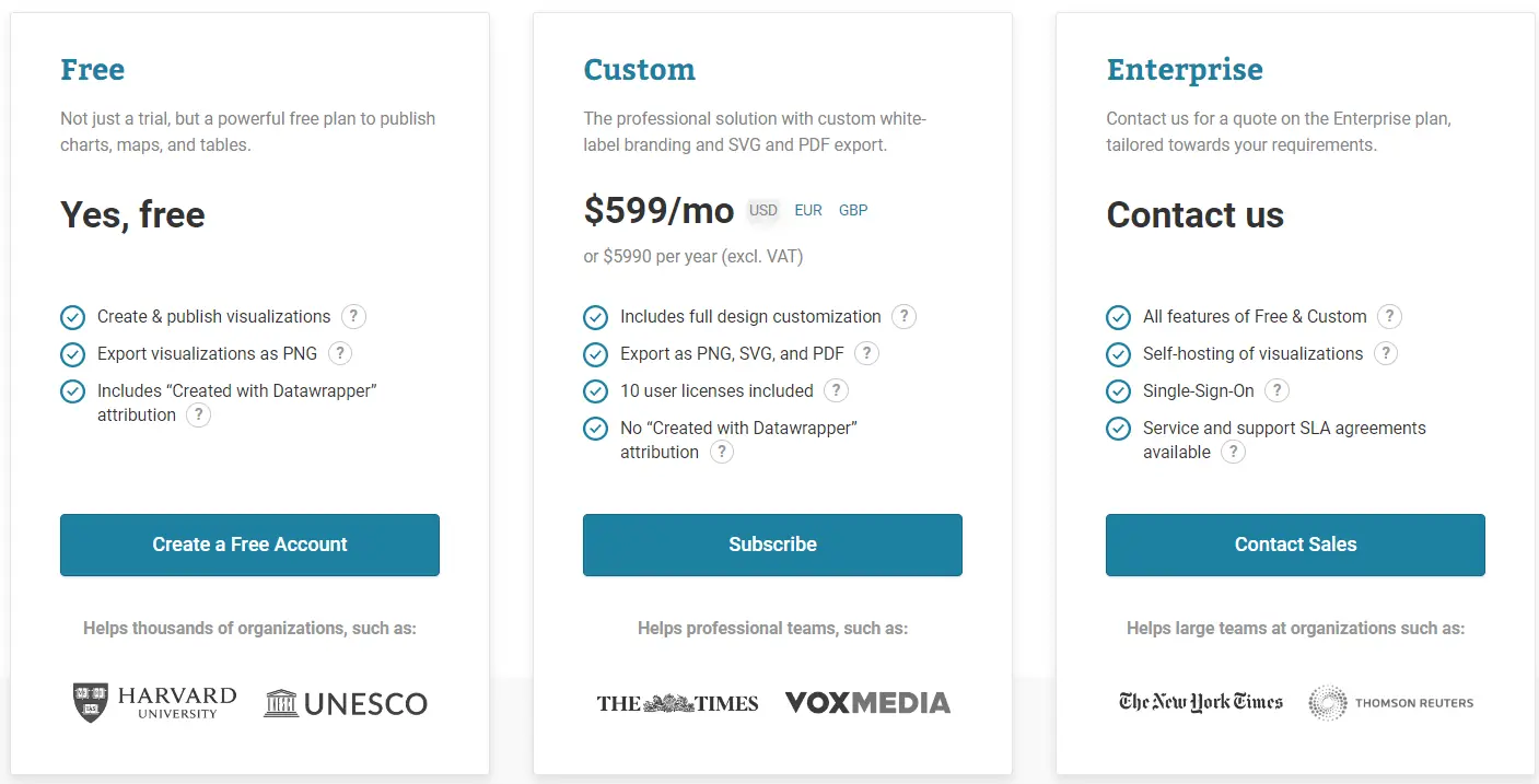
Datawrapper pricing plan has three plans:
- Freemium that offers many features, so it can be used as a main plan.
- Custom plan which will cost you a 599$ per month and includes all of the advanced features that they offer.
- Enterprise plan is for big companies that are looking for a custom plan and require contacting the sales team.
Datawrapper cons
- Not designed for analytics, but rather for visualization.
- Some users say that there’s limited flexibility when working with visuals.
- It can be hard to customize the visual appearance of the charts.
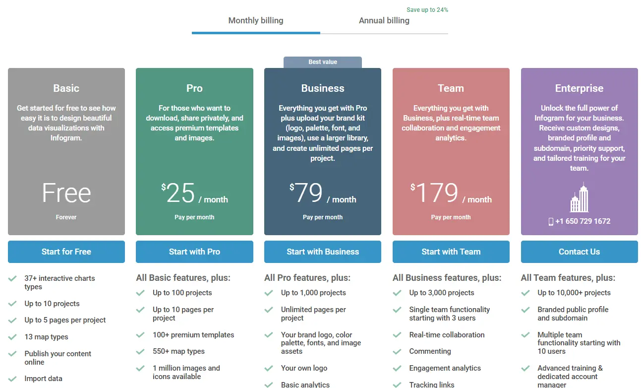
8. Infogram
Infogram is a data visualization platform, another tool that is more for visualization rather than analytics. However, let’s take a look at the features that this tool provides.
Features
- Wide library of elements to visualize data
- One million images and icons.
- Easy drag-and-drop editor.
- Option to publish your content online.
- Team collaboration settings.
- Interactive data visualizations today
Pricing
Infogram pricing plan is divided in five plans:
- Freemium plan
- Pro plan for 25$ per month
- Business plan for 75$ per month
- Team plan 179$ per month with 3 users included
- Enterprise plan pricing must be collected by contacting the sales team.
Infogram cons & limitations
- Not really for analytics and advanced reporting
- Doesn’t provide live reporting and refreshing
- The sharing option is very limited and can get costly
- Complex visualization can’t be created with this tool, as it isn’t created for that.
- Some visualizations can be limited
Ideal Users
- designers
- small entrepreneurs who need visualization, not the reporting
Related Article: Data visualization principles with good examples
Summary
As you can see, there are so many useful tools out there in the market that it can be hard to pick the right one. Hopefully, this article helped you explore tools that could help you solve your business struggles.
FAQ’s
There’s no one solution that fits all. You have to test and explore tools to understand which one is the best. However, we strongly suggest trying Ajelix, which is specifically created for SMB and solo entrepreneurs for painless data visualization.
1. Ajelix
2. Trevor
3. Zoho
4. Datapad
5. Klipfolio
6. Looker Studio
7. Datawrapper
8. Infogram
Explore this article and other comparison blogs. Test the tool, as most of them have free versions and free trials. Once you test them, you can make a decision that could help you the most.
Ready to test Ajelix?
From data to report in one minute or less with Ajelix AI Agents