Data Visualization Principles With Good & Bad Examples

Making sense of raw numbers starts with strong data visualization principles. Good visualization brings clarity to your data and helps drive action, while bad visualization can easily confuse or mislead.
With endless chart and dashboard options, it can be hard to know what actually works. In this guide, I’ll share the core visualization principles, real examples of good vs bad visualization, and practical tips for choosing the right charts, using color effectively, and designing dashboards that deliver clear value to your team.
TL;DR
Data visualization turns complex data into clear, actionable insights. Effective visuals rely on five principles: clarity, accuracy, choosing the right chart, smart use of color, and avoiding misleading design. Charts help people understand patterns and make better decisions faster than tables. Pick tools based on data complexity, skills, and budget, such as Ajelix, Excel, Tableau, or Power BI. Good data visualization is not just about looking nice; it is about truthfully and simply telling a data-driven story.
Role Of Data Visualization
Data visualization turns raw numbers into visuals you can understand. Instead of staring at an endless spreadsheet, you get charts and graphs that highlight the patterns, trends, and outliers that matter. This makes it much easier to spot what’s working and what’s not. Whether you’re in business, trying to make decisions, digging into scientific research, or sharing insights as a journalist, the ability to present data visually is essential.
Change the way you work with agentic AI
One-click dashboards,KPI tracking, and AI-powered insights—for work that actually gets done.

It’s no secret that our brains handle visual information more quickly and naturally than plain text. Visuals turn confusing raw numbers into insights we can actually use, helping both individuals and teams make sense of data and put it to work.
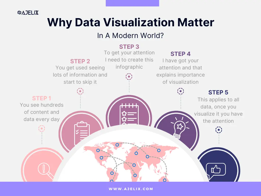
Here’s an example of how data visualization works:
- You see hundreds of content every day
- You get used to seeing lots of information and start to skip it
- To get your attention I have to create an infographic
- I have got your attention and that explains the importance of visualization
A great resource to understand data visualization in more detail is the book Data Visualization: Principles and Practice, Second Edition
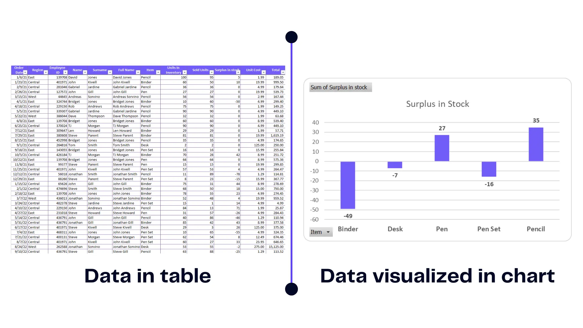
How Visualization Improves Data Understanding and Decision-Making
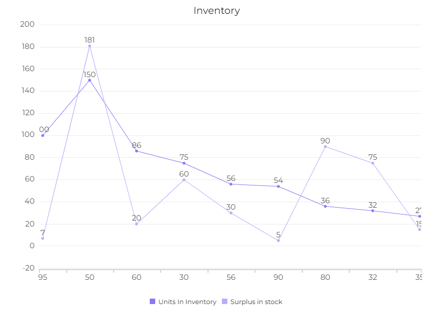
Visualizations provide a roadmap through the numbers complex landscape. It simplifies the information, allowing us to extract insights swiftly. Here’s an example of how representing the same data within the table vs chart you can make better decisions.
Infographic emphasizing the importance of visualization, image by author
This example enlarges the importance of visualization as you can’t make decisions from a table. You simply can’t see the whole picture behind the numbers. Contrary to the graph it’s clear that there’s a stock shortage and you need to order more items.
Visual representations provide clarity in decision making reducing the risk of misinterpretation and promoting well-informed choices.
Related Article: How To Make A Bar Graph in Excel?
5 Data Visualization Principles
- Clarity and Simplicity
- Accuracy and Truthfulness
- The Right Visualization Type
- Colors and Visual Appeal
- Avoiding Misleading Visuals
#1 Clarity and Simplicity
- Keep it simple: Avoid clutter and excessive complexity.
- Use clear labels and titles: Make sure viewers understand what they’re looking at.
- Choose appropriate visual elements: Select charts and graphs that best convey your message.
Simplicity is the ultimate sophistication in visualization. An overload of elements can obscure the message. Clean visuals with minimal distractions ensure that the audience’s focus remains on the data story. Keeping in mind basic principles design will be easier for you to make storytelling with data.
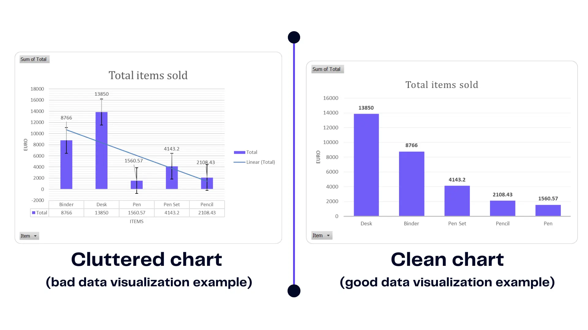
Misleading data visualization examples and good visualization, image by author
An example presents the difference between a cluttered chart and a clean chart. You should aim for the one on the right. The first chart contains too many labels and information that it’s hard to understand. Find out how to visualize financial data.
It’s unclear what is the story behind this chart. However, a clean chart highlights important information therefore it’s easy to make a decision.
Related Article: How To Change Series Name in Excel?
#2 Accuracy and Truthfulness
- Show data accurately. Make sure your visuals really represent what the data says.
- Stay clear of misleading visuals. Techniques that distort information only create confusion and can damage trust.
- Give context. Add the details viewers need so they actually understand what they’re looking at.
Before jumping into visualizations, take the time to clean and prepare your data. Stay away from “garbage in, garbage out” approach. This means checking for errors, filling in any missing pieces, and making sure everything is accurate. If your data isn’t solid, even the best-looking visuals can lead people in the wrong direction. Clean data is the foundation for insights you can trust.

#3 Right Visualization Type
There’s no shortage of options when it comes to data visualization. Bar charts, pie charts, and histograms are staples, but you’ve also got radar charts, line graphs, and tools for time series analysis.
The type of chart you use depends on what kind of data you have and what story you want to tell. Choose the format that best highlights your point without overcomplicating things.
| Visualization Type | Best At | Less Suitable For |
|---|---|---|
| Pie Chart | – Showing how parts make up a whole, like displaying percentages – Comparing simple, categorical data with just a few options (ideally four or fewer) | – Your data has a lot of categories – You want to highlight trends or changes over time |
| Bar Chart | – Comparing categories of data – Showing trends or changes over time (horizontal bar charts) | – Large datasets with many categories – Visualizing proportions within a category |
| Line Chart | – Showing trends or changes over time – Comparing multiple trends | – Highlighting specific data points – Visualizing complex relationships between variables |
| Column Chart | – Comparing categories of data – Highlighting magnitudes or differences between categories | – Showing trends over time (less effective than line charts) |
| Scatter Plot | – Identifying relationships between two variables – Visualizing outliers or clusters in data | – Comparing more than two variables – Communicating trends to a broad audience |
| Heatmap | – Identifying patterns or trends across multiple categories – Visualizing data with two or more dimensions | – Highlighting specific data points – Datasets with very few categories |
| Map Chart | – Displaying geographical data – Visualizing trends or patterns across geographic locations | – Data without a geographic component – Complex data with many variables |
| Box Plot | – Comparing distributions of data across categories – Identifying outliers in data | – Large datasets with many categories – Visualizing trends over time |
| Stacked Bar Chart | – Showing the composition of a whole across multiple categories – Comparing trends for multiple categories over time | – Datasets with many categories – Highlighting individual data points |
| Area Chart | – Showing the magnitude or change of a value over time (similar to a line chart) – Emphasizing the volume or total quantity under the curve | – Highlighting specific data points – Comparing trends for many datasets simultaneously |
| Treemap | – Visualizing hierarchical data structures – Identifying relationships between parts of a whole | – Data with very deep hierarchies – Datasets with many categories that are not hierarchical |
| Time Series Chart | – Showing trends or changes over time – Highlighting specific periods or events within the time series | – Comparing many trends simultaneously – Data with high frequency |
| Donut Chart | – Similar to pie charts, for comparing parts of a whole (percentages) – Can accommodate slightly more categories than the pie chart due to the open center – Useful for highlighting a specific metric in relation to the whole | – Data with many categories (can become cluttered) – Not ideal for comparing trends over time |
Each data visualization method has its strengths and weaknesses, and recognizing these differences is key to choosing the best approach. To create a good data dashboard, focus on clarity and flow so your visuals tell a clear story and support insightful decisions.
Related Article: How To Delete A Chart in Excel?
#4 Colors and Visual Appeal
- Use a consistent style to maintain a cohesive visual appearance throughout your data visualization.
- Choose appropriate colors that are easy to distinguish and visually appealing, which helps prevent confusion.
- Consider the overall design, paying close attention to layout and composition for a more effective data visualization.
Colors do more than make data visualizations look good. The right color choices can highlight important data points, separate categories, and even influence how people feel about the information. This all contributes to more effective data visualizations.
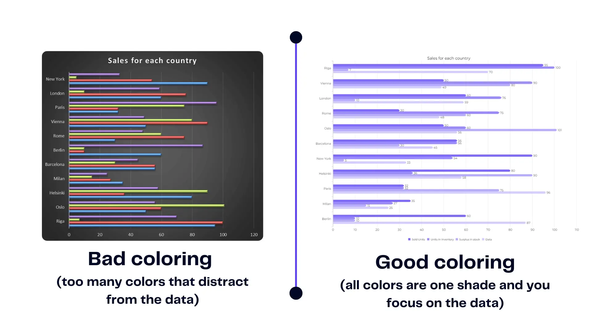
Good vs bad coloring chart example, image by author
A harmonious color palette aids perception and helps avoid confusion. If your colors clash or blend too much, your audience might misread the data. Sticking to harmonious palettes keeps your message clear and makes comparisons easier. Today, you can use AI tools to quickly find and match the best colors for your data visualizations.
Visualizations excel at unearthing hidden relationships. Scatter plots reveal correlations, while line charts expose trends. These patterns might remain invisible in raw info but become evident through the power of visuals. Explore the world of business intelligence and analytics.
See the example above to understand best practices for simple data correlation visualization.
#5 Avoiding Misleading Visuals
- Use appropriate scales and units: Select scales that accurately represent the data.
- Focus on the key message: Ensure that the visualization supports your main point.
- Consider the audience: Tailor the visualization to the needs and understanding of your viewers.
Misleading visuals can lead to misguided conclusions. It’s crucial to be aware of pitfalls like distorted scales, truncated axes, and inappropriate comparisons. Ir will ensure that your visualizations remain accurate.

Ensuring accurate and ethical information representation is key. Integrity is paramount in visualization. Accurate representation involves transparently presenting data points, acknowledging uncertainty, and avoiding manipulative techniques that can distort the truth. Explore good dashboard examples here.
Related Article: How To Explode A Pie Chart in Excel?
How To Visualize Data With Ajelix AI Agent?
Time needed: 15 minutes
Here’s a step-by-step guide on how easy it’s to create professional-looking dashboards using Ajelix AI Agent.
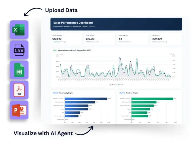
- Data Upload:
Prepare your data in any format – CSV, Excel, Google Sheets, PDF, presentations, or others. Simply drag and drop it onto the Ajelix AI Agent platform or use the upload option.
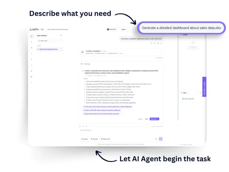
- Use Ajelix AI Agent for faster result
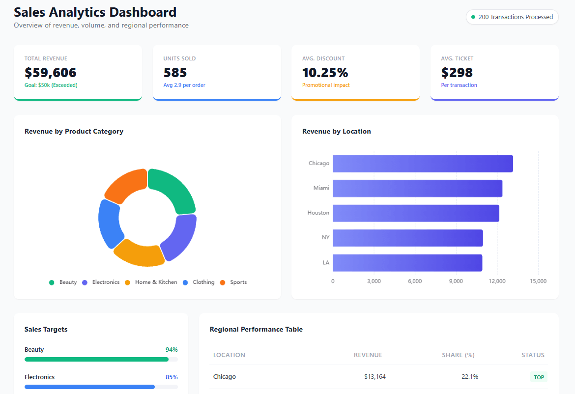
To create visualizations faster, just describe your goal to the Ajelix AI Agent. It will analyze your data and generate a tailored dashboard with relevant charts and structure – ready to use or customize to your needs.
- Customization
1. Review the generated dashboard and describe the changes you want to the Ajelix AI Agent.
2. Ask the AI Agent to adjust charts, update data fields, change the layout, or modify styling.
3. If needed, you can also inspect and edit the underlying HTML code for more advanced customization.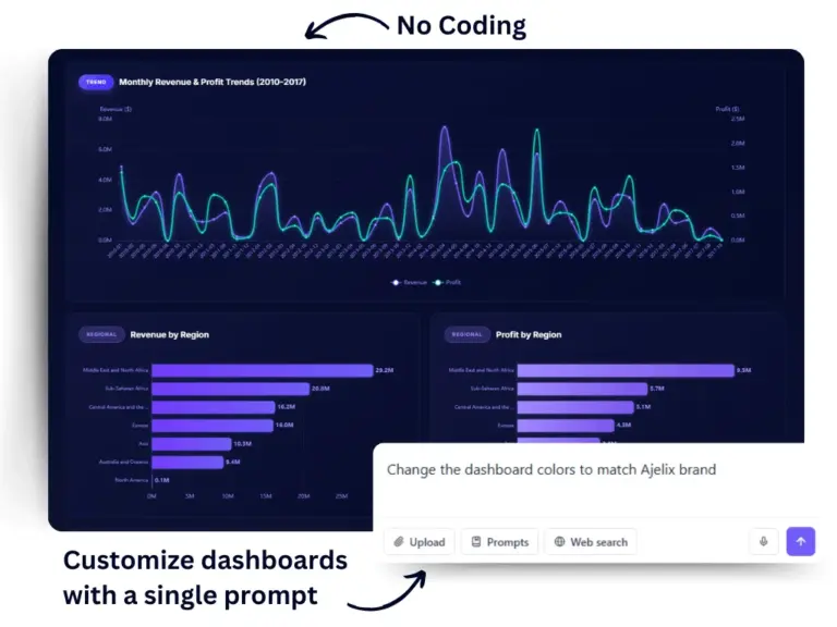
- Sharing Your Dashboard
Once you’re satisfied with your dashboard, click the “Share” option. Ajelix AI Agent will generate a unique link that you can share with others to give them access to your visualization.
You can also download the dashboard for offline use or sharing as a file.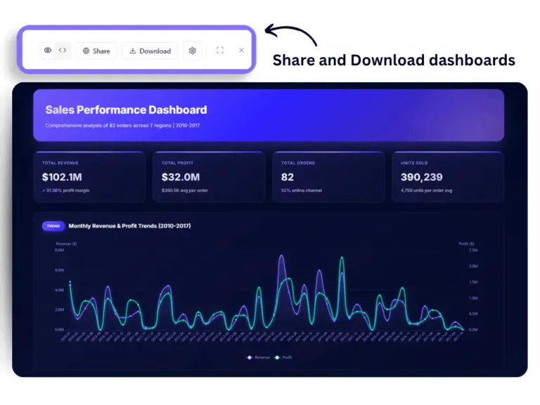
Additional Tips:
- Ajelix AI Agent offers tutorials and documentation to help you navigate the platform and explore its features in more detail.
By following these steps, you can leverage Ajelix AI Agent to transform your data into clear and insightful visualizations. Remember, start with the basic data upload or connection, then explore customization and advanced options based on your needs.
Reporting gives you a headache?
Upload your data and create professional reports with agentic AI
Start free
Try free and upgrade whenever
Choosing the Right Tools for the Job
Once you’re familiar with the principles of data visualization, the next step is picking the right tool. There are many data visualization tools out there, and what works best depends on your needs and resources. Keep these things in mind:
- Data Complexity: Basic spreadsheets work fine in Excel or Google Sheets for simple data. For more complex datasets, look at specialized tools like Tableau or Power BI for business data visualization.
- Technical Expertise: Some platforms offer easy drag-and-drop interfaces, perfect for beginners. Others require a bit of coding, which gives you more control but demands technical skill.
- Budget: You’ll find good free options, but premium software often includes advanced features that can make a difference if you need more flexibility.
- Collaboration Needs: If your team is involved, consider cloud-based tools that allow multiple users to work together, share dashboards, and see real-time changes.
Choose a tool that aligns with your project requirements to ensure your data visualizations are both clear and impactful.
Tools For Easy Data Visualization
- Ajelix AI Agent: intuitive, drag-and-drop AI workspace that enables users to turn data into dashboards, reports, apps, and presentations. Great option for small business owners and professionals who need basic analytics features.
- Tableau: Industry leader with powerful features for data manipulation, analysis, and visualization. Offers a wide variety of chart types and customization options.
- Power BI: Microsoft’s business intelligence platform known for its integration with Excel and other Office products. Well-suited for creating interactive dashboards and reports.
- Qlik Sense: User-friendly tool with a focus on self-service analytics and data exploration. Known for its intuitive interface and associative data exploration capabilities.
Free and Open-Source Tools:
- Google Data Studio: A user-friendly platform for creating interactive dashboards and reports. Integrates seamlessly with other Google products like Sheets and Analytics.
- Tableau Public: Free version of Tableau with limited publishing capabilities. Great for exploring the software and creating basic visualizations.
- Apache Spark: Open-source framework for large-scale data processing and visualization. Ideal for data scientists and developers working with Big Data.
Other Options:
- Infogram: Cloud-based platform ideal for creating social media-friendly infographics and reports.
- Looker: Data exploration and business intelligence platform geared towards developers and data analysts.
- Zoho Analytics: Comprehensive business intelligence suite with data visualization capabilities. Integrates with other Zoho products and services.
Remember, the “best” tool is subjective. Experiment with different options to find one that aligns with your specific needs, skillset, and budget. Most data visualization tools offer free trials, allowing you to test-drive the features before committing.
Conclusion
Good data visualization examples go beyond looks. They combine solid design principles with clear data to help you communicate insights effectively. Clean visuals, meaningful storytelling, and accurate data are what set effective data visualizations apart from bad data visualization examples.
If you want to learn more about using Excel or Google Sheets for better business data visualization, check out our other articles. Follow us on social media for daily tips and updates.
FAQ
Bar charts are for comparing categories (e.g., sales by region). However, line charts show trends over time (e.g., stock price over months).
Here are some common data visualization mistakes to avoid, all concise:
Clutter: Too many elements or data points in one chart.
Unclear Labels: Missing or confusing axis labels and chart titles.
Misleading Colors: Colors not intuitive or not accessible to colorblind viewers.
Wrong Chart Type: Using a bar chart for trends (use line chart) or vice versa.
3D Effects: Distracting and can distort data perception.
Here are a few options: Spreadsheets (Excel, Google Sheets), Presentation Software (PowerPoint, Keynote), Standalone Tools (Ajelix AI Agent, Power BI), and Online Tools (Canva, Infogram).
Spruce up your data viz with these quick tips:
Focus on Clarity: Keep it simple and avoid clutter.
Color Counts: Use color strategically to highlight key data points.
Consistent Design: Maintain consistent fonts, colors, and styles throughout.
Label It Right: Clear and concise labels for axes, titles, and data points.
Whitespace is Key: Don’t cram elements – allow breathing room for visual impact.
Ready to give it a go?
From data to report in one minute or less with Ajelix AI Agent