Stacked Area Charts: Best Examples On How To Use Them
Stacked area chart is a type of data visualization that allows us to display quantitative data using a series of colored layers, or “areas,” stacked on top of one another to represent cumulative values. Each layer represents a different category or subgroup of the data.
The total height of the stack at any given point corresponds to the total value of the data at that point.
These charts offer a dynamic way to comprehend complex data structures, enabling us to identify trends, anomalies, and relationships more effectively. This article will walk you through the best examples on how and when to use stacked area charts.
Case Studies When To Use Stacked Area Charts
1. Helps To Reveal Data Trends Over Time
Stacked area charts excel at illustrating the evolution of data over time, making it effortless to track changes, patterns, and fluctuations. By stacking different data categories, they create a visual narrative that simplifies the often complex choreography of time-based data.
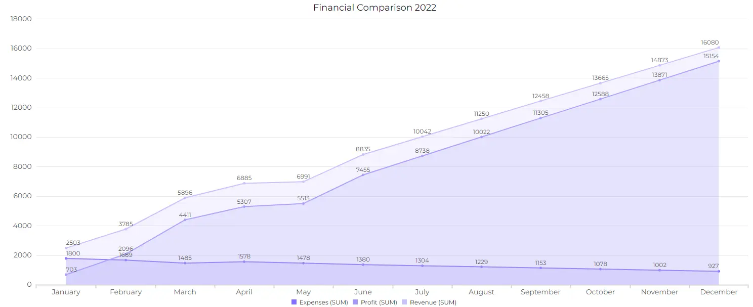
Use Case: Sales and revenue analysis
Businesses employ stacked area graphs to dissect their profit and revenue data, examining contributions from different products, regions, or customer segments.
Author’s Note: All the charts showcased in this article are made with Ajelix BI data visualization platform. You can join freemium and create charts without hard set ups and analytics knowledge.
2. Compare Multiple Data Categories
Stacked area charts are a valuable for comparing multiple data categories, offering a unique perspective that sets them apart from traditional bar and line charts. Unlike bar charts that display data categories side by side or line charts that show trends individually.
Stacked charts enable users to not only see how individual categories change over time but also how they interact within the whole, providing a holistic view of data relationships. This feature can be particularly advantageous when dealing with data that showcases relative proportions and contributions, as it makes it easier to spot which categories dominate or fluctuate. However, it’s essential to consider the context and the specific data you’re working with.
While stacked area charts excel at illustrating relationships, they may not be the ideal choice for showing absolute values, which bar charts can represent more accurately. Line charts, on the other hand, offer a simpler representation of individual trends over time.
The choice between these chart types ultimately depends on the specific goals of your data analysis and the story you want to convey.
Author’s Note: For effective visualization to succeed learn more about data storytelling, AI data analytics and explore our summary for data visualization trends 2024.
When to Avoid Using Stacked Area Charts
Stacked area charts are a valuable tool for many data visualization scenarios, but there are situations when they may not be the most suitable choice. Here are some instances when it’s advisable to avoid using stacked area charts:
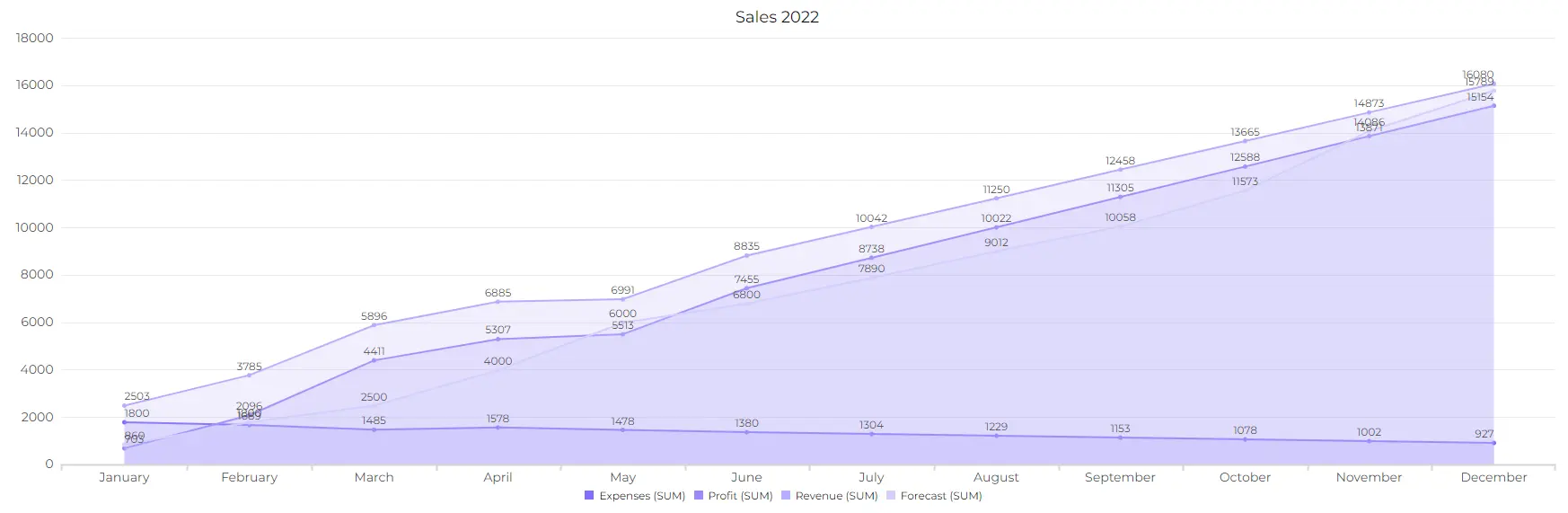
1. Small Data Sets
Stacked area charts are most effective when dealing with larger data sets. Using them for small data can lead to cluttered and less informative visualizations.
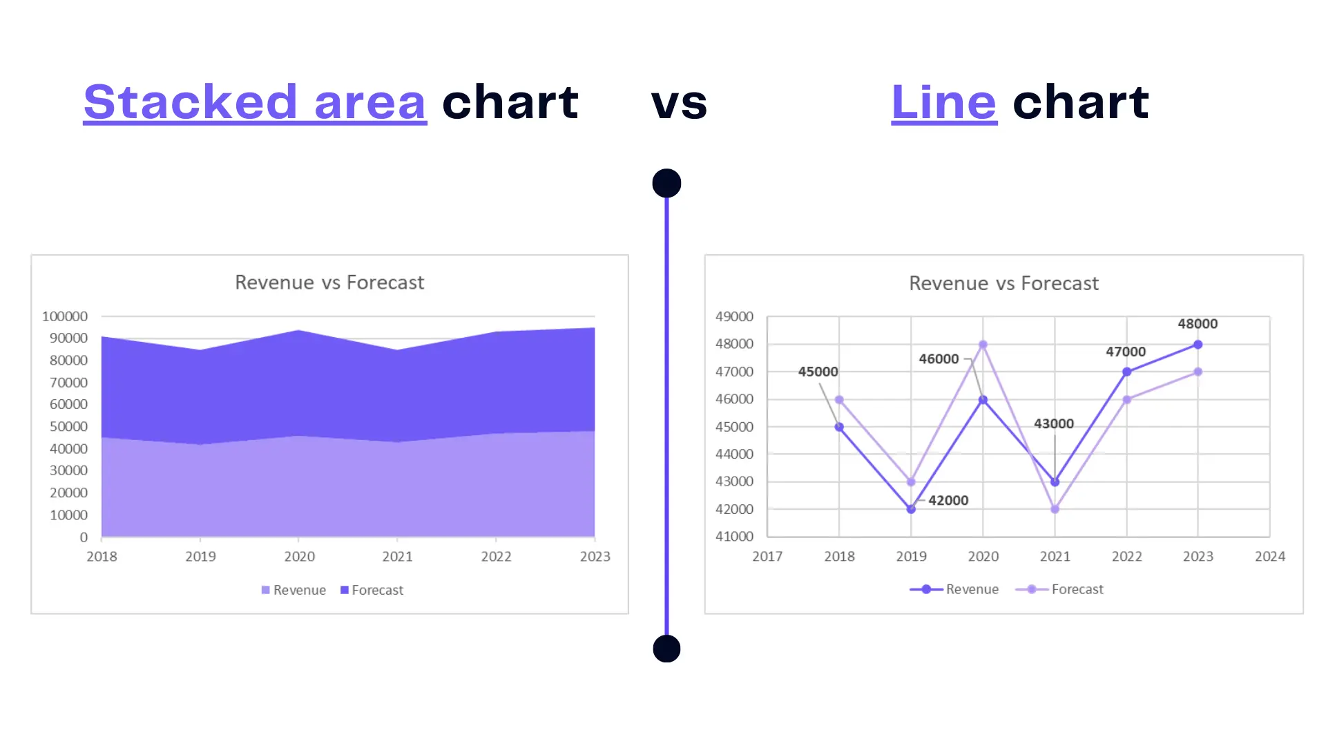
As you can see in the example above data amount is quite small and it’s hard to understand the correlation between forecast and revenue in stacked graph. However, line chart is more clearer and instantly represents the value differences.
2. Precise Absolute Values
If your goal is to precisely represent and compare absolute values, bar charts or line charts are usually more appropriate. Stacked area charts emphasize proportions within the whole rather than absolute quantities.
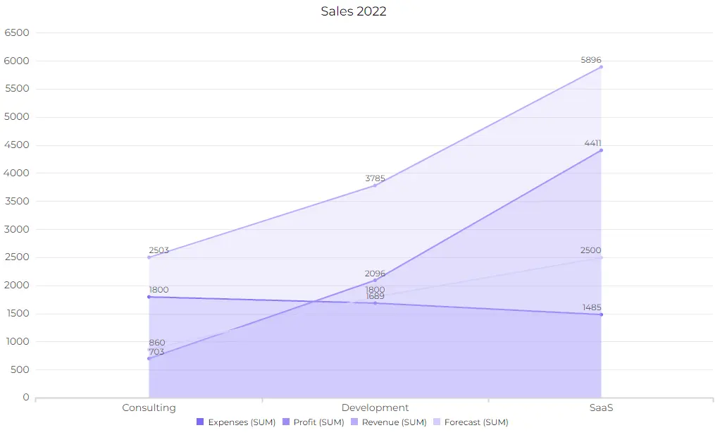
3. Too Many Data Categories
When dealing with an excessive number of data categories, stacked area charts can become crowded and difficult to interpret. Simplifying the data or considering alternative chart types may be necessary.
4. Negative Values
Stacked area charts are not suitable for representing negative values or data that needs to account for losses or reductions.
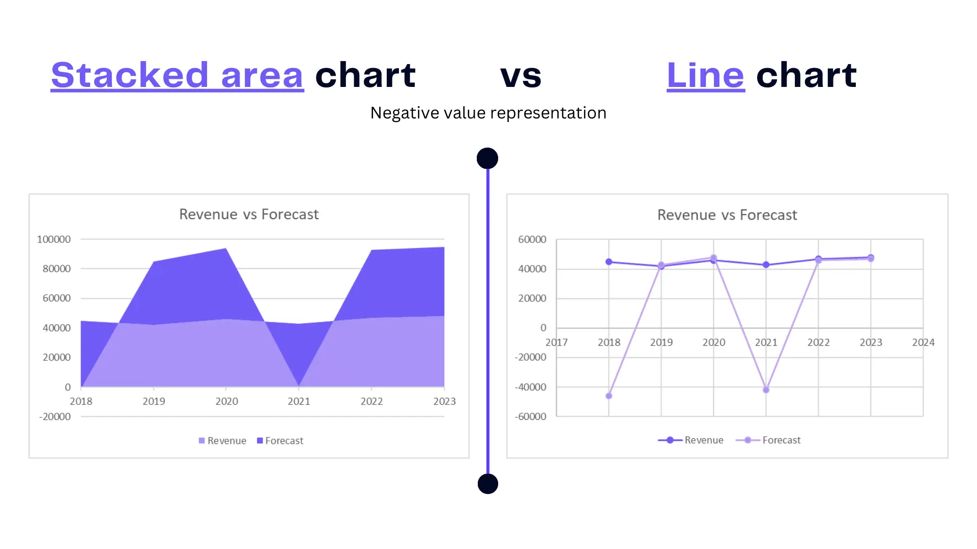
As you can see that line chart can better visualize negative values than stacked area chart. It’s almost hard to understand what is happening on the first chart. However, line chart perfectly separates the negative values along with the postive.
5. Data with Many Fluctuations
If your data has frequent and rapid fluctuations over time, stacked area charts can make it challenging to distinguish individual category contributions. In such cases, line charts may offer better clarity.
Ultimately, the choice of chart type depends on the specific characteristics of your data and the insights you aim to convey. Consider the context, the audience, and the nature of your data when deciding whether to use stacked area charts or explore alternative visualization methods.
Tools and Software for Creating Stacked Area Charts
Excel
Excel is a versatile tool for creating Stacked Area Charts, offering extensive customization options. However, there’s a much training needed to create great reports with Excel. We have created several trainings and guides to help you tackle these tasks. Add and remove gridlines, add tick marks, create a double bar chart, and learn about data visualization principles.
Tableau
Tableau’s interactive features make it a preferred choice for data professionals. This tool requires much knowledge and expertise in data analytics. It can cost much for small companies to use this advanced tool.
Ajelix BI
The process is very straightforward once you start using Ajelix for data visualization tasks. Our dashboard provides more than 15 elements to help you tackle reporting tasks.
Not only does it ease the data analytics process it also helps you reduce the time spent looking for the right settings. Ajelix BI was created to help you create reports fast and painlessly.
Conclusion
Stacked Area Charts are versatile tools, accommodating various data types and facilitating comprehensive analysis. We encourage readers to delve into the world of data visualization, experimenting with Stacked Area Charts and discovering their unique applications.
Ready to create stacked charts with Ajelix BI?
From data to report in one minute or less with Ajelix AI Agent