From data to report in one minute or less. Ajelix BI is launched! 🚀 Get started for free.

How to Make a Double Bar Graph in Excel

How to create a double bar graph in Excel? Step by step guides with screenshots and tutorials.

When it comes to visualizing data with precision and clarity, Excel is the go-to tool for many. In this guide, we will explore the art of creating a double bar graph in Excel, a versatile representation of data that allows you to compare two sets of information side by side.

What is a Double Bar Graph?

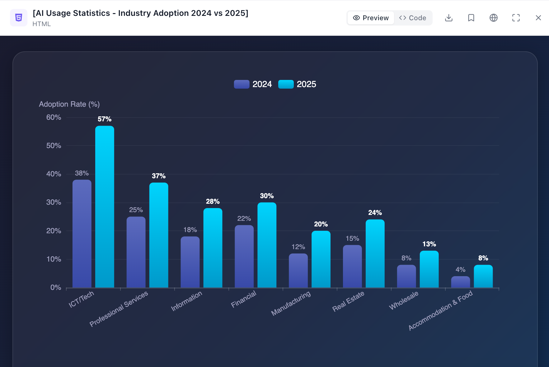
A double bar graph in Excel is a data visualization tool that presents and compares two sets of data side by side using a series of vertical bars. Each set of data is represented by its own set of bars, making it easy to visually compare values between the two data sets.

What is double graph in excel? definition and example

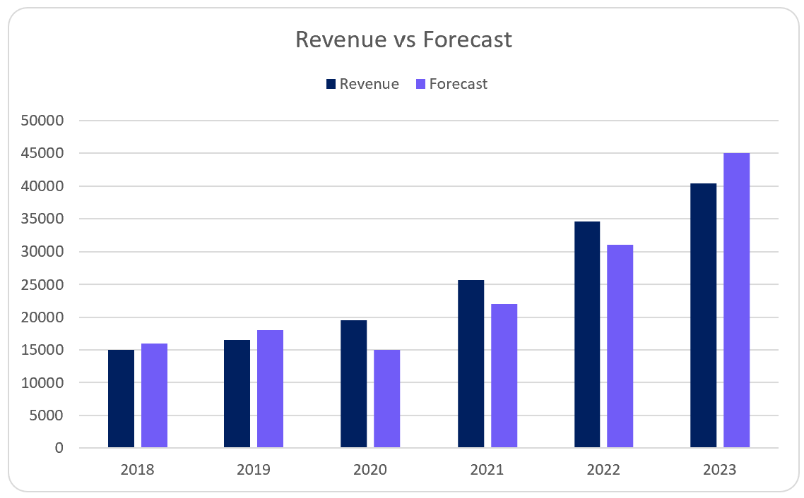
Screenshot of double bar graph in Excel. Image Credit: Ajelix

How To Create the Basic Bar Graph?

Creating a double bar graph in Excel is a dynamic way to visualize and compare data sets effectively. In this step-by-step guide, we’ll navigate through the process of crafting a double bar graph using the versatile tool, Excel.

1. Select Data for the First Bar Set

Identify and select the data you want to represent in the first set of bars on your graph. Excel allows you to choose a specific range effortlessly.

Choose the data for your basic bar graph

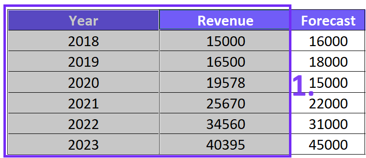
Screenshot from Excel with data for the bar graph. Image Credit: Ajelix

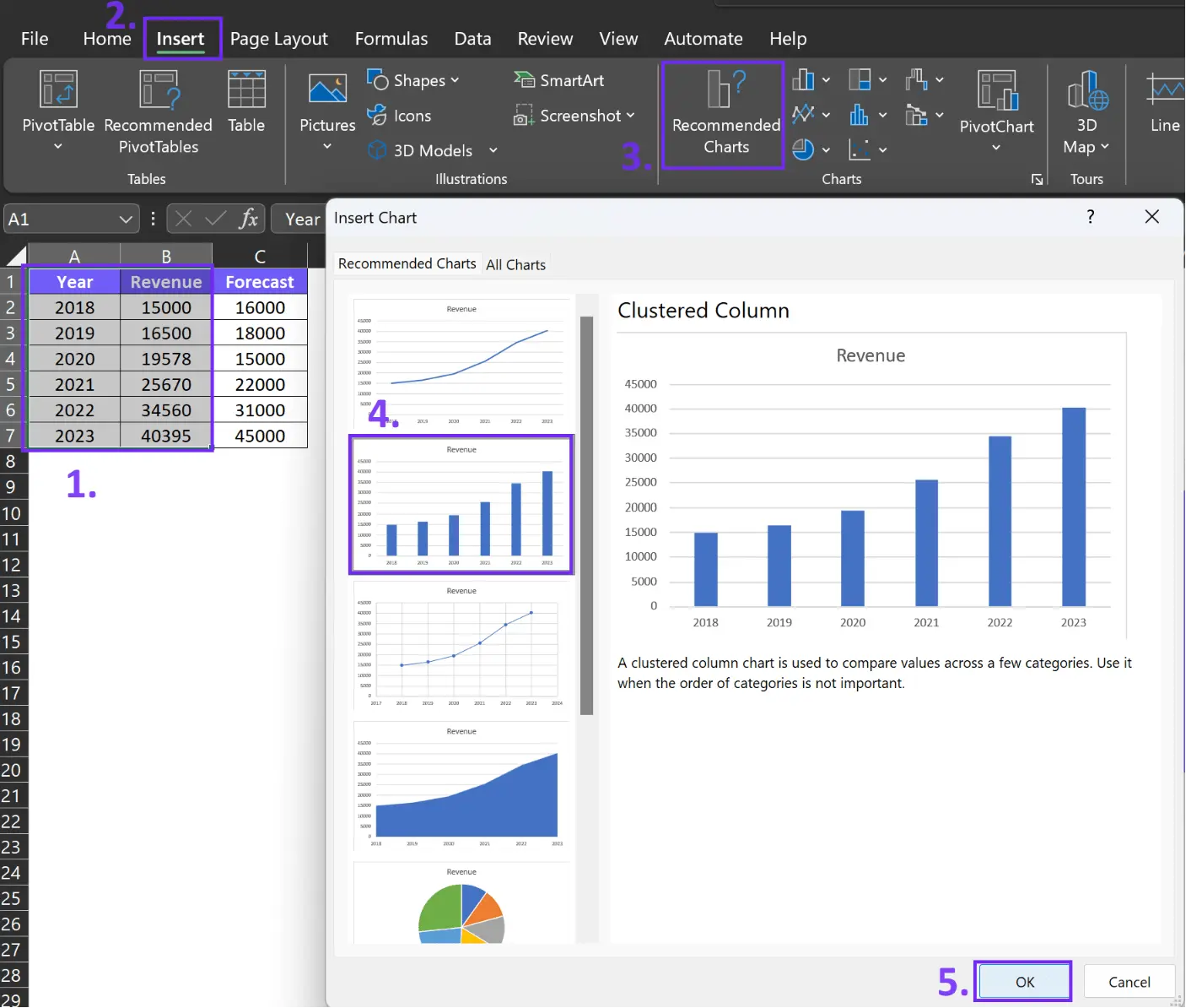
2. Insert the Initial Bar Chart

With your data selected, it’s time to insert the initial bar chart. Excel makes this step straightforward, and you’ll have your first set of bars ready in no time.

  1. Choose your data
  2. Go to the Excel toolbar and click the Insert section
  3. Pick Recommended Charts
  4. Choose clustered column or bar graph and click Ok
Insert bar graph from you data - how to create a double bar graph in excel

Related Article: Data visualization principles with good examples

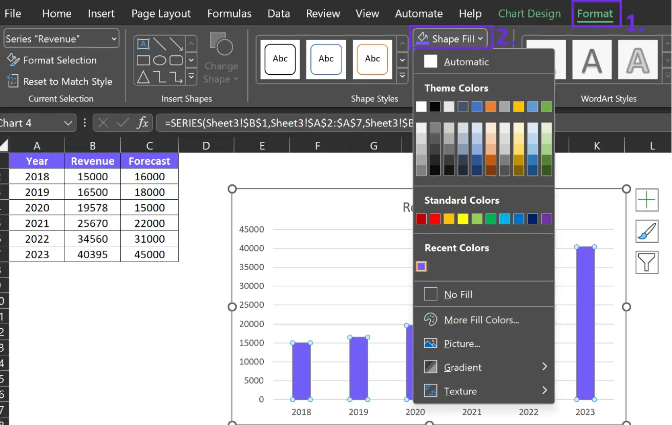
3. Customize Bar Styles and Colors

To enhance the visual appeal and convey additional information, you can customize the style and color of your bars. This adds a personal touch to your graph, here’s how to change color to your graph:

  1. Active your chart
  2. Go to Excel toolbar and click Format
  3. Choose Shape Fill and pick the colors for your bars
How to change colors to your charts in excel graph

Related Article: How to make bar charts bars wider?

How To Add the Second Set of Bars?

To incorporate the second set of bars, insert a secondary data series. This is where Excel’s power shines, as it allows you to seamlessly integrate the two data sets. To do that follow these steps:

Time needed: 1 minute

Add a second bar to your Excel bar chart

  1. Activate the chart

    Simply click on your chart to activate additional settings

  2. Access chart filtering settings

    Once you have activated the chart additional settings will pop up. Click on the filtering options and pick Select Data.
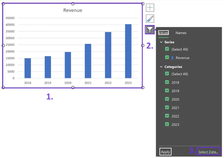
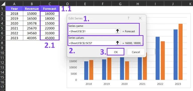
    Access filtering options for your bar chart

  3. Select Data Source

    Once you have accessed data source settings, click Add
    Select data source for your bar chart

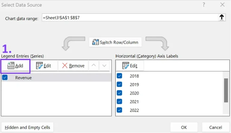
  4. Choose data to visualize in your chart

    Pick the data you want to add to your bar chart in the small settings menu. Choose the label for your second data and insert it in the Series name field. Add values that should be displayed in the chart under the Series values field.
    How to add second bar values to your double chart

Related Article: Create effective data visualization dashboards that tell a story

Here’s a quick video summary of how to create a double bar graph:

3 Ways How To Create a Double Bar Chart in Excel vs. Ajelix BI #excel #tutorial #guide #tips #howto

Fine-Tuning Your Double Bar Graph

Adjusting Axis Labels and Titles

To make your graph more informative, don’t forget to label your axes and provide a clear title. Excel offers easy ways to customize these elements.

Managing Data Gaps or Overlaps

Ensure your data is accurately represented by managing any gaps or overlaps between the bars. Excel’s precision tools make this task efficient.

Utilizing Data Labels for Clarity

For precise data interpretation, consider adding data labels to your bars. This visual aid can eliminate any ambiguity in your graph.

10X Your Chart Creation With Easy Visualization Tool

Create reports in one minute or less

marketing data visualization report from Ajelix BI

Marketing data report dashboard with Ajelix BI. Image Credit: Ajelix

Generating reports has never been easier thanks to Ajelix BI‘s data visualization feature. All you need to do is upload your Excel file, select a template, and watch as professional reports are created in mere seconds. See it yourself in this quick video:

Craft Reports in 60 seconds with Ajelix BI #excel #bi #dataanalytics #reporting #aitools #howto
Create reports in 60 seconds with Ajelix BI. Video Credit: Ajelix

Empower Your Data With AI Data Analysis

Before presenting your graph, make sure you thoroughly understand its visual cues and what they convey about your data. Dive deeper into your data with AI-powered analysis, and uncover valuable insights for your charts, ready to be shared with your colleagues. See how it works in less than 60 seconds:

AI-Powered Data Analysis: Uncover Hidden Insights in 5 Steps with Ajelix #ai #data #business
AI-powered data analysis for your data with Ajelix. Video Credit: Ajelix

Conclusion

Recap of Double Bar Graph Creation

In this comprehensive guide, we’ve walked through the process of creating a double bar graph in Excel, from the initial setup to the final touches.

The Power of Visual Data Representation in Excel

Never underestimate the power of visual data representation. Excel empowers you to present your data effectively, helping you make informed decisions and communicate your findings with clarity and impact.

Ready to create reports 10X faster?

Speed up your spreadsheet tasks with Ajelix AI in Excel

Excel formula generator from Ajelix - more than 15 ai tools for spreadsheets

Similar posts

How to analyze data in Excel spreadsheet banner by author

How To Analyze Data In Excel Spreadsheet

April 4, 2024
Excel is the workhorse of data analysis in countless businesses. It can unlock valuable insights from spreadsheets, but for many, its pow…
How to add drop down list in Excel banner

How To Add Drop Down List in Excel

November 2, 2023
Let’s take a look at how to add drop down list to make your spreadsheets more professional and user-friendly. We’ll take a lo…
How to add checkbox in Excel banner

How To Add Checkboxes In Excel

October 31, 2023
This article will cover steps to add checkboxes in Excel with screenshots and tips to help you tackle this task. Learn how to enable the …

Online Calculators

10 equipment rental KPIs for rental business owners banner

10 Equipment Rental KPIs For Rental Business

July 25, 2024
Equipment rental KPIs are measurable values that track how well your rental business is using its equipment to generate profit and satisf…
15 financial KPIs for finance department to track banner

20 Financial KPIs For The Finance Department

July 23, 2024
Financial KPIs are quantifiable metrics that businesses use to track their financial health and performance. They provide valuable insigh…
15 ecommerce kpis for online business owners banner

15 Ecommerce KPIs Any Online Business Should Track

July 18, 2024
Ecommerce KPIs track how well your online store is performing. These metrics provide insights into different areas of your business, like…
Accounting KPIs for your accounting department banner

15 Accounting KPIs For Your Accounting Department

July 16, 2024
Accounting KPIs are measurable metrics that track how well an accounting department is performing. These metrics help accountants assess …
KPI For Quality Assurance calculate quality kpis formulas and examples banner

15 KPI For Quality Assurance: Calculate Quality KPIs

July 11, 2024
Quality KPIs are key performance indicators for quality management used to assess a company’s performance in delivering quality pro…
Free EBIT calculator online with formula and examples banner

Free EBIT Calculator Online With Formula Examples

July 4, 2024
An EBIT calculator is a tool that helps you calculate a company’s earnings before interest and taxes (EBIT). EBIT is a financial me…

Business Intelligence

15 financial KPIs for finance department to track banner

20 Financial KPIs For The Finance Department

July 23, 2024
Financial KPIs are quantifiable metrics that businesses use to track their financial health and performance. They provide valuable insigh…
15 ecommerce kpis for online business owners banner

15 Ecommerce KPIs Any Online Business Should Track

July 18, 2024
Ecommerce KPIs track how well your online store is performing. These metrics provide insights into different areas of your business, like…
Accounting KPIs for your accounting department banner

15 Accounting KPIs For Your Accounting Department

July 16, 2024
Accounting KPIs are measurable metrics that track how well an accounting department is performing. These metrics help accountants assess …
KPI For Quality Assurance calculate quality kpis formulas and examples banner

15 KPI For Quality Assurance: Calculate Quality KPIs

July 11, 2024
Quality KPIs are key performance indicators for quality management used to assess a company’s performance in delivering quality pro…
generative AI for data analytics banner blog article by ajelix

Generative AI For Data Analytics: What You’re Missing Out

April 18, 2024
Organizations across all industries are turning to data analytics to inform strategic decisions, optimize processes, and gain a competiti…
Hoe to calculate business growth rate with examples and formula banner by ajelix

How to Calculate Business Growth Rate? Formula & Examples

April 16, 2024
Whether you’re a seasoned entrepreneur or just starting, measuring progress is vital to identify areas of strength, pinpoint opport…