Digital Dashboard 101 Guide With Good & Bad Examples

Today data-driven world businesses are flooded with data. From sales figures to customer satisfaction metrics, easy to get lost in the sea of data. The main goal of a digital dashboard is to provide interactive visualization with real-time data and information. 💻
This blog article will cover different types of dashboards, good data examples, and bad. We will cover the main pitfalls for implementing data dashboards as well as the best tools for dashboard creation.
Change the way you work with agentic AI
One-click dashboards,KPI tracking, and AI-powered insights—for work that actually gets done.

What is a Digital Dashboard?
A digital dashboard is a centralized and interactive platform that provides a real-time view of key performance indicators (KPIs) and other important business data.
It’s like having a cockpit for your business, giving you a quick and easy way to track progress, identify trends, and make informed decisions.
Why Use Digital Dashboard?
There are many pros to how businesses can benefit from digital dashboard implementation in the company.
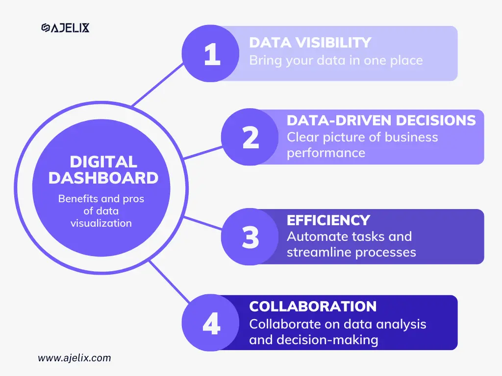
Here are key points:
- Data visibility: it’s easier to understand business metrics once it’s visualized in one place so you can get a grasp of the situation.
- Enhance decision-making: with all data in one place, it’s easier to get information about the business performance. It can help you make better decisions about strategy, marketing, sales, and operations.
- Increased efficiency: digital dashboards can automate tasks and streamline processes, much like how automated email design enhance efficiency in communication workflows.
- Improved collaboration: dashboards are created for easy sharing and editing, helping the team to work together on data analysis and decision-making.
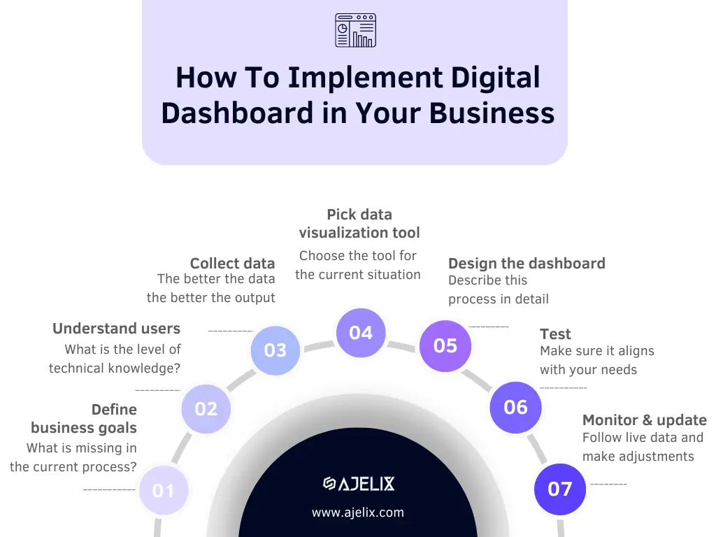
How To Create A Digital Dashboard For Data Analytics?
Time needed: 10 days
Here is a step-by-step guide on how to create an effective digital data dashboard:
- Define your business goals
First thing first. Define the goals and objectives that you want to accomplish with data analytics. What do you want to achieve with digital dashboard? What is missing in the current process? What do you need to make informed decisions? Once you have identified the goals you can start by define the KPIs.
- Understand the users
Who will be the dashboard users? Understand their capabilities and technical knowledge. What are their needs and expectations? Answering these questions will help you design and pick the right tool for the dashboard.
- Collect data
Once you have the goals you can understand what data you need. Make sure the data is clean, regular, and aligned with the KPIs. Remember that the better the data the better the output. If you have messy data you will have messy decisions.
- Pick a data visualization tool
There are so many BI tools available on the market that can help with data analytics, , including specialized services like Power BI consulting. Once you have defined the goals, users and data sources it will be easier to pick the tool that aligns with the current situation and needs. Later in this article, we will provide a list of different data visualization tools.
- Design your dashboard
Once you have the tool, the goals, and the data you can start designing the dashboards.
- Test dashboard
Leave some time to test your dashboard to make sure it aligns with the everything outlined above. Remember that new processes can take some time to adapt and make it work efficiently.
- Monitor and update
The purpose of digital dashboard is that it changes and gives you live data. Make sure that it’s updated with latest data, otherwise it’s pointless.
Different Types of Digital Dashboards
Each team and each organization will need a different type of dashboard, as there are so many differences between data sources and main KPIs.
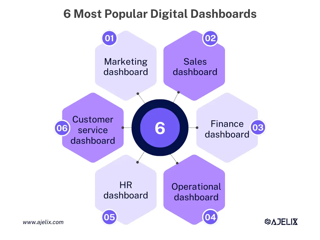
For example, sales team can’t use finance dashboard as the metrics are not relevant. In this chapter we will deep dive into most popular data dashboard types and differences.
1. Marketing Dashboard
For marketers navigating the turbulent seas of campaigns and social media analytics, marketing dashboards are the compass, plotting course amidst metrics and engagements.
Here are the key metrics that marketers measure:
- Website traffic: how many people are visiting your website and how often.
- Social media engagement: how many people are interacting with your brand on social media.
- Email open rates: how many people are opening your emails.
- Conversion rates: the percentage of people who take a desired action, such as making a purchase or signing up for a newsletter.
- Customer satisfaction: how satisfied your customers are with your products or services.
2. Digital Sales Dashboard
Sales dashboards act as the navigational charts for sales teams, tracking pipeline progress and scrutinizing the intricacies of the sales funnel.
Here are 5 vital metrics for sales teams:
- Sales pipeline: the progress of your sales deals from lead qualification to close.
- Customer lifetime value (CLTV): the average revenue that a customer generates over their lifetime.
- Average deal size: the average amount of money that your sales team closes each deal.
- Customer acquisition costs (CAC): the average amount of money that you spend to acquire a new customer.
- Sales conversion rate: the percentage of leads that your sales team converts into customers.
3. Digital Finance Dashboard
In the fiscal realm, finance dashboards steer through the budgetary waters, monitoring expenditures and forecasting financial trajectories.
Here are the key finance metrics:
- Revenue: the total amount of money that your business generates from sales.
- Expenses: total amount of money that your business spends.
- Profit margin: percentage of revenue that your business keeps after paying for expenses.
- Cash flow: movement of money into and out of your business.
- Debt levels: amount of money that your business owes to creditors.
4. Digital Operational Dashboard
In the trenches of day-to-day activities, operational dashboards emerge as vigilant overseers, monitoring real-time data and ensuring the sails of daily operations catch the wind of efficiency.
Here are 5 vital operational metrics:
- Production output: how much product your business is producing.
- Inventory levels: tracks the amount of inventory that you have on hand.
- Customer service metrics: track the level of service that you are providing to your customers.
- Employee productivity: measures how productive your employees are.
- Return on investment (ROI): measures the return on money that your business invests in its operations.
View other operational KPIs and metrics you should track.
5. Digital HR Dashboard
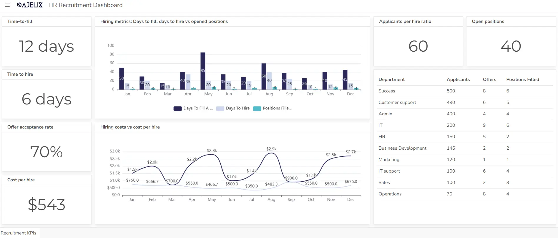
Amidst the human capital landscape, HR dashboards measure employee performance metrics and serve as the lighthouse for recruitment and retention endeavors.
Vital HR department metrics:
- Employee engagement: how engaged your employees are with their work.
- Employee turnover: the percentage of employees who leave your company each year.
- Training and development: tracks the number of employees who are taking training courses.
- Performance management: the performance of employees against their goals.
- Compensation and benefits: the compensation and benefits that you are offering to your employees.
Looking for more metrics? Check the guide with other HR KPIs.
6. Customer Service Dashboard
For customer service teams, these dashboards become the chronicles of ticket resolution times and metrics gauging customer satisfaction.
Check 5 customer service key metrics:
- Contact volume: the number of customer inquiries that you receive each day.
- Average resolution time: the average time it takes to resolve a customer inquiry.
- First contact resolution (FCR): the percentage of customer inquiries that are resolved on the first contact.
- Customer satisfaction: how satisfied your customers are with the service that you provide.
- Customer loyalty: how likely your customers are to recommend your business to others.
4 Best Practices For Designing Digital Dashboards
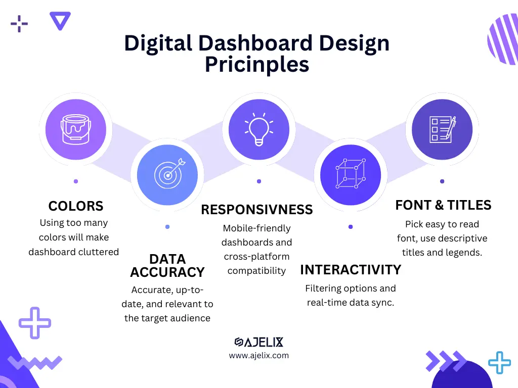
1. Color choice and interactivity
Use colors effectively and thoughtfully. Using too many colors can make the dashboard cluttered and difficult to read. Conversely, using too few colors can make the dashboard boring and uninspired.
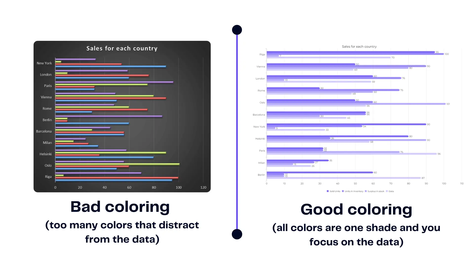
Consider the overall purpose of the dashboard and the target audience.
For example:
- Use more muted colors for a dashboard that is for a technical audience
- Use more vibrant colors for a non-technical audience.
2. Data Accuracy and Reliability
The data should be accurate, up-to-date, and relevant to the target audience. It should also be presented in a way that is easy to understand and interpret.
Here are a few tips:
- Keep your dashboards simple and uncluttered.
- Use a consistent style throughout your dashboards.
- Label your visualizations clearly.
- Test your dashboards with your target audience to make sure they are effective.
- Monitor and update your dashboards regularly.
3. Responsiveness and Compatibility
Make sure the chosen data visualization tool is compatible with all devices including Mac. Check if the dashboards are responsive, as some tools require additional dashboard building for each device type.
4. Additional Tips
When creating a digital dashboard make sure to use:
- Consistent color scheme throughout the dashboard.
- Font that is easy to read and understand.
- Clear and concise title for each visualization.
- Legend to explain the colors and symbols used in the visualization.
- Drill-down feature to allow users to see more detailed information about a particular metric.
- Filter feature to allow users to view data for a specific time period or group of users.
Read more on our article about data visualization practices.
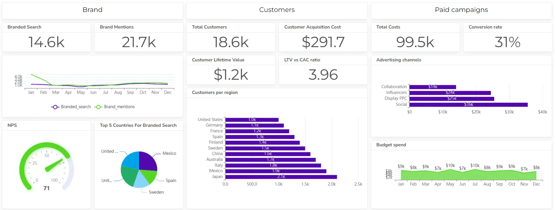
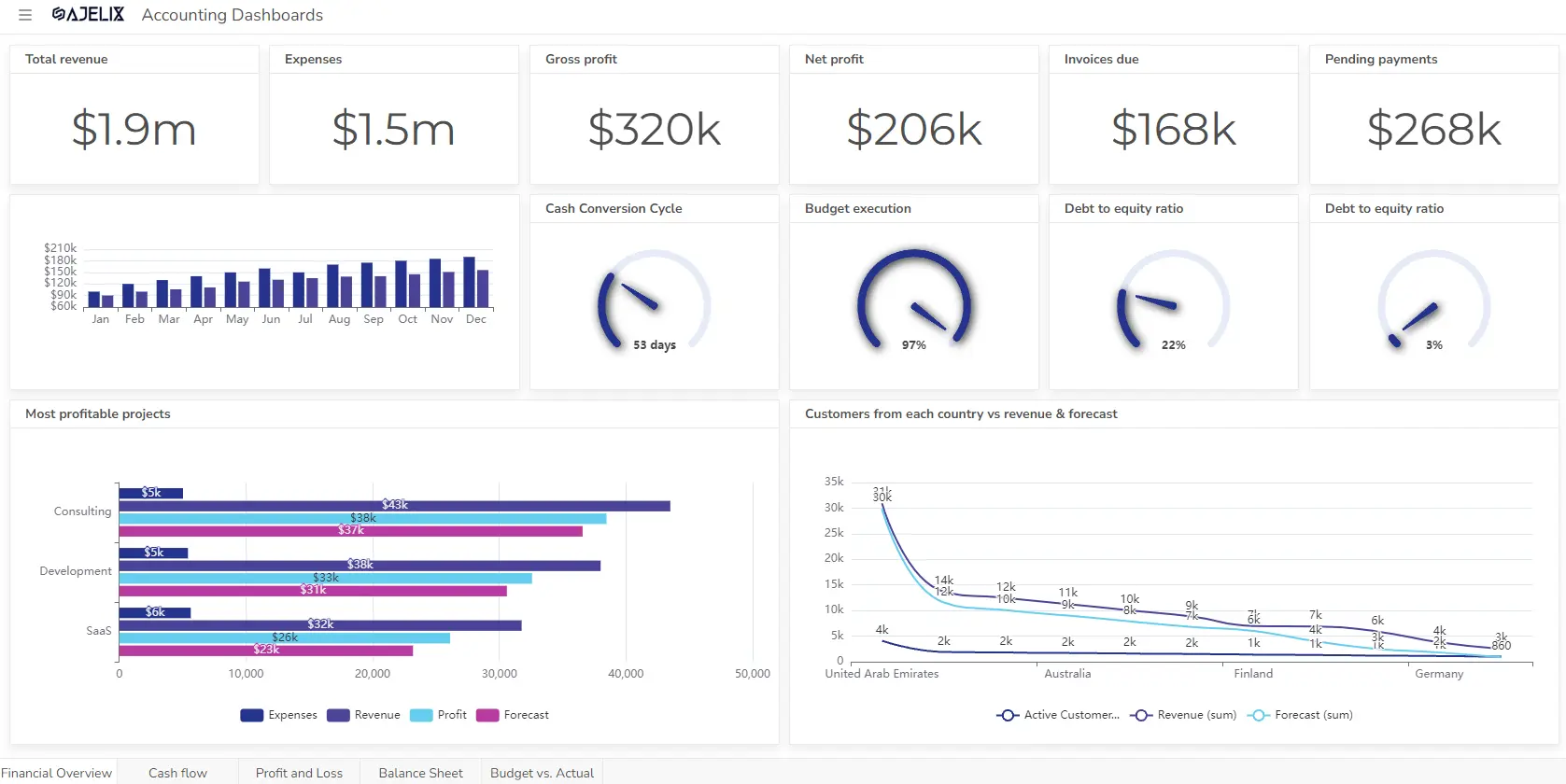
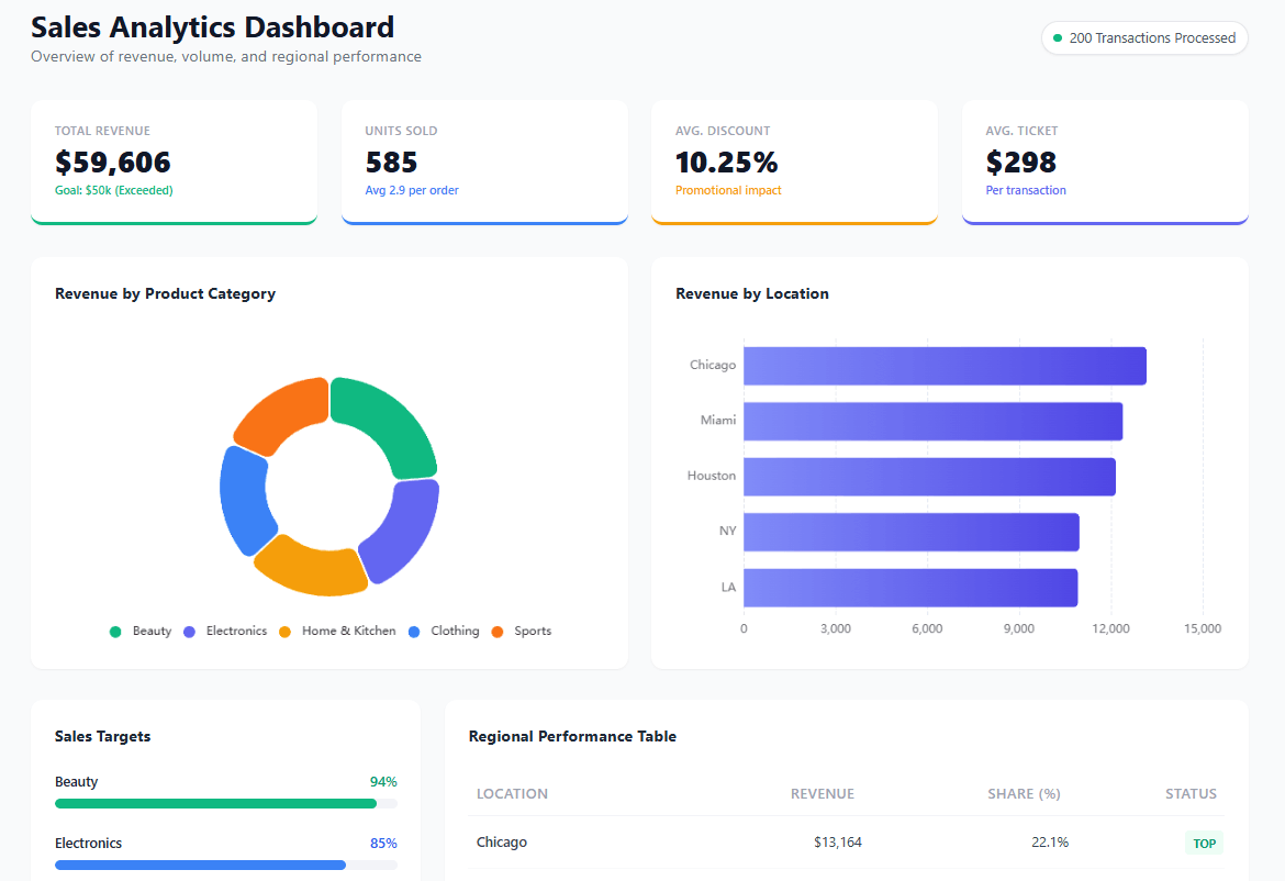
Good Examples of Digital Dashboards
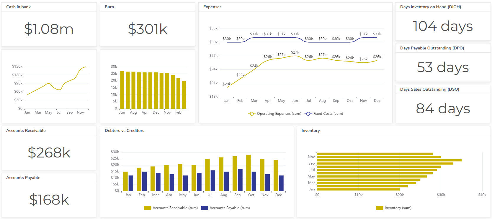
An accounting team dashboard that tracks key metrics such as days to inventory on hand, cash in the bank, burn, accounts receivable, and other metrics. This dashboard helps management stay on top of finances, identify areas for improvement, and make adjustments to strategies.
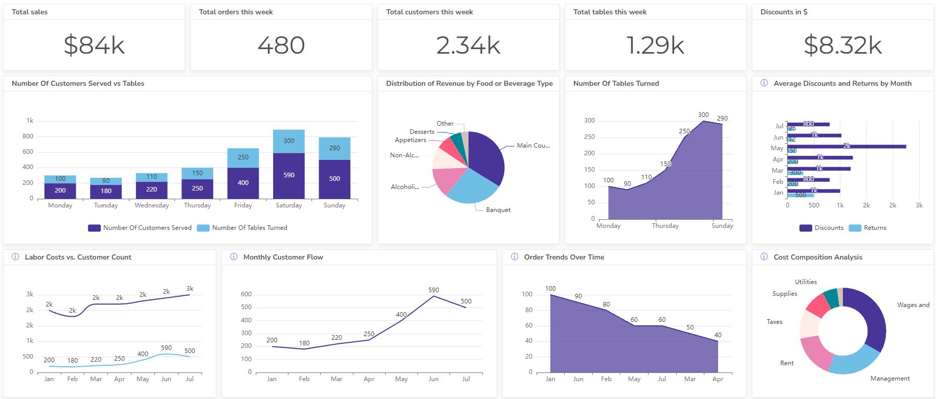
Bad Examples of Digital Dashboards

This dashboard displays a vast amount of data in a cluttered and difficult-to-navigate format. Dashboard is overwhelming and difficult to use, making it ineffective in helping managers make informed decisions.
Outdated Design
Anchored in unappealing aesthetics and inefficient layouts, outdated designs sabotage the user experience and hinder the functionality of digital dashboards.
Inaccurate Data Representation
Misleading visualizations and a lack of contextual information can transform a dashboard from a guiding star to a misdirection, leading decision-makers astray.
best Tools for digital dashboards
Reporting gives you a headache?
Upload your data and create professional reports with agentic AI
Start free
Try free and upgrade whenever
Conclusion
Digital dashboards are a valuable tool for businesses to visualize and analyze their data, leading to improved decision-making, increased efficiency, and better collaboration.
We covered how to create a digital dashboard, different types of dashboards for various departments, best practices for designing dashboards, and a list of tools for dashboard creation.
Ready to create a digital dashboard?
From data to report in one minute or less with Ajelix AI Agents