Effective Data Visualization Dashboards That Tell a Story

Humans are wired for stories. We connect with narratives on a deeper level and retain information more effectively when presented in a story format. 🎨
Data visualization dashboards can be powerful storytelling tools. Combining data with clear visuals and a logical flow allows you to create digital dashboards that engage your audience, reveal hidden trends, and drive action.
This article will unveil the principles of crafting data visualization dashboards that tell a captivating story. To help you analyze and present data in a meaningful way.
Why Storytelling Matters in Data Dashboards
Humans have a natural inclination to connect with stories and visualizations. We remember narratives far better than we remember statistics or numbers. Using storytelling in your data dashboards can make your data come alive, engaging your audience on a deeper level.
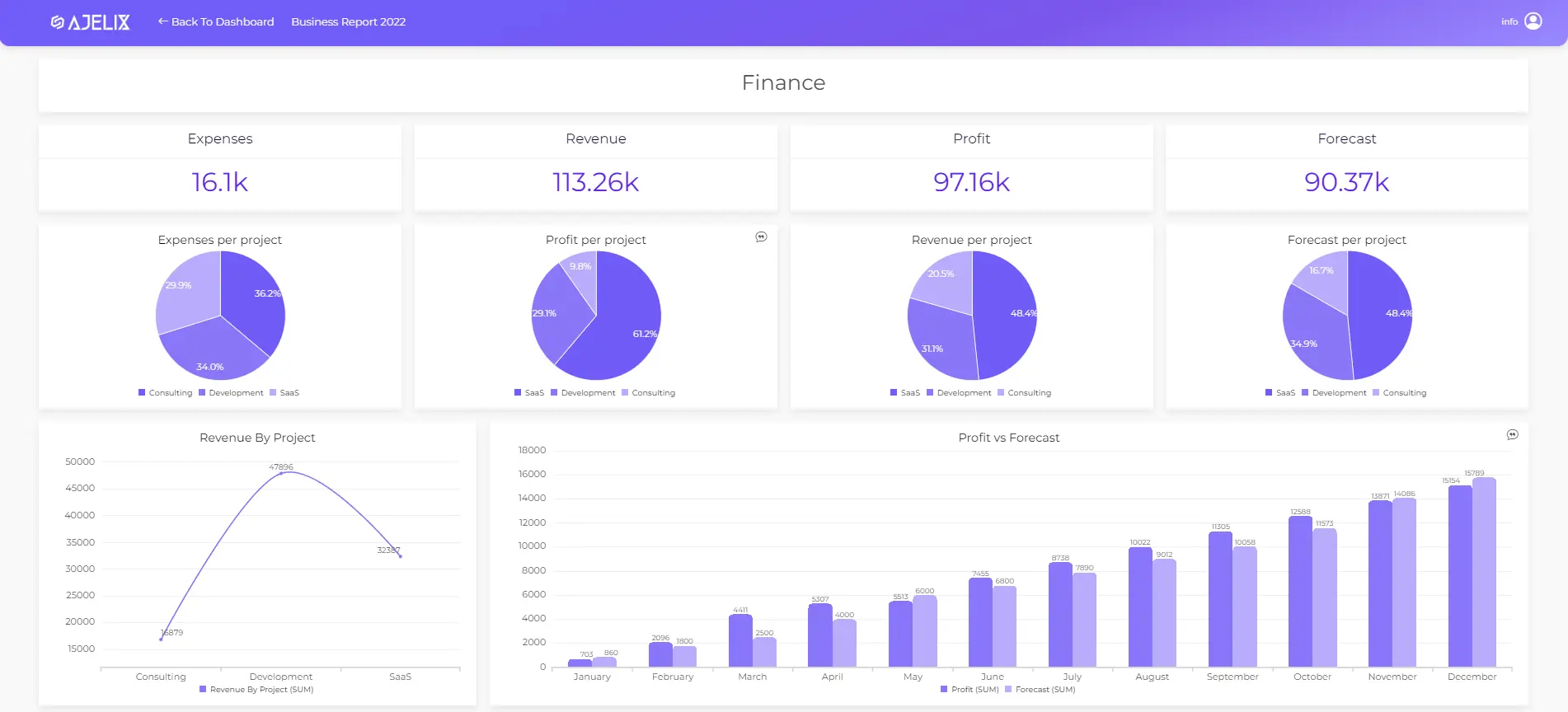
Let’s look at a dashboard from Ajelix BI that visualizes data in a clear design that is easy to understand. The dashboard consists of AI comments explaining the story behind every chart. You can read our story about AI’s role in data visualization.
Understanding Your Data
Gathering and Preparing Data
Effective data visualization starts with the quality of your data. Gathering and preparing your data ensures that you’re building your dashboard on a solid foundation. You can read all about data visualization principles here.
Identifying Key Insights
Before diving into dashboard design, it’s essential to identify the key insights you want to convey. Dashboards are great to retain information more effectively, but before creating anything you first have to answer several questions. What story does your data tell and who are the main characters behind data? What message do you want to convey to your audience? Understand the goal and it will become clear what data dashboard you need.
Designing Your Dashboard
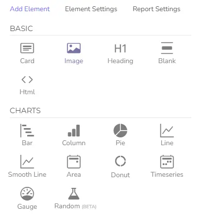
Choosing the Right Visualization Tools
Selecting the appropriate visualization dashboard tools is crucial, let’s explore this example using Ajelix BI. Building data dashboard that looks great in Excel can be challenging and demands much experience.
Not to mention how much time it will take to create an effective dashboard design. However, using visualization tools for data analysis can ease the creation and save you some precious time.
Time needed: 3 minutes
6 steps in creating an effective data visualization dashboard with Ajelix BI
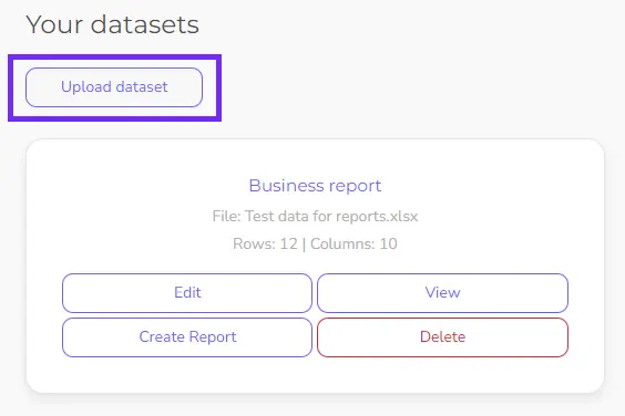
- Upload your Excel or CSV file to Ajelix portal
Keep in mind that your file should consist of only one sheet.
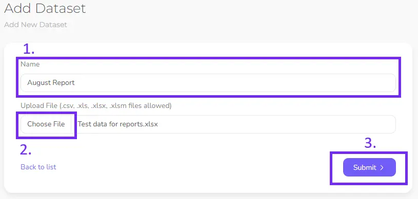
- Add the title to your data and upload the file
Once you have uploaded a data file click Create Report.
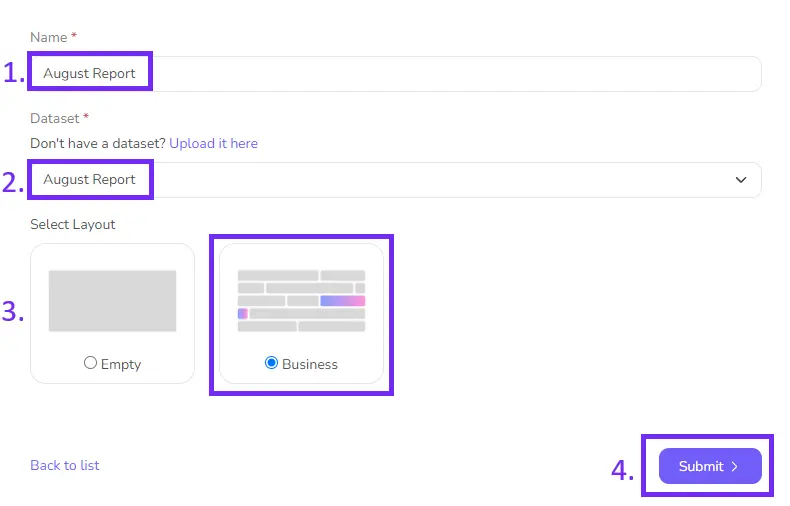
- Give your report name and choose a dashboard template
Now it’s time to set up your report: give your dashboard title, choose data file and pick a template.
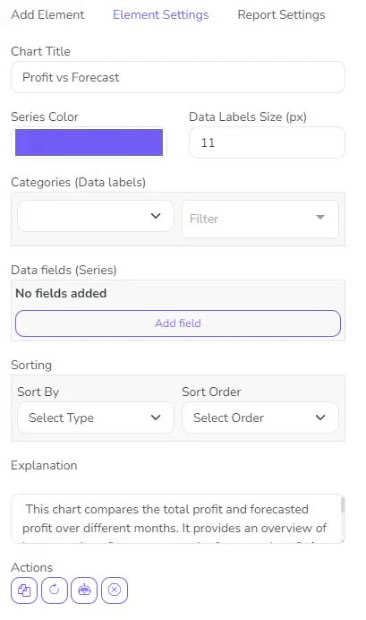
- Creating data dashboard: Fill your report with charts and graphs
Now, begin constructing by selecting elements from a list to create a report that effectively communicates data. If you selected a template, add data columns to align the charts with the data. Add line chart, pie chart, time series or gauge chart to create a compelling data story.
- Connect data with charts to visualize insights
Activate chart settings by pressing on each chart and setting up data.
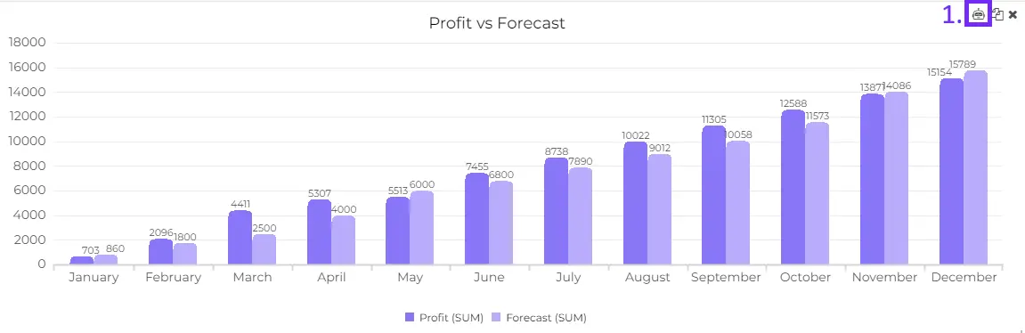
- Explain your graphs with AI to unlock the data story behind each chart
Now you have all the charts and story-telling continues: add AI explanations for each chart or add your own comments. Once you share the report with someone they will see these comments and the story will add.
Related Article: How To Prepare Files for Ajelix BI Upload?
Layout and Composition Tips
The arrangement of elements within your dashboard can significantly impact its effectiveness. Visualization tools will help you create a layout that guides your audience’s eyes and keeps them engaged.
Color Psychology in Data Visualization
Colors have the power to evoke emotions and convey meaning. Make your data dashboard color palette or use tools that will help you effectively communicate your message. Avoid adding too many colors to your data reporting dashboard BI.
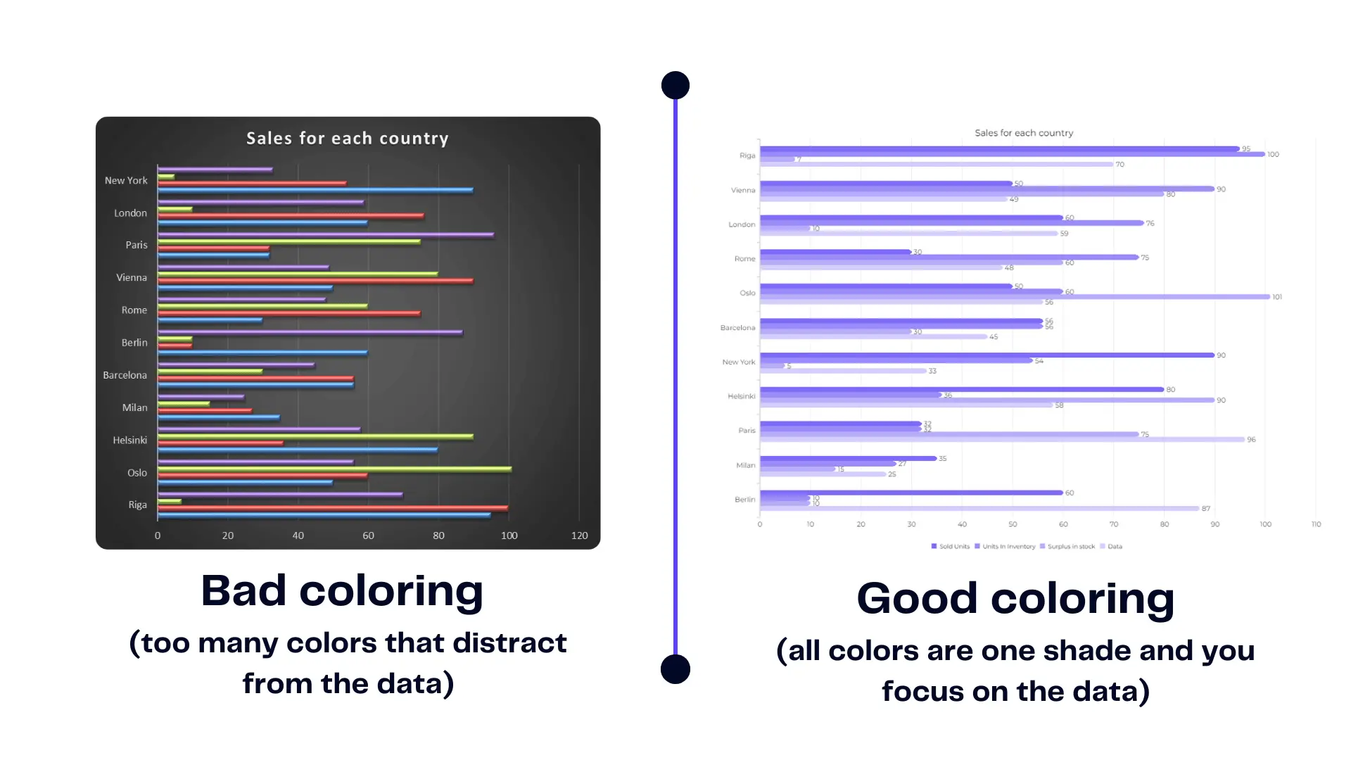
Here’s an example of good dashboard coloring vs. bad.
Creating a Compelling Narrative
Defining Your Storyline
Every dashboard should have a narrative arc. Craft a storyline that takes your audience on a journey through your data, from problem to solution. This is where BI tools can come in handy.
Setting Clear Objectives
Clearly define the objectives of your dashboard. What do you want your audience to take away from this data? What action do you want them to undertake and what decisions to take?
If this is financial data then your data dashboard should reflect the good financial news and the bad news. Learn more about financial data visualization here.
The Hero’s Journey in Data Dashboards
Explore the concept of the hero’s journey in data dashboards. Position your data as the hero, and your audience as the protagonist in a story of discovery and transformation.
Selecting the Right Metrics
Key Performance Indicators (KPIs)
Identify the KPI reporting that matters most to your business or project. These metrics should be front and center in your dashboard, guiding your audience’s focus. KPI dashboard reporting will reveal the business intelligence thanks to data analytics and data sources.
Metrics That Align with Your Story
Ensure that every metric included in your dashboard aligns with your storytelling objectives. Irrelevant data can clutter your narrative. Explore more about business intelligence and analysis.
Visual Elements That Pop
Effective Use of Charts and Graphs
Discover the art of choosing the right chart or graph for your data. Different types of visualizations convey different types of information.
Incorporating Images and Icons
Visual elements go beyond charts. Learn how to incorporate images and icons that reinforce your narrative and make your dashboard visually appealing.
Typography for Impact
Don’t underestimate the power of typography in your data dashboard examples to make informed decisions. The right fonts and text formatting can enhance readability and emphasize key points.
Related Article: Crafting charts and graphs in Excel
Here’s a quick summary of how easy it is to create report dashboards with Ajelix BI:
Interactivity and User Engagement
Adding Filters and Drill-Down Options
Interactivity allows users to explore the data on their terms and make business decisions thanks to data analysts. Implement filters and drill-down options to empower your audience.
Implementing Hover Effects
Engage your audience with interactive hover effects that reveal additional information and context from raw data.
Building User-Friendly Navigation
Navigation within your dashboard should be intuitive. Ensure that users can easily move between sections and explore the story at their own pace.
Data Dashboard Best Practices
Keeping it Simple: Less is More
Simplicity is elegance in creating an Excel dashboard from a data set using a dashboard reporting tool. Avoid clutter and unnecessary complexity. Keep your dashboard clean and focused on the story you’re telling with data visualization dashboard software.
Consistency in Design and Messaging
Ensuring consistency in design elements and messaging prevents your audience from getting distracted or confused while navigating your dashboard.
Mobile Responsiveness
In a mobile-first world, ensure that your dashboard is responsive to different screen sizes. By optimizing your dashboard, you can not only enhance user experience but also free up storage on iPhone devices, making it more efficient. Mobile users should have the same quality experience as desktop users.
Related Article: Excel Dashboard 101
Telling a Story with Data
Crafting Compelling Data Captions
Accompany your visualizations with captions that provide context and insight. Captions are a vital part of your storytelling combined with types of data analysis and statistical analysis.
Sequencing Your Data for Impact
The order in which you present your data matters. Learn how to sequence your data to build a compelling narrative that keeps your audience engaged.
The Emotional Connection in Data Storytelling
Explore the emotional dimension of data storytelling. Connect with your audience on a human level by tapping into their emotions.
Data Security and Privacy
Protecting Sensitive Information
Security is paramount when dealing with data. Make sure to protect sensitive information from unauthorized access.
Compliance with Data Regulations
Navigate the complex landscape of data regulations and ensure that your dashboard complies with all relevant laws.
Collaboration and Data Sharing
Collaborative Dashboard Creation
Discover how to collaborate effectively with team members or stakeholders in creating and refining your data dashboard.
Sharing Dashboards Effectively
Learn best practices for sharing your dashboard with your target audience, whether it’s colleagues, clients, or the public.
Final Thoughts
The Ever-Evolving Field of Data Visualization
Data visualization is a dynamic field that continues to evolve. Stay updated with the latest trends and technologies.
Empowering Decision-Makers with Data Stories
The purpose of your data visualization dashboard is to give decision-makers data stories that inspire action and positive change.
From data to report in one minute or less with Ajelix AI Agent