13 Dashboard Design Principles: Ideas & Best Practices

Dashboards have become key players in helping businesses navigate the complexity of information. 📊The main goal is to turn raw data into clear and visually compelling insights. Making it easier for your team to understand and use the information to make informed decisions.
However, just like any other tool, if not designed well, dashboards can become obstacles instead of helpers. Poorly designed digital dashboards can hide important information and make it difficult to make good decisions. To avoid this, it’s important to follow basic design guidelines.
This article will guide you through 13 essential design principles that will transform your dashboards from stagnant data displays into powerful tools for driving action based on data.
We’ll explore how to understand your audience, set clear goals, choose the right data, and create a clear story using visuals.
Change the way you work with agentic AI
One-click dashboards,KPI tracking, and AI-powered insights—for work that actually gets done.

13 Dashboard Design Principles Summarized
- Define your audience
- Set dashboard goals
- Clean & prepare the right data
- Storytelling
- Dashboard with context
- Minimalist design
- Interactive elements
- Responsivity
- The right colors
- Provide context
- Branding
- Real-time data hassles
- Collect feedback
- 7 Tools for dashboard design
- Quick design guide
1. Know Your Audience & Define User Personas
Imagine walking into a room filled with different people, each with unique needs and goals. Some might be tech-savvy data analysts, while others might be less familiar with complex visuals. Now, imagine presenting them all with the same dashboard.
Would anyone be able to understand and use the information effectively?
The answer, unfortunately, is likely no. This is why understanding your audience is the cornerstone of effective dashboard design.
By taking the time to identify your target audience, you can tailor the design to maximize their comprehension and engagement. This means asking yourself:
- Who will be using this dashboard? Is it for executives, managers, or frontline employees?
- What are their specific needs and goals? What information is needed to make informed decisions?
- What is their level of technical expertise? Are they comfortable with complex visuals and data analysis, or do they need a simpler presentation?
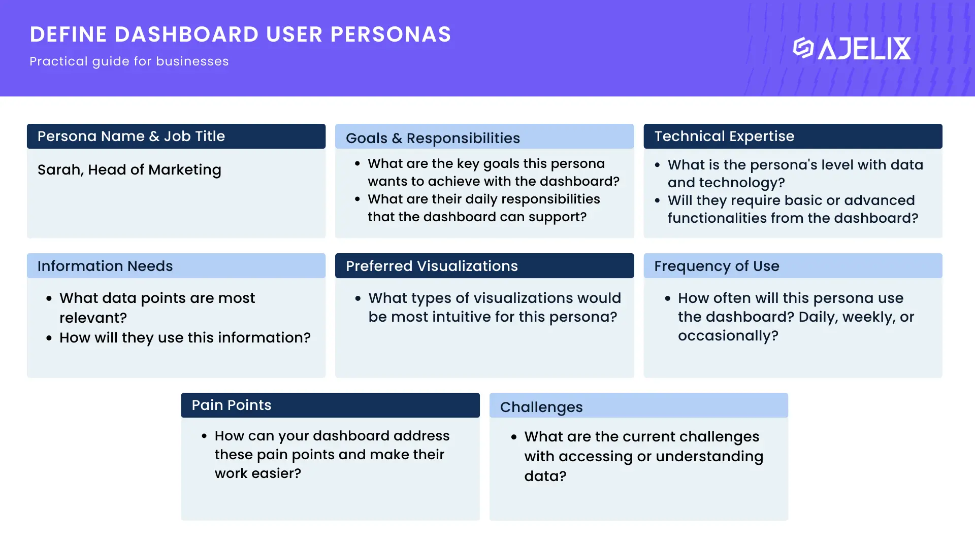
A practical guide for defining user personas for dashboards
Download the PDF guide for designing dashboards below!
Define User Personas
User personas are fictional representations of your target audience, outlining their goals, motivations, and pain points.
By answering the following questions for each persona, you can gain valuable insights into who will be interacting with your data visualization:
| Information | Question 1 | Question 2 |
|---|---|---|
| Persona Name & Job Title | Assign a name and job title to your persona to personalize it. | (e.g., Sarah, Marketing Manager) |
| Goals & Responsibilities | What are the key goals this persona wants to achieve using the dashboard? | What are their daily responsibilities that the dashboard can support? |
| Technical Expertise | What is the persona’s level of comfort with data and technology? | Will they require basic or advanced functionalities from the dashboard? |
| Information Needs | What specific data points are most relevant to this persona’s work? | How will they use this information to make decisions? |
| Preferred Visualizations | What types of visualizations (e.g., charts, graphs, tables) would be most intuitive for this persona? | Consider any accessibility needs related to visual format or color perception. |
| Frequency of Use | How often will this persona use the dashboard? Daily, weekly, or occasionally? | This can help determine the level of detail and complexity needed in the design. |
| Pain Points & Challenges | What are the current challenges this persona faces with accessing or understanding data? | How can your dashboard address these pain points and make their work easier? |
For example, a dashboard for data analysts might include interactive charts and detailed reports, while a dashboard for non-technical users might prioritize clear visuals and concise summaries.
By prioritizing your audience, you can ensure your dashboard is not just informative, but also accessible and actionable for everyone who needs it.
2. Define Your Goals & Pick the Dashboard Type
Before embarking on any journey, having a clear destination in mind is crucial. The same principle applies to designing dashboards. Defining your goals upfront ensures every design decision aligns with a specific objective.
So, why are clear goals so important? Firstly, they help you prioritize information. With a defined goal, you can identify the most relevant data points to showcase on your dashboard, avoiding clutter and information overload.
Secondly, clear goals determine the type of dashboard best suited for your needs. Here are three common types and their associated goals:
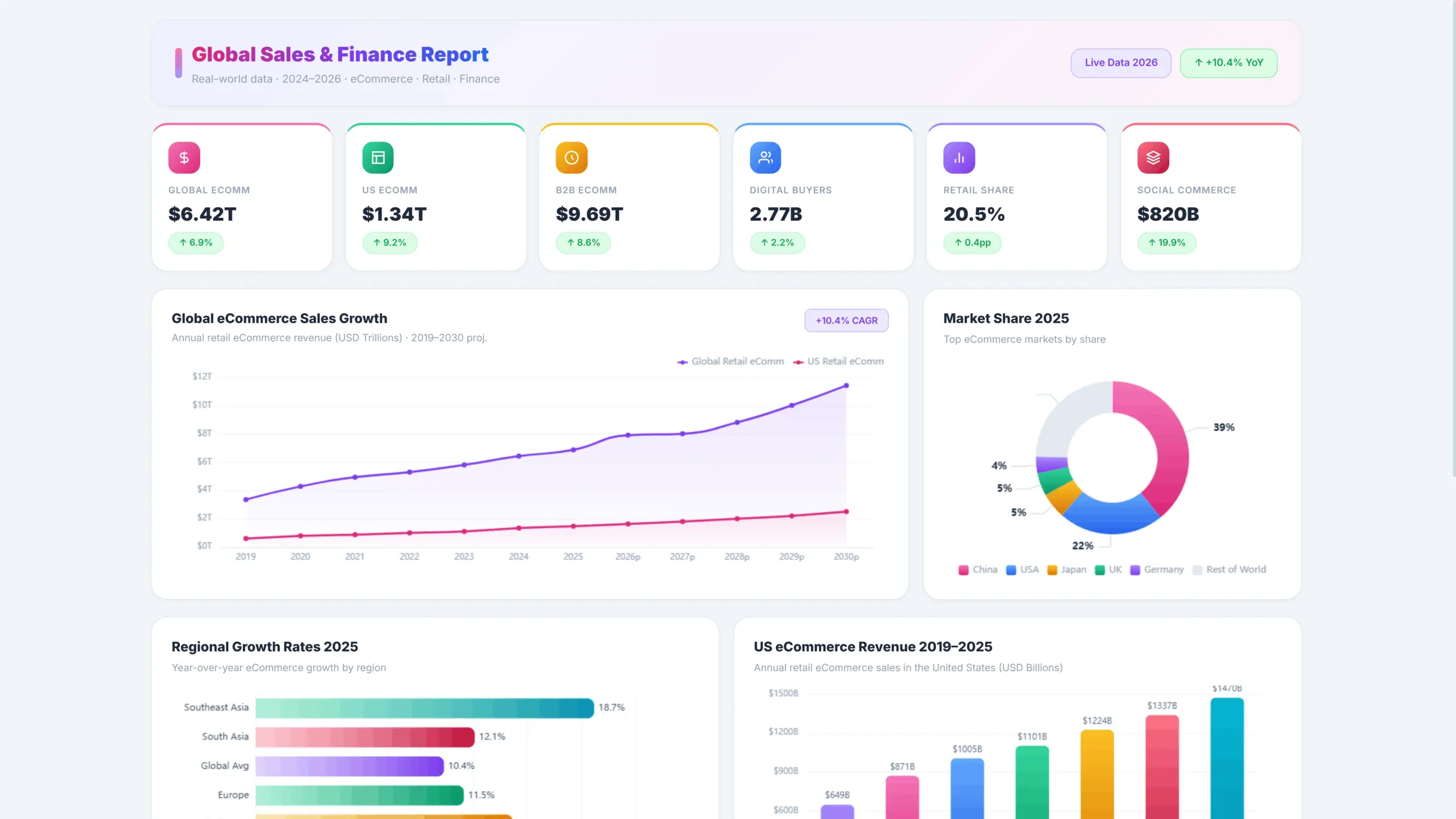
1. Monitoring Dashboard
Monitoring dashboards focus on real-time data visualization and tracking key performance indicators (KPIs).
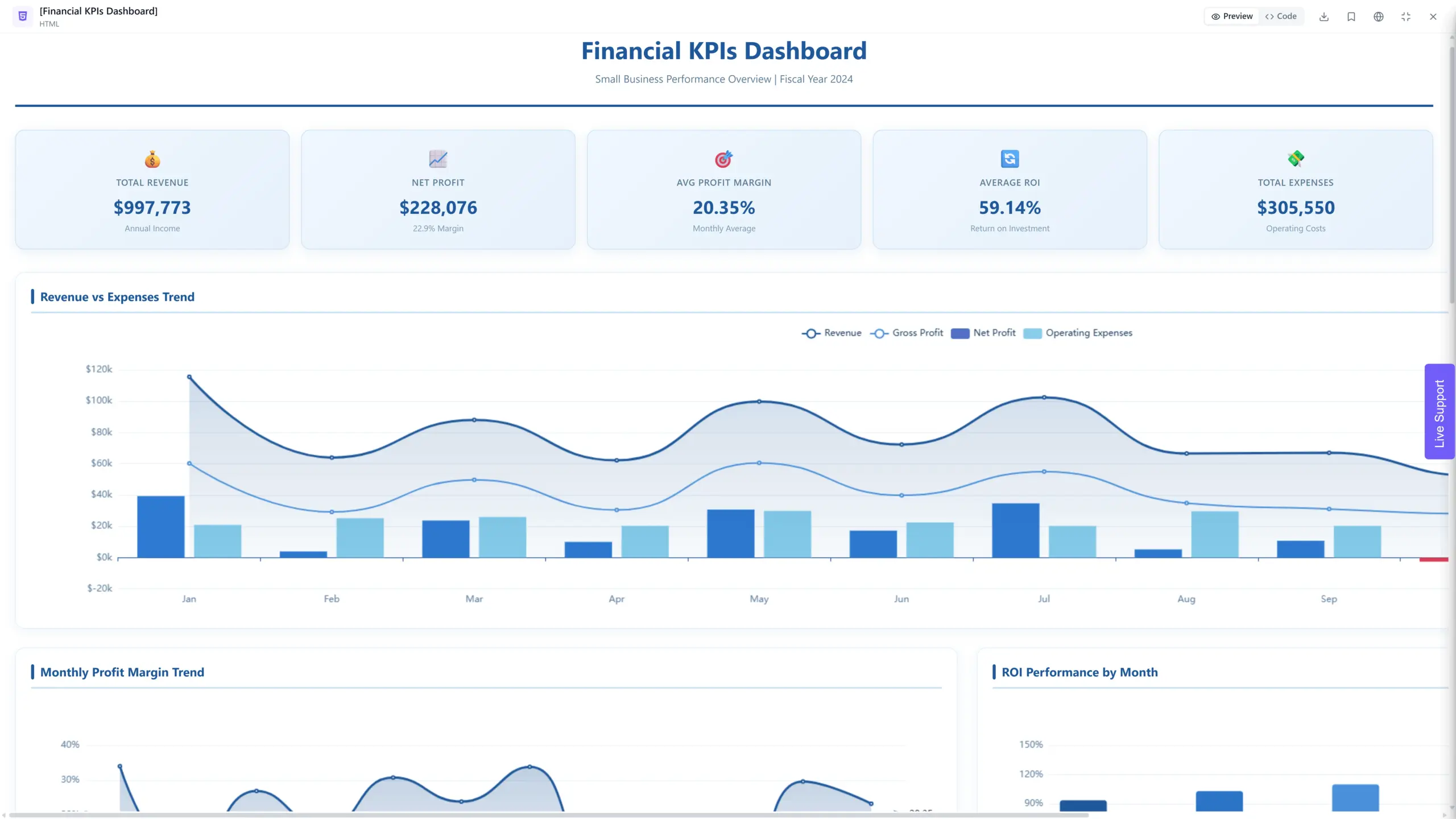
Monitoring Dashboard with Financial KPI report for small business owner, example from Ajelix, taken by author
The main goal for this dashboard is to provide a quick and comprehensive overview of the current state of affairs, allowing users to identify any immediate issues or opportunities.
This dashboard was created with Ajelix, fancy to build a dashboard for your business? Start free here.
2. Analytical Dashboards
Analytical Dashboards delve deeper, enabling users to analyze trends, identify patterns, and uncover insights from historical data.
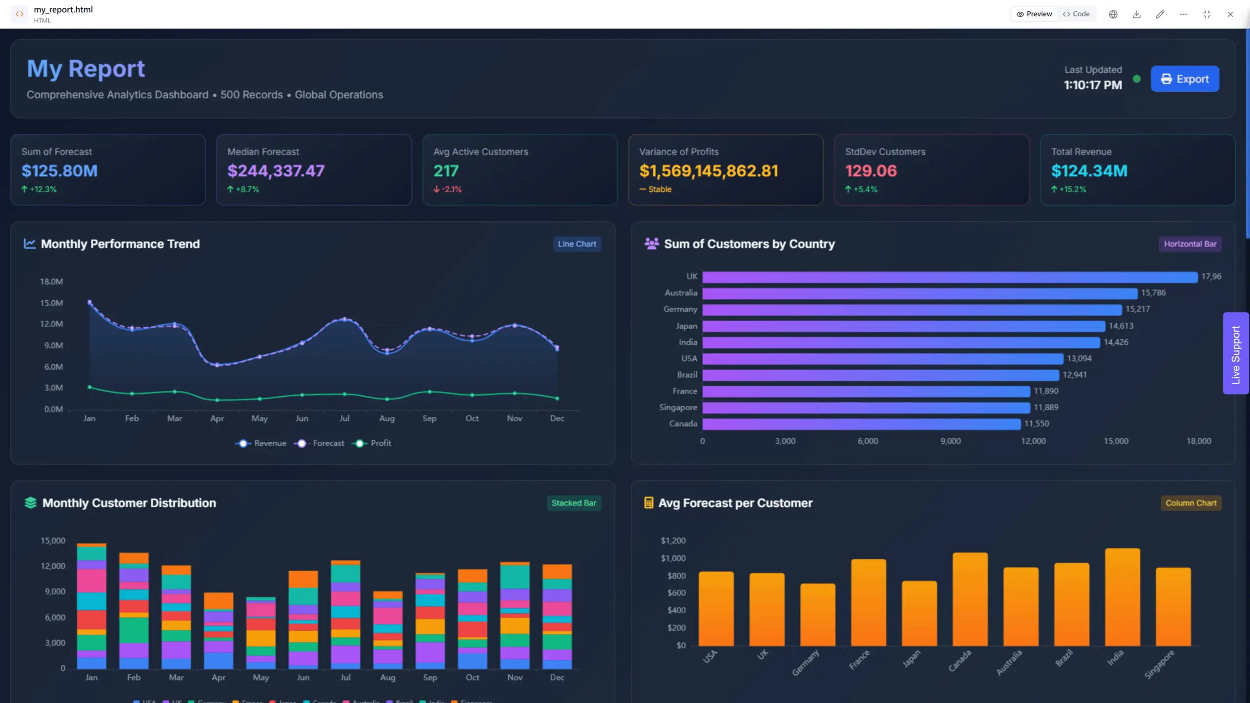
Analytical dashboard visualizing data more in depth, screenshot by author
The main goal is to support informed decision-making by providing a deeper understanding of the underlying factors influencing performance.
3. Operational Dashboards
Operational Dashboards focus on providing actionable information for day-to-day operations.
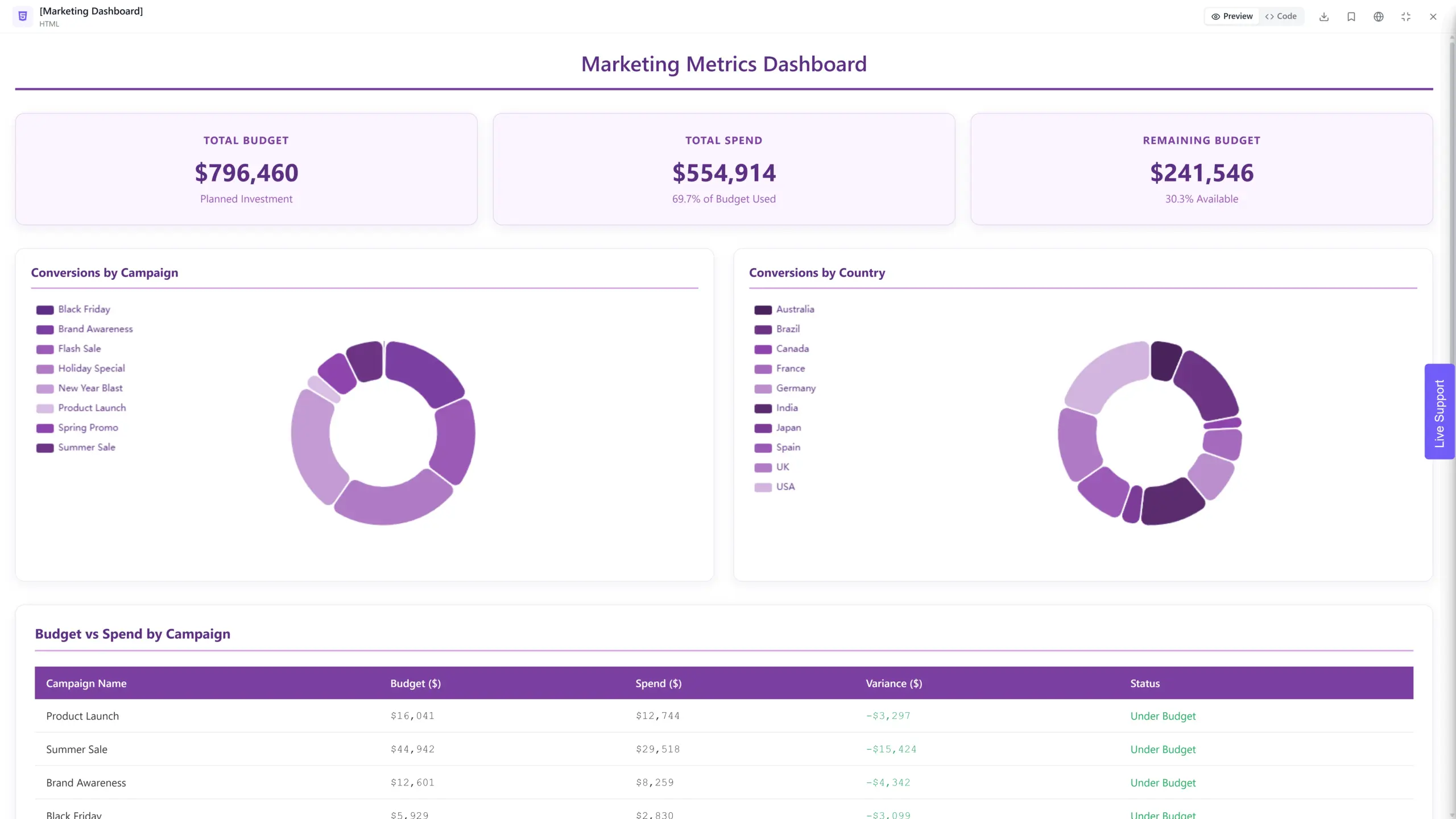
Marketing operational data dashboard from Ajelix, screenshot by author
The goal is to help users monitor progress, identify bottlenecks, and make quick adjustments to optimize workflows and processes.
E-commerce Website Dashboard Example
| Tasks | Action |
|---|---|
| Business | E-commerce website. |
| Your goal | Increase website conversion rates |
| Data points | Product page views, abandoned cart rates, and conversion rates by customer segment |
| Dashboard type | Operational |
| Insights & Conclusions | Optimize landing pages or offer targeted promotions. |
Remember, a well-defined goal acts as the compass guiding your dashboard design. By taking the time to set clear objectives, you ensure your dashboard becomes a valuable tool for achieving success.
3. Choose the Right Data: Less is More, but More is Meaningful
When it comes to data it’s easy to fall into the trap of “more is better.” However, when it comes to designing effective dashboards, choosing the right data is key, not just having a lot of it.
Similar to the previous chapters, aligning your data selection with your goals and audience is paramount. Ask yourself:
- Does this data point directly contribute to achieving my defined goals?
- Will this information be relevant and understandable to my target audience?
6 Tips for Choosing Data for Your Dashboard
Financial dashboard example with data clarity tips, made by author
- Align with user needs and goals: Ensure the data directly supports what users need to know and achieve.
- Focus on quality over quantity: Prioritize data that is accurate, consistent, and up-to-date.
- Less is often more: Avoid cluttering your dashboard with excessive data points. Prioritize the most relevant and impactful information.
- Consider different data types: Utilize a variety of visualizations (charts, graphs, tables) to effectively represent different types of data.
- Provide context: Include labels, units, and timeframes to enhance data understanding.
- Think about refresh rates: Determine how often data needs to be updated based on its volatility and user needs.
Remember that data visualization plays a crucial role in presenting information effectively. Different data types require different visualization techniques to optimize comprehension. Here are some quick examples:
- Trends: Line charts are ideal for showcasing trends over time.
- Comparisons: Bar charts are effective for comparing different categories or groups.
- Proportions: Pie charts can be helpful for visualizing the composition of a whole.
However, remember, avoid relying solely on complex visualizations. Maintain a balance between visual appeal and clarity, ensuring even the less data-savvy users can understand the information presented.
4. Tell a Story with the Right Charts
Data, on its own, can be a collection of numbers and figures, cold and uninspiring. However, when presented effectively, it can transform into a compelling narrative, guiding users towards meaningful insights and actionable steps.
This is where the art of visual storytelling comes in. For this, you can use PowerPoint AI tools to craft visually engaging presentations that effectively communicate your message easily. By strategically employing visuals and layout, you can guide users through the information, creating a logical flow that fosters understanding and engagement.
Here are some key aspects to consider:
1. Hierarchy and Flow:
- Prioritize information: Arrange data points in a way that highlights the most important elements first. This creates a visual hierarchy, guiding users’ attention towards the most impactful pieces of information.
- Example: place main KPIs in the header and format them as scores, like in our dashboards above.
- Logical flow: Ensure the data flows sequentially and intuitively. Think about the natural progression of the story you want to tell with your data and arrange the visuals accordingly. Users should be able to easily follow the narrative, without getting lost in a maze of information.
- Example: use several headings to separate charts, if you have operational dashboard then include several titles, such as, quality KPIs, productivity, maintenance, etc.
2. Visual Storytelling Techniques:
Comparisons: Utilize visuals like bar charts and line graphs to compare different entities or categories, highlighting similarities and differences. This allows users to identify patterns and trends more easily.
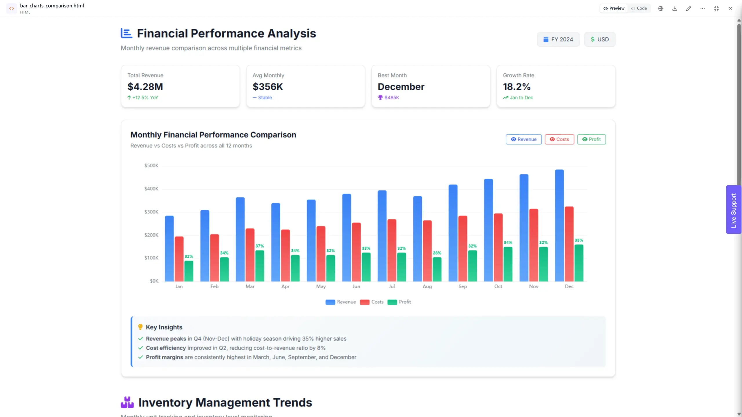
Bar chart example with several bars highlighting the importance of comparisons, made by author
Trends: Employ line charts, trend lines and time series graphs to showcase how data points change over time. This can help understand the direction and pace of change, enabling make informed predictions.
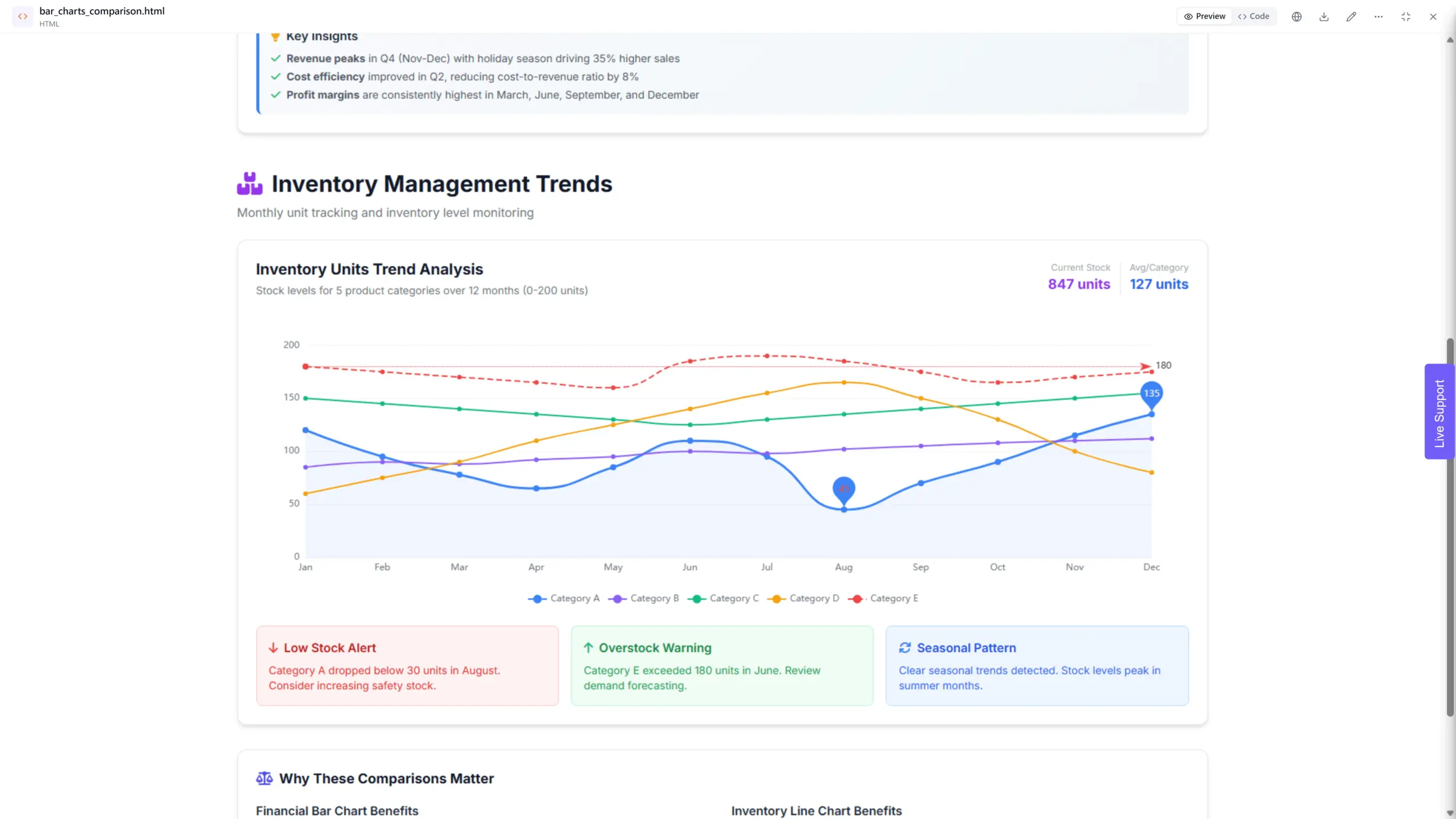
Time series chart showing trends over time, example by author
Anomalies: Use contrasting colors or highlighted areas to draw attention to outliers or unexpected data points. This can prompt users to investigate further, potentially leading to the discovery of new insights.
This not only improves user engagement but also enhances comprehension and information retention. Remember, your data has a story to tell, use visuals and layout to make it heard.
5. Provide Context With Labels & Legends
Imagine walking into a museum and being confronted by a collection of beautiful artifacts, but without any labels or explanations. While the objects might be visually appealing, understanding their significance and appreciating their history becomes a significant challenge. The same principle applies to data visualization in dashboards.
Providing context is crucial for enhancing data understanding and interpretation. By adding context, you transform raw data points into meaningful information that users can readily grasp and act upon.
Here are several ways to effectively infuse your dashboard with context:
1. Labels and Legends:
- Clear and concise labels for every data point are essential. Users need to understand what they’re looking at without needing to decipher cryptic abbreviations or jargon.
- Legends play a similar role, especially when using multiple colors or symbols to represent different categories. Ensure legends are easily accessible and well-explained, allowing users to quickly interpret the visual representation of data.
2. Annotations
Annotations can be used to highlight specific data points or areas of interest. These can be brief text descriptions providing additional context beyond the basic data point. Ajelix platform offers AI generated insights and analytics.
3. Tooltips
Tooltips offer a similar functionality, appearing when a user hovers over a specific element. They can provide more detailed information, without cluttering the overall dashboard design.
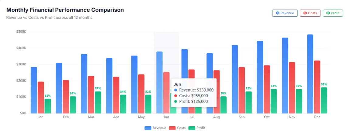
Tooltip for chart example from Ajelix platform, image by author
By the way: tooltips, legends, categories and anything else that helps design the perfect dashboard is set automatically when using Ajelix. Learn more here and start free 🙂
Reporting gives you a headache?
Upload your data and create professional reports with agentic AI
Start free
Try free and upgrade whenever
By incorporating clear labels, annotations, background information, and data sources, you can illuminate the data landscape, empowering users to interpret information accurately and confidently.
6. Keep it Simple for Maximum Impact
Simplicity should be a cornerstone of effective dashboard design. Remember, your goal is not to overwhelm users with a visual cacophony but to present information clearly and efficiently.
Here’s why a minimalist approach is key:
1. Clarity and Conciseness
- Strive for clear and concise communication. Avoid technical jargon and overly complex language. Use plain, easy-to-understand language that your target audience can readily grasp.
- Focus on the essentials. Don’t bombard users with an excessive amount of information. Prioritize the most critical data points and visuals that align with your defined goals.
2. Balanced Layout and Consistency
- Balance is key to creating a visually pleasing and user-friendly dashboard. Arrange elements in a way that feels orderly and intuitive. Users should be able to easily scan the dashboard and find the information they need without getting lost in a maze of visuals.
- Consistency is crucial for building user trust and familiarity. Maintain a consistent use of fonts, colors, and formatting throughout your dashboard. This creates a sense of cohesiveness and professionalism, making it easier for users to navigate and understand the information presented.
Using business intelligence or data visualization tools can help you create a dashboard that includes all of the basic design principles listed above.
3. Avoiding Distractions:
- While effective visuals can enhance data communication, avoid using excessive charts, colors, or animations that detract from the essential information. Remember, the goal is to inform, not entertain. Flashy visuals might initially grab attention, but they can ultimately distract users from the core message and hinder comprehension.
Bad Dashboard Example

Bad dashboard example, created by the author
Yes, this dashboard is a little bit exaggerated in terms of bad dashboard examples. But this is a scenario “everything has gone bad”. The colors are out of contrast (we will touch on color psychology later in this article), the charts are not in sync, it’s hard to understand what is happening, why it’s happening and
Good Dashboard Example
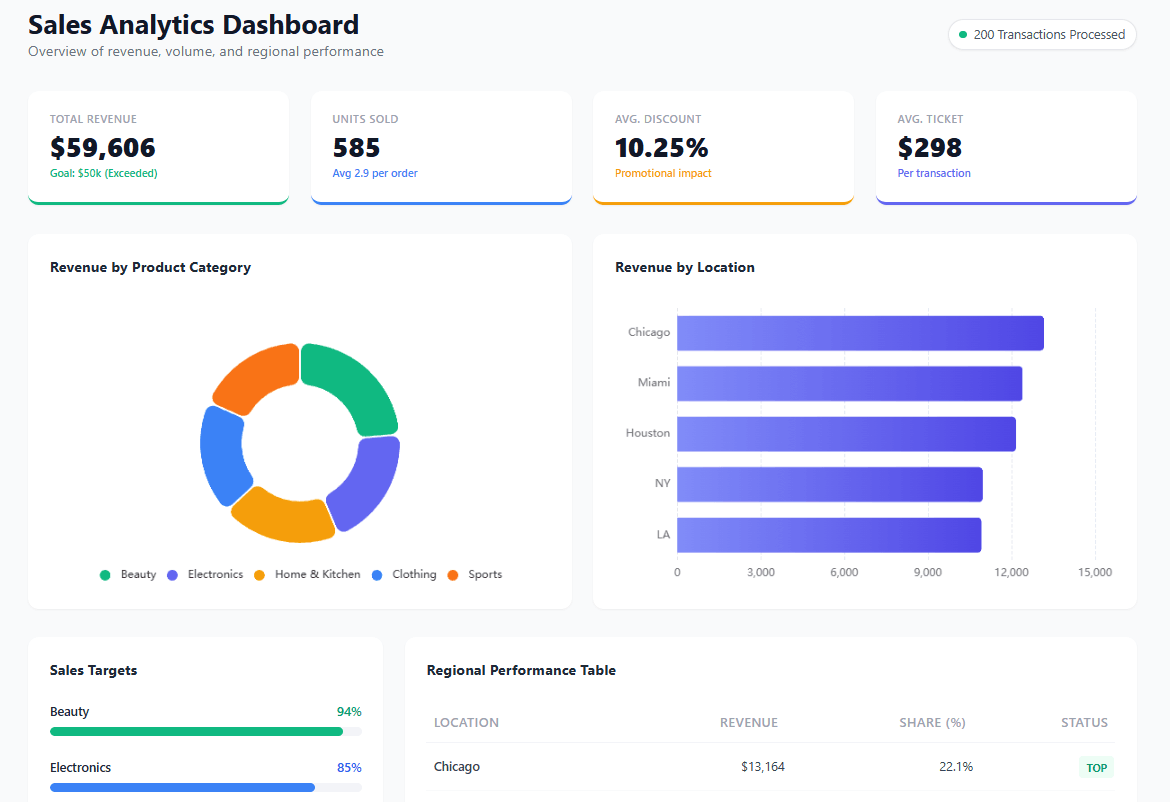
Good dashboard design example from Ajelix, created by author
As you can see in the example above the dashboard is clean, it has matching colors, data titles are clearly named, everything is organized, and there is a hierarchy. By embracing simplicity, you create a dashboard that is clear, concise, and user-friendly.
7. Use Interactive Elements
Interactive elements can transform data into an engaging and dynamic experience. This empowers users to actively explore the information, fostering deeper understanding and discovery.
1. Enhanced User Engagement
Interactive elements like filters, drill-down capabilities, and custom view options allow users to actively engage with the data. They can personalize their experience, focusing on specific aspects of interest and uncovering patterns that might not have been readily apparent in a static presentation.
Benefit: Increased engagement fosters a sense of ownership in the team, leading to a deeper understanding and appreciation for the insights data offers.
2. Deeper Analysis and Discovery
By providing users with the ability to filter data by specific criteria, drill down into specific details, and create custom views, you empower them to conduct their own analysis and draw independent conclusions.
Benefit: Deeper analysis fosters a sense of critical thinking and exploration, encouraging your team or users to delve deeper into the data and uncover hidden insights.
3. Examples of Interactive Elements
- Filters: Allow users to refine data based on specific criteria (e.g., selecting date ranges, product categories, user segments).
- Drill-downs: Enable users to explore deeper levels of detail within specific data points (e.g., clicking on a bar in a graph to see a breakdown by subcategories).
- Tooltips: Provide additional information on hover, without cluttering the main view (e.g., displaying specific data points or brief descriptions).
- Sliders or date pickers: Allow users to adjust timeframes or parameters to customize their view (e.g., selecting specific date ranges or adjusting numerical values).
- Sorts: Allow users to arrange data in different orders based on various criteria (e.g., sorting by ascending or descending order, sorting by specific columns).
- Clickable elements: Enable users to navigate to different sections of the dashboard or access deeper levels of information (e.g., clicking on a map region to see detailed data for that area).
- Drag-and-drop functionality: Allow users to rearrange charts, graphs, or other dashboard elements to personalize their view (e.g., prioritizing certain data points or focusing on specific sections).
- Expand/collapse features: Allow users to expand or collapse sections of the dashboard to reveal or hide specific details on demand (e.g., revealing detailed breakdowns upon clicking on a summary statistic).
For most of the business intelligence platforms, these features come by standard. Explore different data analytics tools that can help you visualize dashboards.
8. Ensure Mobile Responsiveness
In today’s mobile-centric world, information needs to be accessible anytime, anywhere. This means your dashboard shouldn’t be confined to the desktop; it should be adaptable and viewable on various devices, including smartphones and tablets.
Why is mobile responsiveness crucial? Consider these points:
1. The Rise of Mobile Users:
Mobile-friendly dashboards are crucial for managers. They enable on-the-go access to critical data, real-time insights, and seamless collaboration, fostering informed decision-making and a competitive edge in today’s fast-paced business environment.
2. Responsive Design Principles:
Responsive design is an approach that ensures your dashboard adapts automatically to different screen sizes and resolutions. This involves using flexible layouts, fluid images, and responsive typography that adjusts based on the viewing device.
Note: most of the BI platforms offer responsive design for different devices. Except Power BI and Tableau as there you will have to create a report for each device.
3. Optimizing for Mobile:
- When designing for mobile, prioritize clarity and simplicity. Utilize larger fonts, clear visuals, and avoid complex layouts that might be difficult to navigate on a small screen.
- Focus on the most essential information and prioritize data points that are most relevant to mobile users. Consider offering expanded views or additional details accessible through taps or gestures.
Note that you won’t have to think about these things if you design with tools that have already built-in responsivity.
9. Leverage Color Psychology
Colors are much more than just visual elements; they possess the power to evoke emotions, influence perception, and guide user attention.
1. Colors and Emotions:
Different colors evoke distinct emotional responses. For example, red is often associated with excitement, urgency, or danger, while blue conveys calmness, trust, and professionalism.
Understanding these associations allows you to choose colors strategically to enhance the message you want to convey with your data.
2. Effective Color Palettes:
- When selecting colors for your dashboard, it’s crucial to go beyond simply choosing aesthetically pleasing combinations. Consider the following factors:
- Target audience: Different cultures might have varying associations with specific colors. Be mindful of these cultural nuances and choose colors that resonate with your target audience.
- Accessibility: Ensure sufficient color contrast between text and background elements to cater to users with visual impairments.
- Harmony and balance: Choose a limited color palette and use them consistently throughout your dashboard to create a sense of visual unity and coherence.
3. A Basic Guide to Color Meanings:
While color perception can be subjective, here’s a general overview of some common color meanings in the context of dashboards:
- Red: Often used to represent warning, urgency, or high values.
- Green: Associated with growth, success, or positive trends.
- Blue: Conveys trust, stability, or low values.
- Yellow: Represents caution, optimism, or change.
- Orange: Can evoke enthusiasm, energy, or calls to action.
10. Round Your Numbers and Give Context
Numbers are the foundation of any data visualization, but their presentation is equally crucial. By formatting and labeling data effectively, you can transform cold figures into clear, understandable information. This ensures users readily grasp the meaning and significance of the data presented.
1. Formatting for Readability:
- Rounding: While raw data might be precise, displaying excessive decimal places can often hinder readability. Consider rounding numbers to appropriate levels based on the scale and context of the data. For example, displaying percentages with four decimal places might be unnecessary and confusing for most users.
- Units: Always include clear and consistent units next to numerical values. This prevents confusion and ensures users accurately interpret the data. For example, displaying sales figures without specifying whether they represent dollars, euros, or another currency can be misleading.
2. Choosing the Right Scale:
- Selecting the appropriate scale for your data visualization is vital. Avoid using scales that are too large or too small, as they can distort the message you want to convey. For instance, if you’re displaying website traffic, using a scale that goes from 0 to 100,000 might be more effective than one ranging from 0 to 10 million, especially if the majority of your traffic falls within a smaller range.
3. The Power of Context:
- Numbers themselves don’t always tell the whole story. Providing context is crucial for adding meaning and understanding. Consider the following:
- Timeframes: Include timeframes for data points, especially when comparing trends or analyzing changes over time. For example, displaying a sales figure for “January” is more informative than simply showing the number itself.
- Comparisons: Contextualize data by providing comparisons to benchmarks, industry averages, or historical data. This allows users to understand the relative performance or significance of the presented figures.
Remember, effective data formatting and labeling is not just about aesthetics. It’s about presenting information in a way that is clear, concise, and readily understandable for your target audience.
11. Stay Consistent and Branded
Maintain consistency in visual elements and branding, to create a unified and professional experience that users can easily navigate and trust. Partnering with expert graphic design and branding services can help ensure that your dashboards align perfectly with your overall brand identity.
Why is consistency crucial? Here are some key benefits:
1. Enhanced Usability:
- Consistent use of fonts, colors, and layout elements throughout your dashboards improves user experience. Users can intuitively navigate and understand the information without needing to re-learn the visual language with each new dashboard they encounter. This reduces cognitive load and fosters a sense of familiarity and ease of use.
2. Building a Unified Style Guide:
- Develop a clearly defined style guide that outlines the approved fonts, colors, and layout elements for your dashboards. This guide ensures consistency across all dashboard designs, regardless of who creates or updates them. This maintains a cohesive user experience and minimizes the risk of visual inconsistencies or confusion.
3. The Power of Branding:
- Integrating branding elements such as your logo, brand colors, and fonts into your dashboards reinforces your organization’s identity and professionalism. This creates a sense of recognition and trust with users, further enhancing the overall user experience. For example, through branded email signatures, presentation templates, or digital business cards powered by tools like Wave Connect, HiHello. Other similar tools can also help you create a visual identity and make it cohesive and recognizable across all client and team interactions.
By embracing consistency and branding, you transform your dashboards from a collection of data points into a unified and professional platform that effectively communicates information, empowers users, and reinforces your organization’s identity and values.
12. Don’t Overdo Real-time Data
While real-time updates offer undeniable benefits in certain situations, overdoing it can have unintended consequences. Why might excessive real-time data be problematic? Consider these downsides:
1. Information Overload:
- Constant updates, especially for data points with high variability, can create information overload for users. This can be overwhelming and distract them from focusing on the most critical information.
2. Performance Issues:
- Frequent real-time updates can burden system resources and impact dashboard performance. This can lead to slow loading times, lagging updates, and a frustrating user experience.
3. Consider User Needs and Refresh Rates:
- Not all data needs to be updated in real-time. Evaluate the needs of your users and the type of data being displayed. For instance, real-time stock prices might be crucial, while website traffic might be adequately represented with updates every few minutes or even hourly.
- Choose appropriate refresh rates that balance the need for up-to-date information with user experience and system performance.
When is real-time data truly beneficial?
- Situations where immediate action is required based on the data, such as monitoring system errors or tracking critical financial transactions.
- Scenarios where data fluctuates rapidly and understanding these fluctuations is essential, like monitoring live sports scores or managing high-volume online auctions.
13. Iterate and Refine
The journey of creating an effective dashboard doesn’t end with its initial launch. Just like any living organism, dashboards need to evolve and adapt to remain relevant, valuable, and informative.
Why is iteration crucial?
- User needs and expectations evolve over time.
- Data sources and business priorities might shift.
- New technologies and best practices emerge.
By embracing a culture of continuous improvement, you ensure your dashboard stays aligned with changing needs and delivers maximum value.
How to measure dashboard effectiveness?
- User feedback: Actively solicit feedback from users through surveys, interviews, or usability testing. This helps you understand their perceptions, pain points, and suggestions for improvement.
- Data usage metrics: Track how users interact with your dashboard. Metrics like frequency of access, time spent on specific elements, and filter usage can reveal valuable insights into user behavior and identify underutilized features or confusing elements.
- Goal achievement: Ultimately, the effectiveness of your dashboard should be measured by its ability to support users in achieving their goals. Track key performance indicators (KPIs) that align with the objectives you defined at the outset.
Embrace a feedback loop:
- Analyze the data you collect through user feedback and usage metrics.
- Identify areas for improvement based on the insights you gather.
- Implement changes and iterate on your dashboard design.
- Continuously monitor and evaluate the effectiveness of your updates.
Remember, iteration is not a one-time event; it’s an ongoing process.
Choosing the Right Tools for the Job
The world of data visualization offers a plethora of tools to help you build effective dashboards. Choosing the right one depends on your technical expertise, budget, and specific needs. Here’s an overview of some popular options:
- Ajelix: A newcomer aiming to simplify data visualization for non-technical users. It boasts user-friendly chat functionality, AI functionality, and affordable pricing plans.
- Tableau: A leader in the field, known for its robust features, powerful analytics capabilities, and vast customization options. However, it requires a steeper learning curve and comes at a premium cost.
- Power BI: Microsoft’s offering, tightly integrated with the Microsoft ecosystem, offering ease of use and seamless collaboration for teams already using Microsoft products.
- QlikView: Renowned for its associative data exploration engine, allowing users to navigate and analyze data dynamically. Requires a specific license and can be complex for non-technical users.
- Looker: A cloud-based platform gaining traction for its ease of use, strong data governance features, and exploration capabilities. Pricing is based on usage and features.
- Zoho Analytics: User-friendly platform with pre-built templates, AI analytics, and powerful analytics capabilities. Comes in different pricing plans.
- Grafana: A popular open-source platform known for its flexibility and diverse community support. Requires technical expertise for setup and customization.
Remember, the best tool is the one that empowers you to create clear, informative, and user-friendly dashboards that effectively leverage the power of data.
Consider your specific needs and priorities when making your choice, and don’t hesitate to explore different options to find the perfect fit.
How do you design a dashboard?
Time needed: 1 hour
Here are 7 quick steps to design a successful dashboard:
- Define Your Goal & Audience:
What question are you trying to answer with the data? (e.g., Track sales trends, monitor website traffic) Who will be using the dashboard? (e.g., Executives, marketing team)
- Gather & Clean Your Data
Collect relevant data from various sources (e.g., CRM, website analytics). Ensure data accuracy, consistency, and proper formatting.
- Choose the Right Visualizations
Match the chart type to the data and your goals. (e.g., Bar charts for comparisons, line graphs for trends). Prioritize clarity and avoid overwhelming visuals.
- Design for Clarity
Use clear labels, concise titles, and consistent formatting. Organize information logically and guide users through the story. Leverage white space to enhance readability.
- Make it Interactive (Optional):
Implement filters, drill-down features, or custom views for deeper exploration. Ensure user experience remains smooth and intuitive.
- Test & Refine
Share your draft with target users and gather feedback. Iterate on the design based on user suggestions and data usage patterns.
- Launch & Maintain
Deploy your dashboard on a user-friendly platform. Monitor its effectiveness and schedule regular updates to maintain relevance.
Bonus Tip: Leverage online tutorials and templates to jumpstart your design process.
Remember, effective dashboards prioritize user needs, tell a clear story with data, and empower informed decision-making.
Conclusion
Designing effective dashboards is not simply about presenting data; it’s about building bridges between complex information and the users who need to understand it. By following the principles outlined in this guide, you can craft dashboards that are informative, engaging, and empower users to make data-driven decisions.
Remember, successful dashboards are not static creations. Embrace a culture of continuous improvement, gathering feedback, refining your design, and keeping pace with evolving user needs and technological advancements. By fostering a collaborative and iterative approach, you can ensure your dashboards remain valuable assets that drive positive outcomes for your organization.
So, the next time you face a mountain of data, don’t be intimidated. Embrace the challenge and see it as an opportunity to transform information into insights, empower users, and ultimately, unlock the true potential of data within your organization.
FAQ
Including too much information or cluttering your design. Using confusing or inconsistent formatting. Failing to provide context for the data. Not considering the needs of your target audience.
Tools for dashboard creation are Ajelix, Tableau, Power BI, QlikView, Looker, and Grafana (Open-source).
Ready to design dashboards with Ajelix?
From data to report in one minute or less with Ajelix AI Agents