Pie Charts: When To Avoid & How To Use Them With Examples

Pie charts are most effective when you need to visualize the proportional distribution of a whole into multiple categories.
In this blog we will share examples on how to use pie charts and when to avoid them. You’ll see good examples and as well as bad pie chart visualization examples.
How & When To Use Pie Charts?
1. Showing Proportions
Pie charts excel at illustrating the percentage or proportion of each category in relation to the whole. This is particularly useful when you want to emphasize the contribution of different elements within a dataset.
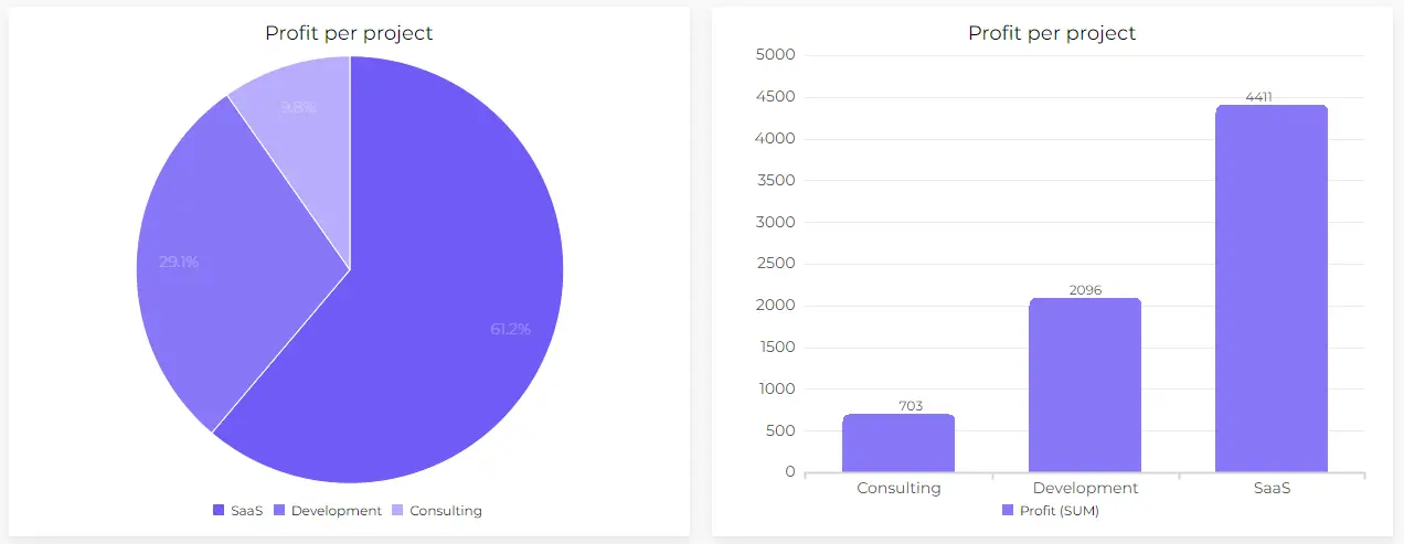
You can see that pie chart shows you the big picture of total profit visualizing % for each project. However, bar chart visualizes total amounts for each project separately. Both methods work fine, to choose the right chart you should understand the visualization goal.
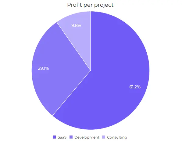
2. Data Categories in %
When one or a few categories significantly dominate the dataset, a pie chart can visually highlight these dominant elements, making it easy for viewers to identify key contributors.
Just like in the example above you can instantly see which project brings the most profit. When you want to see percentages rather than total amounts pie charts will do the job.
Author’s Note: Discover professional & efficient data visualization with Ajelix BI. Simple report creation with user-friendly editing, you don’t have to spend hours trying to create the perfect charts on Excel. Give it a go with a freemium and see if it helps you.
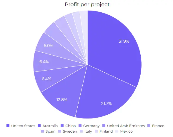
3. Up To Five Category Values
Pie charts are most effective when they are simple and easy to read. Limiting the number of categories to five ensures that the chart remains clear and does not become cluttered, facilitating quick and accurate interpretation by viewers.
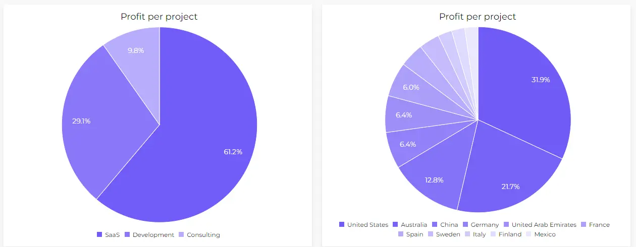
The more categories you add the harder it’s to understand the whole picture. Take a look at the example above the first chart is clear and shows us the value distribution. However, the second picture is cluttered and it’s hard to separate the values.
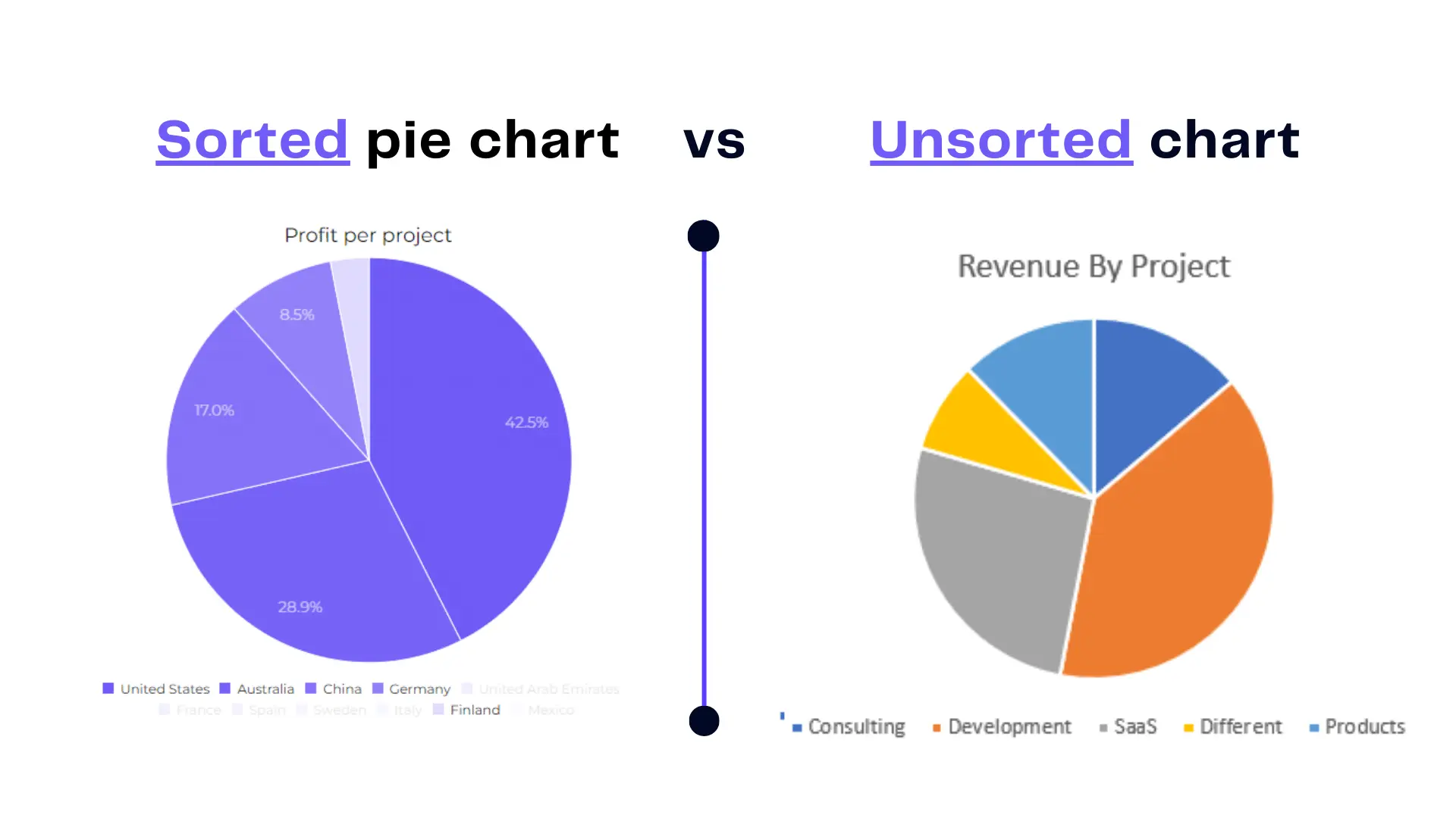
4. Sort The Category Value Data
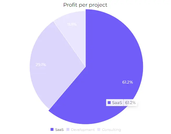
Sorting a pie chart organizes the slices in a logical order, making it easier for viewers to read and interpret. This enhanced readability ensures that the audience can quickly identify and understand the distribution of categories.
When To Avoid Using Pie Charts?
Avoiding the use of pie charts is advisable where alternative visualizations may better serve the purpose of conveying information. Here’s our case studies when you should avoid using pie charts.
1. Not Suitable For Complex Data Sets
Pie charts may struggle to effectively represent complex relationships or nuanced data structures. In such cases, alternative visualizations like bar charts or radar charts can offer a more comprehensive view. For example, to show trendlines and forecast values.
2. Avoid Using Too Many Categories
Pie charts become cluttered and lose their effectiveness when there are too many categories, leading to difficulty in interpretation. Opting for alternative visuals, such as stacked bar charts or treemaps, helps maintain clarity with a larger number of elements.
You can see in the example how hard it’s to understand each category when pie chart is clustered. We would get a whole different view if this was a bar chart or line chart.
Author’s Note: We have covered a different articles that can help with your visualization journey. Such as, how to create an effective visualization dashboards, visualizing financial data and adding secondary axis in Excel. Feel free to check our resources and bookmark our page for later.
3. Don’t Use Time-Series Data
Pie charts are static and do not convey changes well over time. Line charts or area charts are more suitable for illustrating trends, allowing for a dynamic representation of data evolution.
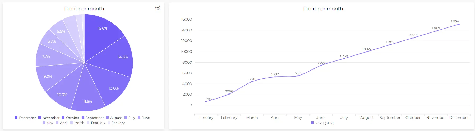
As you can see in the example above time series data is easier to understand in the line chart. Pie chart doesn’t give a great comparison whether we have a profit growth or no over time.
4. If You Need Detailed Numerical Representation
Pie charts do not naturally lend themselves to displaying precise numerical information. In scenarios where numerical accuracy is crucial, using a table or a bar chart with data labels is more appropriate.
Conclusion
In the realm of data visualization, understanding when to avoid or embrace pie charts is paramount. A recap underscores the importance of exploring alternatives for complex data sets, avoiding common mistakes, and employing effective practices for creating meaningful visuals.
Feel free to check our social accounts where we post useful spreadsheet tips daily, as well as try our AI Excel tools and data visualization platform to level up your productivity.
Ready to create a pie charts with Ajelix BI?
From data to report in one minute or less with Ajelix AI Agent