How To Add A Secondary Axis In Excel (Chart With 3 Axis)

A chart with a secondary axis in Excel is a way to visualize data series that use different units of measurement or have vastly different scales. It essentially adds a second vertical (Y) axis to the chart, allowing you to plot these different data types on the same graph without them distorting each other.
This article will show you how to add a second axis in Excel. It will provide a complete guide for expanding your types of graphs.
What is Secondary Axis in Excel Chart?
A secondary axis in Excel is an additional vertical or horizontal axis that can be added to a chart. It plots a different data series with a different scale or unit of measurement than the main axis.
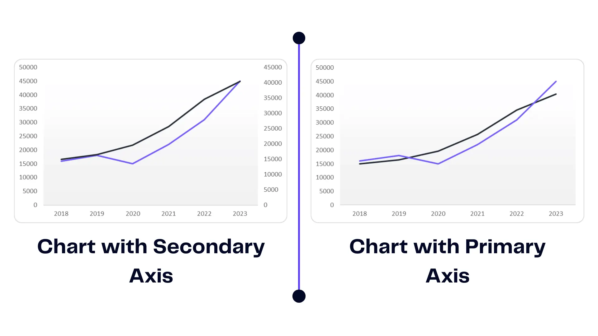
An infographic showing the main difference between radar charts with primary and secondary axis
Struggling with Excel charts and graphs? You might find useful our article on how to make a bar graph in Excel.
Why Do You Need a Second Axis?
When dealing with complex datasets, there are scenarios where a secondary axis becomes essential. For instance, when comparing data with varying units of measurement or drastically different value ranges, a secondary axis enables clear difference. By representing disparate raw data sets on separate axes, you can ensure accurate visualization without sacrificing clarity or distorting the interpretation.
How To Create a Chart in Excel?
To embark on our journey of adding a secondary axis, it is crucial to first create a graph in Excel. This involves a few simple steps to transform your raw numerical data into a visually appealing representation.
1.Select the Data for the Chart
Before adding a second axis, it is important to understand the significance of selecting the right data for your column chart. Highlight the data range that encompasses both the categories and their corresponding values.
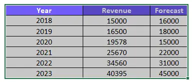
Ensuring accuracy and completeness in your data selection is vital to achieving meaningful visual representation.
2. Insert the Chart in Excel
With your data selected, it’s time to insert the bubble chart into Microsoft Excel. Access the “Insert” tab in the Excel ribbon, where you will find a variety of chart options at your disposal.
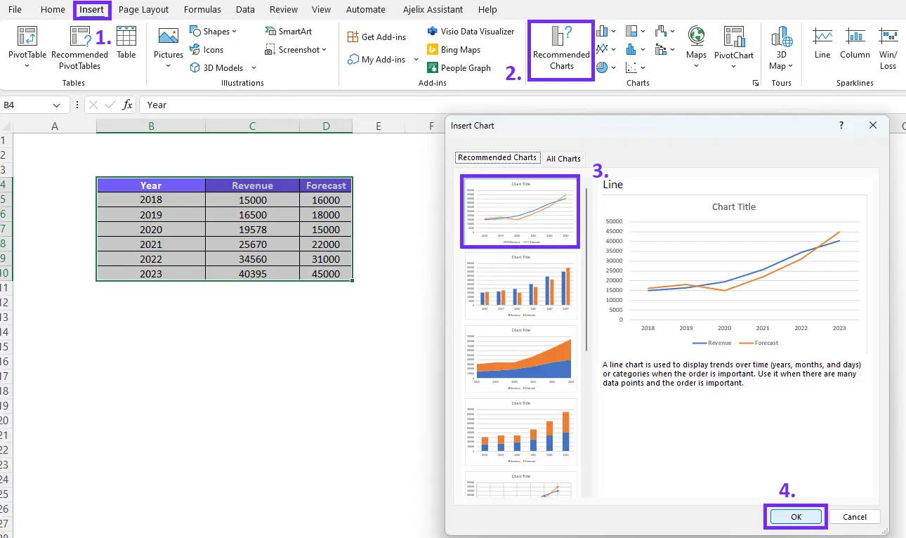
Discover different chart types and select the one that matches your data and the insights you want to communicate. For beginners, we advise you to choose from Recommended Charts as it will be more easier to set up your chart. Also, explore our guide on how to explode a pie chart in Excel.
How To Activate The Chart For Additional Settings?
After inserting the chart, it is important to activate it before proceeding further. Clicking on the chart activates it, causing the “Chart Tools” tabs to appear in the Excel ribbon. These tabs, including “Design,” “Layout,” and “Format,” provide a range of formatting options to enhance and customize your chart.
Here’s a quick summary on how to add secondary axis:
How To Add A Second Axis?
Time needed: 2 minutes
Add a Second Axis To Your Excel Chart with our step-by-step guide.
- Insert the Chart
You can follow our guide above to learn how to insert the chart in your spreadsheet.
- Activate the Chart
Click on the chart to open additional settings
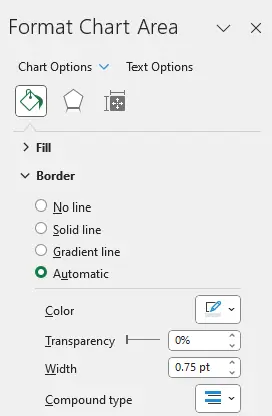
- Double-click on the Chart to Open Format Chart Area Settings
Another way to open the dialog is to click on the chart, open Format, and choose Format Selection.
- Activate the Series Option settings by clicking on the data point in chart.
Click on the line graph or displayed data to open additional settings in the Format Chart Area pane.
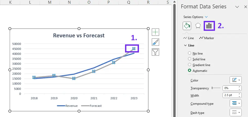
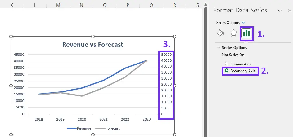
- Click on Series Option and choose Secondary Axis
After completing the previous steps, you need to click on the small displayed graphic. This will allow you to add a secondary axis. The infographic below shows how to add a secondary axis step by step.
Visit our blog to understand how to make bar charts bars wider with our helpful guide. Here’s a quick video guide to walk you through the steps.
Conclusion
In conclusion, adding a secondary axis in Excel opens up new possibilities to display your data. Create and select data for the line chart, and leverage Excel’s formatting options to enhance the clarity of your graphs.
Create dynamic and insightful charts with the plot data series on the secondary axis and fine-tune the chart appearance. Unlock the potential of dual-axis charts to elevate your data analytic capabilities to show the relationship between data.
Frequently Asked Questions
Yes, Excel allows you to have multiple axes in a chart, including a secondary axis.
By adding a secondary axis, you can compare data series with different scales effectively.
Yes, you can add a secondary horizontal axis in Excel to compare two different data series horizontally.
Yes, you can use the keyboard shortcut Ctrl + 1. That will open the Format Data Series pane and then follow the steps to add a secondary axis.
Learn more about Excel and Google Sheets hacks in other articles. Stay connected with us on social media and receive more daily tips and updates.
Speed up your spreadsheet tasks with Ajelix AI in Excel