Seeing is Believing: Marketing Data Visualization Practices
The old adage “seeing is believing” perfectly captures the power of data visualization in marketing. Numbers and spreadsheets, while crucial, can leave audiences especially creatives overwhelmed and fail to resonate. 📈
Data visualization bridges this gap, transforming complex information into clear, captivating visuals that tell a story. This article dives into the world of marketing data visualization practices, exploring how to harness the power of sight to transform your marketing strategies.
What is Marketing Data Visualization?
Marketing data visualization is the process of translating complex data sets into visually digestible formats. Marketing reports visualize data from campaigns and traction, which is the main difference in the data set.
Data analysts and decision-makers can understand information better with the help of charts, graphs, and interactive displays. These visual aids effectively convey the story behind the numbers. If you have financial data we got you covered with a guide on financial data visualization.
Why It Matters for Your Marketing Strategy
Understanding the importance of data visualization is akin to unlocking a treasure trove of insights. It helps marketing teams make smart choices, improve campaigns, and quickly adjust strategies based on real-time data, ultimately increasing KPIs and ROI.
Types of Data to Visualize in Marketing
In marketing activities’ dynamic realm, harnessing data types’ power in marketing is pivotal for success. Effective visualization of this data can be a game-changer and your B2B digital marketing agency knows how to go about it!
Here’s a glimpse into the diverse data types in marketing that demand compelling visualization:
- Customer Segmentation: Unveiling distinct consumer groups, their behaviors, and preferences through visual representations aids in targeted marketing efforts.
- Website Traffic: Visualizing web organic traffic patterns, clickstream data, and user interactions unveils valuable insights for optimizing online strategies.
- Social Media Engagement: Analyzing likes, shares, comments, and sentiment data analysis through visual dashboards helps gauge brand presence and audience sentiment. You can even use tools for agencies to help you gather and analyze all these insights.
- Email Marketing Performance: Visualizing open rates, click-through rates, and conversion metrics empowers marketers to fine-tune email campaigns. They might need to explore what is a DMARC policy or study how to generate an SPF record in order to improve email deliverability and reduce spam.
- Sales Funnel: Tracking prospects’ journey from awareness to conversion with visual funnels provides a clear picture of the sales team process. To ensure a strong start to your funnel, use a LinkedIn email finder to gather prospect contact information quickly.
- Competitor Analysis: Comparative visualizations of market share, keyword rankings, and social media presence reveal competitive landscapes.
- Content Performance: Visualizing which content pieces resonate most with your audience aids in content strategy refinement.
- Ad Campaign ROI: Visualizing ad spend against revenue generated offers a quick overview of campaign profitability.
- Customer Lifetime Value (CLV): Visualizing CLV data over time helps in nurturing long-term customer relationships.
- Heatmaps and Click Maps: These visual tools offer insights into where users focus their attention on websites, aiding in website optimization.
In modern marketing, knowing and showing data types is key to successful strategies. The right visualizations transform raw data into actionable insights, driving informed decision-making and ultimately, marketing excellence. View more examples of data visualization in marketing here.
Start with Marketing Data Visualization
Essential Tools and Software
Embark on your data visualization journey equipped with the right tools. Discover a plethora of software options, from industry giants to niche players, tailored to meet your specific needs. You can use powerful tools like Power BI or Tableau, or opt for something simpler like Ajelix BI.
Choosing the Right Data Visualization Techniques
Data visualization is an art as much as it is a science. Explore different techniques like bar charts, heatmaps, and scatter plots to find the best way to visualize your data.
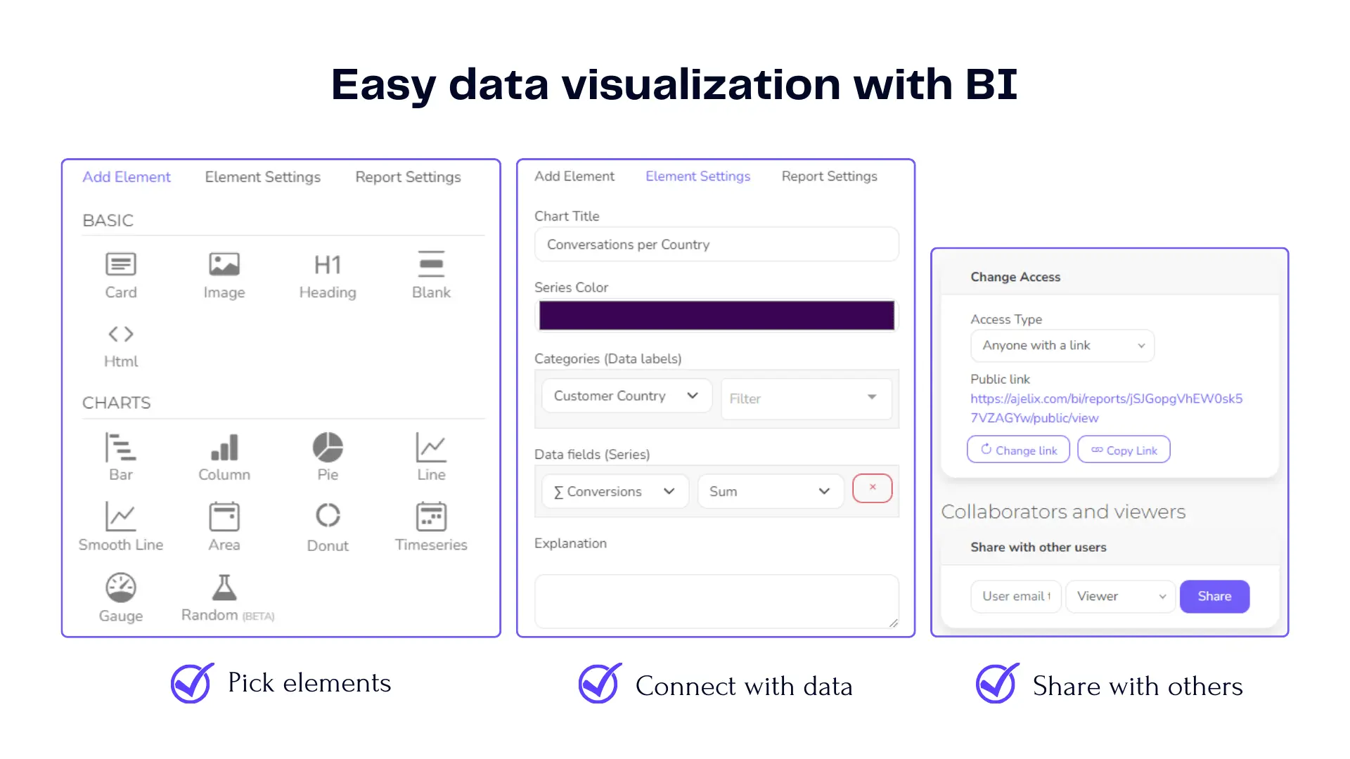
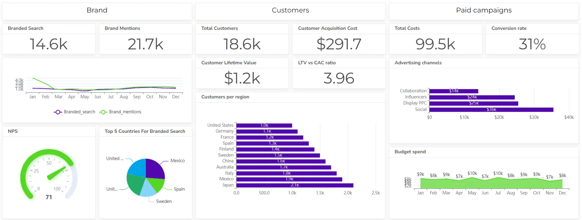
Screenshots from Ajelix BI platform (taken by author)
It’s hard to mess up something when you have a visualization tool that helps you turn data into reports. However, I would not suggest creating reports in Excel if you’re not an experienced user and looking for something professional.
Crafting Compelling Marketing Dashboards
Designing User-Friendly Dashboards
A well-designed monthly marketing reporting dashboard is a user’s best friend. Explore the principles of intuitive design, ensuring that your dashboard tells a cohesive story at a glance.
Marketing KPIs To Measure
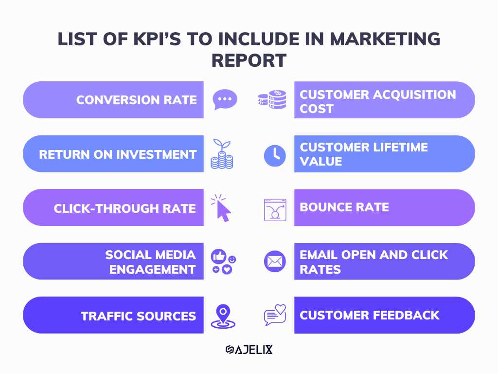
Infographic with KPI to include in the marketing report (made by author)
When creating a marketing report, it’s important to concentrate on the correct marketing KPI to gauge campaign success. Including the right metrics ensures that you’re making data-driven decisions. Here’s a breakdown of key metrics to consider:
- Conversion Rate: Monitor how well your marketing efforts are converting lead generation into customers. A high conversion rate signifies effective strategies.
- Customer Acquisition Cost (CAC): Understanding the cost to acquire each new customer helps in marketing budget allocation and optimizing ad spend.
- Return on Investment (ROI): Calculate the ROI for each campaign to evaluate its profitability. ROI is a fundamental metric for assessing marketing success.
- Customer Lifetime Value (CLV): Focus on nurturing long-term relationships by analyzing the CLV. It helps in identifying the value each customer brings over time.
- Click-Through Rate (CTR): Track how many users click on your ads or content. A high CTR indicates strong engagement.
- Bounce Rate: This metric reveals the percentage of visitors who leave your site without taking any action. A lower bounce rate is usually better.
- Social Media Engagement: Monitor likes, shares, comments, and overall engagement on social media platforms to gauge your online presence. This is also an ideal platform to share customer video testimonials. Video testimonials are visual narratives that highlight the success of your customers with your product or service, contributing to your brand’s authenticity and trustworthiness. You can even stream these videos through a live transcoder to share them instantly with your audience, whether it’s on your website, social media, or email campaigns.
- Email Open and Click Rates: Analyze email campaign performance with open and click-through rates. Tailor your content based on these insights.
- Traffic Sources: Identify which channels are driving the most traffic to your website, allowing you to allocate resources effectively.
- Customer Feedback: Include qualitative data from customer surveys or feedback forms to gain insights into customer satisfaction and areas for improvement.
Using these KPIs in your digital marketing report provides a comprehensive view of your efforts. This, in turn, helps you enhance your strategies and achieve improved results.
Best Practices for Data Visualization
Simplifying Complex Data
In a world drowning in data, simplicity is key. Learn how to distill complex information into clear, concise visualizations that resonate with your target audience.
Using Color and Imagery Effectively
Colors and images hold the power to convey emotions and emphasize key points. Master the art of color psychology and imagery to make your data come alive.
Avoiding Common Pitfalls
Steer clear of the pitfalls that can turn your data visualization into a visual nightmare. From misleading visuals to overloading with information, we uncover the traps to avoid.
Related Article: Qualitative data visualization
Storytelling with Data
Creating a Narrative with Your Visuals
Data doesn’t just inform; it tells a story. Discover how to weave a narrative through your visuals, making your data relatable and engaging.
Engaging Your Audience
Engagement is the name of the game. Explore techniques to captivate your audience, keeping them invested in your data-driven story.
Leveraging Data Visualization for Competitive Analysis
Gaining Insights into Competitor Strategies
Uncover the secrets to staying ahead in the marketing game by using data visualization to analyze your competitors’ strategies. Learn how to spot trends, identify strengths and weaknesses, and adapt your approach accordingly. Collaborating with top advertising companies can further enhance your competitive analysis efforts, leveraging their expertise to interpret data trends and refine marketing strategies.
Benchmarking Your Performance
Benchmarking is a crucial component of competitive marketing analytics. Discover how data visualization can help you set meaningful benchmarks and measure your marketing performance against industry standards.
Data Privacy and Ethics in Marketing Visualization
Protecting Customer Data
In an era of data breaches and privacy concerns, safeguarding customer data is paramount. Dive into the ethical considerations of data collection and visualization, ensuring that you maintain the trust of your audience.
Ensuring Ethical Practices
Explore best practices for ethical data handling, including transparency, consent, and compliance with data protection regulations. Build a foundation of trust with your customers while harnessing the power of data.
Future Trends in Marketing Data Visualization
AI and Machine Learning in Visualization
Unlock the potential of artificial intelligence and machine learning in data visualization. Explore how these technologies are shaping the future of marketing insights. Ajelix BI offers AI data analytics that helps you explain charts to a wider audience.
For example, visualizing contact enrichment from digital business cards, such as industry, role, or event source can reveal which networking channels generate the highest-quality leads and improve your segmentation strategies.
Overcoming Challenges in Data Visualization
Dealing with Data Overload
Data overload is a common hurdle. Uncover strategies to handle vast datasets effectively and extract meaningful insights without drowning in information.
Ensuring Data Accuracy
Data integrity is non-negotiable. Delve into methods and tools to verify and maintain data accuracy throughout your visualization process.
Steps to Implement Effective Data Visualization
Setting Clear Objectives
A clear roadmap is essential. Define your objectives and marketing goals for data visualization, ensuring alignment with your marketing strategy.
Building a Skilled Team
Explore the steps to assemble a proficient data visualization team, from hiring the right talent to fostering a collaborative environment.
Tips for Data-Driven Decision-Making
Incorporating Visualization into Your Strategy Meetings
Revolutionize your strategy meetings by integrating an AI meeting assistant, data visualization, and BI. Learn more about Business Intelligence here. Discover how visuals can drive more informed, data-driven decisions.
Creating a Culture of Data-Driven Marketing
Training Your Team
Empower your marketing team with data literacy. Learn how to provide training and resources to cultivate a culture of data-driven decision-making.
Encouraging Data-Driven Mindsets
Explore strategies for instilling a data-driven mindset throughout your organization, from leadership to entry-level roles.
Conclusion
After exploring marketing data visualization, it’s clear that this art can transform your marketing strategy and business goals. With an understanding of data types, best practices, and new trends, you can navigate the changing world of data-driven marketing.
From data to report in one minute or less with Ajelix AI Agent