Charts and Graphs in Excel: A Step-by-Step Guide

When it comes to analyzing and presenting data, charts, and graphs are the perfect tools to help you communicate information in a meaningful and visually appealing way. Whether you’re a student, a business professional, or a data analyst, Excel is a powerful program that can help you create stunning charts and graphs in just a few simple steps.
This article will cover the basics of creating charts and graphs in Excel, from selecting your data to customizing your visuals. With this step-by-step guide, you’ll be able to create stunning charts and graphs in no time. Let’s get started.
Step 1: Select Your Data
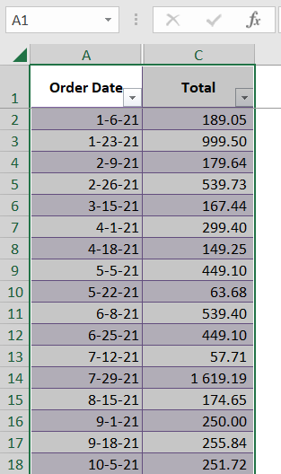
The first step in creating charts and graphs in Excel is to select the data you want to visualize. To do this, open your Excel spreadsheet and select the desired cells. Ensure that the data you select is organized in a way that makes sense for the type of chart or graph you’re creating. You can mark the needed rows by hovering your mouse over the data, see the example below where we marked columns A and B for creating a chart.
Related Article: How To Print A Graph in Excel and Google Sheets
Step 2: Choose Your Chart or Graph Type
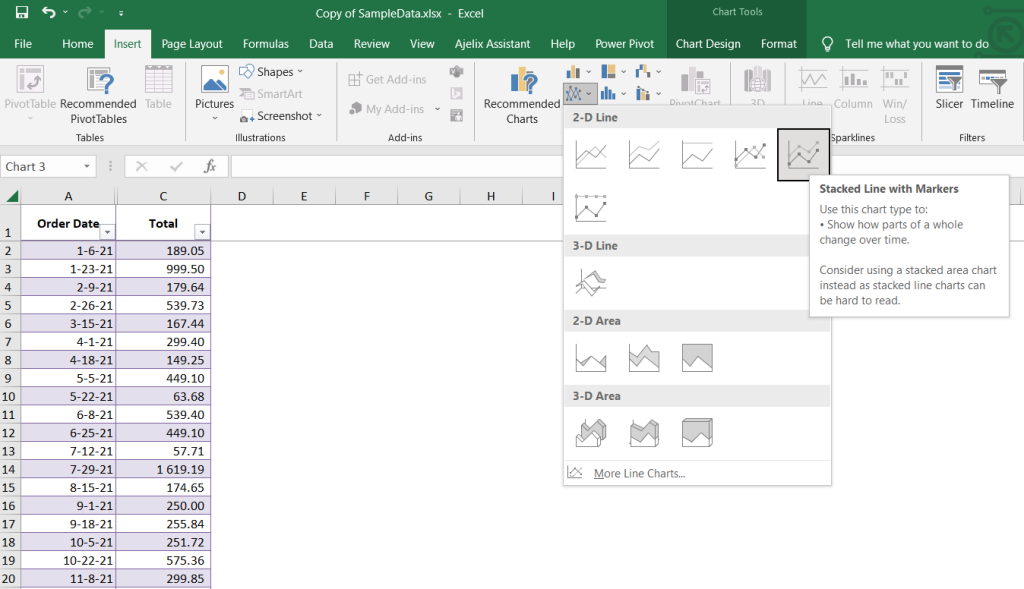
The next step is to decide which type of chart or graph you want to create. Excel offers a wide variety of designs, so you’ll want to select the one that best fits your data set. The most commonly used designs in Excel include bar charts, line graphs, pie charts, and scatter plots. Decide which type of chart or graph you want to create, and you’re ready to move to the next step. To choose the chart or graph go to “Insert” > “Charts” and choose the chart or graph type you want to use. In our example, we chose a “line chart” to see the trend over the period of time. See the example below.
Related Article: How To Create Pivot Chart in Excel
Step 3: Insert Your Charts or Graphs
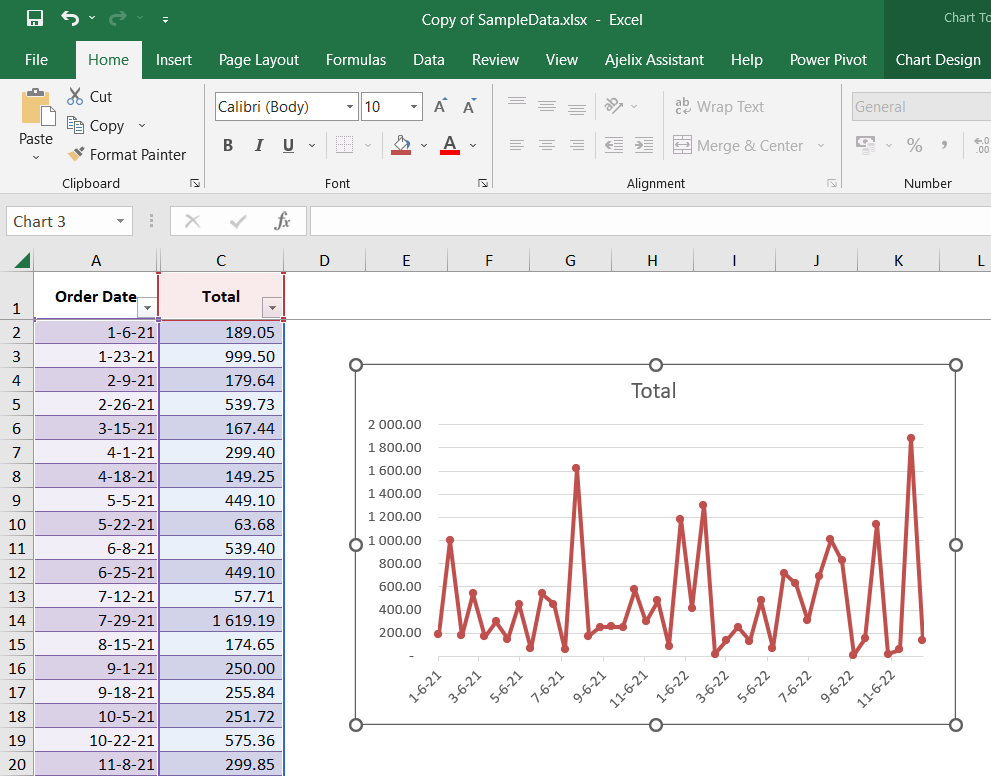
Now it’s time to insert your chart or graph into your Excel spreadsheet. To do this, select the Insert tab at the top of the Excel window and then select your desired chart or graph type from the menu. Once you’ve selected your chart or graph type, Excel will automatically create a visual representation of your data. In the example below you will see that we created a line chart to better view sales data.
Related Article: How To Delete A Chart in Excel?
Step 4: Customize Your Charts or Graphs
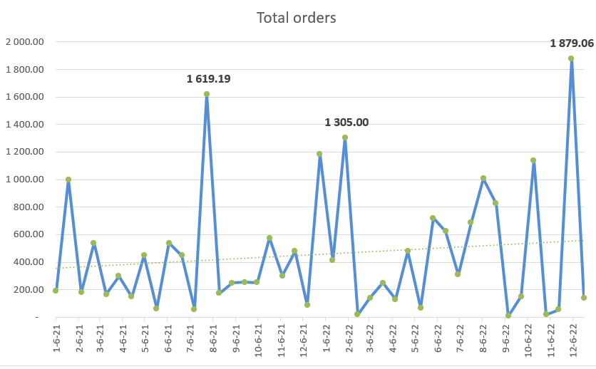
The next step is to customize your chart or graph to reflect better the information you’re trying to communicate. Excel offers a wide variety of customization options, including the ability to add labels, change colors, and add trendlines. To customize your chart, select the Design tab at the top of the Excel window and then select the desired customization option from the menu. Once you have inserted your chart you should design it to meet your needs. Change the title of the chart, change color pallet, and data labels to highlight the results. You can see in our example below that we customized our chart to make it visually pleasing and we add the trendline.
Related Article: Copy and Remove Conditional Formatting in Excel
Step 5: Save Your Charts or Graphs
Once you’ve created your chart or graph, it’s time to save it so you can use it in the future. To save your chart or graph, select the File tab at the top of the Excel window and select Save As. Then, select the desired file format and enter a file name. Once you’ve done this, your chart or graph will be saved and you can use it whenever you need it.
Related Article: How To Create a Sparkline in Excel?
Conclusion
Creating charts and graphs in Excel is easy to communicate data in a meaningful and visually appealing way. With this step-by-step guide, you’ll be able to create stunning charts and graphs in no time. So get started today and start visualizing your data like a pro.
Learn more about Excel and Google Sheets hacks in other articles. Stay connected with us on social media and receive more daily tips and updates.
Speed up your spreadsheet tasks with Ajelix AI in Excel


