How To Analyze Data In Excel Spreadsheet

Excel is the workhorse of data analysis in countless businesses. It can unlock valuable insights from spreadsheets, but for many, its power can be overwhelming. If you’re struggling to analyze data in Excel to extract meaningful information, this blog post is for you.
TL;DR
To analyze data effectively in Excel, start by cleaning and organizing your dataset, use consistent headers, correct data types, and remove duplicates. Sort and filter to quickly focus on specific information. Use core formulas (SUM, AVERAGE, COUNTIF, VLOOKUP, CORREL) to uncover insights, and visualize results with clear, well-formatted charts. For larger datasets, PivotTables let you summarize and explore data dynamically. Mastering these basics turns Excel into a powerful analysis tool, or you can simplify everything further with AI tools as an AI data analyst, to do the work for you.
We’ll equip you with step-by-step techniques to transform your Excel skills and turn data into a strategic advantage. Here’s what we will cover in this article:
- Clean and organize data
- Sorting and filtering for analysis
- Excel functions for data work
- Data visualization in Excel
- Pivot Tables
- Key takeaways
- FAQ
Change the way you work with agentic AI
One-click dashboards,KPI tracking, and AI-powered insights—for work that actually gets done.

Organizing Your Data
Before crunching numbers and uncovering insights, you need a solid foundation – clean and organized data. Here’s why clean data is so important in data analysis:
- Accuracy: Dirty data leads to inaccurate results. Inconsistent formatting, typos, or duplicate entries can easily skew your analysis and lead to misleading conclusions.
- Efficiency: Clean data saves you time! When your data is well-organized, navigating, filtering, and analyzing is easier.
- Clarity: Clean data presentations are clear and easy to understand. When others see your analysis, they can quickly grasp the story behind the numbers.
3 Tips to clean your data
1. Consistent Headers
The first row of your data table should contain clear and descriptive headers for each column. These headers act as labels, telling you exactly what kind of data is in each column (e.g., “Customer Name,” “Order Date,” “Product Category,” “Sales Amount”).
Screenshot from Excel with formatted table headings, image by author
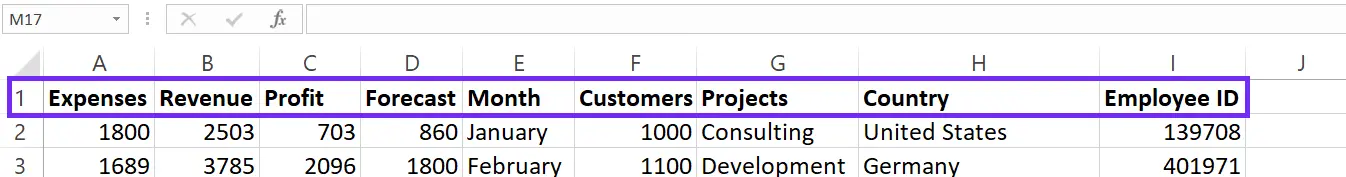
2. Data Types
Excel allows you to define the data type for each column (text, number, date, etc.). This ensures that calculations and formatting are applied correctly. For example, a column containing dates should be formatted as a date type, not text.
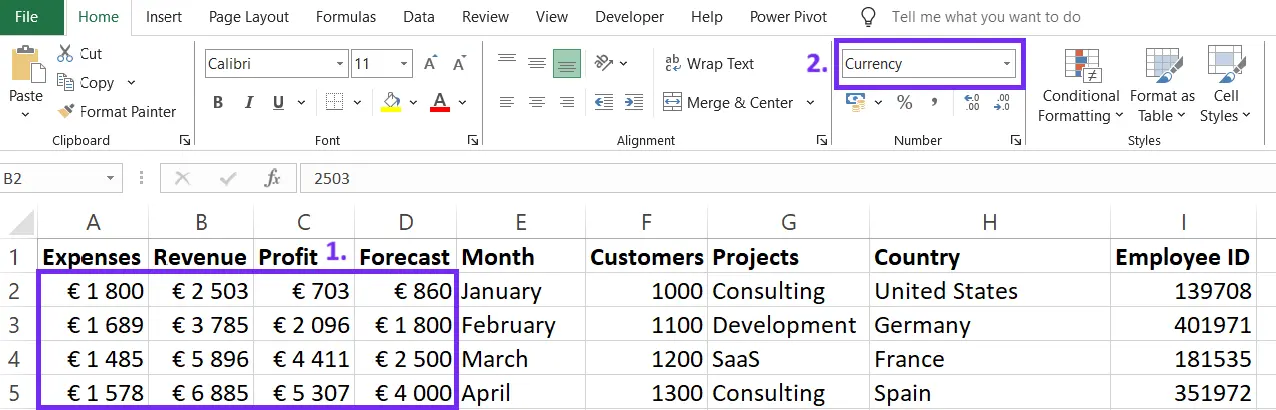
Screenshot from Excel on how to set data formatting in table, image by author
3. Removing Duplicates
Duplicate entries can inflate your results and distort your analysis. Use the built-in “Remove Duplicates” function in Excel to identify and eliminate these duplicates.
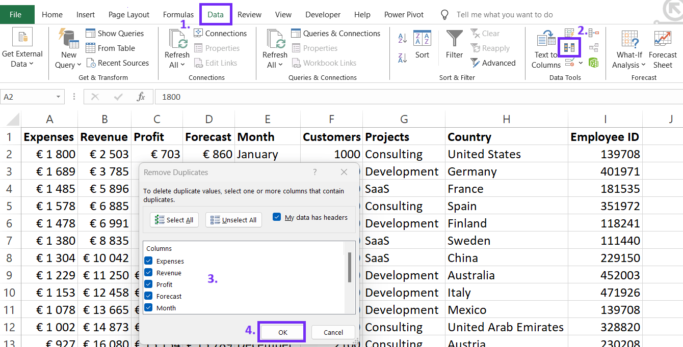
Screenshot from Excel with steps on how to remove duplicates, image by author
Sorting and Filtering Data in Spreadsheet
These features in Excel help you sift through your data to find exactly what you’re looking for.
- Sorting: Arranges your data in a specific order based on a chosen column. Sort alphabetically (A to Z or Z to A) for text data, or numerically (smallest to largest or largest to smallest) for numbers and dates.
- Filtering: Allows you to temporarily hide rows that don’t meet certain criteria, focusing only on the subset of data that interests you. Think of it like putting all the blue shirts in a separate pile!
Sorting by Specific Columns
Need to see your data chronologically? Sort by the “Date” column! Sorting by a specific column helps you identify trends and patterns over time. Here’s how:
- Click on any cell within the data you want to sort.
- Go to the “Data” tab on the Excel ribbon.
- Click the “Sort & Filter” button in the “Sort” group.
- A “Sort” window will appear. Choose the column you want to sort by from the “Sort by” dropdown menu.
- Select “Ascending” to sort from smallest to largest (or A to Z) or “Descending” to sort from largest to smallest (or Z to A).
Screenshot from Excel with filtering steps, image by author
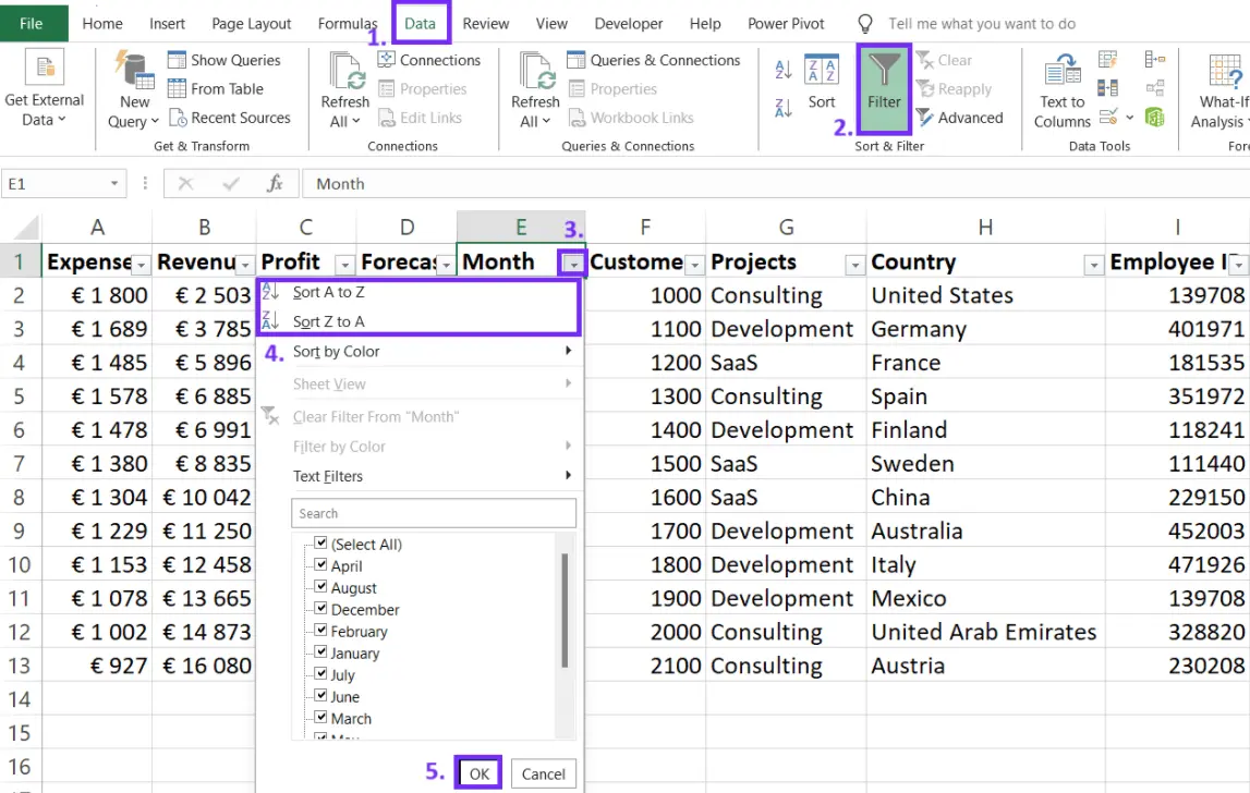
Filtering for Specific Criteria
Let’s say you only want to analyze data in Excel for a particular country category, like “United States.” Here’s how to do that:
- Click on any cell within the data table.
- On the “Data” tab, in the “Sort & Filter” group, click the “Filter” button.
- A dropdown arrow will appear on each column header. Click the dropdown arrow for the column you want to filter (e.g., “Country”).
- Select the criteria you want to filter by (e.g., “United States”). Only rows containing “Electronics” in that column will be visible, while others are temporarily hidden.
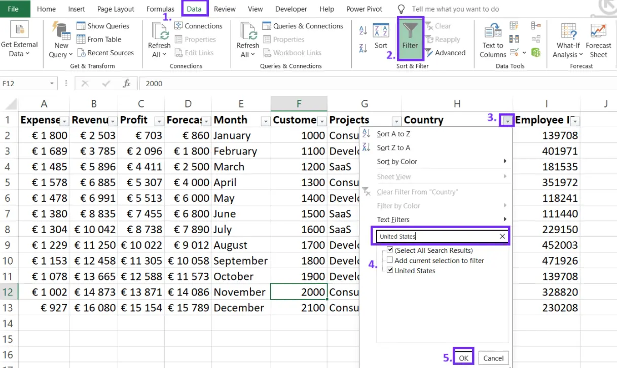
Screenshot from Excel with filtering settings steps, image by author
P.S. Excel filtering options are limited, as you can’t filter data with several criteria. You might want to try BI platforms and tools that ease the filtering and data analytics process, such as Ajelix.
Reporting gives you a headache?
Upload your data and create professional reports with agentic AI
Start free
Try free and upgrade whenever
Formulas and Functions: For Data Analysis in Excel
Spreadsheets are all about numbers, a vital step in data analysis is calculations to discover correlations and patterns. Excel functions can help you do that by using the right formulas to calculate your data and visualize by best practices. Essential Formulas that can help with analytics tasks:
- SUM: This function adds up values across a range of cells. Select the range of cells containing your sales figures, type “=SUM(“, then select the cell range again, and close the parenthesis.
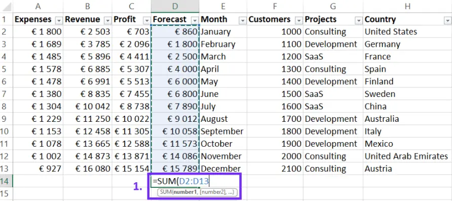
Screenshot from Excel with SUM function, image by author
- AVERAGE: The AVERAGE function crunches the numbers for you. Select the range of cells containing your prices, type “=AVERAGE(“, select the cell range again, and close the parenthesis.
- COUNTIF: This function counts the number of cells that meet specific criteria. Select a blank cell, type “=COUNTIF(“, then in quotes, type the criteria (e.g., “CA”). Next, select the cell range containing your order locations, and close the parenthesis.
- VLOOKUP: Searches for a specific value in the leftmost column of a table and returns a corresponding value from a different column in the same row.
- CORREL: Calculates the correlation coefficient between two sets of data. It ranges from -1 to 1, with -1 representing a perfect negative correlation, 0 representing no correlation, and 1 representing a perfect positive correlation.
Have you used AI agent for Excel tasks? You can create formulas and functions using artificial intelligence in Google sheets. Take a look at the video below or sign up free with Ajelix.
Visualize Your Data With Charts
Charts and graphs in Excel take your data analysis to the next level by translating numbers into visually compelling stories. Without visualizations, your data makes no sense to you or your auditory.
Why Use Charts and Graphs?
The human brain excels at processing visual information. Charts and graphs take advantage of this by presenting complex data in a clear and easy-to-understand format. They can reveal trends, patterns, and relationships that might be hidden within rows and columns of numbers.
Choosing the Right Chart Type
Excel offers a variety of chart types, each with its own strengths. Here are some popular choices:
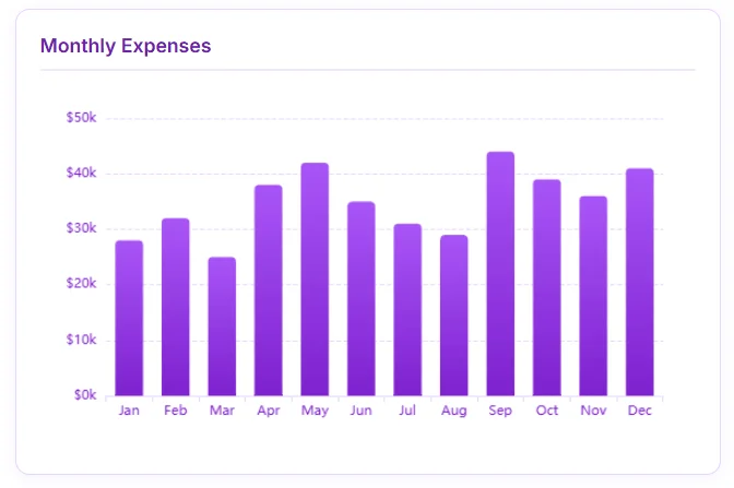
- Bar Charts: Ideal for comparing categories or showing changes over time. Use bar charts to visualize sales figures across different regions, for example.
Bar chart screenshot from Ajelix showcasing financial trend, image by author
- Line Charts: Excellent for showing trends and how data points change over time. Line charts are perfect for tracking stock prices or website traffic over a specific period.
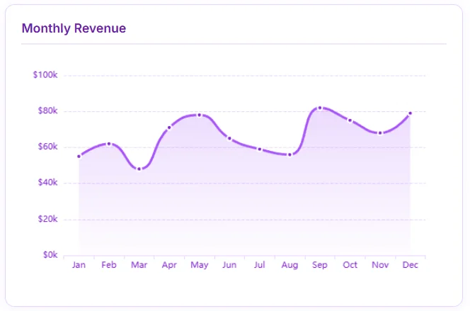
Line chart screenshot from Ajelix showcasing financial trend, image by author
- Pie Charts: Best suited for depicting proportions of a whole. Pie charts can effectively show the breakdown of sales by product category or customer demographics.
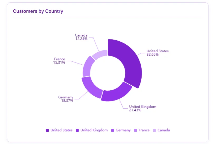
Pie chart screenshot from Ajelix showcasing customer trend, image by author
Do you struggle with chart creation in Excel? You don’t have to anymore with Ajelix you can create professional charts in seconds.
Tips for Chart Customization
Once you’ve chosen your chart type, don’t settle for the default settings! Excel allows you to customize your dashboard for maximum visual impact:
- Formatting: Change bar colors, add gridlines, or adjust the chart layout to enhance clarity and visual appeal.
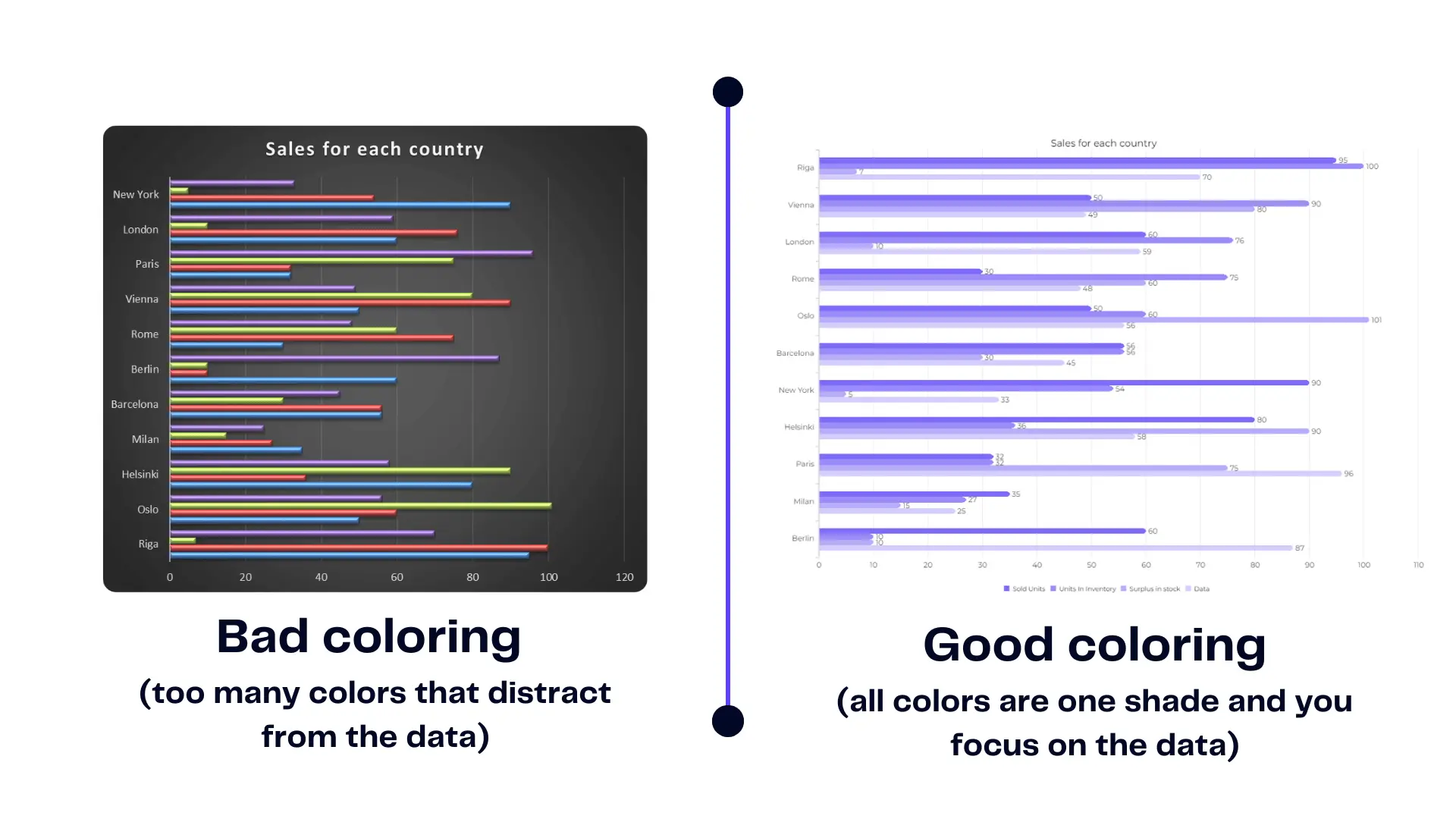
Bad chart coloring compared with good coloring, image by author
- Labels: Add clear and concise labels to your chart axes and data points to make it easy for viewers to understand the information presented.
- Titles: Give your chart a descriptive title to summarize the key takeaway of the data.
By mastering the art of chart creation and customization, you can transform your spreadsheets into visually engaging presentations that effectively communicate insights to your audience.
Did you know you can create dashboards with charts and graphs automatically using Ajelix? This way you can save time on messy spreadsheets by simply uploading your files and creating reports in seconds.
Pivot Tables For Analysis
Ever felt overwhelmed by a massive spreadsheet full of numbers? PivotTables can help condense a mountain of data into a concise and interactive summary table.
What are PivotTables?
PivotTables are dynamic tools that allow you to analyze large datasets flexibly. They act like a giant switchboard, letting you rearrange and summarize your data based on different categories.
Creating a Pivot Table: A Step-by-Step
- Select your data: Make sure your data is well-organized in a table format (you can format your data range as a table using the “Ctrl+T” shortcut).
- Insert the Pivot Table: Go to the “Insert” tab on the Excel ribbon. In the “Tables” group, click the “PivotTable” button.
- Choose the destination: A window will pop up asking where you want to place the Pivot Table. You can choose to create a new worksheet or embed it within the existing datasheet. Click “OK”.
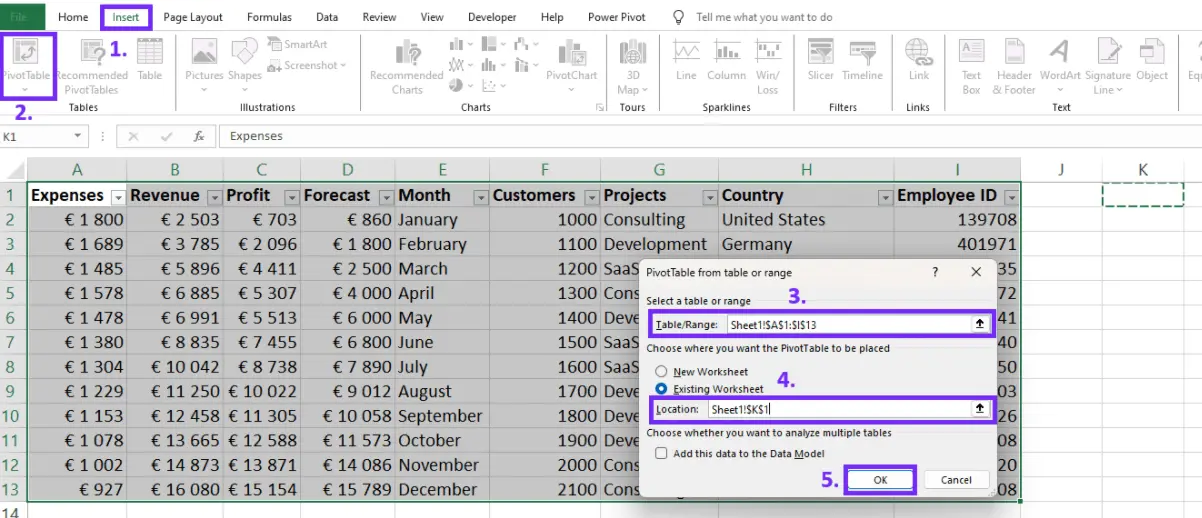
Screenshot from Excel with steps on how to insert Pivot Table, image by author
The PivotTable Wizard: Excel’s PivotTable wizard appears on the right side of your screen. This is where the magic happens!
- Drag and Drop Fields: The wizard displays a list of fields from your original data set. Think of these fields as building blocks for your PivotTable. You can drag and drop these fields into different areas:
- Rows: This section determines which categories you want displayed on the rows of your PivotTable. For example, dragging the “Product Category” field here will show sales figures for each category.
- Columns: Similar to rows, this section allows you to categorize your data along columns. Dragging the “Month” field here will display sales figures by month.
- Values: This is where you specify how you want to summarize your data. Typically, you’ll drag a numerical field like “Sales Amount” here. This area displays the actual calculations (e.g., sum, average) based on your row and column selections.
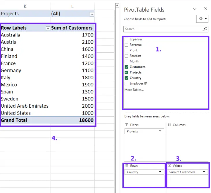
Screenshot from Excel with steps on how to create a Pivot Table, image by author
With PivotTables in your Excel toolkit, you can conquer even the most complex datasets, transforming them into clear and informative summaries that tell a data-driven story!
Key Takeaways
- Clean and organized data is the foundation to analyze data in Excel effectively.
- Sorting and filtering help you sift through data to find what you need.
- Pivot Tables offer a powerful way to summarize and analyze large datasets.
- Formulas and functions empower you to perform calculations and answer questions from your data.
- Charts and graphs bring your data to life with visual storytelling.
This is just the beginning of your data analysis journey in Excel. The more you practice and experiment with these techniques, the more comfortable and confident you’ll become.
FAQ
You can switch to Google Sheets or use tools such as Ajelix, Power BI, Zoho Analytics, and other data visualization software.
To ensure your data is formatted correctly for analysis in Excel: Use clear labels for each column. Set the correct data type (number, text, date) for each column. Eliminate duplicate entries that can skew results.
Speed up your spreadsheet tasks with Ajelix AI in Excel