To understand what reports you can build learn elements that Ajelix BI offers and then dig deeper into report building.
Editor offers 15 elements with whom you can create your reports. Each graph lets you customize reporting process from scratch.
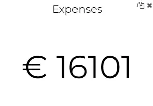
1. Card – let’s you calculate different metrics, such as, total income, average costs, count of customers, etc.
2. Image – add any pictures to your reports using link.

3. Heading – insert titles, names in any part of your report.

4. HTML – with this element you can insert different elements, like, tables, images, descriptions, links, the possibilities are wide.

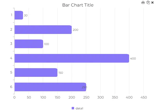
5. Bar chart – visualize your data in bar chart with option to add as many columns as you’d like.
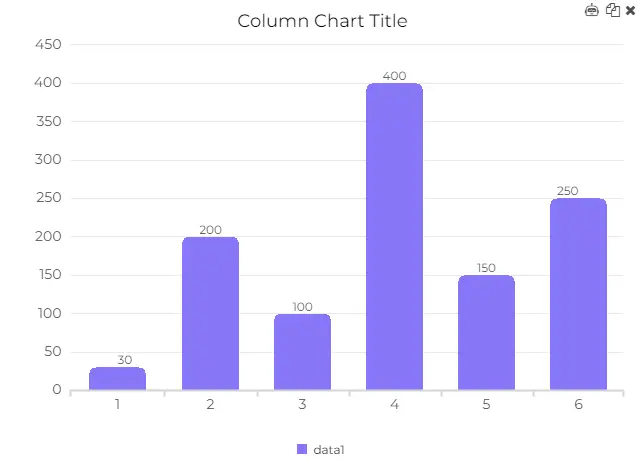
6. Column bar chart – another bar graph that let’s you visualize data horizontally.
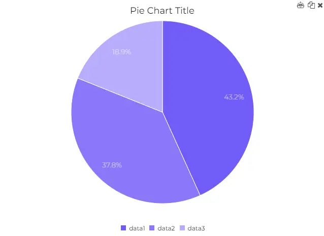
7. Pie chart – visualize data in a circle form.
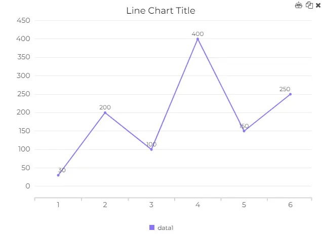
8. Line chart – add as many lines as you need and compare data.
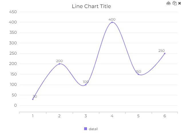
9. Smooth line chart – same visualization principle as the previous graph the only difference is the smooth line.
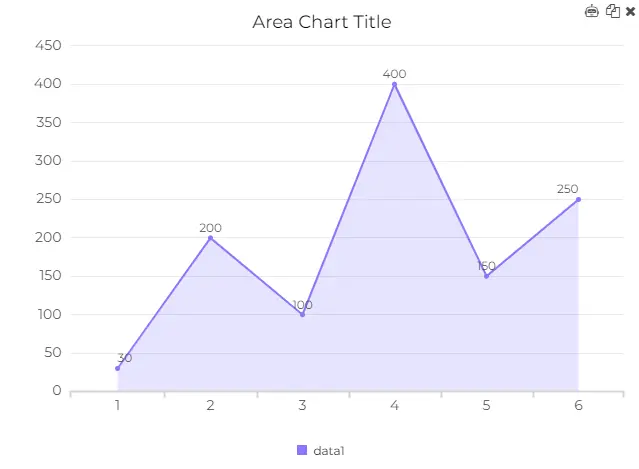
10. Area chart – let’s you visualize historic data and show trends.
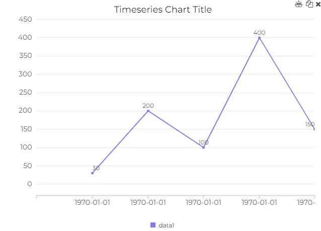
11. Time series chart – this chart is specifically create to let you visualize trends thorough dates and years. To use this chart you need data that is based on date.
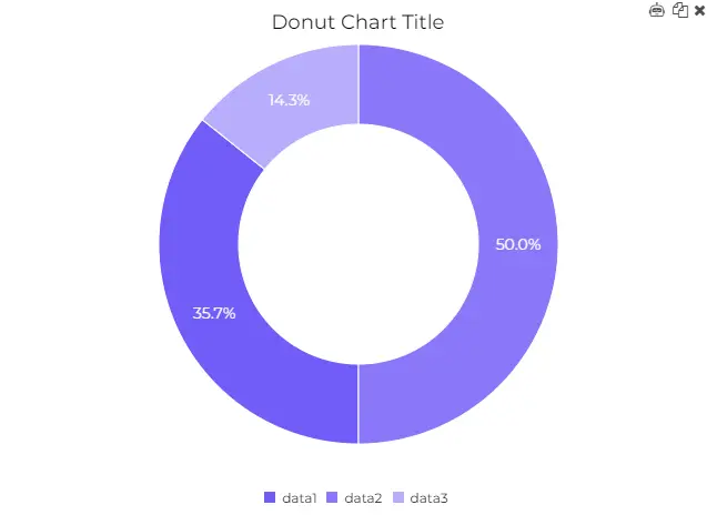
12. Donut chart – very similar to pie chart visualization the only difference is the circle in the middle.
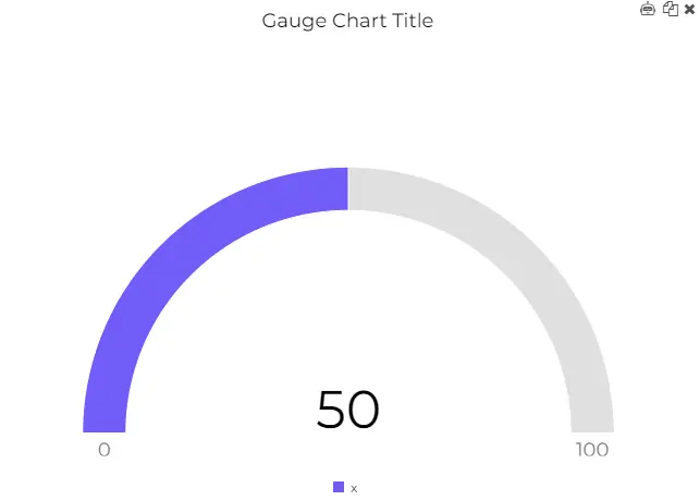
13. Gauge chart – this element let’s you track KPI’s and different metrics. It allows you to set maximum value and calculate the actual value from your dataset.
Didn’t find the answer to your question? Contact us via: support@ajelix.com
