Let’s dive deep into report building! We will walk you through the elements, setup, and how to create your first report. Make sure you have read previous articles on how to format files and how to upload data.
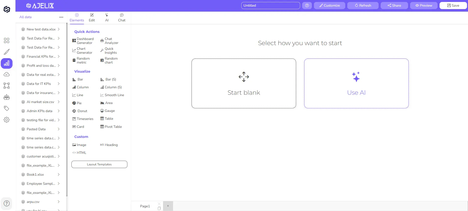
Once you have completed the setup that we covered in the previous guides, you should have a blank editor like this 👇
To understand the functions of each element, read the article about available ajelix elements.
If you prefer video format, here’s a step-by-step guide 👇 If not, skip this and follow the written guides below.
1. Understanding editing
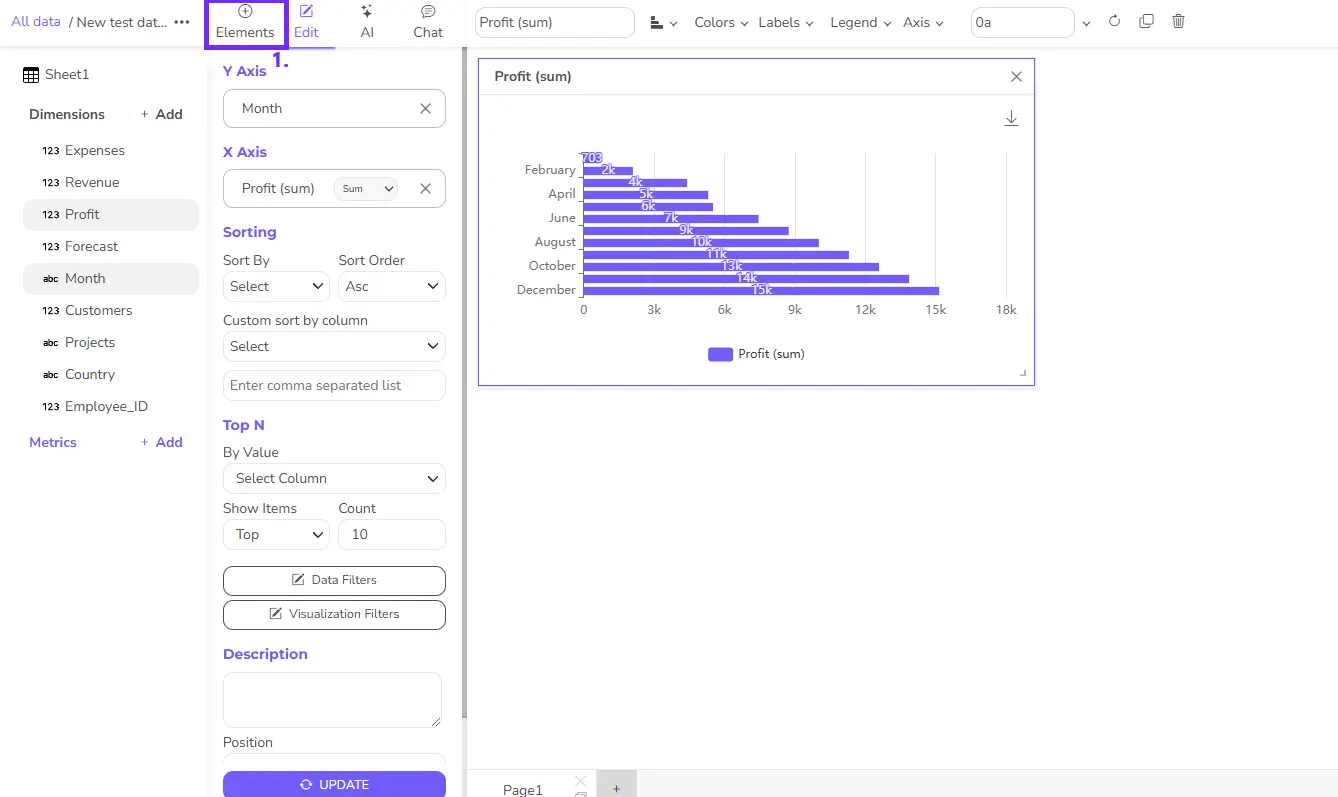
Pick the first element you want to see in your report. Once you click on any element it will appear on your report and you will see the editor.
- Your data: This is where you can see all your files. Click on any data source and select any column to add it to the chart. This feature enables you to build a dashboard from several data sources.
- Element setup: In this section, you can arrange the Y and X axes. You can also drag and drop any column here, apply filters, and sort chart data.
- Report preview: here you can arrange, and resize all charts using drag and drop functionality. This is the preview of all elements.
- Customization settings: this toolbar lets you change colors, labels, legends, set number formatting, and customize chart visual appearance.
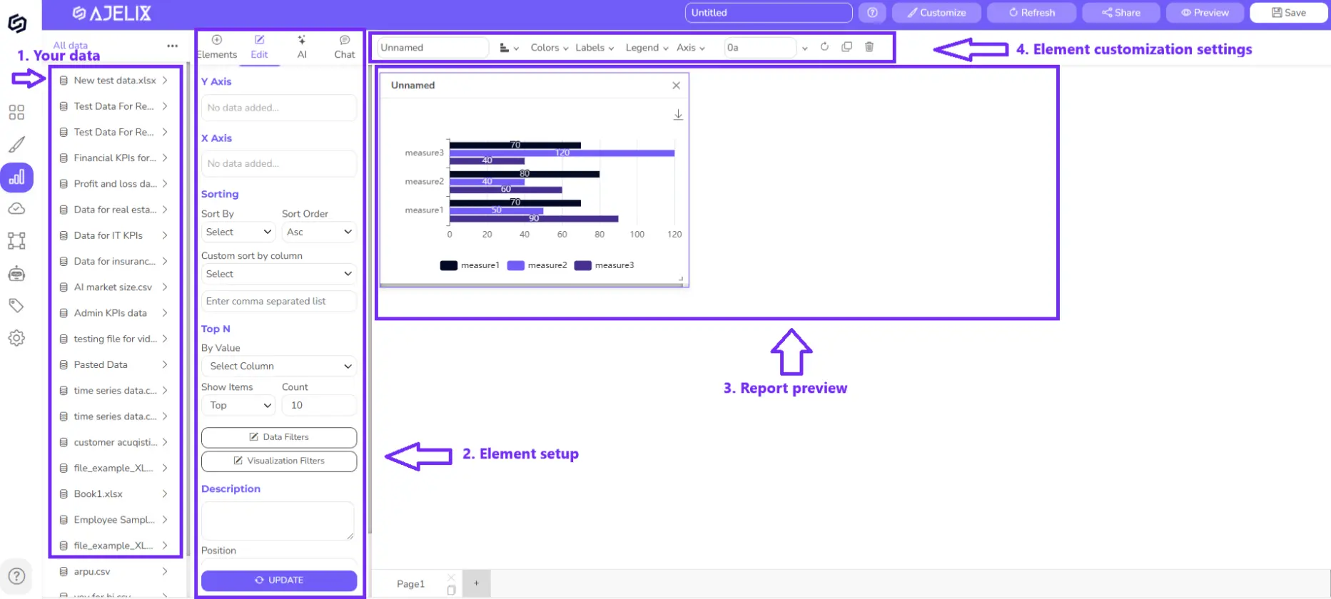
Click on any element to open the element settings. Each element has its element settings where you can:
- Rearrange and rename the X and Y axis by drag and drop functionality.
- Sort columns ascending or descending or set your own criteria
- Set “Top N” value
- Apply filters to a chart or any data
- Add explanations or comments
2. Set up the first element
If you skipped the guide about available ajelix elements, you can read it here.
2.1. Add data to your chart
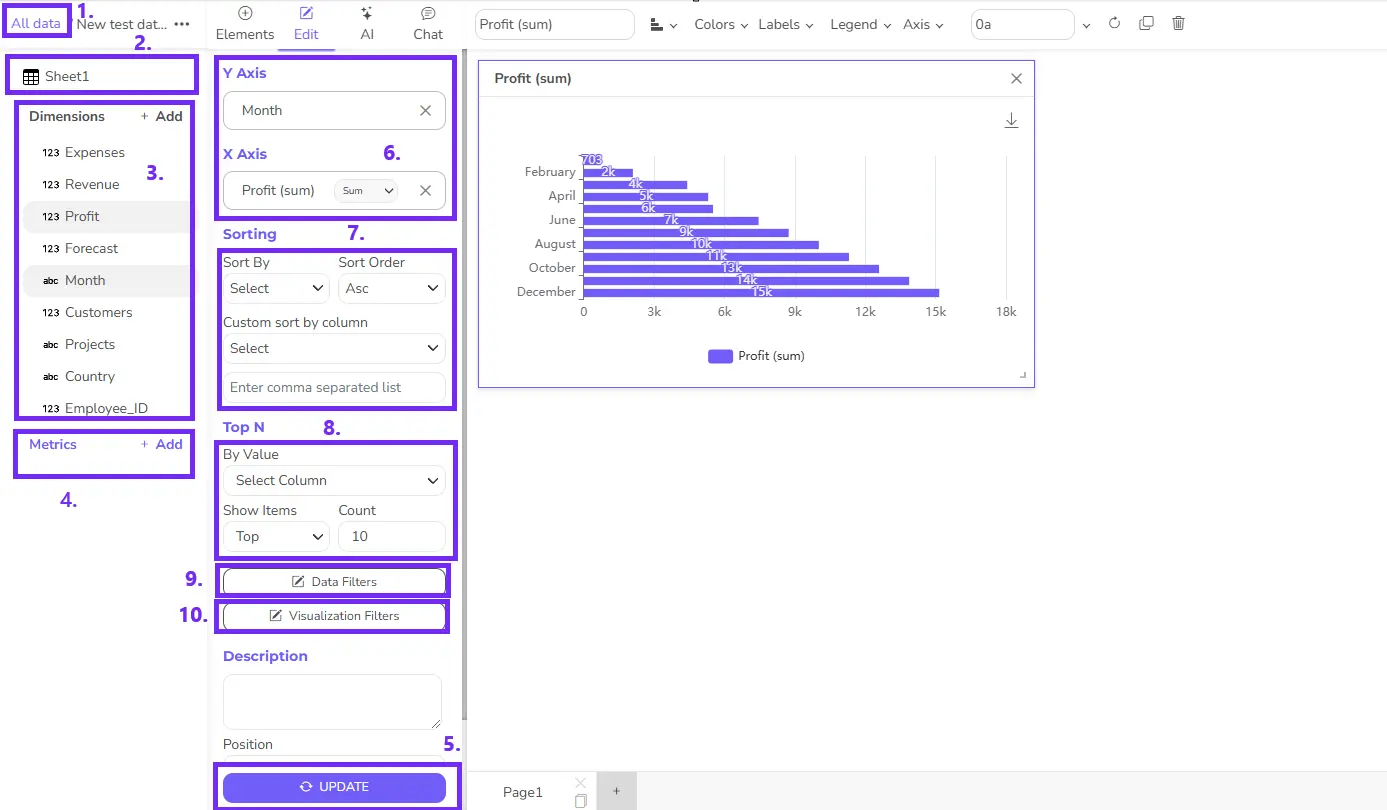
Now, let’s set up the first element settings. We picked the column chart element that we will start editing. Look at the picture below to track the editing step by step.
To create charts, you first have to understand how to add data to your charts.
- Click on any file icon on the left side. The number 1 represents all the data sources you have added to the platform. It can be different Excel files, Google Sheets files or even tables from SQL database.
- Sheet1 indicates the name of the data table; in this case, the data source is Excel and we have opened the first sheet.
- Dimensions are column titles here, you can see all data you had in the data source ready for visualization.
- For example, you want to add the “Month” as a label on the axis and “Profit” as a calculation. There are 2 ways to do that: click on both columns and chart will automatically update with this data, or click and drag the values to X and Y fields.
- Metrics are KPIs and calculations you can create to track ROI or other vital metrics. You can do that in the data preparation step or by clicking on the “Add metric” button. To learn more about creating KPIs and data models visit the data modeling guide.
- Once you have made changes to the chart, click the “Update” button to see the changes in your charts.
- In this field, you can see data that is visualized on the chart. You can change calculations or rearrange them by using the drag-and-drop functionality. You can also rename the column titles or change calculations SUM, AVERAGE, etc.
- The sorting field lets you sort ascending or descending by any label. Sorting custom field gives you the option to set your sorting criteria. For example, you want to rearrange month names in chronic order by separating each label with a comma. Example: Jan, Feb, Mar, etc.
- Top N lets you sort and visualize only top or bottom values. Select the column, for example, “Clicks” and top 10 or 5. Depends on how much you want to visualize.
- Data Filters will filter any column from your data source. For example, if you have visualized a “Month” column but want to filter based on a specific “Project” that is not visualized.
- Visualization Filters will filter the result that is visualized on the chart. For example, if you have added a “Month” column, you can enter a specific month name you don’t want to see in the chart, for example, March, and the filter will remove it.
- Don’t forget to click “Update” 🎯
2.2. Customize elements
Once you have added dat to your chart, it’s time to customize charts to meet your needs. Follow the numbering in the picture to understand the guides better.
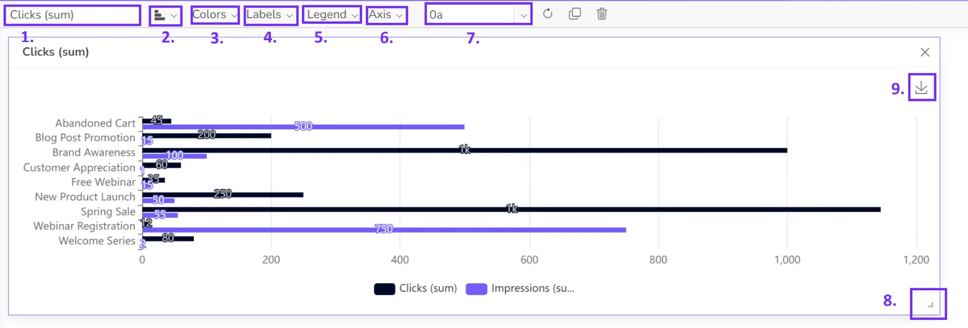
To meet your dashboard needs there are several customization settings you can use. All customization settings for specific element can be found on top toolbar.
- In the first field, you can rename the chart title. If you don’t need a title, delete all text and the title will disappear from the chart.
- In the next dropdown, you can change the chart type to any other, such as, pie chart, line chart or other.
- Select the colors for each category to meet your brand guidelines.
- Customize label settings. Here you can hide labels, change the font size and set colors.
- Legend settings. This feature lets you hide or unhide labels.
- In axis settings you can hide X or Y axis.
- You can set your number formatting in the next field. Set percentage, currency, or any other formatting you need, we have summarized the most popular data types, however, you can visit the custom number formatting guide to create more customized data types.
- Resize any element by dragging the right bottom corner.
- Once you have the charts you can either share a dashboard via link or email or download the chart to insert it in emails or presentations.
Click Save and add the next element. If you enjoy our tool consider subscribing for a monthly or yearly plan (this way you will save 30%) to unlock the premium features.
3. Add another element
Once you’re done with the first element, you can click on Add element in the editor and pick the next element.
Choose from the element list and edit the next element, following the same guides as described above.
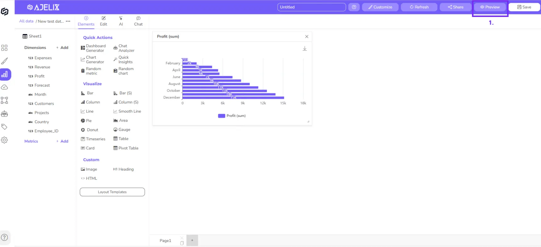
4. Save, Preview, Share
Once your report is ready you can save it, and preview it to see how it looks in full width by pressing on the Preview button at the top right corner. You can also share the report using links, set passwords, or add other users via email.
To learn about data preparation, cleaning, and data preparation & KPI creation, visit this guide.
