Financial Data Visualization Examples and Best Practices
Financial data visualization is taking complex financial information like profits, sales, and expenses and turning it into easy-to-understand charts, graphs, and other visuals. It’s basically about making financial data clear and actionable.
In this article, we’ll dive into the significance of visualizing financial data and explore various visualization techniques. You will uncover key components of effective visualizations and read about best practices and real-life examples for designing impactful data.
Change the way you work with agentic AI
One-click dashboards,KPI tracking, and AI-powered insights—for work that actually gets done.

The Importance of Visualizing Financial Data
Financial data is often intricate and dense, making it challenging to extract insights at a glance. Financial report visualization transforms these numbers into intuitive representations, making data more accessible and understandable for decision-makers. It’s the bridge between raw data and actionable insights.
How Effective Visualization Impacts Decision-Making
Effective visualization for finance isn’t just about creating pretty charts. It’s about conveying information in a way that drives better decision-making. A well-designed visualization can reveal trends, outliers, and correlations that might otherwise go unnoticed, enabling informed choices.
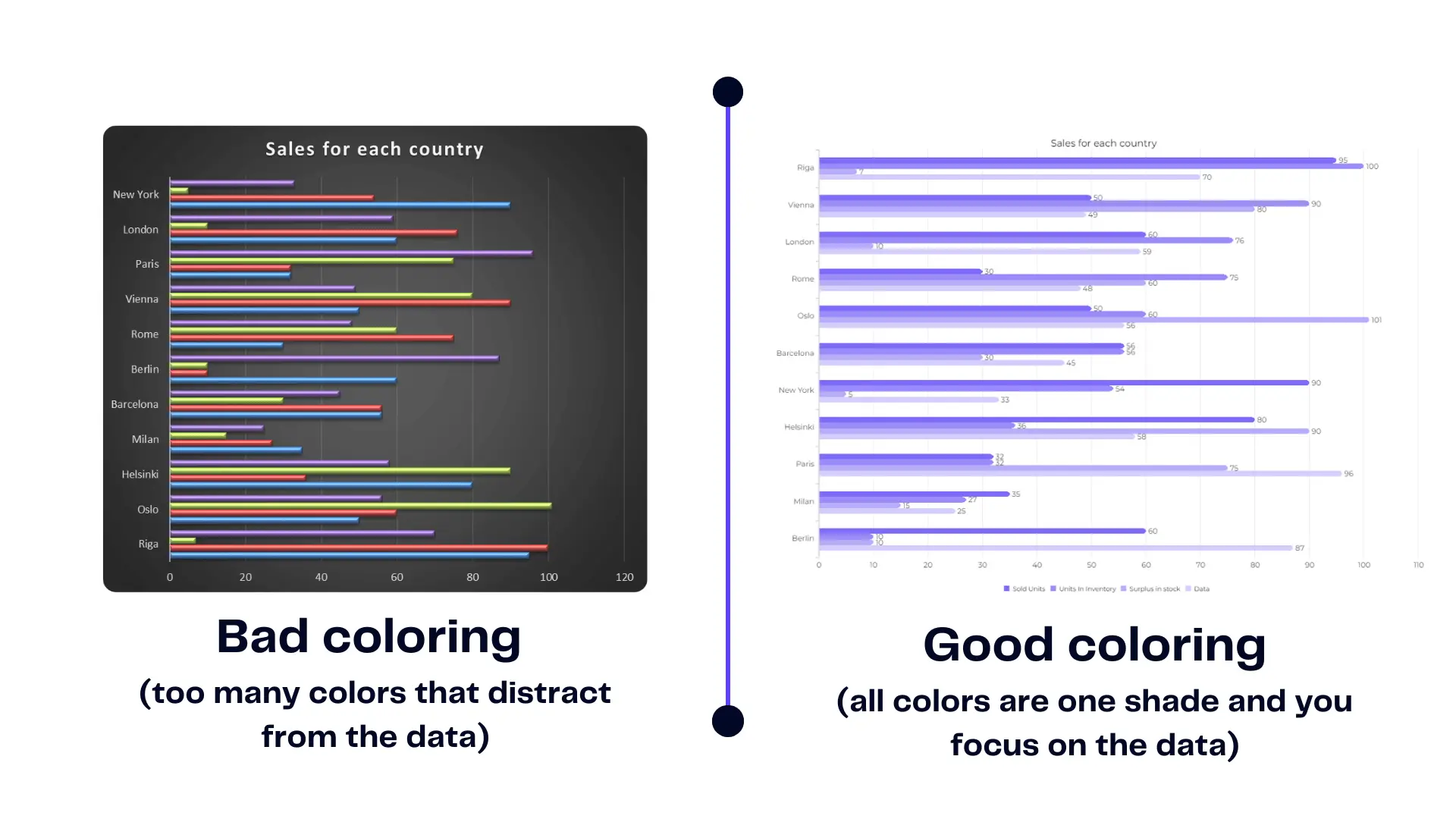
Bad financial data example
What’s the matter of this table? Well, it might be just numbers but…
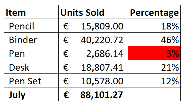
This table is hard to digest and it’s hard to understand the totals and overall situation. Therefore it’s hard to make decisions from this dataset. Just like we discussed in the article data visualization principles human brains process visuals faster and more efficiently.
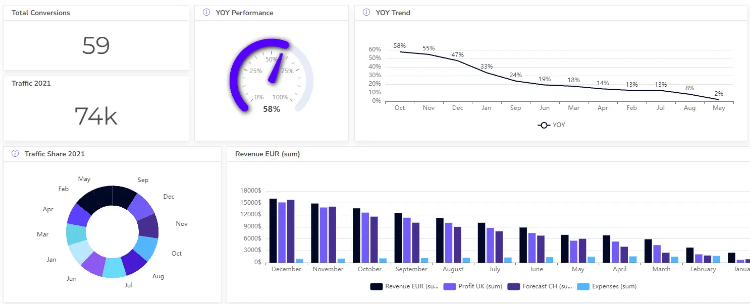
Good data visualization for finance example
This report has a clear goal, it is easy to understand and colors are from one palette.
When creating a financial report infographic you should aim for clear visualization. To help with this process try using visualization tools. AJELIX BI offers such functionality and can help you create professional reports in less than a minute. It will help create financial analysis charts and improve data analysis for finance teams.
Here’s a quick video summary of how to create a report in Excel vs. Ajelix BI:
Types of Financial Data Visualizations
Financial data visualization offers a variety of techniques, from line charts and bar graphs to pie charts and heat maps. Each technique has its own strengths, catering to different types of data and the insights you want to extract.
Depending on what you need to visualize expense tracking, income statement, balance sheet, cash flows, or financial statements. There are lots of financial analytics software and financial tools for data analytics.
Matching Visualization Types to Data Interpretation
Financial data can be complex, but visualizing it effectively can bring clarity and insights. This table provides a roadmap for selecting the most appropriate visualization type for various financial data scenarios. It also acknowledges the challenge of missing data and offers suggestions for handling it within each visualization approach.
| Financial Data Type | Visualization Type | Use Case |
|---|---|---|
| Trends over Time (e.g., Stock Prices, Revenue Growth) | Line Chart | Shows how a value changes over time. Great for identifying trends and seasonality. |
| Area Chart | Similar to line chart, but emphasizes the magnitude of change over time. Useful for visualizing volume or totals. | |
| Comparisons (e.g., Budget vs. Actual Expenses, Market Share) | Bar Chart | Good for comparing different categories at a single point in time. |
| Stacked Bar Chart | Shows how a whole is divided into parts. Useful for visualizing components of a total. | |
| Horizontal Bar Chart | Similar to bar chart, but with categories on the y-axis. Can be easier to read for many categories. | |
| Performance (e.g., Risk-Return Analysis, Portfolio Allocation) | Scatter Plot | Shows the relationship between two variables. Useful for identifying correlations between investments. |
| Bullet Chart | Compares a single value to a target range. Good for performance dashboards. | |
| Composition (e.g., Asset Allocation, Expense Breakdown) | Pie Chart | Shows how a whole is divided into parts. Simpler than stacked bar chart but limited to a few categories. |
| Donut Chart | Similar to pie chart, but emphasizes a specific category within the whole. | |
| Variability (e.g., Stock Price Volatility, Expense Distribution) | Box Plot | Shows the spread and distribution of data points. Useful for identifying outliers. |
Choosing the right chart for your data analytics in finance is a vital part of business data reporting. Choose your financial report graphs wisely and don’t confuse your spectators.
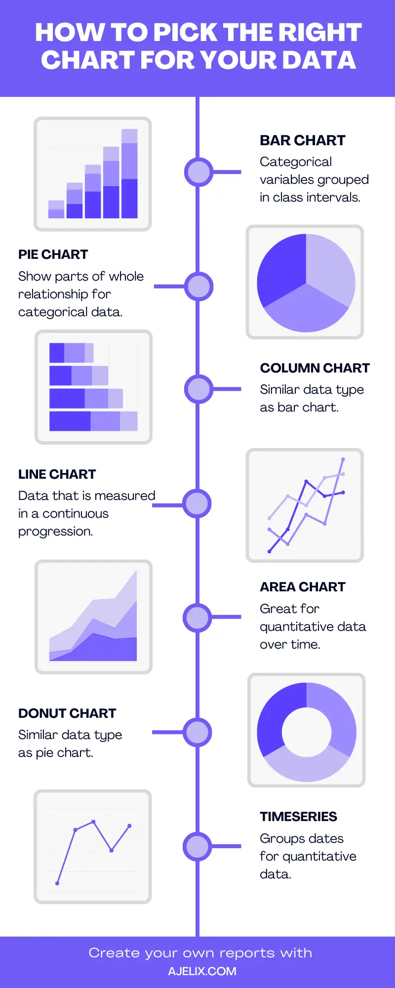
Here’s an infographic explaining which data should you use for each data type:
Best Practices for Designing Financial Data Visualizations
Numbers tell a story, but sometimes that story needs a little help getting across. Financial data, in particular, can be dense and difficult to grasp. Here are the 5 best practices for designing financial data visualizations that bring clarity, engagement, and actionable insights to your financial information.
1. Simplicity in Complexity: Making Data Accessible
- Focus on the message: Ensure your visualization clearly communicates a single key takeaway or insight. Avoid cluttering the chart with too much information.
- Keep it clean: Use clear and concise labels, titles, and legends. Avoid excessive use of colors, fonts, and chart elements that can distract from the data.
2. The Role of Color and Contrast in Enhancing Understanding
Color isn’t just for aesthetics; it’s a tool for communication. Clever use of color draws attention, highlights trends, and conveys meaning. However, balance is crucial – too much color can overwhelm you.
Pick your color palette wisely don’t let the colors overwhelm your viewers. To pick the right color palette use color generators, such as coolors.co. Or use data visualization tools such as ajelix.com that will help you build charts and graphs automatically and generate color pallets from your colors.
3. Accuracy and Data Integrity
- Double-check your data: Ensure the data used in the visualization is accurate and free of errors.
- Proper data representation: Choose the visualization type that best represents the type of data you have (e.g., line charts for trends, bar charts for comparisons).
- Consider data limitations: Be mindful of missing data and outliers, and disclose how you handled them in the visualization.
4. Data Hierarchies for Effective Communication
Visualizations often comprise multiple elements. Hierarchy helps viewers focus on important information first, ensuring they understand the main point before looking at details.
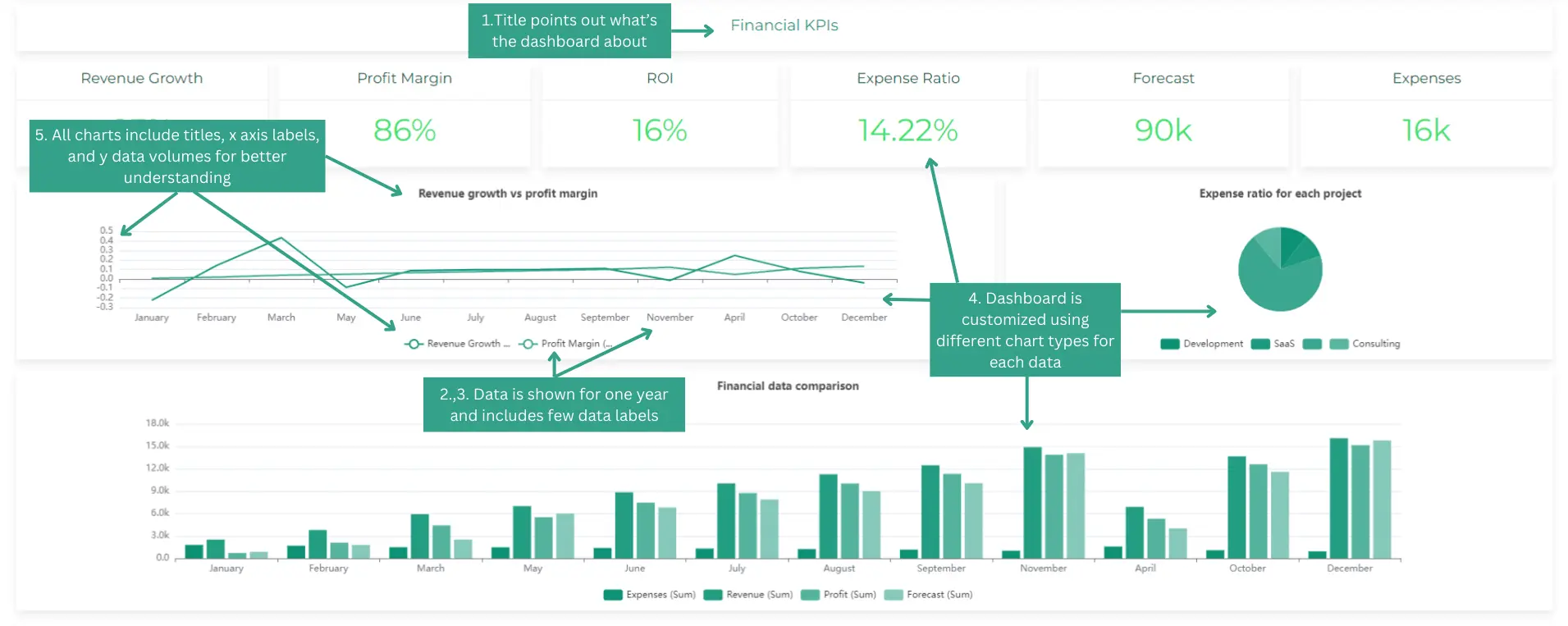
5. Effective Communication
- Target your audience: Tailor the complexity of the visualization to the audience’s financial literacy.
- Use color strategically: Colors can highlight important data points or categories, but avoid using too many colors or color schemes that are difficult to distinguish, especially for viewers with color blindness.
- Context is key: Provide context for the data by including relevant information like timeframes, units, and comparisons.
Additional Best Practices
- Interactivity can be powerful: Consider interactive visualizations and digital dashboards that allow users to explore the data further.
- Accessibility matters: Use visualizations that are accessible to people with disabilities, such as ensuring proper color contrast and providing alternative text descriptions for chart elements.
- Design for impact: Pay attention to aesthetics and design principles to create visually appealing and impactful visualizations.
By following these best practices, you can create financial data visualizations that are clear, informative, and drive better decision-making.
Tools for Financial Data Visualization
Financial data visualization tools range from spreadsheets to specialized platforms like Tableau and Power BI. These tools require advanced training and data analytics knowledge it might not be for everyone. The choice depends on the complexity of your data and the level of interactivity you need. AJELIX BI is great financial tool for finance data visualization.
There are many tools available for financial data visualization, catering to different needs and technical expertise. Here’s a range of options to consider:
- Business Intelligence (BI) Tools (Ajelix BI, Tableau, Power BI, Qlik): Powerful tools with drag-and-drop interfaces for creating interactive and complex financial dashboards.
- Spreadsheets (Excel, Google Sheets): These offer basic charting functionalities suitable for simple visualizations.
- Presentation Software (PowerPoint, Keynote): Useful for creating presentations that incorporate financial data visualizations.
- Scripting Libraries (Python libraries like Matplotlib, Seaborn): Offer more customization and require programming knowledge.
- Financial Data Analysis Platforms (Bloomberg, Thomson Reuters Eikon): Often include built-in data visualization tools specifically designed for financial data.
- Online Data Visualization Tools (Data Studio, Canva): User-friendly options for creating basic to intermediate visualizations without needing extensive technical knowledge.
Reporting gives you a headache?
Upload your data and create professional reports with agentic AI
Start free
Try free and upgrade whenever
AI Financial Data Visualization
Artificial Intelligence (AI) is changing data visualization. Machine learning can analyze big data, find patterns, and provide valuable insights, helping us make informed decisions based on data. Learn more about AI data visualization with Ajelix BI.
Financial data visualization AI features:
- Dashboard generator – automatically creates digital report from your data
- Chart generator – write a prompt and AI will create a chart for you
- Chat analysis – chat about your data with AI and get deeper analysis.
- Explore AI analysis features more deeply.
How To Create Effective Financial Data Visualizations?
Time needed: 8 hours
Crafting a compelling data visualization involves understanding your data, choosing the right format, and presenting it. Here’s a breakdown to guide you:
- Define Your Goal
What message or insight do you want your visualization to convey?
Who is your audience? Tailor the complexity to their level of understanding. - Prepare Your Data
Gather and clean your data, ensuring accuracy and consistency.
Identify data types (categorical, numerical, dates) to determine suitable visualizations.
Consider how you’ll handle missing data points (exclude, estimate, etc.). - Choose the Right Visualization Type
Refer to the table from our previous discussion to match your data type with effective visualization options (e.g., line charts for trends, bar charts for comparisons).
Consider the visual hierarchy – what elements should stand out the most? You can use data visualization tools for this matter, such as ajelix.com to create reports automatically. - Design for Clarity and Usability
Labels and Titles: Use clear and concise labels for axes, data points, and legends.
Color: Employ color strategically to differentiate categories or highlight important data points. Avoid excessive or confusing color schemes.
Formatting: Maintain consistent formatting throughout the visualization for a polished look.
White Space: Don’t clutter the chart – allow space for elements to breathe and be easily read. - Focus on Effective Communication
Context Matters: Provide context for the data by including relevant information like timeframes, units, and comparisons.
Source Your Data: Mention the data source to establish credibility.
Accessibility: Ensure the visualization is accessible for people with disabilities (e.g., proper color contrast, alternative text descriptions). - Refine and Iterate
Take a step back and evaluate the overall effectiveness. Does the visualization clearly convey your message?
Get feedback from colleagues or potential viewers to identify areas for improvement.
Refine based on feedback and iterate until you achieve a clear and impactful visualization.
By following these steps and incorporating best practices, you can transform complex data into engaging and informative visualizations that empower better decision-making.
Conclusion
Financial data visualization is the fusion of art and science. It transforms complex data into understandable visuals, empowering decision-makers to navigate the intricate world of financing activities confidently.
In a rapidly changing financial landscape, the ability to extract insights from data is a strategic advantage. Visualization isn’t just a tool; it’s a necessity for those seeking to thrive in an era where data rules. Every company management should track financial performance.
Ready to give it a go?
From data to report in one minute or less with Ajelix AI Agent