Julius AI Alternatives: Top 5 Choices 2026

If you’re exploring tools that match (or exceed) Julius AI’s features, this article is for you. Let’s examine five Julius AI alternatives that may better align with your goals, budget, and workflow.
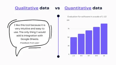
Tools like Julius offer a quick way to analyze data. However, as teams grow and their needs evolve,...