Visualizing Quantitative Data: Best Practices
In an age where data rules the roost, harnessing its potential has become paramount. Enter data visualization, the art and science of representing data in graphical form, transcending numbers into insightful visual narratives.
The Importance of Data Visualization
Data Visualization is the art of transforming complex data into visual representations, and its importance cannot be overstated in our data-driven world. At its core, it serves as a bridge between raw data and human comprehension.
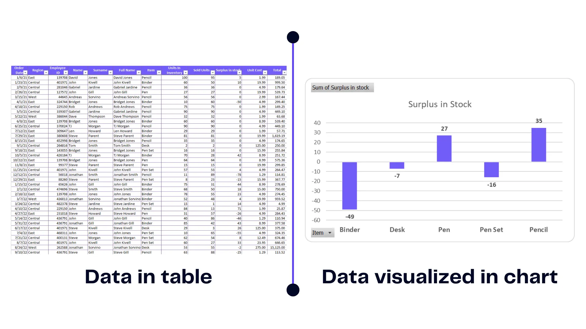
Comparison between data in table vs. data visualized in chart. Image Credit: Ajelix
This visual storytelling aids decision-making, as it enables quick, informed choices and better communication.
What is Quantitative Data?
Quantitative data is the numerical essence of information, dealing with measurable quantities rather than descriptions. Quantitative data include figures like ages, temperatures, and income. Basically, anything that you can summarize in a graph.
What is Quantitative Data Visualization?
Quantitative data visualization transforms numerical data through charts, graphs, and visual aids. It’s the bridge between complex data and human understanding, simplifying the comprehension of intricate numerical relationships.
What’s The Difference Between Quantitative Data and Qualitative Data?
Quantitative data and qualitative data are two distinct pillars of data analysis. Quantitative data deals with measurable quantities, such as numerical figures, providing a solid basis for statistical analysis.
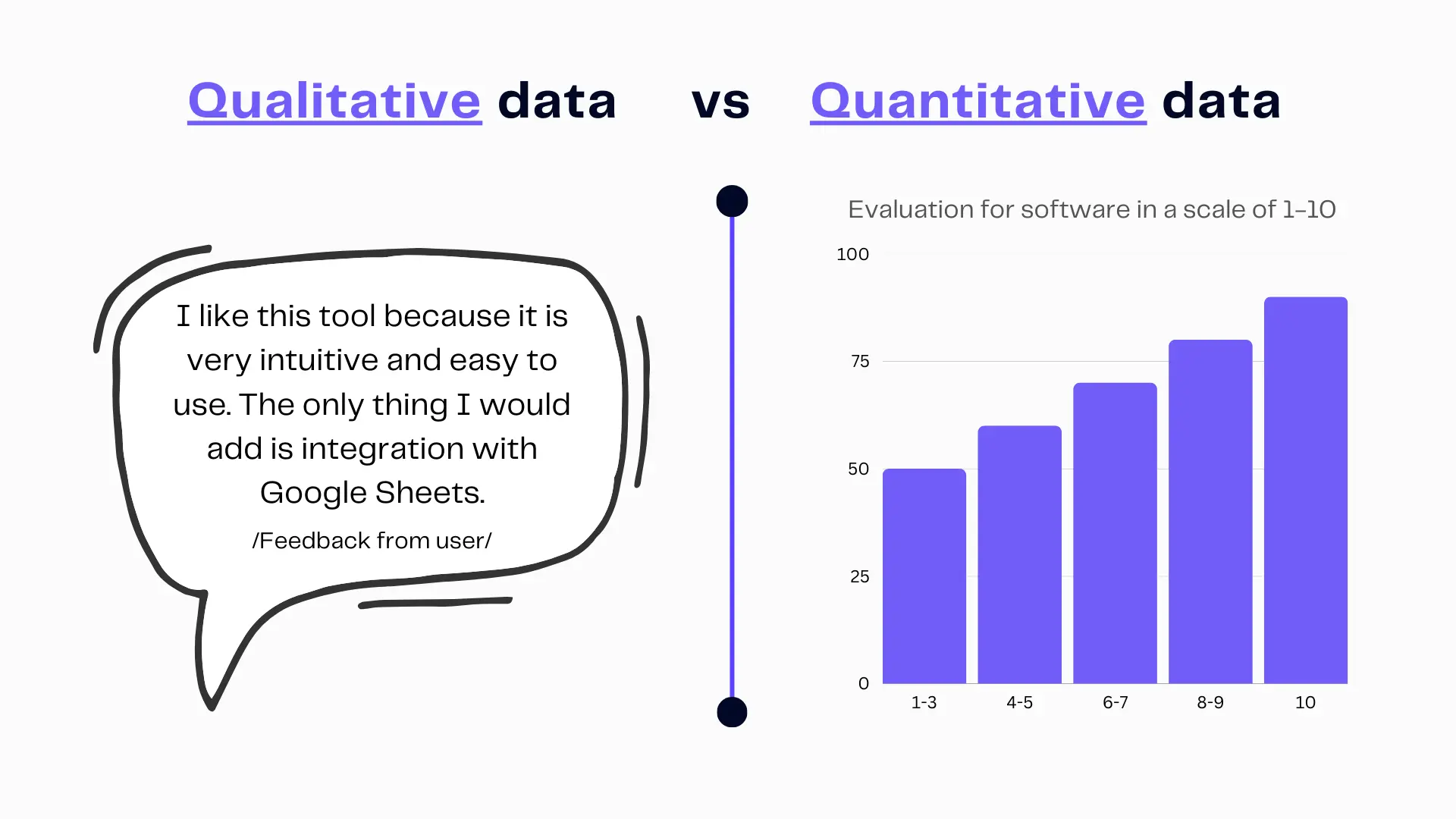
Difference between qualitative data and quantitative data. Image Credit: Ajelix
Qualitative data, on the other hand, deals with descriptive attributes, often involving words, providing richer context and insights. The difference lies in the nature of the data; one is numeric, while the other is descriptive.
Selecting the Right Chart For Qualitative Data
Understanding Different Chart Categories
Charts come in various forms, each suited to specific data types and presentation needs. Get acquainted with the different categories of charts and their applications.
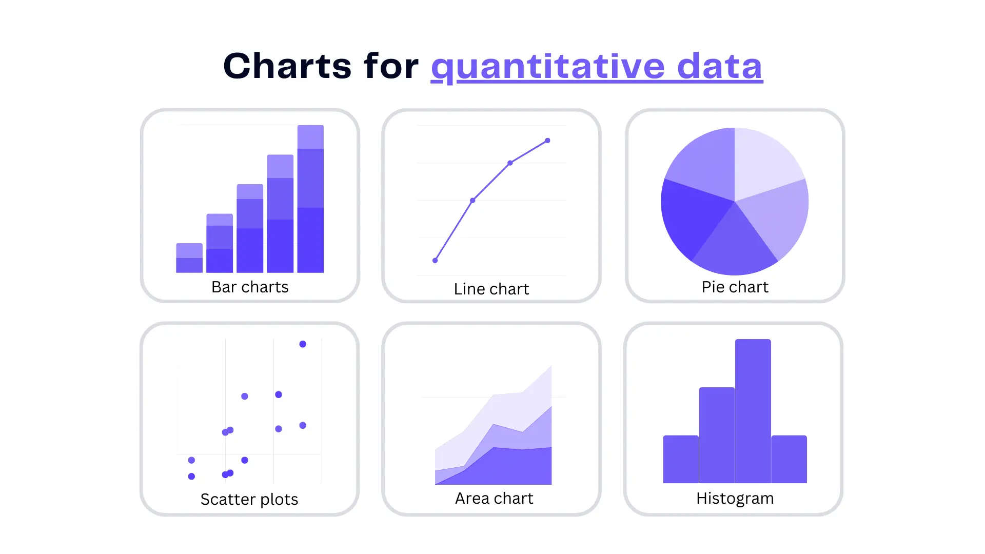
Quantitative data chart types include, bar charts, line charts, pie charts, and others. Image Credit: Ajelix
Bar Charts: When and How to Use Them
Bar charts are a great way to compare in data visualization, ideal for comparing data across categories. When comparing the revenue of various product lines over a quarter, a bar chart provides an immediate, structured overview.
The key to crafting impactful bar charts lies in mastering the art of selection and arrangement. Here’s a quick summary of how to set up a bar chart in Excel and Ajelix BI:
Line Charts: Visualizing Trends and Patterns
Line charts are the go-to choice for tracking trends over time. These charts elegantly connect data points with lines, making it easy to discern trends over time. For instance, an example of a line chart can unveil stock price fluctuations, aiding investors in making informed decisions. Here’s a quick summary of how to create a double-line chart in Excel and Ajelix BI:
Pie Charts: Breaking Down Parts of a Whole
Pie charts are excellent for showcasing proportions within a whole. A pie chart, a consummate choice for data visualization, artfully dissects a whole into components. For instance, consider an example in demographics, where a pie chart elegantly showcases the ethnic makeup of a region, providing clear insights into diversity and distribution. Here’s how to create one:
Scatter Plots: Analyzing Relationships and Correlations
Scatter plots allow you to explore relationships between two variables. Dive into the intricacies of creating meaningful scatter plots.
Histograms: Uncovering Data Distribution
Histograms provide insights into data distribution. Learn how to create them to reveal patterns and anomalies in your dataset.
Heatmaps: Depicting Data Density
Heatmaps offer a visual representation of data density. These graphic representations offer valuable insights, displaying intensity through color gradients. For instance, an example in weather forecasting showcases a heatmap illustrating temperature fluctuations across a geographic region, empowering meteorologists with a nuanced understanding of climate patterns.
Designing Effective Visualizations
Principles of Effective Data Visualization
Great data visualizations adhere to certain principles. Effective data visualization hinges on key principles that illuminate complex information. Quantitative data visualization demands precision and clarity. Here are a few tips to keep in mind:
- Begin with data integrity, ensuring accuracy and reliability.
- Choose appropriate charts or graphs, aligning with your data’s narrative.
- Embrace the principle of simplicity, removing clutter, and distractions.
- Employ color and scale judiciously to highlight patterns.
- Consistency in labeling and scales enhances comparability.
- Storytelling through visual elements makes your message resonate.
- Consider your audience, tailoring your visualizations for maximum impact.
- Ultimately, these principles form the bedrock of conveying data meaningfully, providing insights that drive informed decisions.
Selecting Colors and Color Schemes
Colors can enhance or detract from the effectiveness of your visualizations. Delve into the psychology of color and choose schemes that convey your message optimally.
Labels and Annotations: Adding Context
Clear labeling and annotations provide context to your data visualizations. Learn the art of effective labeling to guide your audience’s interpretation.
Incorporating Interactive Elements
Interactive elements can breathe life into your visualizations. Explore the world of interactivity and engage your audience on a deeper level. Learn more about it in our article about interactive visualization.
Sharing Your Visualizations
Collaborative Data Visualization
Collaboration enhances the quality of your visualizations. Learn how to collaborate effectively with others in this journey.
Incorporating AI
Explore the fusion of AI and machine learning with data visualization, enhancing the depth of your insights. Learn more about it in our blog article about AI data analytics or watch a video below to see it in action:
Level Up Your Data Visualization With Ajelix BI
Crafting reports and charts within Excel spreadsheets can feel overwhelming, especially if it’s not your forte. Effectively utilizing Microsoft Excel often necessitates specialized training, consuming valuable time. Scouring the internet for guides only adds complexity. Consider more easy to use tool for visualization:
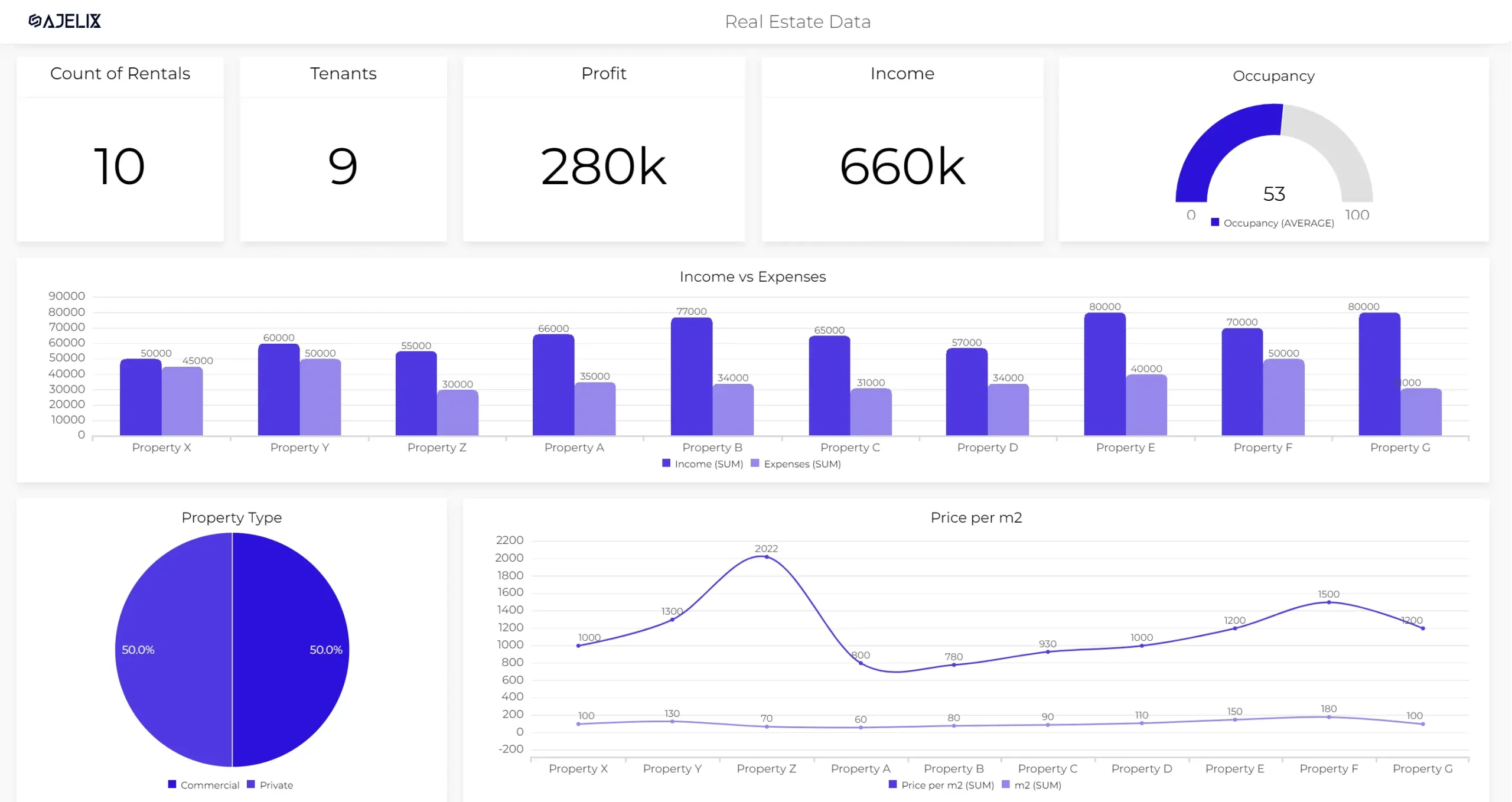
Data visualization dashboard in Ajelix BI
Shifting Data Visualization
Say goodbye to the days when report creation was a burdensome task, all thanks to Ajelix BI’s automatic data visualization capabilities.
With Ajelix BI, the laborious process of uploading Excel files and selecting templates vanishes. In seconds, you effortlessly generate polished, professional reports. Empowered by artificial intelligence, you delve deep into data, extracting insights that seamlessly transform into impactful charts, ready for effortless sharing with your colleagues.
Conclusion
The Power of Quantitative Data Visualization
Data visualization is a powerful tool that can unlock the hidden stories within data, offering a transformative impact across various fields.
Taking Your Skills to the Next Level
With this step-by-step guide, you’re well on your way to becoming a proficient data visualizer. As you refine your skills and explore the ever-evolving world of data visualization, remember that the journey is just as rewarding as the destination.
Ready to create your reports with Ajelix BI?
From data to report in one minute or less with Ajelix AI Agent