Dynamic Reports in Excel: How to Build Interactive Reports

Creating comprehensive, informative reports in Excel is a key part of any business. It helps to provide insight into data sets, trends, and patterns that can be used to make more informed decisions. Excel is a powerful tool for data analysis and report creation, but it can be difficult to create dynamic and interactive charts and reports that produce meaningful insights. In this article, we’ll discuss how to create dynamic charts and reports in Excel.
Dynamic reporting involves creating reports with interactive elements that enable users to quickly and easily explore data sets and identify trends. Dynamic reports provide more insight than static reports as users can explore data sets in more depth. Excel provides several features that allow users to create dynamic reports, including pivot tables, slicers, and conditional formatting. Let’s take a closer look at each of these features and how they can be used to create dynamic reports.
For more advanced data visualization you should look for tools such as Microsoft BI. Read our article and learn more about this tool and how can it help you.
Pivot Tables for Reporting
Pivot tables allow users to quickly summarize, analyze, and explore data sets. They enable users to transform data into meaningful insights by grouping and sorting data, creating calculations, and filtering data.
Read more insights about power pivot to analyze data in Excel. With pivot tables, users can quickly explore data sets, identify trends, and build interactive reports. Find out about pivot tables in our article.
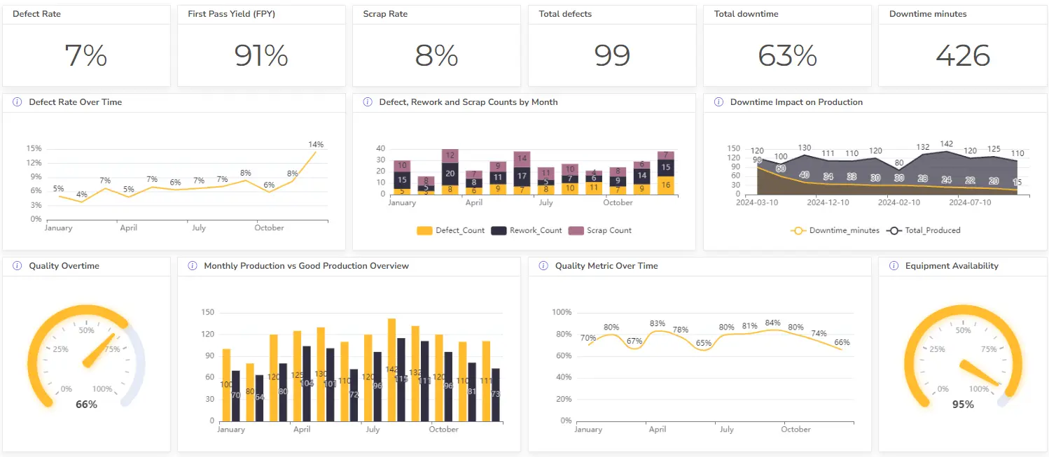
Build interactive reports from Excel files with Ajelix BI
If you’ve ever found yourself drowning in a sea of data within Excel spreadsheets, you’re not alone. Excel is a powerful tool, but when it comes to transforming raw data into meaningful insights, it often falls short. That’s where Ajelix BI steps in, revolutionizing the way you work with data.
With Ajelix BI, you can seamlessly bridge the gap between static spreadsheets and dynamic, interactive reports. No more sifting through endless rows and columns. We’ve built this solution to transform your mundane Excel files into captivating BI data visualizations. Here’s a quick peek:
Picture this: You upload your Excel file into Ajelix BI, and like magic, it transforms into an interactive dashboard. You can effortlessly drill down into your data, uncovering hidden trends and outliers with AI. It’s like having a data analyst at your fingertips.
Interactive reports powered by Ajelix BI are a game-changer. They allow you to explore your data intuitively, providing deeper insights with just a few clicks. Whether you’re a business analyst, marketer, or financial wizard, this tool empowers you to make data-driven decisions with confidence.
Try Ajelix freemium and start creating reports
In a world where data is king, Ajelix BI reigns supreme, turning your static spreadsheets into dynamic, actionable insights. Say goodbye to Excel’s limitations and hello to a new era of data visualization.
Slicers for Dynamic Reports
Slicers are interactive filters that quickly and easily filter data sets. If you’re trying to create easy a dashboard that is easy to understand then make sure to read our blog about excel organization. By setting up slicers, users can quickly filter data sets to reveal key insights. Slicers can be used to filter data by specific categories, such as date, region, or product. Here are a few tips on how you can use slicers in Excel for dynamic reporting:
- Create a pivot table with a slicer to easily filter the data by date and show different values over time.
- Build a dynamic dashboard with multiple charts that are all connected to a slicer. This allows you to change the data in the charts by selecting different values in the slicer.
- Use a slicer to filter data from a pivot table and create a chart that shows the filtered data.
- Create a slicer with multiple options for users to view different data in a chart.
- Use a slicer to dynamically filter data in a table and graph. This allows users to easily switch between different types of data or subcategories.
- Set up a slicer to compare data from different regions or countries and show the results in a chart.
- Connect multiple slicers to show different combinations of data in a chart.
- Create a slicer that shows different outcomes of a scenario. It allows us to experiment with different scenarios and see the results quickly.
We’ve created a summary of Excel built-in tools that you can use to format your sheets, make sure to read it.
Conditional formatting for dynamic reports
Conditional formatting allows users to quickly identify patterns and trends in data sets by highlighting specific values or ranges of values. For example, users can quickly identify cells that are above or below a certain value. This is a great way to explore data sets and identify important trends and insights quickly.
More insights on how you can use conditional formatting in Excel:
- Color-code cells based on their value. For example, if you have a range of cells that shows sales figures, you could use conditional formatting to color-code cells with the highest sales figures in green and cells with the lowest sales figures in red.
- Create data bars to represent the relative value of each cell. If you have a range of cells showing product prices, you could use conditional formatting to create a data bar for each cell that indicates the relative value of that product.
- Create icons to represent the relative value of each cell. For example, if you have a range of cells showing product ratings, you could use conditional formatting to create an icon for each cell that indicates the relative rating of that product.
- Use rules to highlight duplicate values. If you have a range of cells showing customer names, you could use conditional formatting to highlight cells with duplicate customer names.
- Use rules to highlight cells that meet specific criteria. For example, if you have a range of cells showing customer ages, you could use conditional formatting to highlight cells with customers aged 18-25.
- Use rules to highlight cells that fall outside of specific criteria. If you have a range of cells showing customer ages, you could use conditional formatting to highlight cells with customers aged outside of 18-25. Learn about conditional formatting in our blog.
Conclusion
Combine these features to create dynamic reports that provide meaningful insights into data sets. Another way of creating dynamic reports is to write a VBA code in your workbook our introduction to VBA programming might help you. If you’re struggling with the code try leveraging AI to generate code for you.
Dynamic reporting is an invaluable tool for businesses, providing insight into data sets, trends, and patterns that can be used to make more informed decisions. Excel provides several features that allow users to create dynamic reports, including pivot tables, slicers, and conditional formatting. By combining these features, users can quickly explore data sets and identify key trends, helping them to gain valuable insights into their data sets. In case you want more advanced dynamic reporting solutions you should look for an advanced Excel expert who can help you. Read our blog article on how to find the right Excel expert Or read a quote about Dynamic report creation and find information about our services.
Learn more about Excel and Google Sheets hacks in other articles. Stay connected with us on social media and receive more daily tips and updates.
Speed up your spreadsheet tasks with Ajelix AI in Excel