How To Create Pivot Tables In Excel

Excel Pivot Tables are an incredibly powerful tool for data analysis. They allow you to quickly and easily summarize and analyze large sets of data, making it easy to identify patterns, trends, and insights that would be difficult to spot using other methods. In this tutorial, we will cover the basics of using pivot tables in Excel, including how to create and customize them, as well as some advanced tips and tricks for getting the most out of your data analysis.
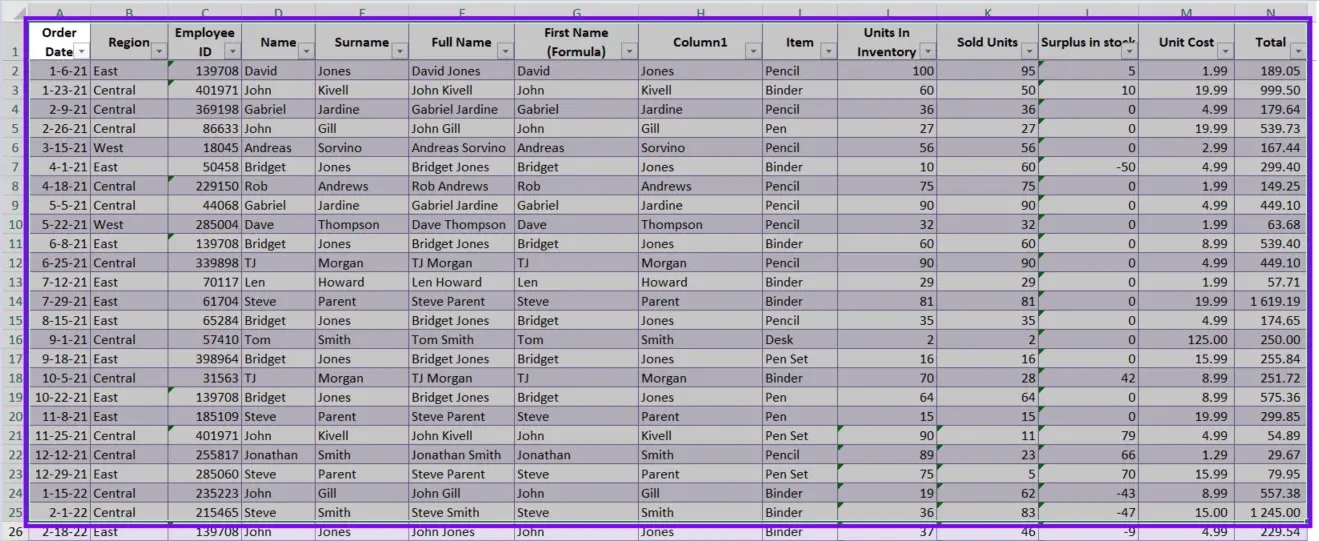
Before we get started, it’s important to note that pivot tables work best with data that is organized in a tabular format, with rows and columns. If your data is not already in this format, you may need to spend some time cleaning and organizing it before you can create a pivot table.
Creating a Pivot Table
Time needed: 5 minutes
How To Create A Pivot Table in Excel
- Select the Data
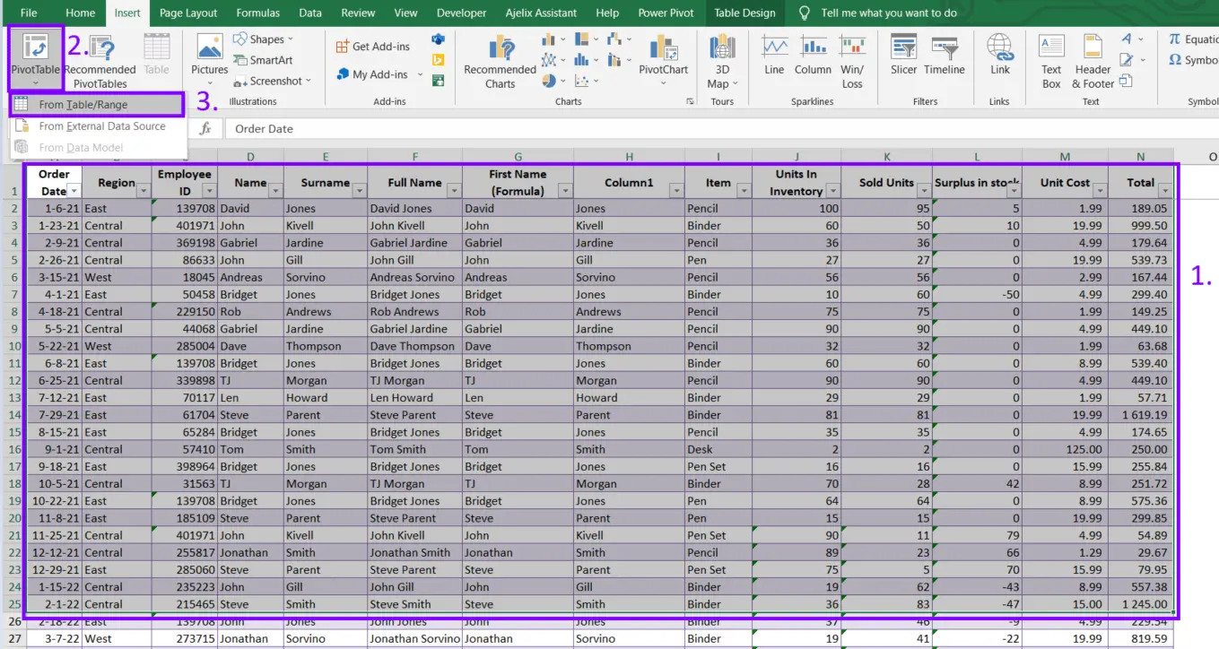
To create a pivot table in Excel, first, select the data that you want to analyze. This can be a single sheet or a range of cells.
- Insert Pivot Table
Once your data is selected, go to the “Insert” tab in the ribbon and click on “PivotTable.” This will open the “Create PivotTable” dialog box.
- Choose the location for the Pivot table
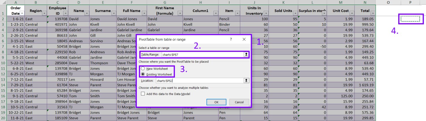
In the dialog box, you will be prompted to select the location for your pivot table. You can choose to create a new worksheet for your pivot table or place it in an existing worksheet. Once you have selected a location, click “OK.”
- Set up your Pivot Table
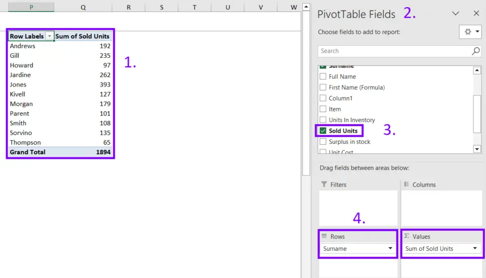
Your pivot table will now be created, and you will be taken to the “PivotTable Fields” pane on the right side of your screen. This page is where you will add the fields (columns) from the data that you want to analyze. To add a field to your pivot table, simply drag and drop it from the “PivotTable Fields” pane to one of the four areas: Rows, Columns, Values, or Filters.
Related Article: How To Remove Conditional Formatting?
Customizing a Pivot Table
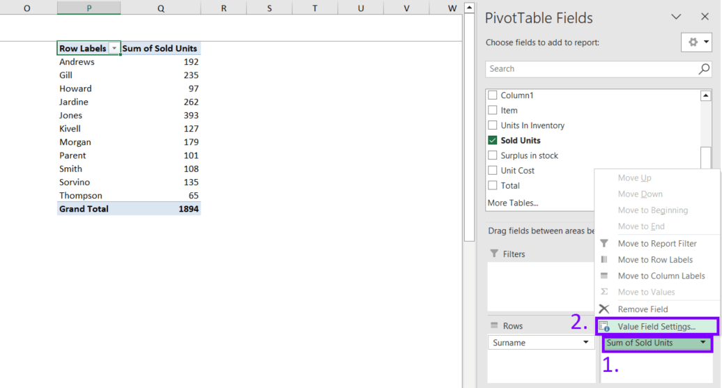
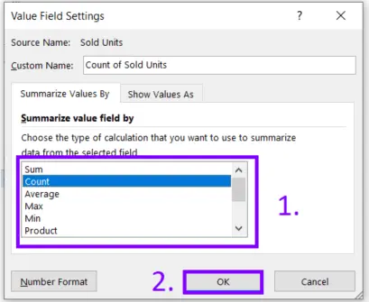
Once you have added fields to your pivot table, you can begin to customize it to suit your needs. One of the most common ways to customize a pivot table is to change the way that data is summarized. By default, Excel will automatically summarize data using the Sum function, but you can change this to other functions like Count, Average, Max, or Min. To change the summary function, simply click on the field in the Values area and select “Value Field Settings”
The pop-up window will show. Now you can select the function you want to use from the dropdown menu and set it for your Pivot Table.
You can also change the layout of your pivot table by dragging and dropping fields between the Rows, Columns, and Values areas. This can be useful for highlighting different aspects of your data or for comparing different groups of data.
Related Article: How To Make Contingency Table in Excel?
Advanced Pivot Table Tips and Tricks
Once you have a basic understanding of how to create and customize pivot tables, there are a few advanced tips that can help you get even more out of your data analysis.
One of the most powerful features of pivot tables is the ability to filter data. You can use the Filters area to limit the data that is included in your pivot table based on specific criteria. For example, you can filter data based on a date range, a specific value, or a specific category.
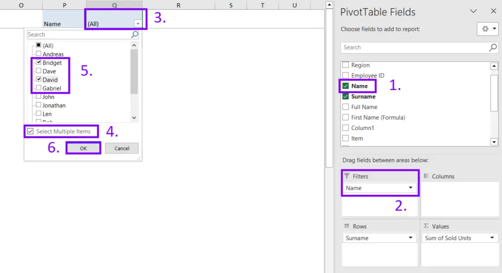
In the example, you can see how to set filter criteria based on a specific range. In step 1 you should choose which data will be filtered, then drag it in the “Filters” row. Step 3 is a dialog box for filtering options and in step 5 you can start filtering data.
Another useful feature of pivot tables is the ability to create calculated fields. These are fields that are calculated based on other fields in your pivot table. For example, you could create a calculated field that calculates the percentage of total sales for each category. To create a calculated field, go to the “Options” tab in the ribbon and click on “Formulas.”
Related Article: How To Calculate Profitability in Excel?
Finally, you can also use pivot tables to create charts and pivot charts. These are graphical representations of your data that can help you quickly and easily spot patterns and trends. To create a pivot chart, simply click on the “PivotChart” button in the “Analyze” tab in the ribbon. This will open the “Insert Chart” dialog box where you can select the type of chart you want to create. Once you have selected a chart type, you can customize it by adding or removing data series and adjusting options.
Related Article: How To Create Excel Template?
Conclusion
Pivot tables in Excel are a powerful tool for data analysis that can help you quickly and easily summarize and analyze large sets of data. By following this tutorial, you should now have a solid understanding of how to create and customize pivot tables, as well as some advanced tips and tricks for getting the most out of your data analysis.
Pivot tables work best with data that is organized in a tabular format, so it is important to spend some time cleaning and organizing your data before creating a pivot table. With practice and experimentation, you will be able to master the use of pivot tables in Excel and use it to gain insights from your data.
Related Article: Is Microsoft Excel Still Relevant in 2023?
Learn more about Excel and Google Sheets hacks in other articles. Stay connected with us on social media and receive more daily tips and updates.
Speed up your spreadsheet tasks with Ajelix AI in Excel


