How To Make a Contingency Table In Excel

Contingency tables are a crucial tool in data analysis, used to organize and summarize the relationship between two categorical variables. These tables provide a visual representation of the data, making it easier to draw conclusions and make informed decisions.
During this article, we will provide a step-by-step guide on how to create a contingency table in Excel.
What Is a Contingency Table in Excel?
Excel contingency table is a grid that summarizes the relationship between two categorical variables by showing how often each combination of categories occurs in your data.
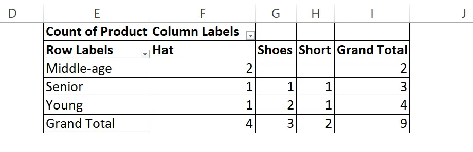
Contingency table example from Excel, image by author
How To Create a Contingency Table in Excel?
Time needed: 10 minutes
Here’s a step-by-step guide on creating a contingency table in Excel
- Prepare Your Data
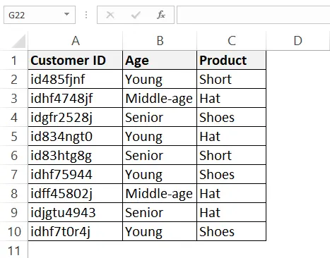
Contingency tables analyze relationships between categorical variables. Ensure your data is organized into columns where each column represents a category (e.g., gender, age group, product type).
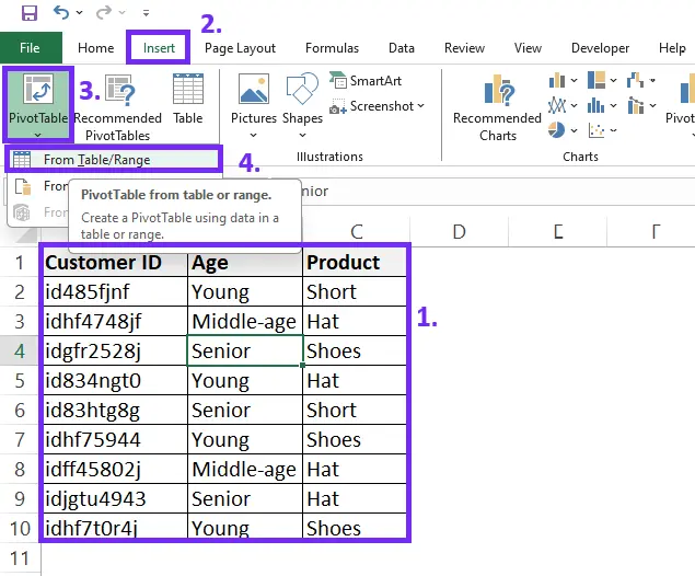
- Insert the PivotTable
Navigate to the worksheet containing your data. Click the Insert tab. In the Tables group, click PivotTable.
- Create the Table
A dialog box will appear. Here’s what to do:
1. Select the data source: In the Table/Range field, enter the cell range of your data table (e.g., A1:C10).
2. Choose the output location: Existing worksheet: Select this option if you want the contingency table on the current sheet. Choose a cell where you want the table to appear.
3. New worksheet: This creates a new sheet for the table.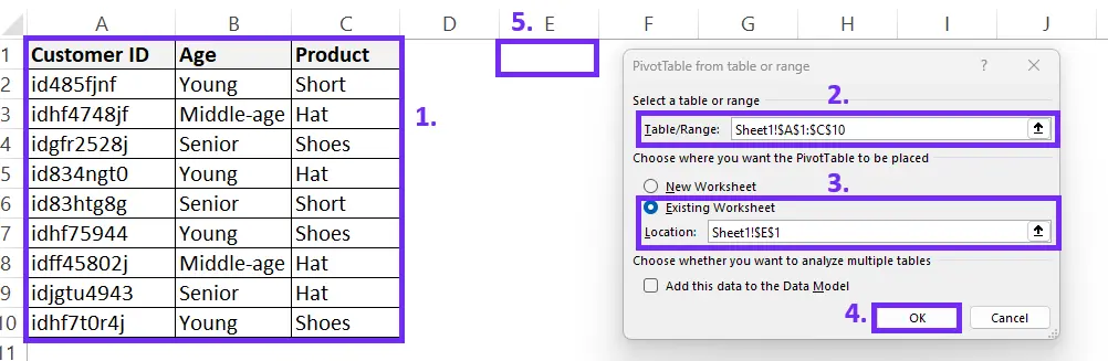
- Build the Contingency Table
The PivotTable Fields pane will appear on the right side of your screen. This is where you drag and drop fields to build your table.
Drag the field representing the row category (e.g., gender) to the Rows area of the PivotTable Fields pane.
Drag the field representing the column category (e.g., product purchased) to the Columns area of the pane.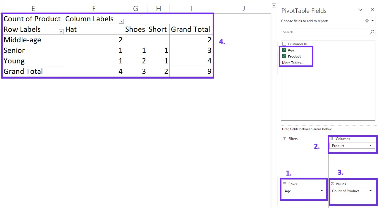
- Calculate Values (Optional)
By default, the table shows counts (number of occurrences) in each cell. You can change this:
Click on any value in the table.
In the PivotTable Analyze tab, click Summarize Values By.
Choose a different summary function like Sum, Average, or Percentage.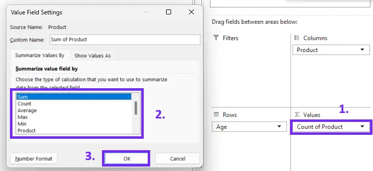
- Customize Your Table (Optional)
Formatting: You can format the table like any other table in Excel. Change fonts, borders, and cell colors to enhance readability.
Grand Totals: Right-click on any row or column header and select Show Values > Show All to display grand totals.
Tip: You can drag additional fields to the Filters area of the PivotTable Fields pane to filter the data and analyze specific subsets.
How To Interpret the Contingency Table?
Interpreting a contingency table in Excel involves analyzing the counts in each cell to understand the relationships between the categorical variables. Here’s a breakdown of how to make sense of your contingency table:
1. Focus on Row and Column Percentages
While raw counts can be informative, often it’s more insightful to look at percentages. You can usually calculate these using the Value Field Settings option by right-clicking on a value in the table. Percentages within each row will show what proportion of customers in that age group purchased each product category.
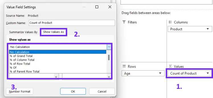
Screenshot from Excel on how to change calculation type for pivot table, image by author
Similarly, column percentages can reveal what portion of customers who bought a specific product category belong to each age group.
2. Identify Patterns
Look for trends or unexpected results in the percentages. For example, a high percentage of young customers buying hats compared to other age groups suggests a strong preference for hats among younger demographics.
P.S. This is where Ajelix BI can help you identify trends faster.
3. Compare Expected vs. Observed
If you had a hypothesis about the relationship between the variables, compare the observed percentages in the table to your expectation. For instance, if you expected similar purchase patterns across age groups, large deviations from that in the percentages might suggest a significant relationship.
4. Look for Statistical Significance (Optional)
While contingency tables provide initial insights, for more robust conclusions, you might consider statistical tests like chi-square to assess whether the observed relationships are statistically significant (i.e., not due to chance).
Here are some additional tips for interpreting your contingency table:
- Small Sample Size: Be cautious when interpreting results from tables based on very small datasets. Trends might not be reliable with limited data.
- Consider External Factors: Contingency tables only show relationships within your data. Other factors not included in the table might also influence purchase decisions (e.g., seasonal trends, marketing campaigns).
By following these steps and keeping these considerations in mind, you can effectively interpret the information revealed by your contingency table in Excel, gaining valuable insights into the relationships between your categorical variables.
Conclusion
Contingency tables are useful in analyzing data text analysis that can reveal important insights into the relationship between quantitative variables. Excel provides a user-friendly interface and robust capabilities for creating contingency tables.
Users can create contingency tables in Excel and make informed decisions by following the steps in this article. Remember to sort and organize the data, choose the appropriate variables, and interpret the table to draw meaningful conclusions.
Learn more about Excel and Google Sheets hacks in other articles. Stay connected with us on social media and receive more daily tips and updates.
Frequently Asked Questions
To choose rows and columns for your contingency table. Select the fields you want to include from the PivotTable Fields pane and drag them into the Rows and Columns boxes.
Yes, you can calculate percentages and totals in your contingency table. To do so, click on the “Value Field Settings” option and choose either “Count,” “Sum,” or “Average” for your data. Select “Show Values As” to display the types of data analysis as a percentage of the row, column, or total.
Yes, you can create charts and graphs from your contingency table. After creating your Pivot Table, select the “Insert” tab and choose the type of chart or graph you want to create. You can then customize your chart or graph as desired.
Speed up your spreadsheet tasks with Ajelix AI in Excel