Great Qualitative Data Visualization Examples
In the vast realm of data visualization, the ability to effectively convey qualitative data holds immense significance. It transcends mere statistics, unlocking narratives that captivate and engage audiences.
We will study qualitative data visualization. This includes its importance, principles, challenges, visualisation tools, best practices, and inspiring examples. These examples show the potential of qualitative data visualization.
What is Qualitative Data?
Qualitative data is information that describes data without using numbers. Instead of measuring quantities, it focuses on qualities, characteristics, and what the specific numbers tell us.
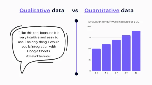
Infographic qualitative vs. quantitative data. Image Credits: Ajelix
Authors note: “For example, if you ask people about their favorite books. And they tell you the titles and why they like them, that’s qualitative data. It helps you understand their preferences and the reasons behind them without assigning numbers to them. It’s like exploring the reasons and emotions behind numbers, understanding people’s actions and feelings.
Related Article: Data visualization best principles with examples
Why Qualitative Data Visualization Matters?
What is the Importance of Qualitative Data?
Qualitative data, often consisting of rich textual, visual, or audio information, offers profound insights that quantitative data alone cannot provide. Its nuanced nature paints a vivid picture, making it an invaluable asset in decision-making processes.
Author’s Note. If you own a business, it is important to understand why your customers gave your product low ratings. Customers rate your product on a scale of 1 to 10. The average score is 5. To understand the reason behind their rating, ask them: “What made you give this rating?” This survey helps customers give feedback on what works well and what needs improvement in your product.
Related Article: How AI data analytics and visualization works?
The Power of Visual Storytelling
Humans are inherently visual beings, wired to respond to images and stories. Qualitative data visualization harnesses this innate trait, enabling storytellers to craft narratives that resonate, making data relatable and memorable.
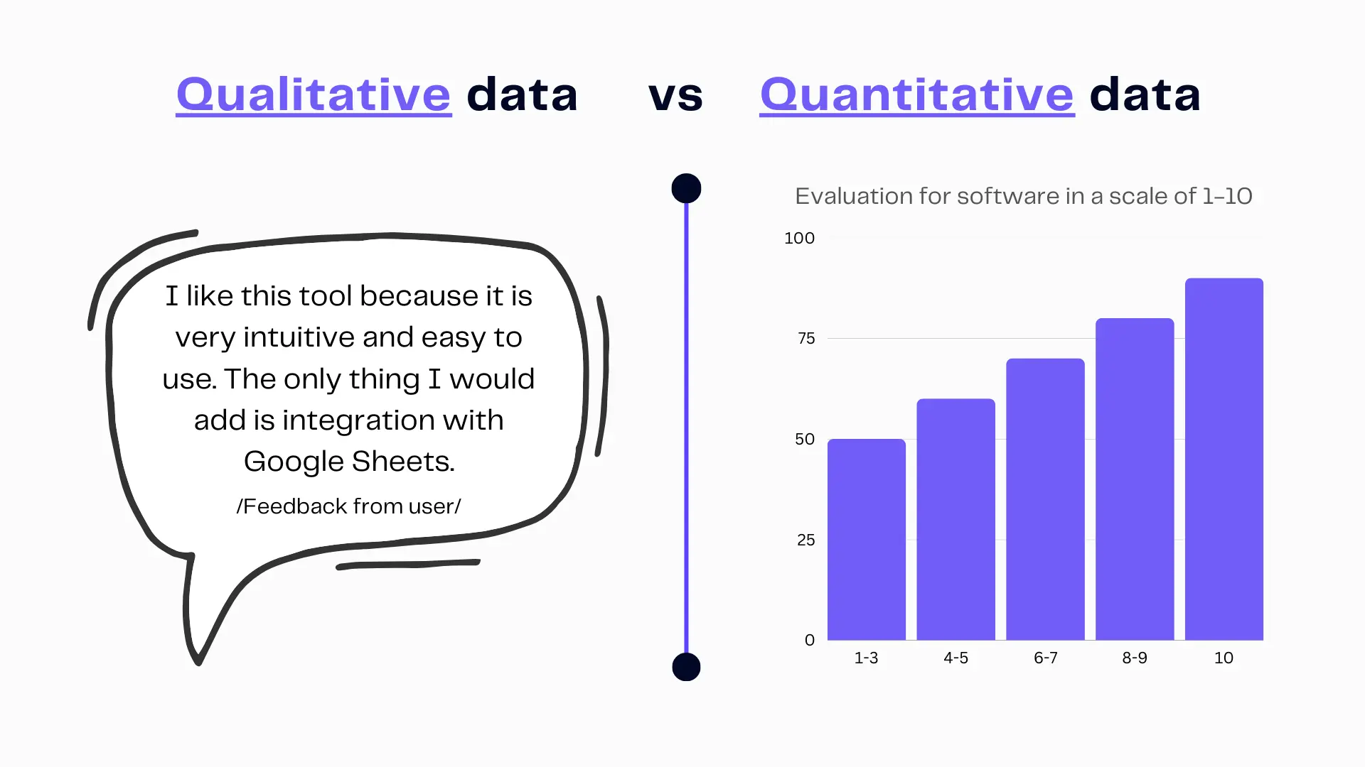
Qualitative raw data vs. quantitative sorted and visualized data. Image Credits: Ajelix
What are The Principles of Effective Data Visualization?
Clarity and Simplicity in Design
Simplicity is the ultimate sophistication. In the world of data visualization, clear and straightforward designs are essential. Avoid clutter and distractions, ensuring that the message is instantly clear.
Choosing the Right Visualization Type
Each dataset has its unique characteristics, demanding a thoughtful choice of visualization type. Bar charts, scatter plots, word clouds, and more – selecting the right tool for the job is paramount.
Add User-Centric Design
An audience-centric approach is key. Tailoring visualizations to your target audience ensures that the message resonates, enhancing understanding and engagement.
Related Article: Create effective data dashboard that tell a story
Types of Qualitative Data
Exploring the Various Forms of Qualitative Data
Qualitative data takes various forms. Whether it’s textual data, visual data, or audio data, each harbors distinct opportunities for insight extraction.
Textual Data
Textual data encompasses written content, offering insights from customer reviews, social media sentiments, or qualitative surveys.
- Customer Reviews: Comments and feedback left by customers on products, services, or experiences. These often contain subjective opinions and descriptions.
- Interview Transcripts: Textual records of interviews with individuals, capturing their responses, thoughts, and narratives in a qualitative research context.
- Survey Open-Ended Responses: Responses to open-ended survey questions. That allow respondents to express their thoughts and feelings in their own words, rather than selecting from predefined options.
- Social Media Comments: Comments on social media posts, where users express their opinions, emotions, and engage in discussions.
- Focus Group Discussions: Transcripts of focus group discussions where participants provide in-depth qualitative insights and opinions on a particular topic.
- Field Notes: Notes taken by researchers during observations or ethnographic studies, often containing descriptive, qualitative data about events, behaviors, and interactions.
- Qualitative Research Reports: Research reports that present in-depth textual analysis and findings from qualitative research studies. That will often involve themes, patterns, and rich descriptions.
- Visual Data: Images, infographics, and photographs all fall under visual data, providing rich sources of information for creative visualization.
Visual Data
Images, infographics, and photographs all fall under visual data, providing rich sources of information for creative visualization.
- Photographs: Images that capture scenes, objects, or people, often used in qualitative research to provide visual context.
- Artwork and Drawings: Visual creations, such as paintings, drawings, or sketches, that express emotions, ideas, or concepts subjectively.
- Video Interviews: Recorded interviews in video format, which capture participants’ facial expressions, body language, and non-verbal cues.
- Documentary Films: Non-fiction films that present qualitative information, often through storytelling and interviews, to convey subjective experiences or perspectives.
- Observation Videos: These videos, often recorded during ethnographic or fieldwork research, showcase real-life events, behaviors, or interactions in a qualitative context.
- Photo Input: The researchers ask participants to provide interpretations or narratives based on specific photographs. Often revealing subjective insights, in a qualitative research method.
- Visual Journals: Personal journals or diaries that incorporate visual elements, such as drawings, collages, or photographs, alongside written reflections.
- Infographics: Visual representations of data or information that use graphics, charts, and images to convey qualitative insights.
- Storyboards: Visual representations used in storytelling or narrative research, which include sketches or images to outline a sequence of events.
These examples illustrate how visual data can convey qualitative information, emotions, and subjective perspectives through various visual mediums and formats.
Challenges in Visualizing Qualitative Data
Addressing Common Hurdles
Working with qualitative data presents challenges such as data ambiguity, subjectivity, and context dependence. Navigating these hurdles requires careful consideration.
Maintaining Data Integrity
Preserving the integrity of qualitative data during visualization is essential. Misrepresentation or oversimplification can lead to misinterpretation.
Dealing with Unstructured Data
Qualitative data is often unstructured, demanding robust methodologies for organizing, cleaning, and transforming it into a usable format.
Tools and Software for Qualitative Data Visualization
Overview of Popular Tools
A plethora of data visualization tools is available for qualitative data visualization. Notable options include Tableau, Power BI, and specialized libraries in R and Python, each with its strengths and applications.
Qualitative-Specific Tools
There are certain tools tailored specifically for qualitative data type and statistical analysis. Streamlining the visualization process and accommodating its unique characteristics.
Best Practices for Data Preparation
Cleaning and Structuring Your Qualitative Data
Data preparation is the foundation of effective visualization. Cleaning, structuring, and transforming qualitative data advantages ensure it is ready for the creative visualization process.
Data Normalization
Normalization techniques harmonize disparate data definition and data sources, facilitating meaningful comparisons and insights.
Coding and Categorization
Categorizing qualitative data points through coding helps in organizing and simplifying complex narratives, aiding in visualization.
Inspiring Examples of Qualitative Data Visualization
Real-World Case Studies Showcasing Effective Visualizations
Numerous real-world cases illustrate the power of qualitative complex data visualization. Let’s explore some compelling examples:
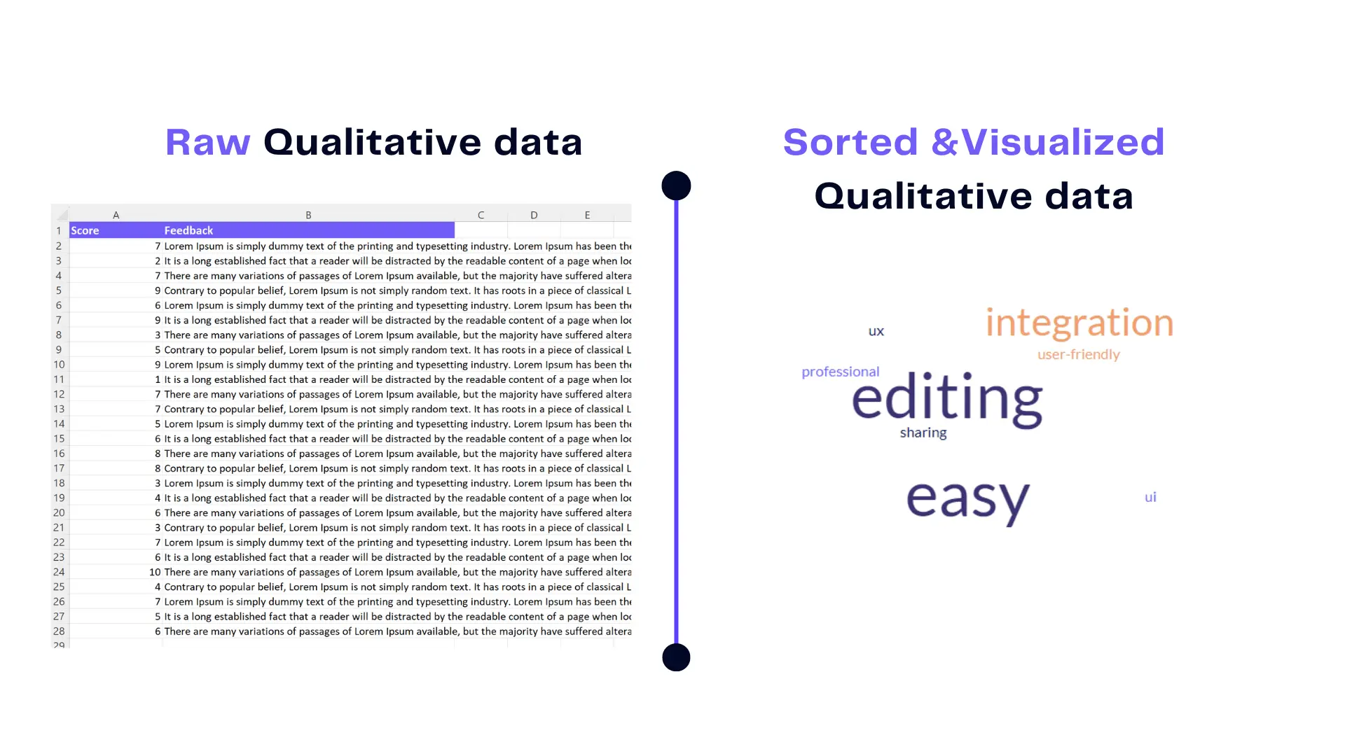
Case 1: Sentiment Analysis Through Word Clouds
Word clouds visually represent word frequencies, making sentiments and themes instantly recognizable.
Word cloud example. Image Credits: Ajelix
Case 2: Thematic Mapping of Customer Feedback
Thematic maps reveal trends and patterns within qualitative customer feedback, guiding strategic decisions.
Case 3: Timeline Visualization of Historical Narratives
Timeline visualizations breathe life into historical events, offering a chronological perspective.
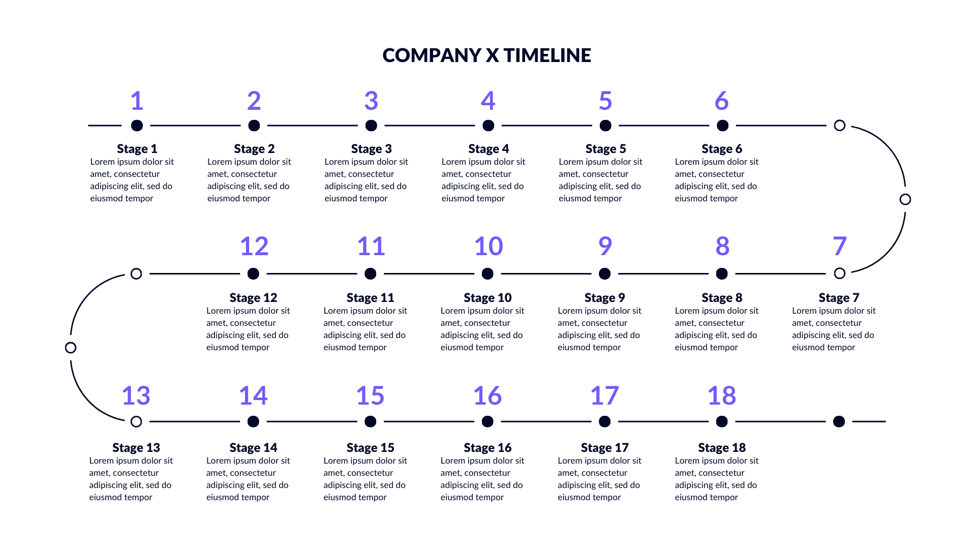
Historic data example. Image Credits: Ajelix
Related Article: Marketing Data visualization examples
Tips for Creating Impactful Visualizations
Crafting Compelling Data Narratives
Effective visualization involves storytelling. Craft compelling narratives that connect with your audience emotionally.
Utilizing Color and Typography Effectively
Color and typography choices can enhance understanding and evoke emotions, when used thoughtfully.
Ensuring Accessibility and Inclusivity
Accessibility should never be an afterthought. Make your visualizations accessible to all, including those with disabilities.
Interactive Qualitative Data Dashboards
The Power of Dynamic Visualizations
Interactive dashboards enable users to explore data management in real-time, fostering deeper engagement and insights. Turning wide range of data in to easy to understand table of contents to identify trends.
Building Interactive Dashboards from Scratch
You can accomplish creating interactive dashboards with the right tools and guidance, even though it may seem complex. There are visualization Ajelix BI software free online for content analysis and to switch from visualization Excel.
Tools for Creating Interactive Dashboards
Discover the tools and platforms that empower you to build engaging, user-friendly interactive dashboards.
Future Trends in Qualitative Data Visualization
The Evolving Landscape of Data Visualization
The field of large amount of data visualization is ever-evolving. Explore emerging trends shaping the future.
AI-Driven Insights
Artificial intelligence will change qualitative data visualization, providing deeper insights and automation. There are software AI that is analysis software for market researchers help with data analytics and regression analysis.
Conclusion
We have learned about the importance of qualitative data visualization in this journey. We have also learned about the principles, challenges, tools, and best practices associated with it. Additionally, we have explored examples and future possibilities of qualitative data visualization. Now, armed with knowledge and creativity, it’s time to explore, innovate, and unlock the untold stories within your qualitative data.
From data to report in one minute or less with Ajelix AI Agent