How to Sort Bar Chart in Descending Order in Excel
We all want our charts and graphs to present the data correctly. So we can gain an understanding of our visual materials. What’s the point of the report if we can’t understand the data behind it?
In this guide, we will walk you through steps you should take to sort bar chart in descending order. As well as provide more easier way to create reports and descend data using Ajelix BI.
Change the way you work with agentic AI
One-click dashboards,KPI tracking, and AI-powered insights—for work that actually gets done.

What’s The Difference Between Descending and Ascending Order?
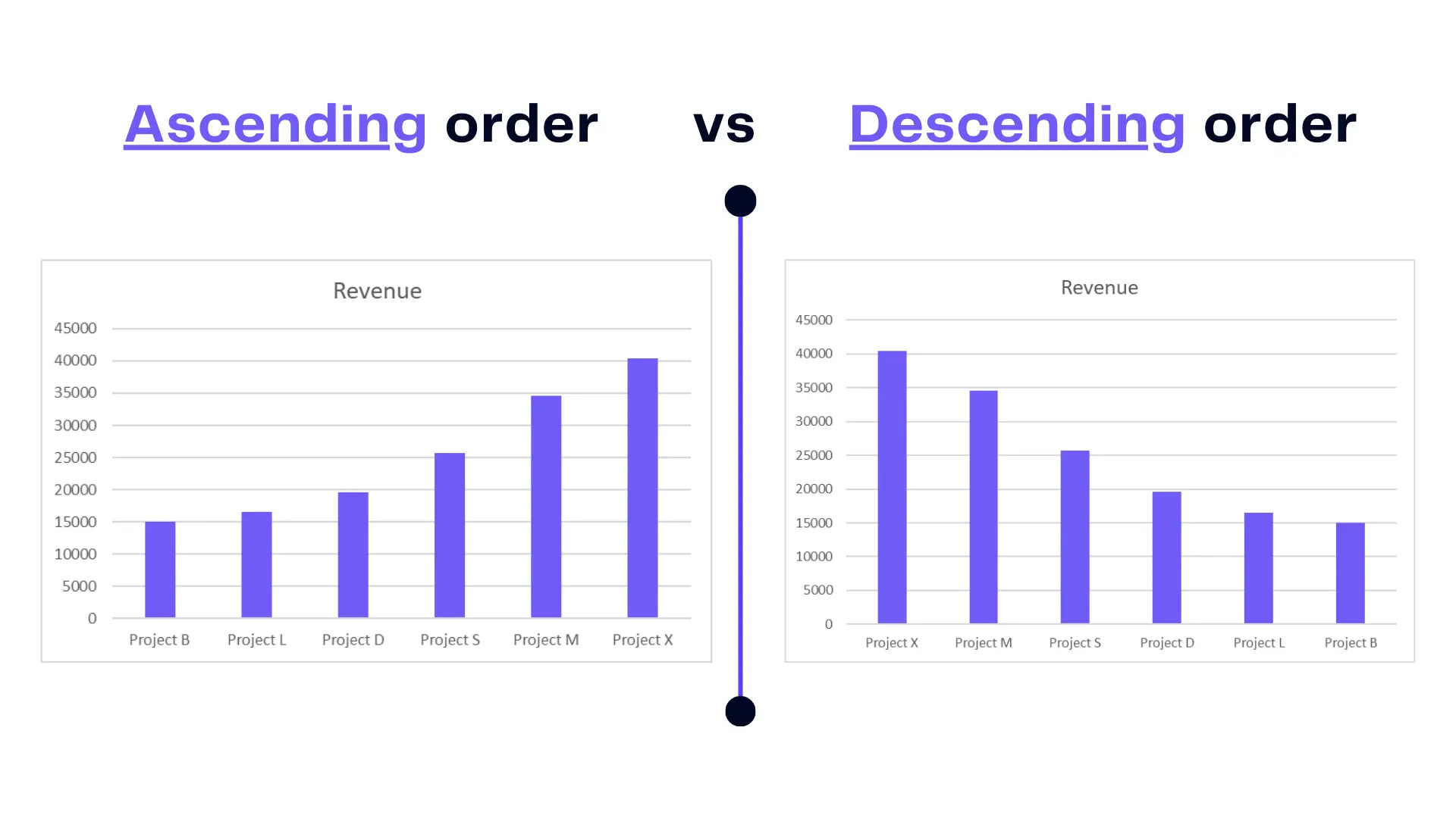
Ascending order follows an incremental pattern, with values or categories arranged from the smallest to the largest. It’s the conventional default, ensuring a logical progression.
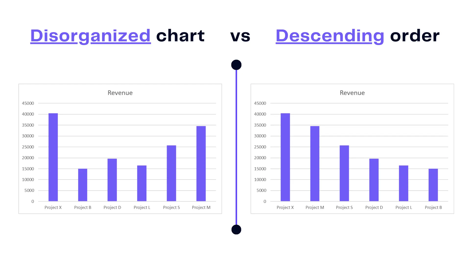
Descending order, on the other hand, flips the arrangement, displaying data from the largest to the smallest. This approach can reveal trends, and outliers, or prioritize the most significant data points. Here’s a visual example:
In the intricate world of Excel charts, comprehending the nuances of ascending and descending order is imperative for creating visuals that convey data’s narrative effectively.
How To Sort Bar Charts in Descending Order
There are several ways to get your chart sorted correctly. We will explore 2 ways to get the needed result.
Method 1: Sort Your Excel Table With Filters
Time needed: 1 minute
To get the chart sorted in descending order use Excel’s filter option and sort your data table.
- Pick the data table
Select the heading of the data table you used to create a bar chart.
- Activate Filter option
Once you select the data table, go to the Home toolbar section and pick Filter.
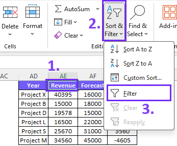
- Filter data from largest to smallest
To organize your data table in descending order, press on the filter option and choose the order from Largest to smallest.

Here’s a quick video wrap-up:
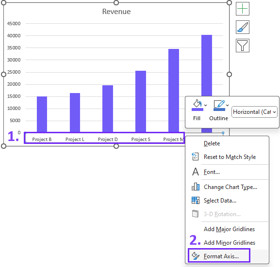
Method 2: Sort Only Your Chart
The second sorting option will only sort your chart visually without filtering your data table. Here are 4 steps on how to do it:
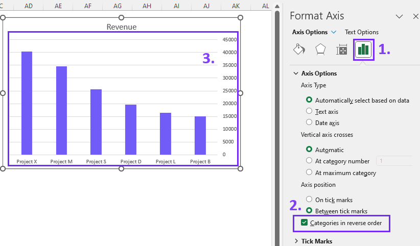
1. Activate the Axis formatting setting by right-clicking on the chart axis. Choose Format Axis from the drop-down menu.
2. Once you’ve accessed the Axis Options pick Categories in reverse order and voila your chart is organized in descending order.
Related Article: 9 Data visualization trends
Sorting Your Charts With Ajelix BI (Create AI Dashboard)
Creating reports and charts in Excel spreadsheets might appear daunting, especially if it’s not your area of expertise. Mastering Microsoft Excel often requires specialized training, which can be time-consuming. The process becomes even more intricate when searching for online guides.
Perhaps it’s worth considering a user-friendly tool alternative for data visualization:
How To Sort Charts with Ajelix Data Visualization Tool
Once you start using Ajelix for data visualization tasks, the process is very straightforward. Not only does it ease the data analytics process, but it also helps you reduce the time spent looking for the right settings.
Here are the steps you need to take to sort your data chart:
1. Create a bar chart and you will see that your chart is automatically sorted in ascending order

2. Open the chart settings by clicking on it. To order your data in descending order, choose Sort By and pick the value column. Select Sort Order and pick Descending.
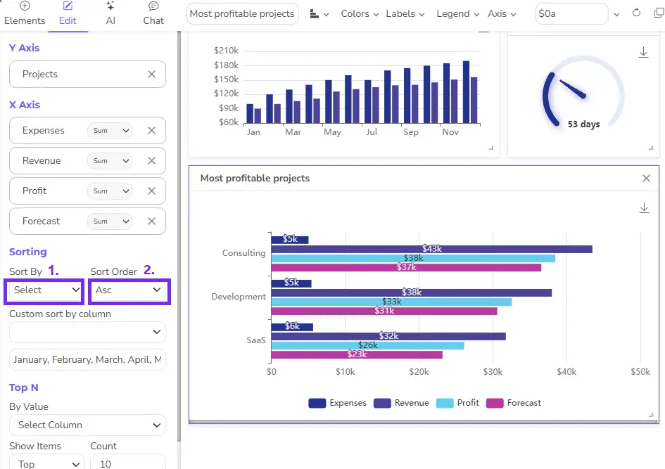
Now you have sorted your graph with a Ajelix data visualization tool. Feel intrigued? Check how Ajelix works and join freemium:
Reporting gives you a headache?
Upload your data and create professional reports with agentic AI
Start free
Try free and upgrade whenever
Conclusion
The power is in your hands now. We encourage you to harness your newfound skills in your Excel projects, creating charts that enlighten and inform. Make sure to watch the demo of Ajelix BI and try it! Who knows maybe you’ll be one of the 200 000 satisfied users who use Ajelix daily.
Ready to create reports 10X faster with Ajelix BI?
From data to report in one minute or less with Ajelix AI Agent