Top 9 Data Visualization Trends 2026
In the ever-evolving landscape of data visualization, 2026 promises to be a year of groundbreaking trends and innovations. We will explore the newest trends in data visualization. It includes using artificial intelligence and the ethical concerns connected to data.
The article also examines how these trends are influencing the future of data. It explores how these trends are shaping the future of data visualization.
What is Data Visualization?
Data visualization is a captivating blend of art and science, transforming raw numbers and intricate datasets into easily digestible visual representations. At its core, data visualization employs an array of techniques, from bar graphs to treemaps, to communicate complex information.
Incorporating data visualization in decision-making processes isn’t just a trend; it’s a necessity. It empowers individuals and organizations to derive insights, make informed choices, and ultimately, drive progress.
Data Visualization Trends 2026
In the realm of data visualization, 2026 promises to be a year of exciting and transformative trends. As we dive into this data-driven era, let’s explore what’s on the horizon.
2026 Data Visualization Trends:
- Interactive visualizations take center stage, replacing static charts.
- AI and machine learning drive ingenious data interpretations.
- Big data becomes digestible with AI-powered insights.
- Data chatbots provide real-time analysis accessible to all.
- User-friendly, no-code dashboards empower non-programmers.
- Animated visualizations enhance data storytelling.
- Collaboration tools facilitate teamwork in data exploration.
- 2026 marks a year of immersive and powerful data utilization.
Interactive visualizations are taking center stage. Gone are the static charts of yesteryears; today’s visualizations beckon users to engage, uncovering insights in a dynamic dance of data.
Fueling this evolution are the twin titans of AI and machine learning. They’re not merely tools but the architects of ingenious data interpretations. Big data, once a daunting behemoth, now bows to AI’s prowess in distilling it into digestible nuggets of wisdom.
Picture this: AI automated insights at your fingertips, providing real-time analysis without the need for a data science degree. Data chatbots, powered by AI, stand ready to answer your queries, making data-driven decisions accessible to all.
User-friendly dashboards are becoming the norm, designed with a no-code philosophy. You don’t need to be a programmer to craft sophisticated displays of your data.
Animated illustrations and visualizations transform static data into a compelling narrative, fostering deeper audience engagement and enriching the data storytelling experience.
Furthermore, collaboration has never been easier. Tools facilitating easy cooperation between teams, allowing them to jointly explore and interpret data, are gaining prominence.
1. The Impact of Big Data
Handling and Visualizing Massive Data Sets
As data continues to grow exponentially, handling and visualizing massive data sets is a challenge. 2026 sees the rise of data compression techniques, data sampling, and distributed computing solutions to efficiently manage and visualize large-scale data.
Real-time Data Visualization Challenges
With the need for real-time insights, data visualization faces challenges related to data streaming and visualization latency. Even this problem is solved for SMEs and anyone who can’t afford big systems and hiring data analysts. Ajelix BI provides real-time data visualization with the ability to upload your data and refresh existing charts with new data. This way enables timely decision-making.
2. Artificial Intelligence in Data Visualization
AI-Powered Automated Insights
Artificial Intelligence (AI) and Machine Learning (ML) are becoming integral to data visualization. AI algorithms can automatically generate insightful visualizations, making data analysis faster and more accessible. ML models can predict user preferences, tailoring visualizations to individual needs. Read more in our article on how AI data analytics work.
The best part of AI analytics in 2025 and 2026 is that it’s finally available to small to medium businesses (SMEs), solo entrepreneurs, and anyone who needs to understand their data. It’s no longer exclusive only to big corporations and industry giants.
Learn how Ajelix can help you make data-driven decisions with Ajelix BI and AI data analytics.
AI is automating the process of deriving meaningful insights from data. Machine learning algorithms can now analyze data and automatically generate visualizations that highlight key trends and anomalies, reducing the manual effort required for data exploration.
Chatbots for Data Exploration
Chatbots are making data exploration more conversational. Users can engage with chatbots to query data and receive visualizations in response. This conversational approach to data analysis is making data more accessible to non-technical users.
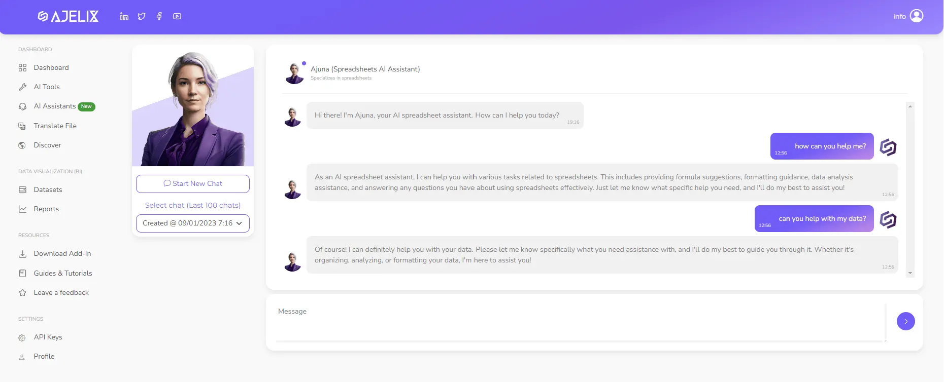
Ajuna spreadsheet assistant for your daily tasks by Ajelix. Image Credit: Ajelix
There are several chatbots that can help with your data analytics one of them is Ajuna spreadsheet assistant powered by Ajelix.
3. Advanced Data Visualization Tools
Emerging Tools and Platforms
In 2026, a new wave of data visualization tools and platforms is emerging. These tools offer advanced features, such as real-time data reporting, user-friendly editing, AI data analytics, 3D visualization, and collaboration capabilities, enabling users to create immersive and engaging data visualizations. Take a look at the demo for Ajelix data visualization:
User-Friendly Data Viz Solutions
The trend is towards user-friendly data visualization solutions. No longer reserved for data experts, these tools come with intuitive interfaces, templates, and drag-and-drop functionalities that empower users to create stunning visualizations without extensive training.
Here’s a quick video summary of how to create a report in one minute or less:
4. Data Storytelling
Effective data storytelling is a skill that bridges the gap between raw data analytics and actionable insights. Here are some invaluable tips to craft compelling narratives that transform your data into a powerful tool:
- Embrace the Hero’s Journey: Start with a protagonist – your data. Introduce the challenge or problem it faces, the conflicts within, and the resolution through analysis. This narrative structure captivates your audience.
- Data Personification: Humanize your data by giving it a personality. Describe it as a character evolving through the story, making the information relatable.
- Visual Elements: Incorporate captivating visuals like charts, graphs, and infographics. These not only enhance comprehension but also add layers to your storytelling.
- Contextualize Your Data: Explain the significance of your data within a broader context. Why does it matter? What real-world impact can it have?
- Conflict and Resolution: Highlight the challenges encountered during analysis and how your data triumphs over them. This creates suspense and engagement.
- Simplify Complexity: Use plain language and avoid jargon. Ensure that your audience, regardless of their familiarity with data, can follow your narrative.
- Engage Emotions: Connect with your audience emotionally. Share anecdotes or case studies to illustrate the human aspect of your data.
- Call to Action: Conclude your data story with a clear call to action. What should your audience do with the insights you’ve presented?
In the realm of data storytelling, these tips transform raw facts and figures into compelling narratives that drive decision-making and inspire action. Mastering this art empowers you to unlock the true potential of your data. We have prepared a blog for qualitative data visualization best practices.
Crafting Engaging Data Narratives
Data storytelling involves crafting compelling narratives around data. In 2026, we see the fusion of data visualization with storytelling techniques, creating narratives that engage users emotionally and intellectually.
6. Interactive Dashboards
From Static to Interactive Visualizations
Gone are the days of static pie charts and bar graphs. Data visualization is all about interactivity. Dynamic charts and graphs that respond to user input, allowing for real-time exploration of data, are gaining prominence. Users can now zoom in, filter, and interact with data, unlocking new dimensions of insights. That’s exactly what Ajelix BI is striving for.
Personalized User Experiences
Interactive dashboards are becoming highly personalized. They adapt to user preferences and behavior, providing a tailored experience. Businesses are using these dashboards to offer customized insights to their customers and stakeholders.
The Rise of No-Code Dashboards
No-code and low-code platforms are democratizing dashboard creation. Even individuals with no coding skills can design interactive dashboards, empowering a wider audience to explore and understand data. Data analytics should be available to anyone and it should be easy to create reports and make data-driven decisions.
7. Data Ethics and Security
Addressing Privacy Concerns
Data ethics and security are paramount with increasing data breaches and privacy concerns. Data visualization professionals are focusing on techniques that anonymize data while still delivering meaningful insights, ensuring data privacy.
Ensuring Data Integrity
Ensuring data integrity is a growing concern. This includes verifying data sources, implementing encryption, and using blockchain technology to create transparent and tamper-proof data visualizations.
8. Customization and Personalization
Tailoring Visualization for Individual Users
Data visualization is moving towards extreme customization. Visualizations are adapted to individual user preferences, including color schemes, chart types, and even content, providing a tailored experience for each user.
Data Viz as a Service (DVaaS)
DVaaS providers are offering data visualization as a service, allowing organizations to outsource their data visualization needs. This trend is making advanced data visualization accessible to businesses of all sizes.
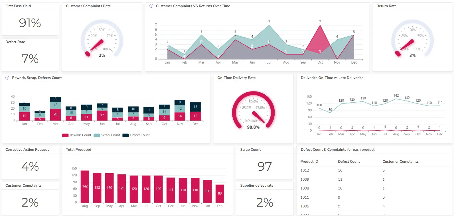
Data Visualization in Finance
Predictive Analytics for Investment
The finance industry is leveraging data visualization for predictive analytics. Investors use visualizations to identify investment opportunities and assess market risks, leading to more informed decisions.
Finance Data Dashboard with Ajelix BI. Image Credit: Ajelix
Risk Assessment and Management
Financial institutions rely on data visualization to assess and manage risks. Visualizing complex financial data helps in identifying potential threats and taking proactive measures to mitigate them. We have covered financial data visualization here.
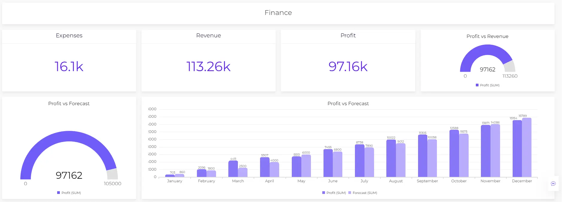
Data Visualization in Marketing
Customer Behavior Insights
In the marketing world, data visualization is used to gain insights into customer behavior. Marketers create visualizations to understand consumer preferences, track marketing campaigns, and optimize strategies.
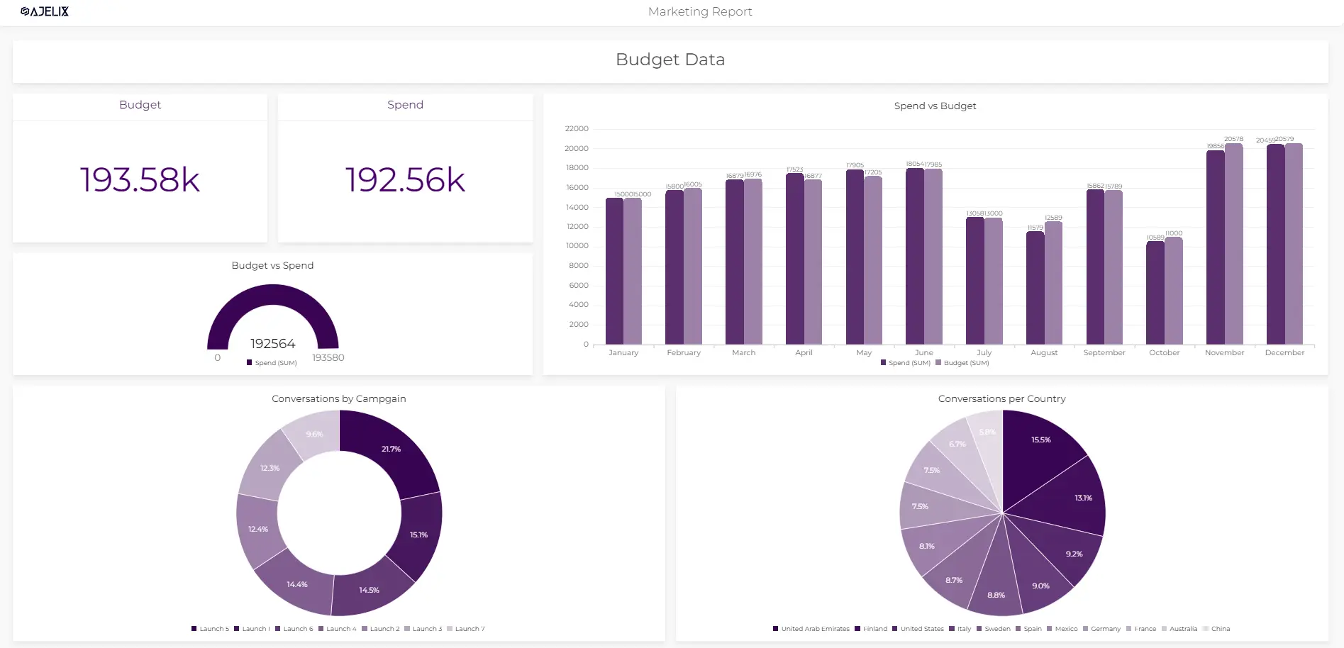
Marketing data dashboard in Ajelix BI. Image Credit: Ajelix
Visualizing Marketing Campaigns
Visualizing marketing campaigns helps marketers analyze campaign performance in real-time. Interactive dashboards provide a comprehensive view of key metrics, enabling data-driven marketing decisions. Get more information about marketing data visualization in our article.
9. Collaborative Data Vizualization
Sharing and Collaborating on Visualizations
Collaboration is at the heart of modern data visualization. Teams can work on visualizations collaboratively, making it easier to share insights and collectively analyze data.
Teamwork in Data Analysis
Collaborative data visualization fosters teamwork in data analysis. Different team members can contribute their expertise to create comprehensive visualizations that drive decision-making.
Tips for Adopting New Trends
Steps to Stay Ahead in Data Viz
As the data visualization landscape evolves, staying ahead is crucial. We provide actionable steps for individuals and organizations to adopt and integrate the latest trends effectively.
Continuous Learning and Adaptation
The key to success in data visualization is continuous learning and adaptation. We discuss the importance of ongoing education and remaining agile in a rapidly changing field.
Conclusion
Embracing the Data Viz Trends of 2026
In conclusion, the data visualization trends of 2026 are reshaping the way we interact with and understand data. From AI-driven insights to immersive AR/VR experiences, these trends offer exciting opportunities for businesses and individuals to harness the power of data for informed decision-making. Embrace these trends, stay agile, and unlock the potential of data visualization in the years to come.
Ready to create trendy reports with Ajelix BI?
From data to report in one minute or less with Ajelix AI Agent