Time Series Charts: How To Create & When To Use With Examples

Time series charts are used for data that is measured through the time. Usually, it’s big amounts of data that needs summary to show the data trendline.
In the blog article we will show you how to create time series charts with Excel and Ajelix BI. We will explain when to avoid using these graphs and when to use with good and bad examples.
How To Create A Time Series Chart?
There are several ways how you can create time series graphs that we will show you during this blog article. The first way will be using Excel and the second one using popular data visualization platform created by Ajelix.
Create a Time Series Chart in Excel
Creating this chart is a pretty straightforward process that we will guide you through. First make sure that your date column is set to Date formatting. If you don’t know what that means or how to do it, follow the link.
Time needed: 2 minutes
Step-by-step guide on how to create a time series chart in Excel:
- Select the data
Select the date column and the data column you want to visualize.
- Insert chart
Click Insert in the Excel ribbon and pick Recommended charts, then pick one of the provided time series chart types.
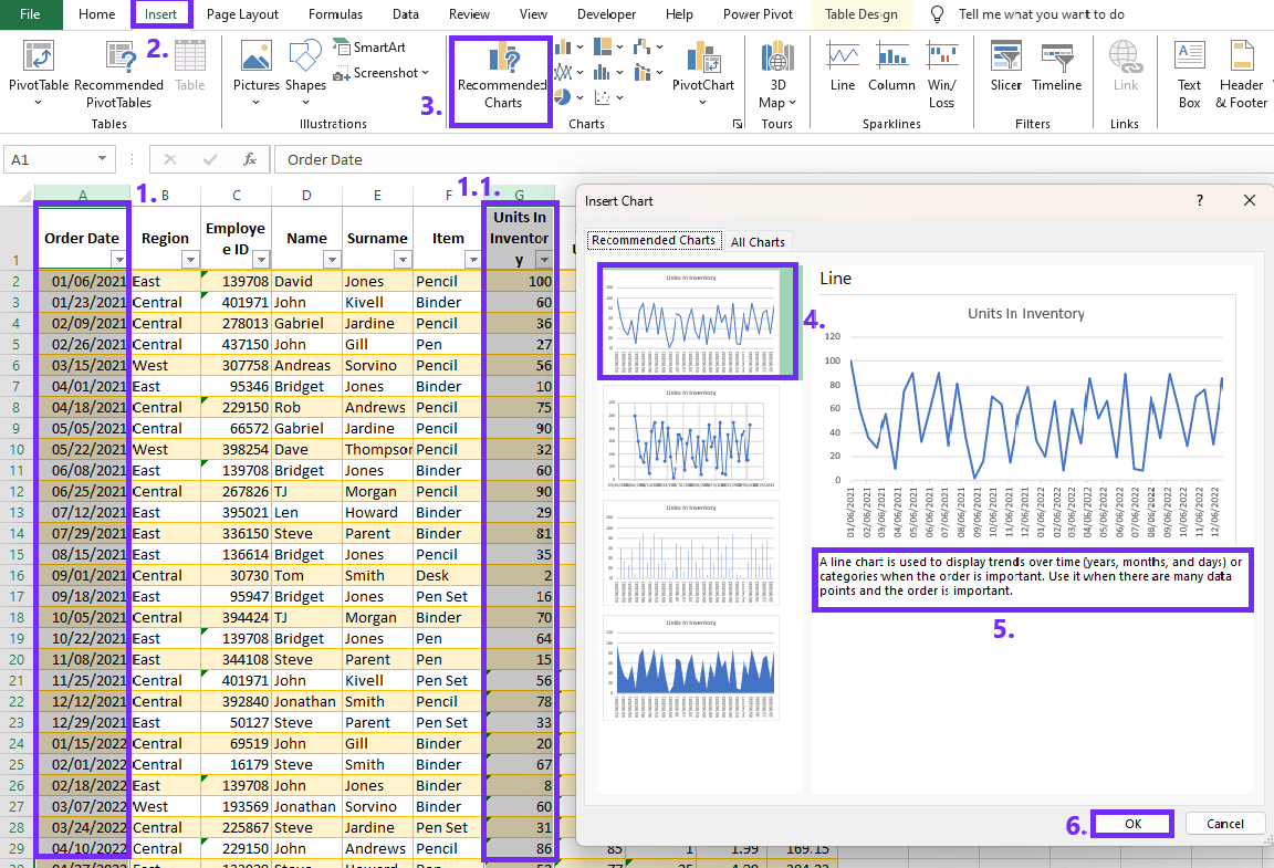
- Customize chart
From the provided chart types you should see that Excel automatically creates a time based chart. If you see only basic chart without time values then move back to the previous step and format data as a time value.
Author’s Note: For more easier chart and graph creation learn more about data visualization and try one of BI tools that would ease the report creation on Excel.
Create A Time Series Chart With Ajelix BI
Creating charts with Ajelix shouldn’t take up as much time as with Excel. Simply upload your Excel or CSV file on Ajelix and create a report. Once you’ve created the report follow the steps below.
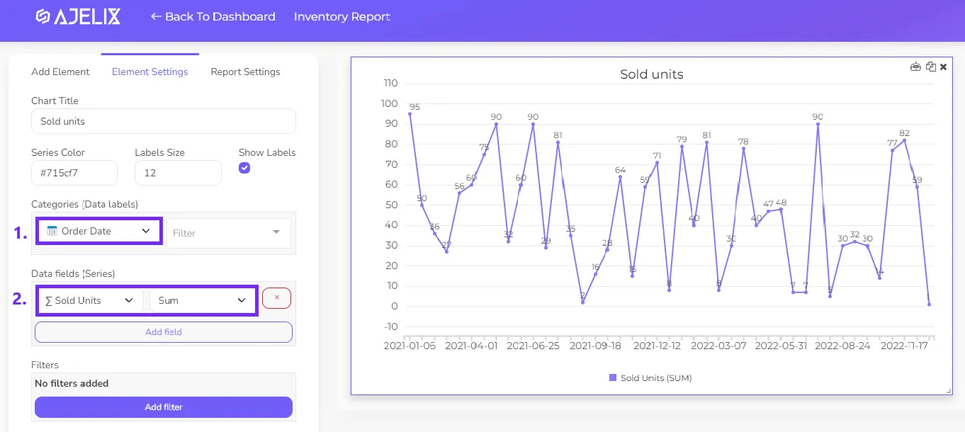
Pick the time series element from the chart list, set up date values and select the column you want to visualize.
When To Use Time Series Charts?
It’s no surprise, time series charts are useful when dealing with data that varies over time. Here are some situations where using a time series chart is beneficial.
1. Monitoring Trends
Time series charts are excellent for tracking trends over a specific period. This could include stock prices, temperature changes, sales figures, or any other variable that changes over time.
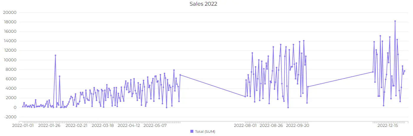
Ajelix BI can automatically summarize big amounts of data to reveal trends over huge amount of time. For example, if you have data that is monitored every day and you want to see the tendency throughout the year. That’s hundreds of data rows, but it’s not a problem for Ajelix BI.
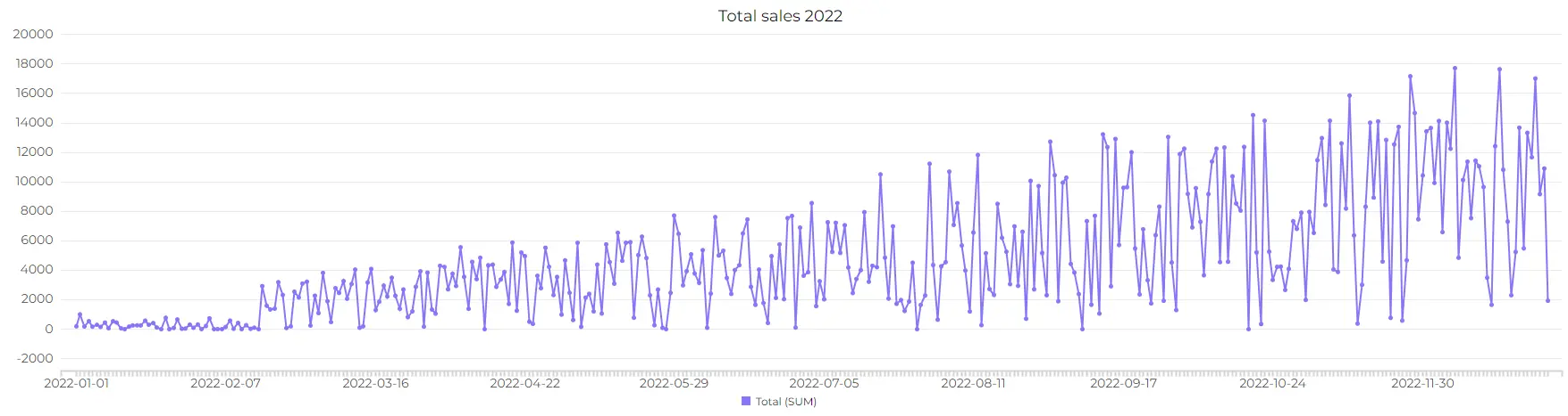
In the example above you can see chart with summarized data. The uploaded file consists with data entries for every day of year 2022. You can see how tool has summarized data so you can see the data trend through all entries. Try it yourself here.
2. Forecasting
These charts are often used in forecasting future trends based on historical data. This is crucial in business planning, financial analysis, and demand forecasting.
3. Analyzing Historical Data
When analyzing historical data, a time series graph can provide a clear picture of how a variable has evolved over time. This is valuable in fields such as economics, finance, and climate science. Basically any business will look at the historic data so these charts come in handy.
4. Comparing Multiple Series
If you have multiple time series data sets, a time series chart allows you to compare them on the same graph, making it easier to identify correlations or divergences.
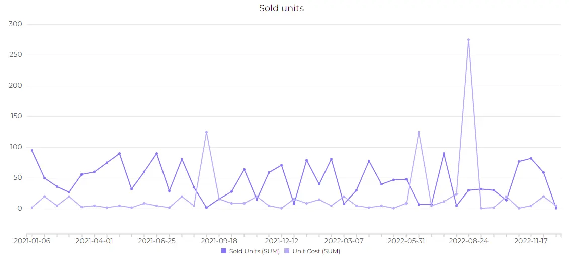
You can see in the example that it’s easy to understand the data and see the data correlation.
When To Avoid Using Time Series Graph?
There are several case studies when you should avoid using time series graphs as it would lead to misunderstandings. We have summarized several examples when using time series graph won’t be the best choice.
1. Inconsistent Time Intervals
If your time intervals are inconsistent or irregular, a time series graph might not effectively represent the temporal relationships in the data. In such cases, alternative chart types, like scatter plots or bar charts, may be more suitable.
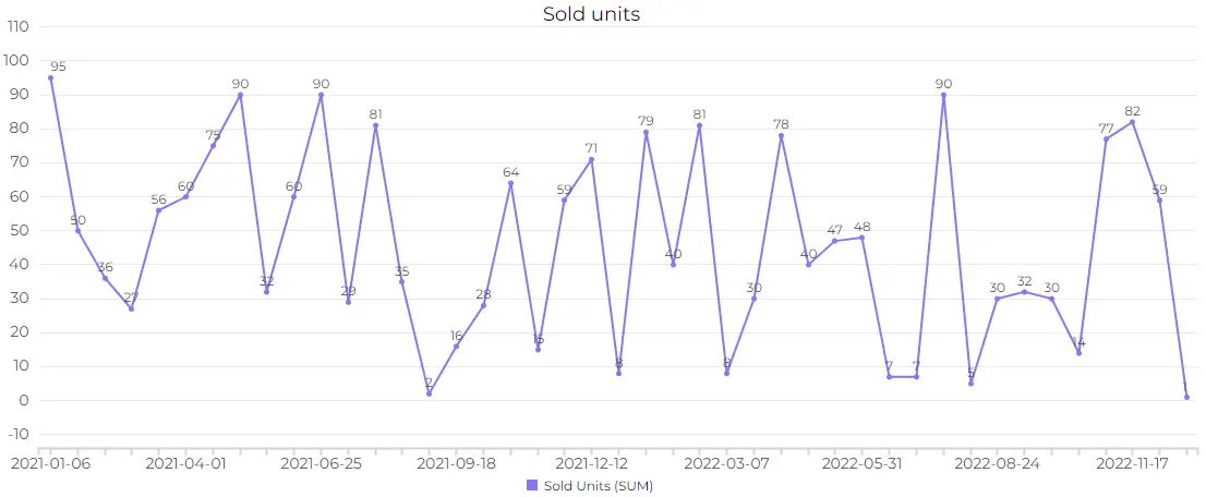
As you can see in the example it’s bad to have holes in your time chart as it doesn’t give you as much insights about your data.
Author’s Note: Learn more about different visualization journeys on how to visualize marketing, financial and real estate data. We haven’t covered your industry leave a comment below and we will create a blog from your recommendation.
2. Limited Data Points
For very limited or sparse data points, especially in short time spans, a time series chart might not provide meaningful insights. In such cases, a simple table or other data visualization methods may be more appropriate.
3. Overlapping Data Patterns
Complex overlapping patterns can muddy clarity. In such instances, simpler visualizations may convey the message more effectively.
Conclusion
As we conclude this exploration of Time Series Charts, remember the key elements – the chronological dance of data, diverse chart types, and the nuances of effective visualization. Embark on your journey of exploration and experimentation. Time Series Charts, with their dynamic storytelling capabilities, await your data, ready to unveil its temporal intricacies.
Ready to create time series charts with Ajelix BI?
From data to report in one minute or less with Ajelix AI Agent