Master Real Estate Data Visualization
Real estate data visualization is turning complex data about properties and the market into easy-to-understand visuals like charts, graphs, and maps. 🏢
Data visualization isn’t just a buzzword; it’s an indispensable tool in the real estate industry. By turning data into visually digestible insights, you can make more informed decisions and gain a competitive edge in the market.
In this guide, we’ll delve into real estate data visualization, share tips, exploring its significance and practical applications.
What is Data Visualization?
Data visualization is the art of transforming raw, complex datasets into visual representations, such as charts and graphs, that are both informative and aesthetically engaging. It goes beyond mere data presentation; it’s about revealing insights, patterns, and trends that might otherwise remain hidden in the numbers. Read more about meaningful visualizations.
What is Real Estate Data Visualization?
Real estate data visualization is a dynamic process of translating raw, complex real estate data into visual representations that provide meaningful insights for professionals in the industry.
Data visualization in real estate plays a pivotal role in market analysis, helping stakeholders assess market trends, track property values, and make investment decisions.
Real Estate Data Types
This table provides a quick reference guide to the most common data types used in real estate data visualization and the visualization types best suited to represent them. Effectively visualizing this data can empower real estate professionals to gain valuable insights and make informed decisions.
| Data Type | Visualization Type |
|---|---|
| Property Characteristics (bedrooms, bathrooms, square footage, etc.) | Bar charts, pie charts, scatter plots |
| Location (address, neighborhood, city, etc.) | Maps |
| Price and Sales Data (listing price, selling price, days on market, etc.) | Line charts, bar charts, histograms |
| Demographics (median household income, population density, etc.) | Bar charts, line charts |
| Market Trends (average sales price, inventory levels, etc.) | Line charts, bar charts |
Understand how to visualize different types of real estate data and extract key insights to support your real estate endeavors. This can be anything from understanding property values in a specific neighborhood to identifying market trends. Did you know you can use AI for data analytics to reveal insights faster?
Design Principles for Effective Real Estate Data Visualization
To successfully understand your data and make data-driven decisions visualization is key. Whether you’re crafting a simple bar chart or a complex interactive dashboard, these tips will help you navigate the intricate art of data visualization in 2024 and beyond.
1. Color Harmony
The choice of colors can make or break a visualization. Embrace a basic color palette that adheres to good design principles, such as complementary or analogous colors. Subtle variations can highlight key data points while ensuring accessibility.
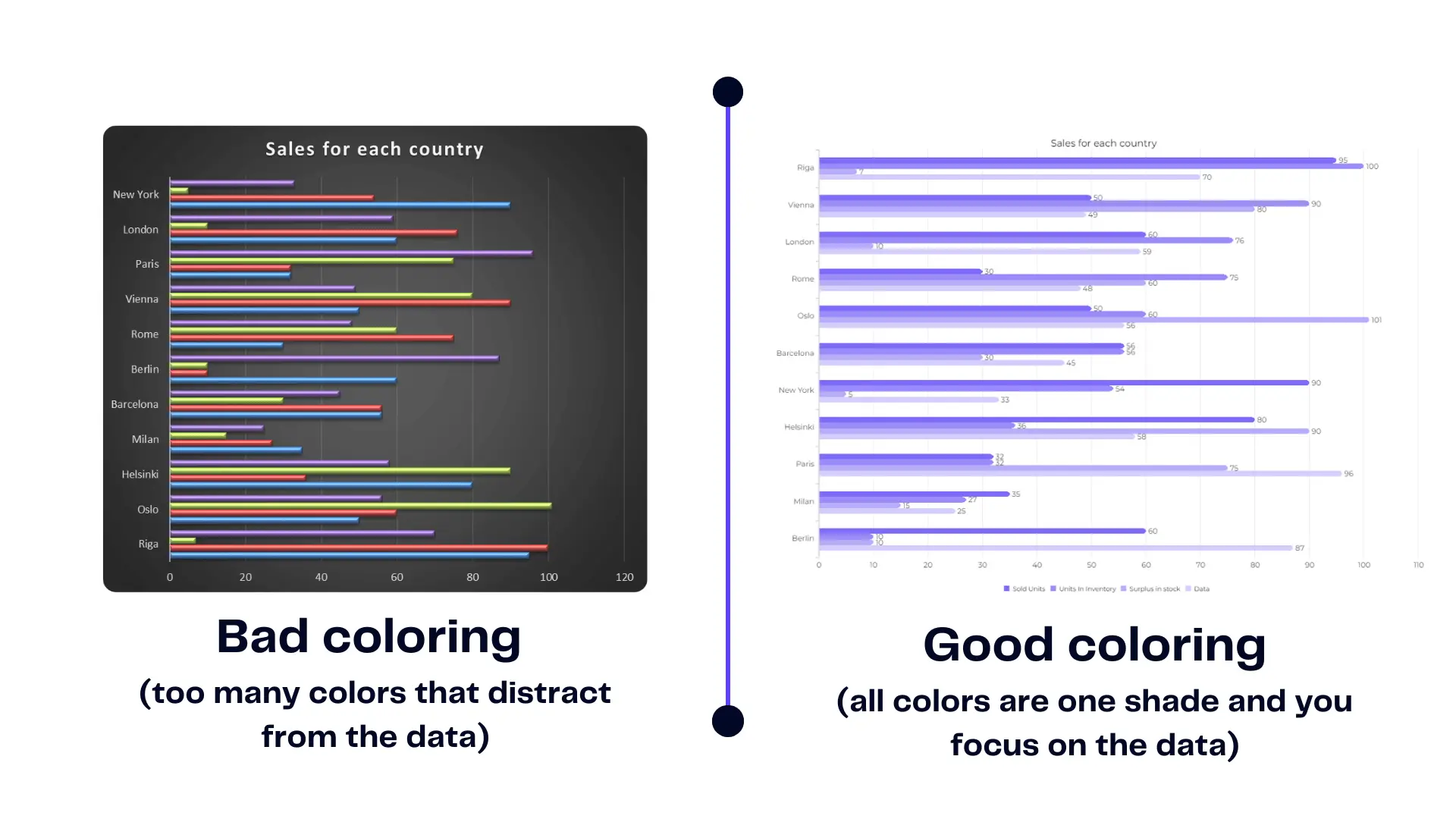
Example of bad chart coloring vs. good chart coloring. Image Credit: Ajelix
2. Choose the Right Chart Type
Different data types demand distinct chart types. Consider bar charts for categorical data and line charts for trends over time. Incorporating novel visualization tools can add depth to your repertoire.
3. Simplicity in Design
Simplicity is a principle that should be practiced relentlessly. Remove clutter, and focus on the core message. Each element should have a clear purpose. Check the bad visualization example below to understand what to avoid 👇

4. Storytelling
Transform data into a narrative. Describe the context, explain the significance, and highlight the trends. Effective storytelling adds depth to your visualization.
5. Maintain Consistency
Use consistent color palettes, fonts, and formatting throughout your visualizations for a polished and professional look. Data visualization tools can help you maintain consistency and a professional dashboard look.
6. Make Visualization Interactive
Depending on the complexity, explore interactive elements that allow users to explore the data further. Explore BI tools for visualization as they provide interactivity as a default feature.
Mastering these design principles is essential for creating effective data visualizations that captivate, inform, and inspire. As the data landscape continues to evolve, staying abreast of trends for 2024 will keep your visualizations fresh and impactful.
Clarity or Chaos? Avoiding Real Estate Data Visualization Pitfalls
This chapter delves into the “Clarity or Chaos?” dilemma, exploring the most common pitfalls that can trip up even the most enthusiastic data visualizer. By understanding these pitfalls, you’ll be well-equipped to create real estate data visualizations that resonate with your audience and unlock the true power of your data.
1. Choosing the Wrong Chart Type
Selecting a chart that misrepresents the data can lead to misinterpretations. For example, using a pie chart to compare sales figures across different locations is misleading as pie charts are best suited for depicting proportions of a whole, not comparisons.
2. Data Clutter
Cramming too much data into a single visualization can overwhelm viewers and make it difficult to identify trends or patterns. Aim for clarity and focus on the most important insights.
3. Inconsistent Design
Inconsistency in color schemes, fonts, and formatting throughout visualizations can make them appear unprofessional and hinder readability.
4. Lack of Context
Failing to provide context for the data, such as labels, legends, and titles, leaves viewers guessing about what the visualization represents.
5. Misleading Use of Color
Colors can be powerful tools to highlight key information, but using them incorrectly can be misleading. Avoid using too many colors or colors that don’t provide clear contrast. Also, be mindful of colorblindness and choose palettes that are accessible to everyone.
6. Neglecting Accessibility
Not considering viewers with visual impairments can exclude a portion of your audience. Opt for high-contrast visuals and consider including text descriptions for charts and graphs.
7. Overlooking Accuracy
Inaccuracies in the underlying data will be reflected in the visualizations. Ensure your data is clean and error-free before creating visualizations.
8. Ignoring Interactivity
For complex data sets, interactive visualizations can be incredibly helpful. However, not considering interactivity can limit the user’s ability to explore the data more deeply.
Avoid Pitfalls: Choosing The Right Visualization Tools
The market offers a plethora of data visualization tools, each with its strengths and weaknesses. From popular options like Tableau and Power BI to Excel and Python libraries like Matplotlib and Seaborn, selecting the right tool depends on your specific needs and proficiency.
Some businesses might choose to invest in developing a real estate mobile app that caters directly to their needs.
Beginners and small to medium businesses may opt for user-friendly interfaces and easy setup. While advanced users might seek more customization and analytical capabilities. Through this article, we will cover easy-to-use data visualization tool for real estate data visualization.
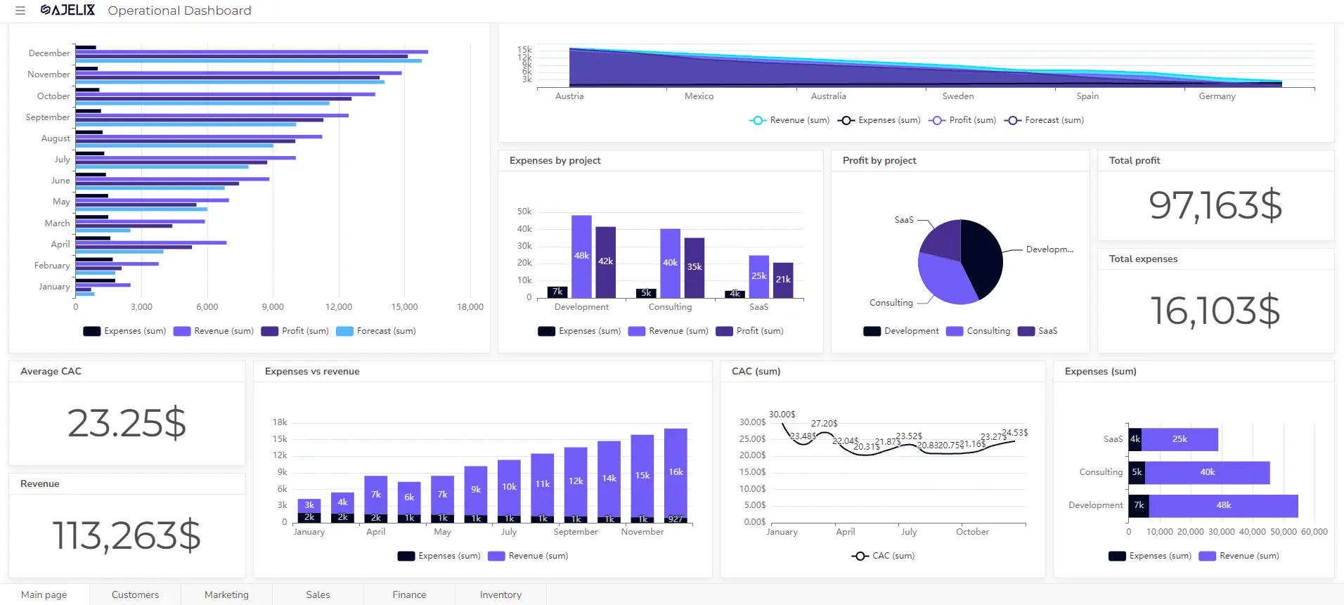
Ajelix Data Visualization For Easy Reporting
In the ever-evolving landscape of data visualization tools, Ajelix BI emerges as a game-changer for small to medium businesses and solo entrepreneurs seeking user-friendly solutions.
Ajelix BI boasts an easy interface that rivals competitors. No need for convoluted setup processes or exhaustive training sessions—easy setup is a promise here. Dive straight into the world of AI data analytics without the hassle of demo calls.
Unlike one-size-fits-all solutions, Ajelix BI is tailored for businesses of your size. It understands the unique challenges faced by small to medium businesses and solo entrepreneurs, offering specialized features that cater to your needs.
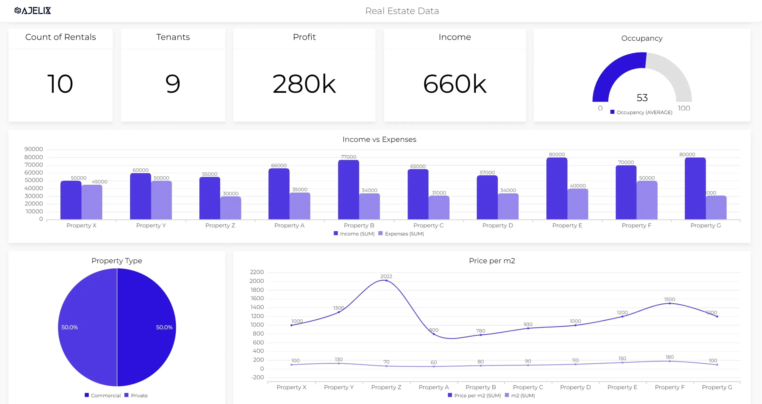
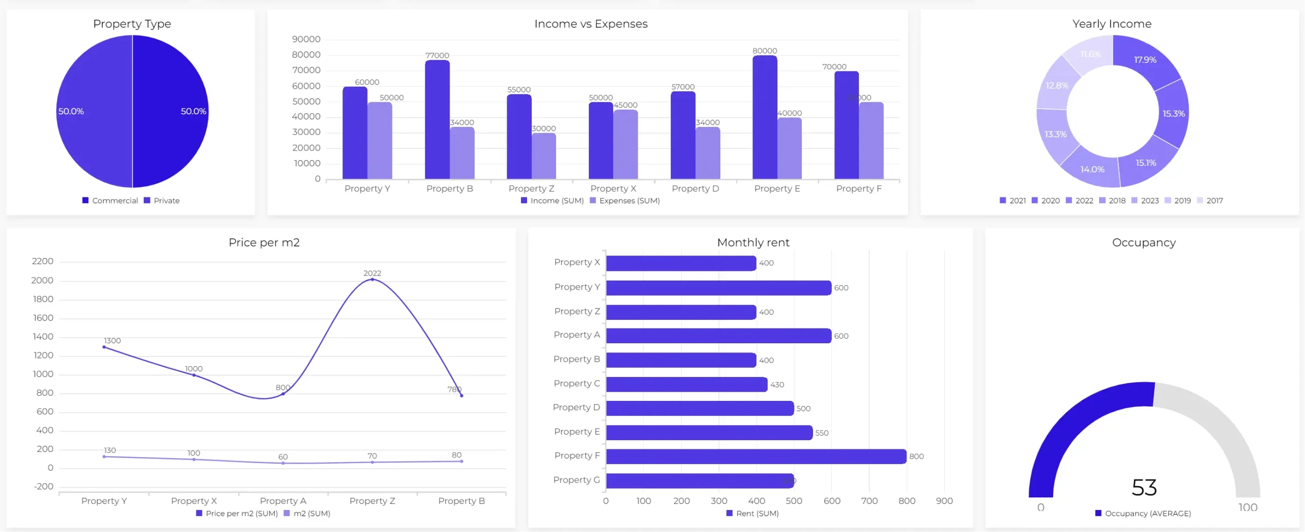
How To Visualize Your Real Estate Date
Are you ready to turn your raw real estate data into compelling visual insights? With Ajelix data visualization, the process is a breeze. Follow these simple steps to harness the power of data-driven decision-making.
Time needed: 5 minutes
Here’s how to create a real estate data dashboard with the Ajelix data visualization tool in seven simple steps.
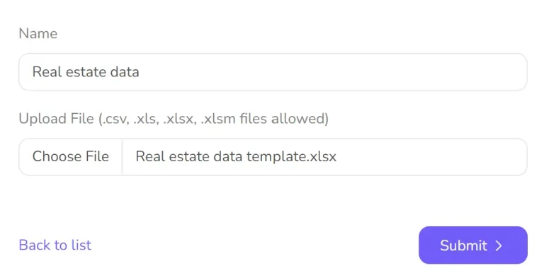
- Data Import
Begin by uploading your real estate data. Ajelix supports a variety of formats, so you can easily upload Excel or CSV data files. Your data is secure and ready for transformation.
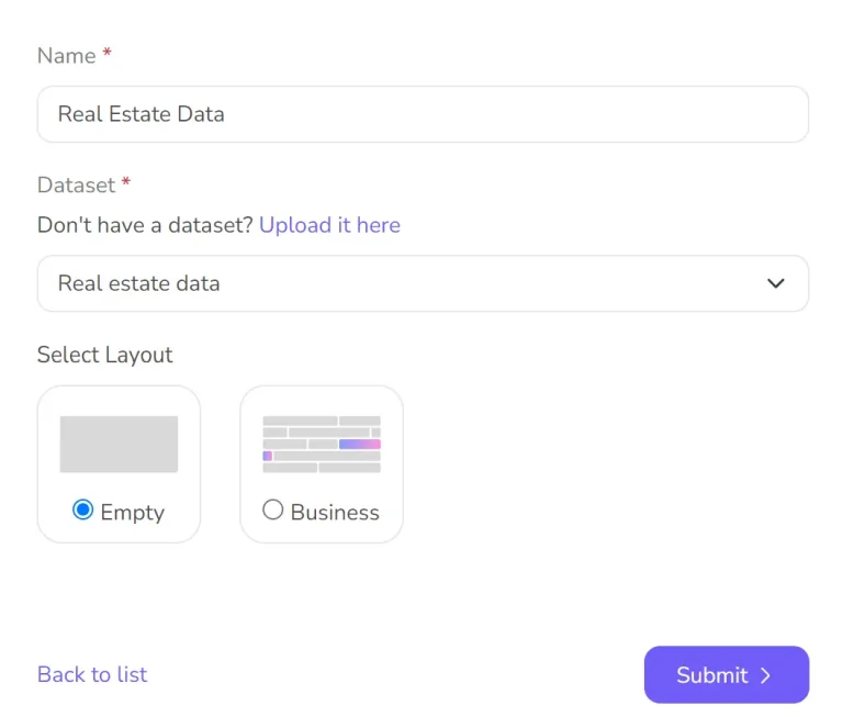
- Set Up The Report
Type the title of your report and connect data sets with the report.
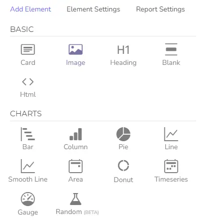
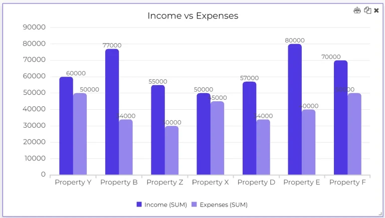
- Choose Your Charts
Now, it’s time to pick the perfect charts for your real estate analysis. From bar graphs to heat maps, Ajelix offers a diverse range of visualization options. Tailor your charts to suit your data and objectives.
- Add Calculations
Enhance your insights by incorporating calculations and aggregations. Ajelix makes it simple to perform complex calculations, ensuring your real estate data is presented with precision.
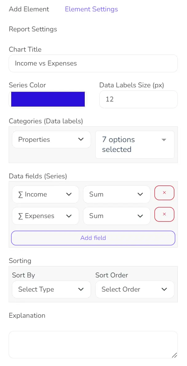
- Titles and Labels
Don’t forget the importance of clear communication. Add informative titles and labels to your visualizations, making it easy for viewers to understand the story your data is telling.
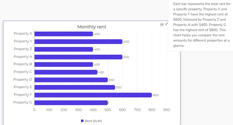
- Analyze with AI
Harness the power of AI to gain deeper insights. Let AI analyze your data, uncovering trends and patterns that might have gone unnoticed.
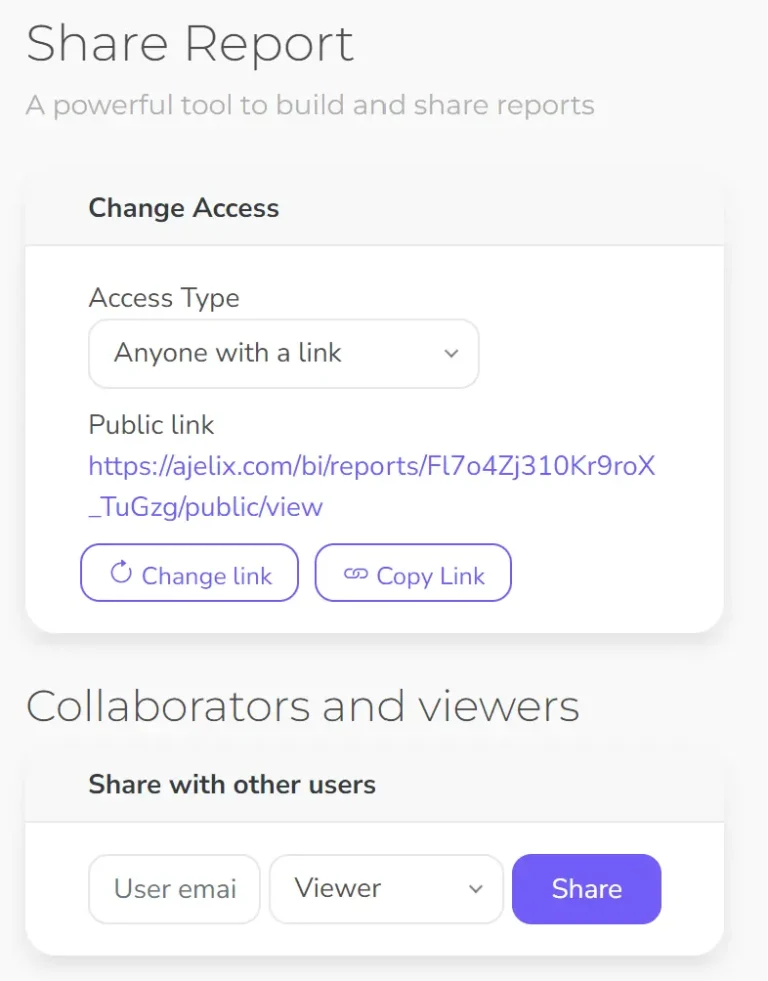
- Share Your Report
Your visual masterpiece is ready to be shared. Invite collaborators by adding editors and viewers to your project. Collaborate seamlessly to make data-driven decisions together.
In just seven simple steps, Ajelix data visualization empowers you to transform raw real estate data into actionable insights. Don’t miss out on the power of data—start visualizing with Ajelix today.
Conclusion
In conclusion, mastering real estate data visualization is a game-changer in the industry. It empowers you to make data-driven decisions, gain a competitive edge, and communicate insights effectively. We encourage you to apply the techniques learned in this guide to your real estate endeavors, as data visualization continues to play a pivotal role in informed decision-making in the real estate industry.
Moreover, if you’re passionate about leveraging these skills in a global setting, exploring real estate jobs abroad might be an exciting avenue to apply your expertise.
FAQ
Check for errors like typos, outliers, and inconsistencies. Address missing values, decide whether to remove them, estimate them (imputation), or highlight their absence in the visualization. Finally, make sure all your data is formatted consistently, including units, dates, and categories. Built-in data preparation tools can help you do that before visualization.
Ready to create your real estate data dashboard?
From data to report in one minute or less with Ajelix AI Agent