How To Make Bar Graph in Excel

Bar graphs can help you visually represent data and providing a clear way to present the necessary information. Excel, a powerful spreadsheet program, offers a range of features that make creating bar graphs quick and efficient.
What is Bar Graph?
A bar graph, also known as a bar chart, is a visual representation of data using rectangular bars. Bar graphs are super popular in all kinds of fields to show data in a cool and easy-to-grasp way. They’re great for comparing stuff, spotting trends, and seeing patterns in data sets.
How To Prepare Data for Excel Bar Chart?
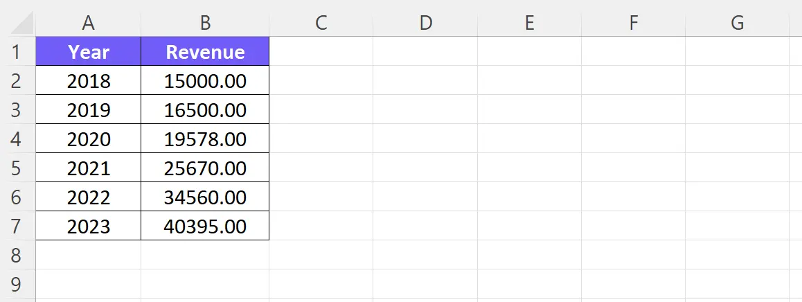
Making sure your data is all neat and tidy in the Excel worksheet is super important. Put your data in columns or rows, where each column or row is for a different category.
Screenshot taken by the author
Figure out which categories really matter for showing the info you want. Leave out any extra or unrelated data that might mess up the graph and make it harder to understand.
Related Article: How To Make Bar Chart Bars Wider?
How To Create A Simple Bar Graph?
Time needed: 2 minutes
Create A Bar Graph in Excel
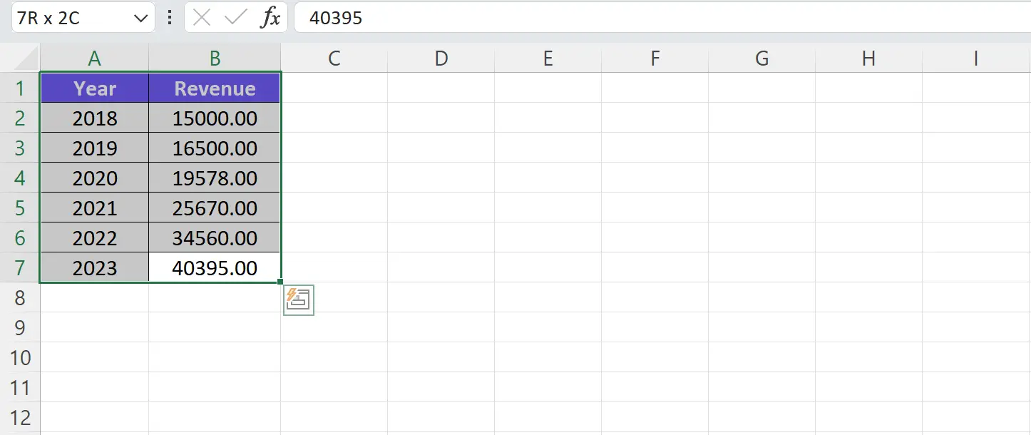
- Select the data for the graph
In Excel, you can easily rules select the data you want to include in your bar graph. Click and drag the cursor over the desired cells or use the Shift key to select a range of cells. Make sure to include both the category labels and the corresponding data values.
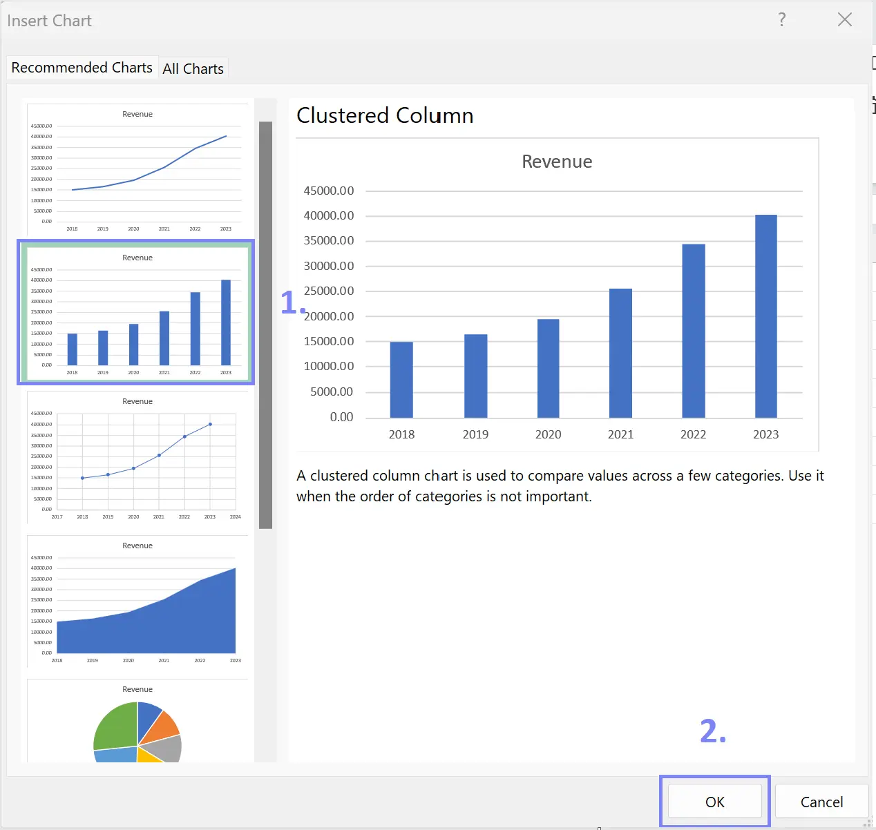
- Insert Bar Graph in Excel
Go To the Excel option file tab, click on Insert tab, and choose Recommended Charts. A pop-up window will show and Excel will give you the option to pick and create a bar chart.
Related Article: How To Delete A Chart in Excel?
How To Customize the Bar Graph in Excel?
How To Format the Axes, Labels, and Title?
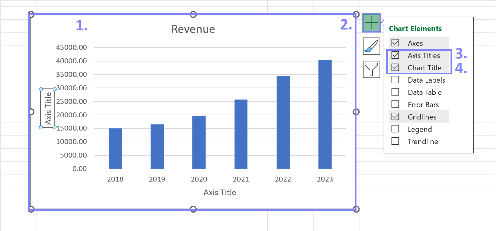
To enhance the visual appeal and clarity of your bar graph, Excel provides numerous customization options. Modify the axes. Set appropriate scales and intervals.
Label the axes clearly. Add a descriptive title. Provide context for the graph. To add titles click on the chart, press the plus sign, and thick settings Axis Titles and Chart Title.
Screenshot taken by the author
To edit your chart titles simply click on them and you’ll be able to make edits.
Related Article: Change Page Orientation to Landscape in Excel
How To Change the Colors and Styles of The Bars?
Excel allows you to customize the appearance of the bars in your graph. Experiment with different colors, and patterns. To change bar chart colors go to Chart Design, pick Change Colors, and experiment with different color palettes provided by Excel. This is a great option if you want to create an advanced chart with lots of bars.
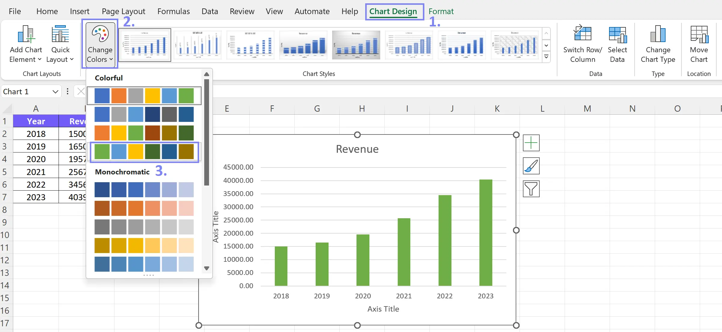
Screenshot taken by the author
If you want to create your own pallet and change bar colors more freely here’s what to do:
- Click on the element that you want to change color, in our example, we chose to customize the bar;
- Click on the Format setting
- Pick Shape Fill to change the bar color or Shape Outline if you’d like other color for bar outline;
- Now you can choose from different colors
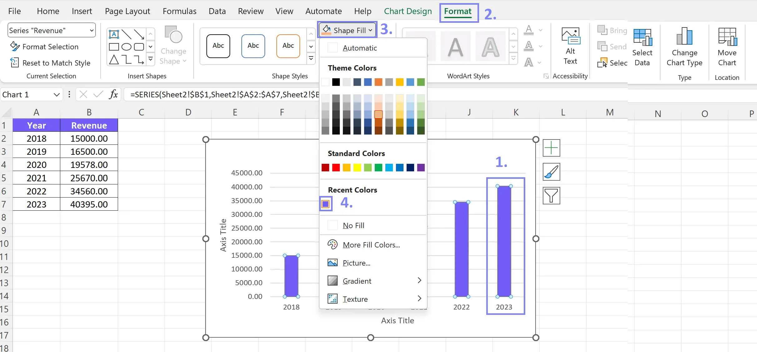
Screenshot with steps on how to change chart color
Related Article: How To Remove Conditional Formatting in Excel?
Conclusion
In conclusion, Excel is a powerful tool for creating bar graphs that effectively visualize and communicate data. By following the outlined steps and utilizing the extensive customization options, you can create visually appealing and informative clustered bar graphs. Excel’s charting features allows you to unlock the full potential of your data visualization and gain valuable insights.
Frequently Asked Questions
The purpose of data labels in a bar graph is two-fold. Firstly, they provide additional information about the values represented by each bar. Secondly, they enhance accuracy and readability.
Yes, you can add trendlines to your bar graph to visualize patterns in the data, providing insights into the tendency.
Export your bar graph from Excel using the “Save As” option. Select a desired format such as JPEG, PNG, or PDF. This will allow for easy sharing and compatibility with other software or platforms.
Learn more about Excel and Google Sheets hacks in other articles. Stay connected with us on social media and receive more daily tips and updates.
Speed up your spreadsheet tasks with Ajelix AI in Excel