How to Make Bar Chart Bars Wider in Excel

Bar charts are one of the most popular ways of visualizing data in Excel. However, the width of the bars in a bar chart can greatly impact the readability and effectiveness of the chart. In this article, we will provide a step-by-step guide on how to make bar chart bars wider in Excel.
Change the way you work with agentic AI
One-click dashboards,KPI tracking, and AI-powered insights—for work that actually gets done.

What is a Bar Chart in Excel?
Bar chart is a type of chart that displays data using rectangular bars. The length of each bar represents the value of a particular category.
There are two types of bar charts in Excel: vertical and horizontal axis. The elements of a bar chart include the axis labels, the legend, the bars themselves, and the data points.
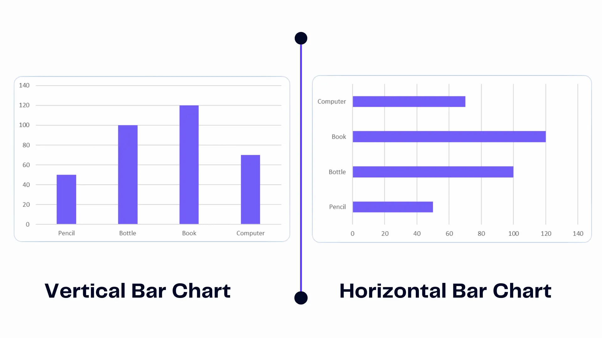
Infographic created by the author represents the differences between the two charts.
Vertical bar chart bars represent data vertically, however, a horizontal bar chart stacks the data horizontally.
Related Article: Remove Conditional Formatting in Excel
The Importance of Bar Chart Bars Width
The width of the bars in a bar Excel chart is crucial to the readability of the chart. Narrow bars can make it difficult to distinguish between different categories, while wider bars can make the chart look cluttered. Important to find the right balance between the width of the bars and the number of categories on the chart.
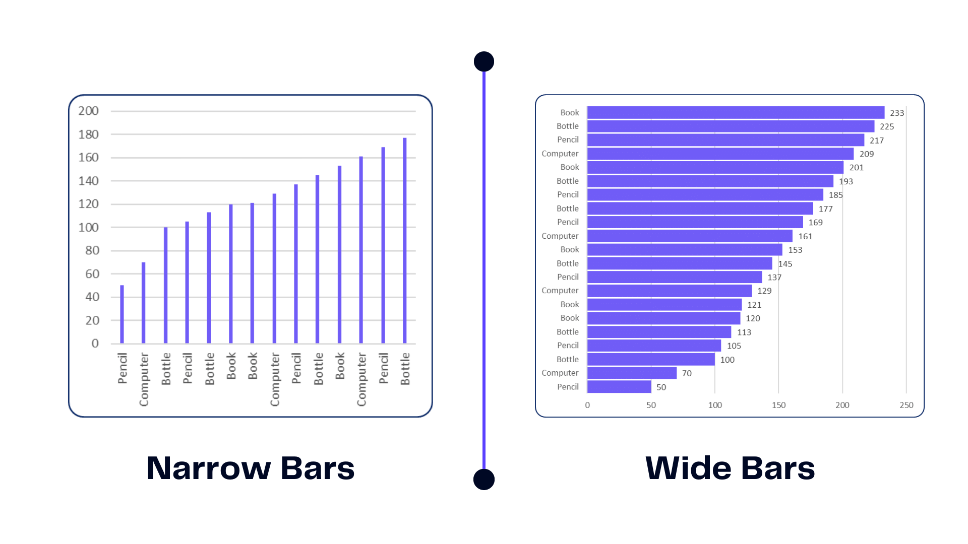
The author created infographic to represent bad practices in creating bar charts.
Related Article: How To Delete a Chart in Excel
How To Make Bars Wider in Excel Chart?
Time needed: 3 minutes
Here are the steps to adjust the width of the bars in bar graphs in Excel:
- Select the chart
To adjust the width of the bars, you first need to select the data and chart style you want to modify.
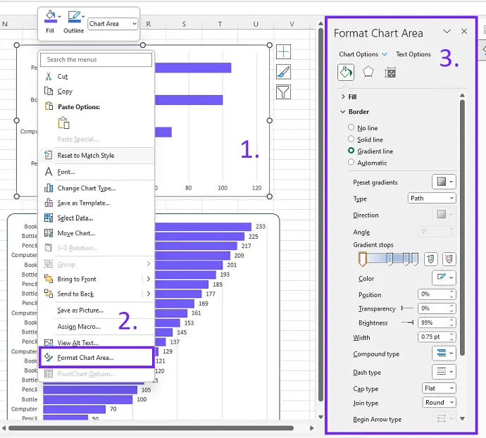
- Access the format data series options
Next, you need to access the format data series options. Access the format data series options by right-clicking on a bar and selecting “Format Data Series” from the menu. Or double-click on the selected chart.
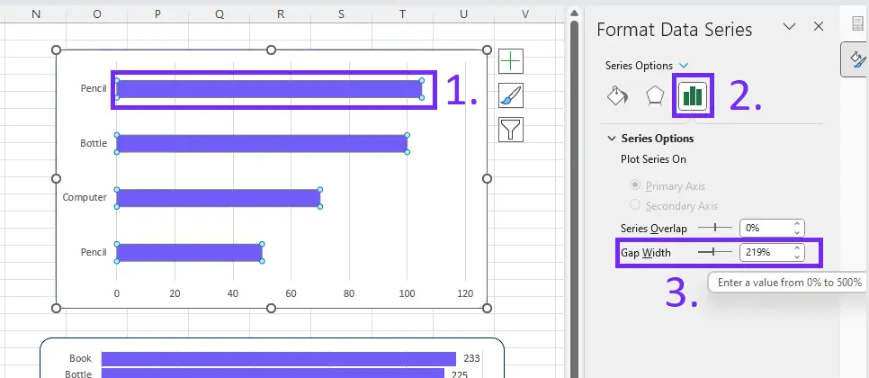
- Change the width of the bars
You can adjust the width of the bars by changing the “Gap Width” option in the format data series settings. The higher the percentage, the wider the bars will be. Click on the bar -> additional “series settings” will appear and the “Gap Width” option will appear.
- Preview and adjust the bar’s width
After adjusting the bar width, preview the chart layout to ensure it meets your expectations. If the bars are still too narrow or too wide, you can go back and adjust the gap width again.
Related Articles: How To Create Excel Template?
Create Reports Under Minute With AI
Creating reports and designing charts in Excel can be challenging, especially if it’s not something you particularly enjoy. Mastering Microsoft Excel often requires specialized training, and familiarizing yourself with its various elements can be time-consuming. Additionally, searching for instructional guides online can be a time-intensive task.
Enhance Data Visualization with Ajelix
With Ajelix, you can instantly turn your data into interactive charts, graphs, and dashboards – directly in chat. Upload your spreadsheets, CSVs, or connect Google Sheets and SQL sources, describe what you need, and Ajelix builds the visuals for you. No manual formatting, no drag-and-drop setup. Use the AI chat to explore your data further, ask follow-up questions, and refine your charts on the fly
Ajelix report example. Image Credit: Ajelix
Here’s how to start:
- Upload your Excel file
- Generate polished & professional reports in seconds
- Customize charts and add additional elements such as Pivot Tables
- Share the dashboard with colleagues using the link
Reporting gives you a headache?
Upload your data and create professional reports with agentic AI
Start free
Try free and upgrade whenever
Adjusting the Width of Specific Bars in Excel
Sometimes, you may want to adjust the width of specific bars in a grouped bar graph. To adjust the width of an individual bar, select it and modify its gap width. However, it’s important to note that adjusting individual horizontal bars can make the chart look uneven and potentially confusing.
Related Article: How To Remove Excel Add-in?
Tips for Widening Bar Chart Bars in Excel
Here are some tips for making sure your bar column chart bars are easy to read and visually appealing:
- Make sure the chart is easy to read using clear labels and legible font size.
- Use contrasting colors to make the vertical bars stand out from one another.
- Stick to best practices for visualizing data in Excel, such as avoiding excessive use of 3D effects or shadows.
Related Article: How To Change Page Orientation To Landscape in Excel?
What are the Common Bar Chart Mistakes?
- Overcomplicating the chart with too many categories or data points.
- Forgetting to label the axes, which can make the chart difficult to interpret.
- Using inaccurate or incomplete data, which can lead to misleading conclusions.
Related Article: How To Delete Rows in Excel?
Conclusion
In conclusion, the width of bar chart bars can greatly impact the readability of your bar chart. By following the provided guide, adjusting the bar width in Excel is easy for anyone. To avoid mistakes, keep the types of graphs simple and label the axes correctly. Experiment with different chart designs to find the best fit for the data presented horizontally or vertically.
Related Article: How To Print A Graph in Excel?
By using contrasting colors, avoiding clutter, and following best practices for visualizing data, anyone can create effective bar charts in Excel. With these helpful suggestions, you can improve your data visualization and create effective bar charts that clearly convey your message.
FAQ
No, you cannot adjust the width of individual bars in a bar chart. You can only adjust the width of all the bars in the chart at the same time.
Narrow bars can confuse the audience as it becomes difficult for them to differentiate between different categories on the chart. This can lead to misunderstandings and misinterpretation of the data.
Some advanced techniques for designing bar charts include:
– using color coding to emphasize certain data points
– adding trend lines to show the overall trend of the data
– using stacked or grouped bars to show multiple data sets in the same chart.
Other techniques include adding annotations or callouts to highlight specific data points and using a combination of different chart types. Such as a bar chart and a line chart, to show different aspects of the data.
Learn more about Excel and Google Sheets hacks in other articles. Stay connected with us on social media and receive more daily tips and updates.
Related Article: How To Create A Sparkline in Excel?
Speed up your spreadsheet tasks with Ajelix AI in Excel


