Donut Chart: When To Use Them With Good Examples
In this blog we’ll explain donut chart attributes, uncovering when and how to use them effectively. We’ll provide you with insights into the best practices and case studies for donut charts.
What is a Donut Chart?
Donut charts consist of a circular figure with a hole in the center, making them visually distinct from their pie chart counterparts. While pie charts represent data in slices, donut charts present it in rings, allowing for a different perspective on the same data.
When to Use Donut Charts?
Donut charts are particularly effective when you need to highlight parts of a whole. They shine in scenarios where you want to emphasize the contribution of individual segments within a larger context. However, it’s crucial to recognize when other chart types may better serve your purpose.
Pros of Using Donut Charts
Donut charts, a variant of pie charts, can be useful in specific data visualization scenarios when their features align with the data and the communication goals. Here are some situations when it’s appropriate to use a donut chart:
1. Displaying Parts of a Whole
Donut charts are excellent for showing the contribution of individual categories to a whole, making them ideal for illustrating the distribution of a single variable’s segments.
2. Comparing Few Categories
When you have a small number of categories to compare and want to emphasize their relative proportions, donut charts can be effective. They’re simpler than pie charts and can provide a more straightforward comparison.
3. Conserving Space
Donut charts are a space-efficient alternative to pie charts. You can add titles or additional text in the middle of the hole while maintaining the ability to visualize proportions.
4. Highlighting a Single Variable
Donut charts are particularly useful when you want to emphasize a single variable and its composition, making it the center of attention in your visualization.
5. Simplifying Data
If your data is straightforward and does not require a complex chart, a donut chart provides a clean and concise way to present the information.
Author’s Note: For complex data or when precise comparisons are necessary, alternative chart types like bar charts or stacked area charts may be more suitable. Always ensure that the choice of visualization aligns with the data and the story you want to convey.
Cons of Using Doughnut Charts
While donut charts can be a useful data visualization tool in certain situations, they also come with several limitations and cons that should be considered:
1. Difficulty in Comparisons
Donut charts can make it challenging to accurately compare the sizes of categories, especially when there are many segments. Users may struggle to differentiate between small differences in arc lengths.
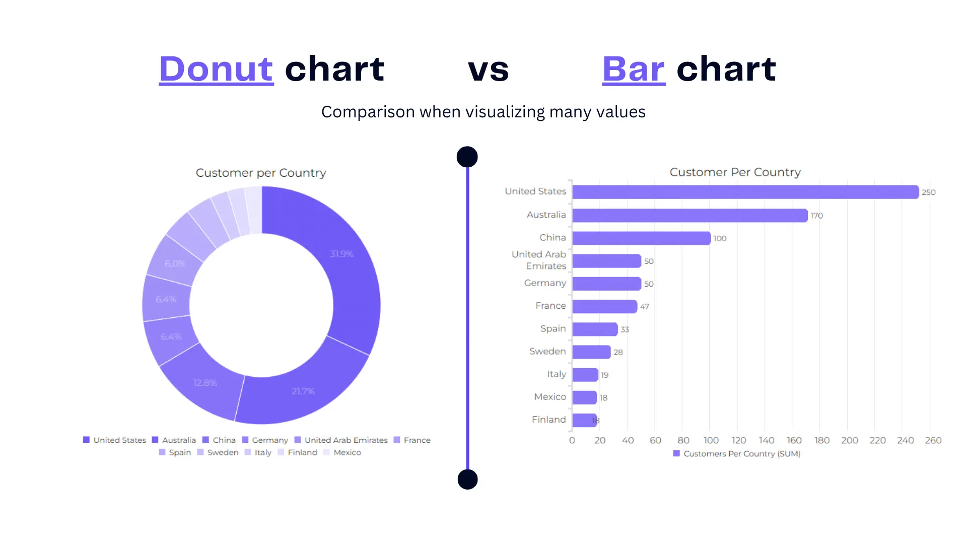
This example shows that bar chart can better visualize many values while donut chart can lead to misunderstandings when it comes to many data fields.
2. Limited Data Categories
Donut charts are best suited for visualizing a small number of categories (typically less than five). When you have many data points, a donut chart can become cluttered and less effective. You can see that in the previous picture.
Author’s Note: To help users create professional reports professional we have created a data visualization tool that will help you speed up the reporting process and avoid mistakes that we’re discussing in this article. You can start using this tool in a freemium plan.
3. Less Effective for Time-Series Data
Donut charts are not well-suited for displaying time-series data or trends over time. Other chart types, like line charts or stacked area charts, are better for this purpose.
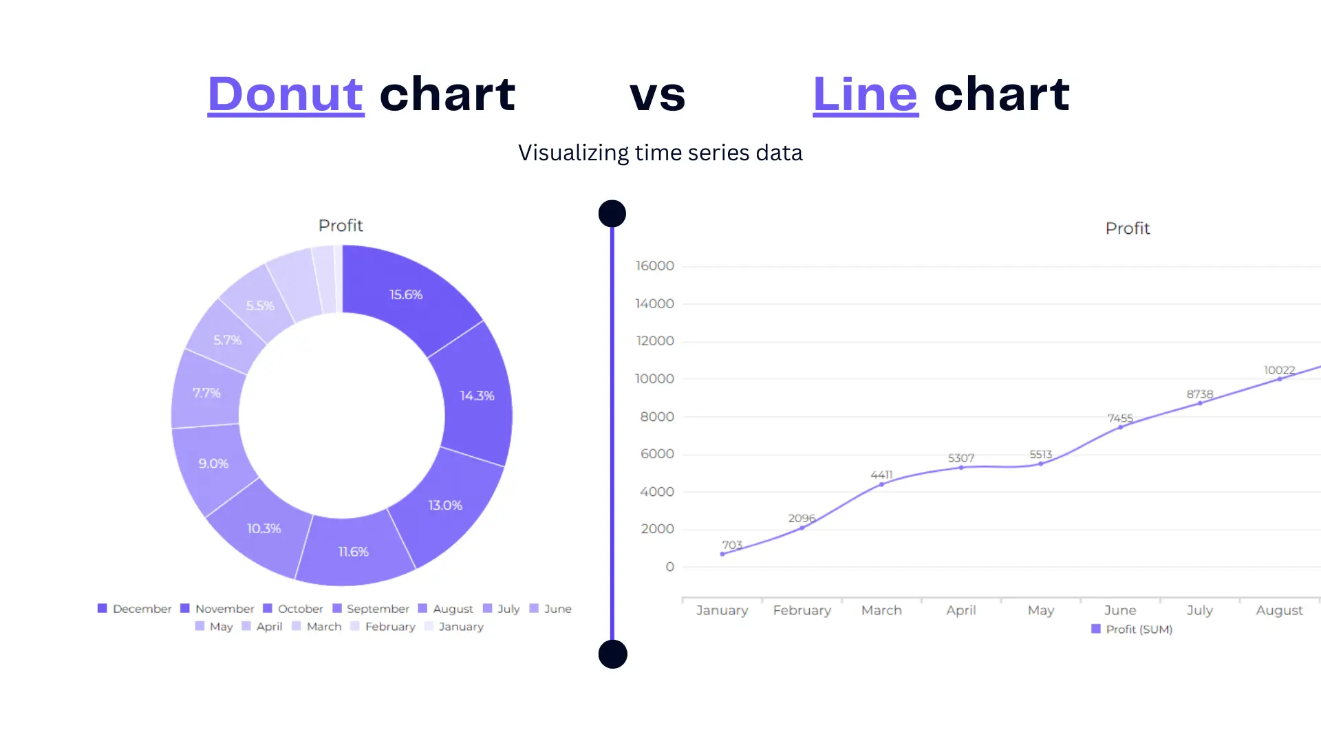
As you can see in the picture it’s hard to understand the profit growth over time, however, line chart very clearly visualizes time period.
4. Limited Interactivity
Donut charts lack interactivity, making it difficult to drill down into the data or highlight specific categories. This can be a drawback for users who need more detailed information.
5. Risk of Misinterpretation
Users may misinterpret the area inside the donut as a second data category, potentially leading to confusion.
Author’s Note: It’s essential to carefully assess whether a donut chart is the most appropriate choice for your data and communication goals, and to consider alternatives when these limitations could impact the effectiveness of your visualization.
Good Practices for Creating Effective Donut Charts
Creating effective donut charts requires following certain best practices to ensure clarity and accurate communication of data. Here are some good practices that we have summarized for creating donut charts:
- Choosing Appropriate Data and Categories
- Thoughtful Labeling and Color Choices
- Exploding Segments for Emphasis
- Ensuring Clarity and Readability
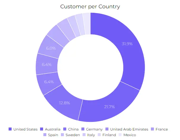
Example 1: A Well-Designed Donut Chart
Once you’ve covered the principles of good donut chart, let take a look how the good example. Using Ajelix AI Agents we’ve created a well designed donut chart, that:
- emphasizes the data
- has a good color palette that doesn’t confuse
- data labels are clear and if needed can be easily filtered
- chart doesn’t lead to misunderstandings
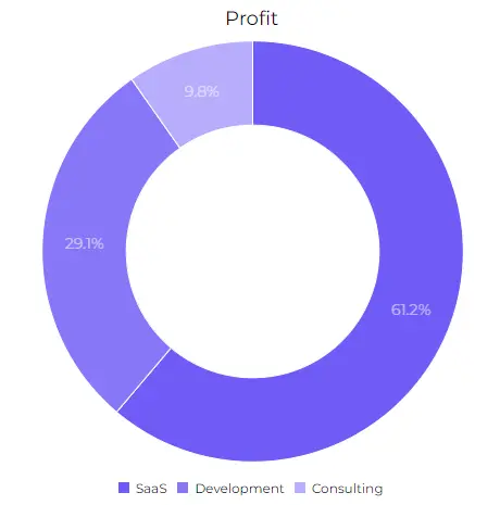
This chart is a great example how donut charts should be used, the message is clear and visualization doesn’t confuse. To get great visualizations without mistakes it is advisable to use visualization tools. These tools can help with your reporting process, it’s also easy to start, simply register and start using the freemium plan.
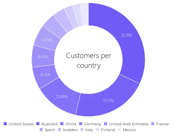
Example 2: A Poorly-Designed Donut Chart
Now, we’ll examine a donut chart that falls short due to design flaws. Identifying these mistakes, we’ll shed light on how such a chart can mislead or confuse its audience and offer recommendations for improvement.
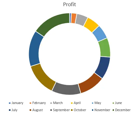
This chart example highlights all the opposite things that you shouldn’t do when creating a donut chart. Here’s a summary of bad things:
- The color palette is confusing and doesn’t match making it visually non-appealing.
- Chart doesn’t have values so it’s almost impossible to understand the exact data.
- Time series data is hard to grasp does the profit grows throughout the period time or it’s shrinking.
- Too many data labels doesn’t give us a grasp of data.
Conclusion
As we conclude this exploration of donut charts, we’ll summarize the key takeaways. We encourage you to apply best practices in donut chart design, and to select the right data visualization method that best suits your specific data and target audience. By doing so, you can unlock the potential of donut charts as a compelling and informative data storytelling tool.
Ready to create donut charts with Ajelix AI Agents?
From data to report in one minute or less with Ajelix AI Agent