How To Explode Pie Chart in Excel

Data visualization plays a crucial role in effectively presenting information. When it comes to visualizing data, pie charts are a popular choice due to their simplicity and ability to convey proportions. In this article, we will talk about pie charts and how exploding slices can make your data look more impressive.
What Is Pie Chart?
Pie charts are visual representations that display data in a circular format. The chart styles divides into sectors, each representing a specific category or data point. The size of each sector corresponds to the proportion of the data it represents.

Pie Chart Shows In Microsoft Excel
A pie chart has sectors, labels for each sector, and a legend with extra information about the chart
Related Article: How To Make A Bar Graph in Excel?
Why Explode a Pie Chart?
Exploding a pie slices involves separating one or more sectors from the main body of the chart, creating a visual emphasis. This technique can be beneficial in highlighting important data or drawing attention to specific categories.

Example of how exploded pie chart in Excel looks like
Exploded pie charts are particularly useful when you want to highlight a particular slice or make comparisons between multiple categories.
Related Article: How To Make Bar Chart Bars Wider?
How To Prepare Data for a Pie Chart?
Before creating a pie chart, it is essential to ensure that your data is organized and accurate. Clean and well-structured data will result in a more meaningful representation.
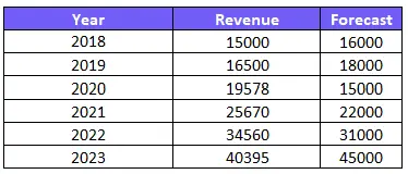
Choose data for the chart that matches your goals and effectively conveys your message. Find out how to remove conditional formatting in Excel to keep your sheet nice and clean.
How To Create a Basic Pie Chart in Excel?
Excel provides a user-friendly platform for creating charts. To create a basic types of pie chart, follow these steps:
1.Select the data range in Excel that you want to include in the chart.
2. Navigate to the “Insert” tab and click on the “Pie Chart” button.
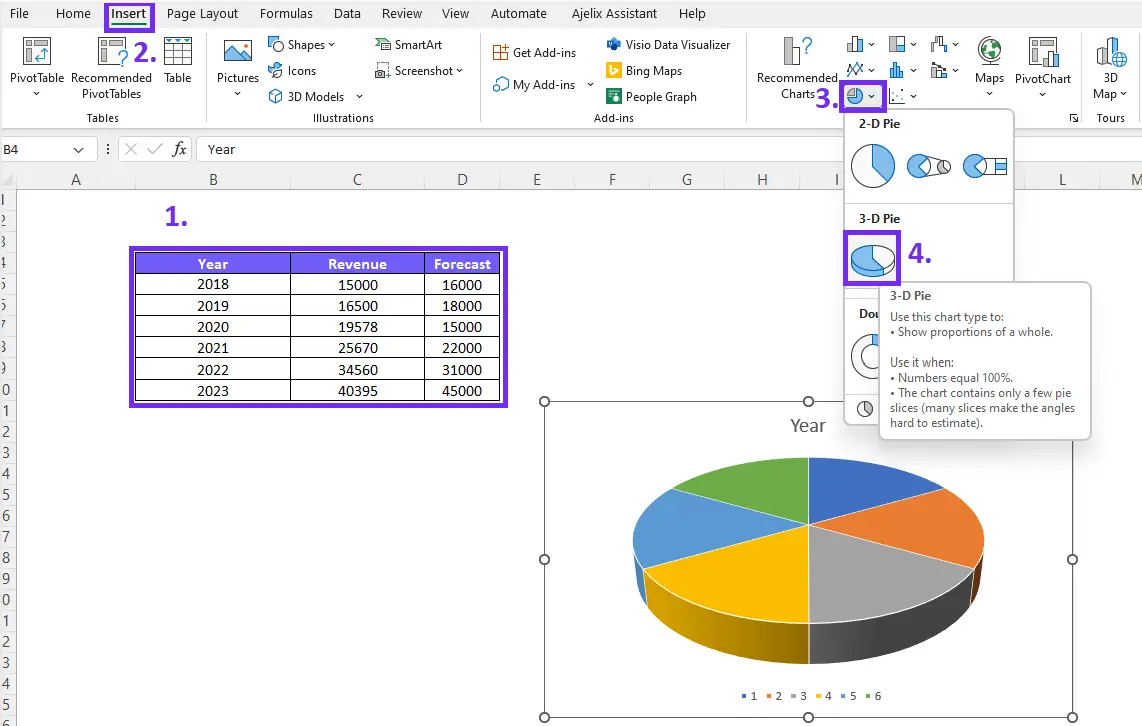
3. Choose the desired chart type, such as a 2D, 3D pie chart, or doughnut chart.
4. Excel will generate the pie chart based on the selected data range.
How To Explode Slices in Excel Pie Chart?
Exploding slices in Excel means separating sectors from the pie chart to create emphasis and visual impact. By exploding a small slice, you can draw attention to specific data points or highlight important categories. This technique helps in conveying the significance of particular data within the chart.
Time needed: 3 minutes
Step-by-step guide on How To Explode Excel Pie Chart Slice?
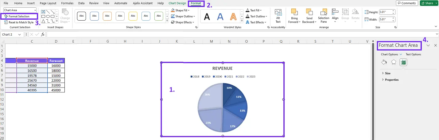
- Choose the pie chart you want to modify
- Double-click in the chart area and Format Chart Area Will Appear
Another way to open Format Chart Area settings is to click on the chart. Click on Format on the format data series pane ribbon choose Format Selection and pie chart settings will enable.
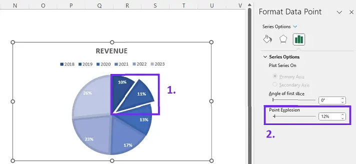
- Click on a specific data point that you want to explode
To open explode settings click on a chart and you will see Series Option settings. You will see Pie Explosion settings that you can change depending on how much you want to emphasize this data set.
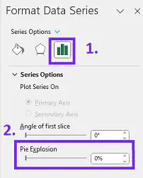
- To explode only one slice double-click on the specific data point not all pie.
If you clicked and destroyed all pie slices, press Ctrl+Z to undo changes and double-click on a data point.
Here’s a quick video summary:
What is the difference between exploding multiple slices and exploding all pie chart?
The main difference lies in how we do the explosion. Exploding some slices highlights specific parts. Exploding all slices creates a more striking look by separating them all.
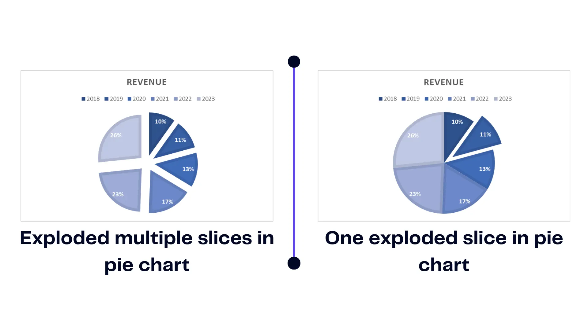
The infographic represents the visual difference between pie charts with multiple exploded slices and one exploded slice.
Sometimes, you may want to emphasize different categories or compare data points by splitting multiple slices in your chart. You can do this to highlight specific information or make comparisons between different sections of the chart. Make sure to customize data labels and change applicable color scheme in your chart sheet.
Exploding multiple slices allows you to visually separate and draw attention to specific data points or categories within the chart. When exploding multiple slices, it is important to follow certain guidelines to maintain clarity and avoid overcrowding the chart. Carefully select the slices that require emphasis and ensure they are visually distinguishable.
Related Article: How To Delete A Chart in Excel?
Conclusion
Exploding slices in Excel can effectively emphasize data points and highlight significant categories. By following the steps outlined in this article, you can create visually impactful charts that effectively communicate your data. Use this technique wisely and explore other ways to visualize data based on the context and goals of your analysis. Experiment, explore, and choose the method that best suits your data and audience.
Learn more about Excel and Google Sheets hacks in other articles. Stay connected with us on social media and receive more daily tips and updates.
Speed up your spreadsheet tasks with Ajelix AI in Excel


