9 Analytics Dashboard Software & Tools 2026

Everyone loves good analytics dashboard software and tools that visualize data in an easy-to-understand way. The real struggle is behind lovely designs because creating analytics dashboards can become a nightmare.
That’s why picking the right tool for visualizing data is the first and most complex step. The digital dashboard and the analytics process depend on the software and functionality. The ease of use, sharing, filtering, training, and costs are factors that one should consider.
In this article, we will take you through 9 top analytics best data dashboard software to create dashboards and visualize data. We will compare the main features and guide you through this process.
9 Data Analytics Dashboard Software
Change the way you work with agentic AI
One-click dashboards,KPI tracking, and AI-powered insights—for work that actually gets done.

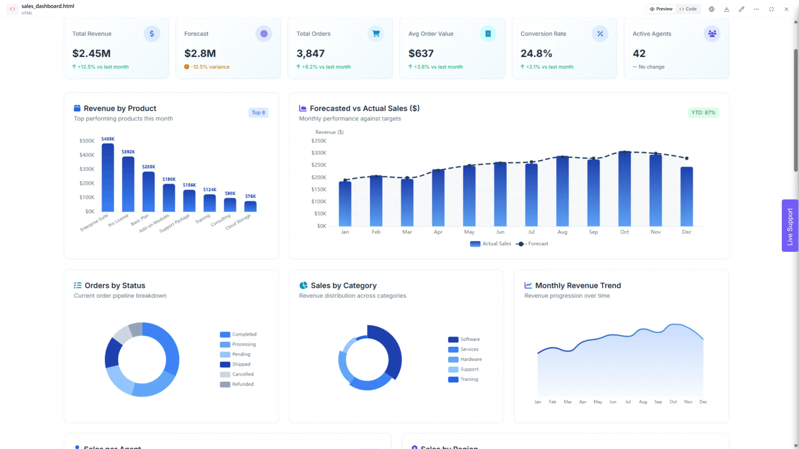
1.Ajelix
Features
- AI-Powered Dashboard Generation: Simply describe what you need in natural language, and Ajelix AI agent generates your dashboard instantly. No drag-and-drop builders or complex configurations – just type your requirements and watch your visualization come to life.
- Instant Visualizations from Conversation: Request any chart type through chat – bar charts, line graphs, pie charts, KPI cards, heatmaps, and more. AI agent understands your data and automatically selects the best visualization format for your specific needs.
- Intelligent Insights on Demand: Ask questions about your data and receive AI-generated insights, trend analysis, and anomaly detection. The agent uncovers patterns and presents actionable findings without manual analysis.
- Seamless Data Connectivity: Connect Excel files with simple drag-and-drop, or establish live connections to Google Sheets, Microsoft SQL Server, PostgreSQL, and MySQL databases. Your dashboards refresh automatically as source data updates.
- Conversational Editing Need changes? Just ask. Modify colors, add metrics, rearrange layouts, or create new visualizations, all through natural conversation. No design skills or technical expertise required.
- Easy sharing: Share your reports and dashboards with colleagues and stakeholders effortlessly.
- Operational dashboards: Create dashboards to monitor key performance indicators (KPIs) and gain a holistic view of your operations.
Pricing
- You can test it for free before committing.
- The Lite plan is $39/month for individuals who need more power – 20MB files, 500MB workspace, and asset creation.
- The Pro plan at $99/month unlocks the full experience with best-in-class models, 100MB files, 2GB workspace, and extended usage.
- The Max plan at $100/month is built for heavy workloads – 500MB files, 10GB workspace, and 2x the processing power.
Learn more about Ajelix pricing.
Reporting gives you a headache?
Upload your data and create professional reports with agentic AI
Start free
Try free and upgrade whenever
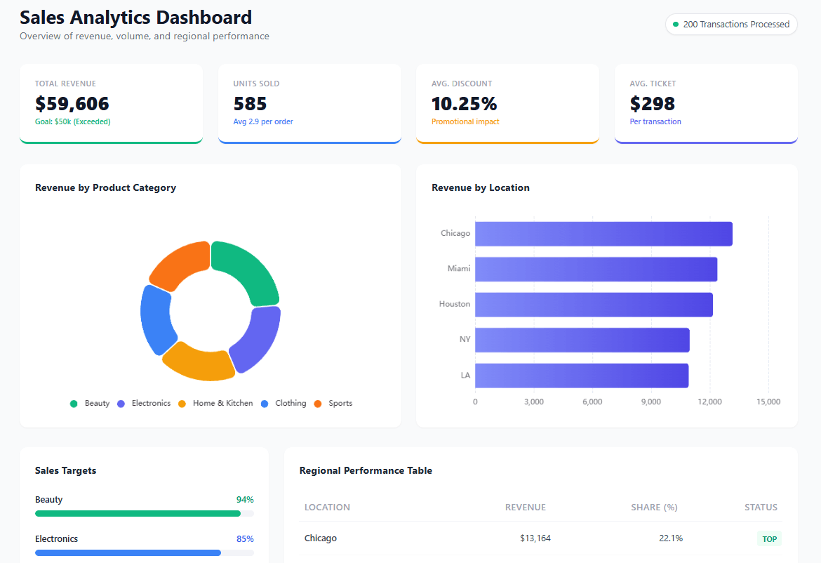
2. Klipfolio
Dashboard example created on Klipfolio BI, screenshot by author from https://www.klipfolio.com/
Features
- Drag-and-drop dashboard creation software: Build customizable dashboards with a wide variety of widgets and visualizations.
- Data integrations: Connect to a wide range of data sources, including databases, applications, and cloud services.
- Real-time data: Access and analyze data in real-time for informed decision-making.
- Alerts and notifications: Set up alerts to be notified of important changes in your data.
- Mobile access: View and interact with your dashboards and reports on your mobile device.
- Team collaboration: Share dashboards and reports with your team and collaborate on insights.
- Security: Secure your data with role-based access control and enterprise-grade security features.
Discover other Klipfolio features and alternatives.
Pricing
- Free access includes 20 metrics, 2 users, and a semantic layer, other functions are limited.
- Professional for 300$ per month provides unlimited metrics, and 10 users (you can add more for an additional price).
- A custom plan for 800$ per month offers unlimited everything plus enterprise solutions per request.
Full pricing available at https://www.klipfolio.com/pricing
3. Tableau
Dashboard creator software on Tableau BI, screenshot by the author from Tableau webpage
Features
- Drag-and-drop visualization: Create interactive dashboards and reports with ease.
- Wide variety of data sources: Connect to and analyze data from various sources.
- Advanced analytics: Perform complex calculations and analyses to gain deeper insights.
- Real-time collaboration: Share and collaborate on dashboards with colleagues in real time.
- Mobile access: View and interact with your data and insights on your mobile device.
- Scalability: Suitable for businesses of all sizes, from small teams to large enterprises.
Learn more about Tableau features and alternatives.
Pricing
- Tableau Viewer costs 15$ and allows you to view already-created dashboards
- Tableau Explorer costs 45$ per user a month and gives the ability to use self-service analytics, filter, and answer data questions.
- Tableau Creator costs 75$ per user a month and allows you to create dashboards and connect to different data sources.
- Learn about Tableau’s pros and cons
Full pricing is available at https://www.tableau.com/pricing
4. Power BI
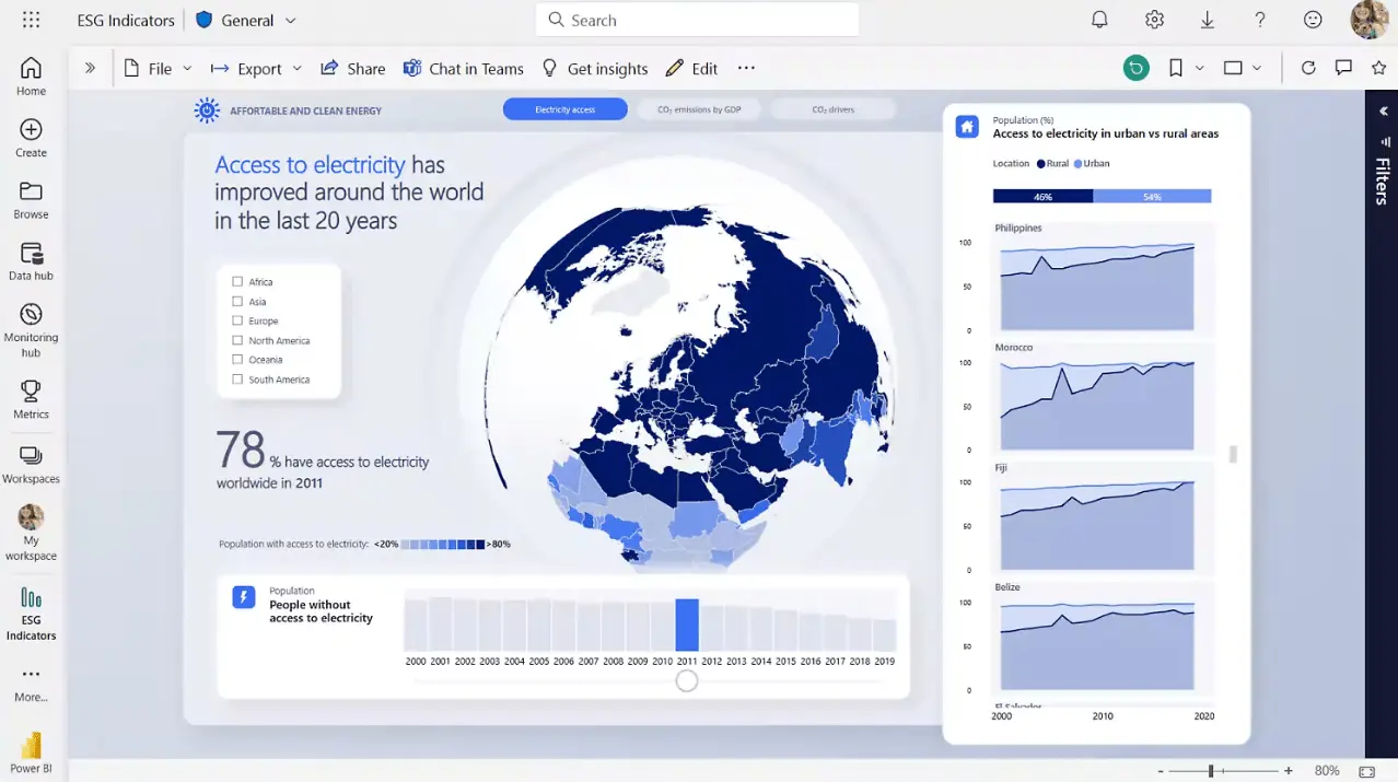
Dashboard example screenshot from Power BI website, screenshot by author
Features
- Visualize data: Create interactive reports and dashboards with various charts, graphs, and custom visuals.
- Connect to almost anything: Access data from diverse sources, including on-premises and cloud storage.
- Empower everyone: Users of all skill levels can explore, analyze, and visualize data independently.
- Collaborate easily: Share and edit reports securely with colleagues both inside and outside your organization.
- Access on the go: View and interact with data on your mobile devices for real-time insights.
- Scalable and secure: Adapts to businesses of all sizes and prioritizes data privacy with robust security features.
Get to know other Power BI features and alternatives.
Pricing
- Free access with limited functionality
- Power BI Pro plan for 10$ per user a month
- Power BI Premium 20$ per user a month
- Power BI Fabric user offers custom billing
- Discover Power BI pros and cons.
Full pricing is available at https://www.microsoft.com/en-us/power-platform/products/power-bi/pricing
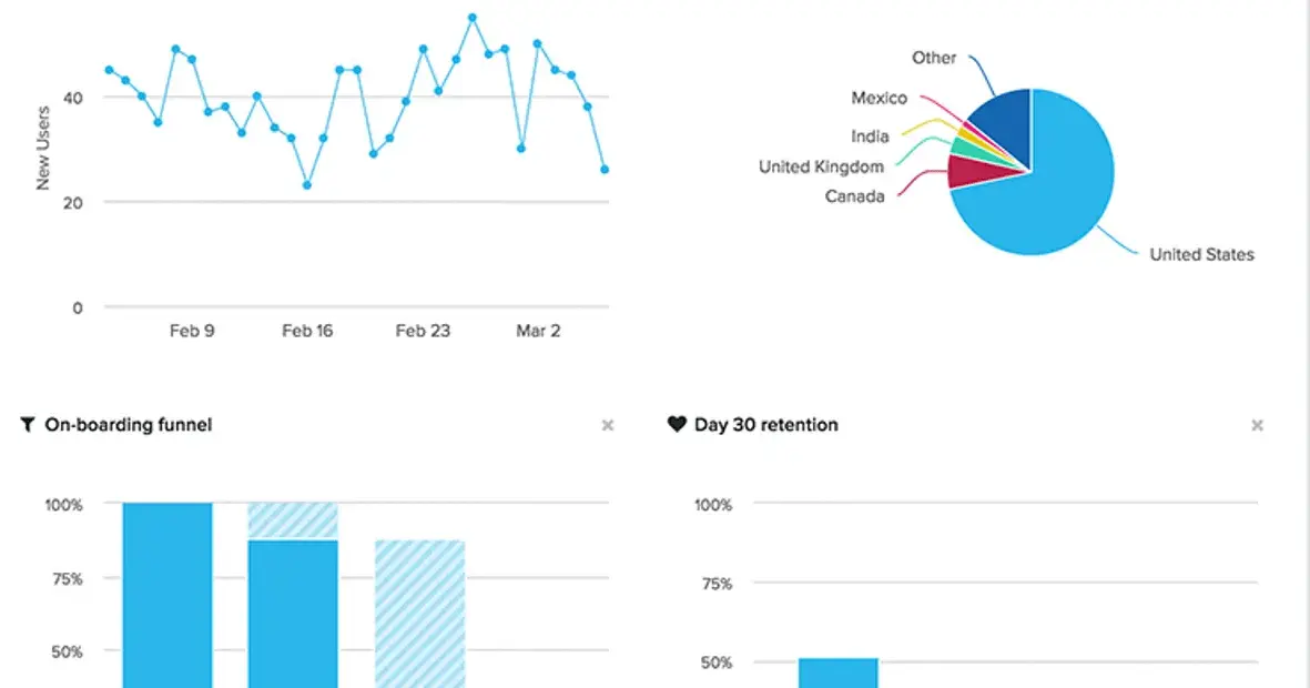
5. Looker Studio
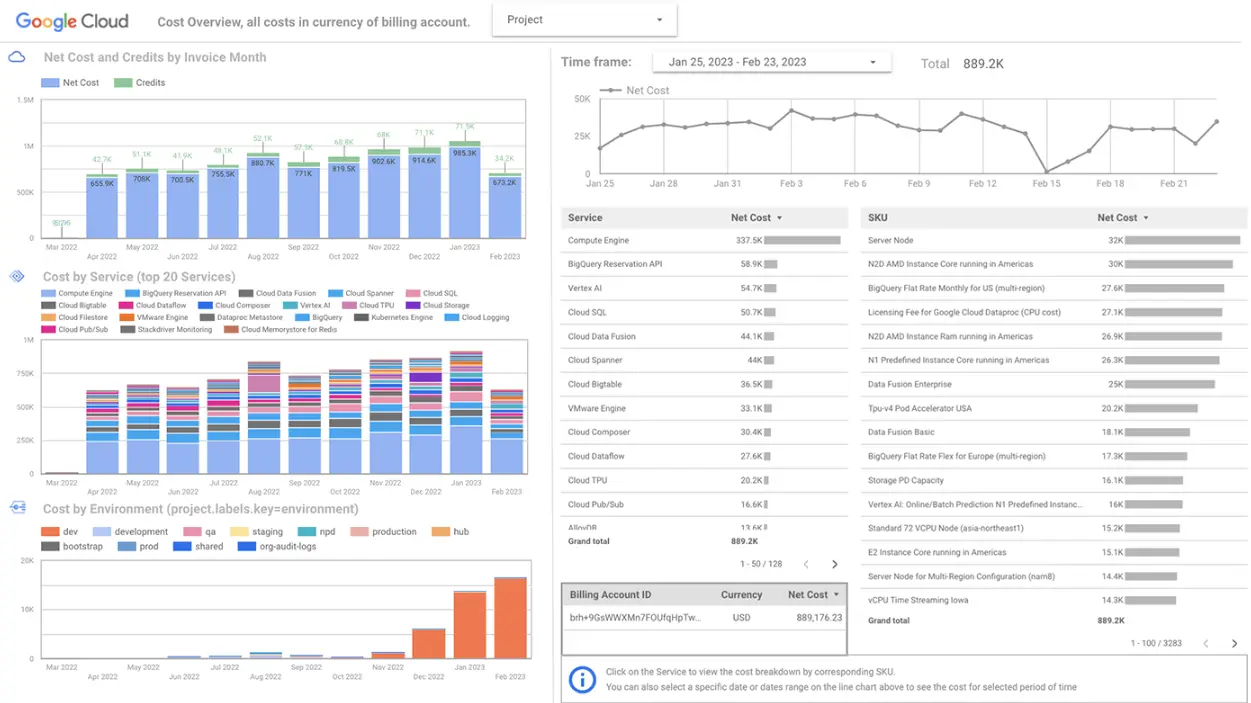
Dashboard example from Looker Studio, screenshot by author
Features
- Easy-to-use interface: The dashboard design tool is intuitive and user-friendly, allowing even non-technical users to create reports and dashboards.
- Drag-and-drop functionality: Simplifies the process of building reports and dashboards by enabling users to easily add and arrange various elements.
- Free and accessible: Available for free, offering a cost-effective solution for data visualization needs.
- Variety of data connectors: Connects to a wide range of data sources, including Google Sheets, BigQuery, and other popular platforms.
- Interactive reports and dashboards: Creates reports and dashboards for the IT department and other departments that users can interact with, allowing for deeper exploration of data.
- Collaboration and sharing: Enables users to share reports and dashboards with colleagues and stakeholders, facilitating communication and data-driven decision-making.
- Discover more Looker alternatives and features.
Pricing
- Looker Studio free version
- Additional costs for data integrations
Full pricing available at https://cloud.google.com/looker/pricing
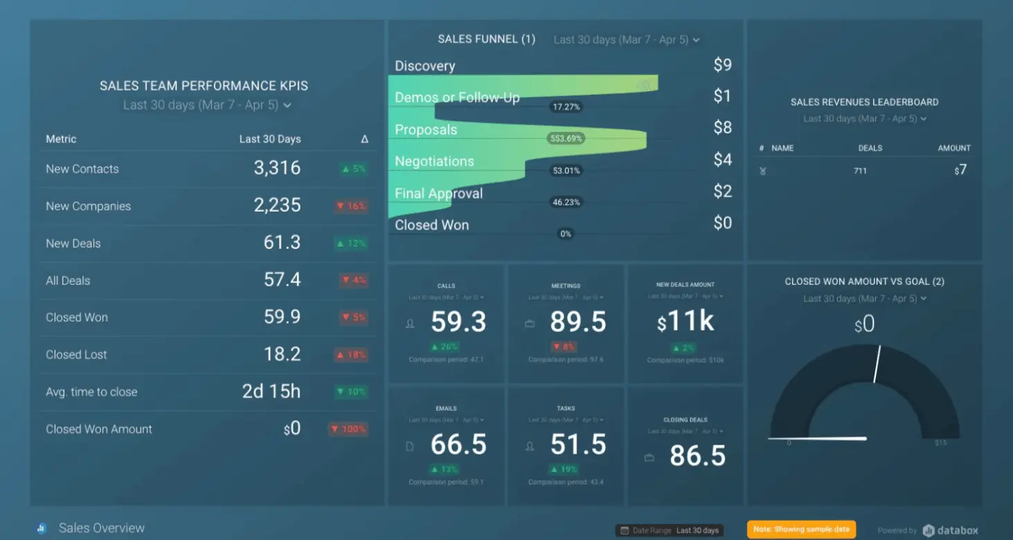
6. Databox
Features
- Centralized Data Tracking: Databox allows you to track and monitor all your business data in one place.
- Customizable Dashboards and Reports: Build tailored dashboards and reports with drag-and-drop functionality, and easily share insights with stakeholders.
- Goal Setting and Tracking: Set specific goals for your key performance indicators (KPIs) and monitor your progress towards them in real-time.
- Integrations: Databox integrates with a wide range of popular marketing, sales, and other business dashboard design tools.
- Automated Alerts and Notifications: Set up automated alerts and notifications to receive instant updates when your data reaches specific thresholds or triggers.
- Mobile Access: View and interact with your dashboards and reports anytime, anywhere, on your mobile device.
Pricing
- Free version
- Starter for 59$ includes 5 users
- Professional 169$ includes 15 users
- Growth 399$ unlimited users and up to 1000 metrics
- Premium for 999$ a month with unlimited everything
Full pricing is available at https://databox.com/pricing
7. Sisense
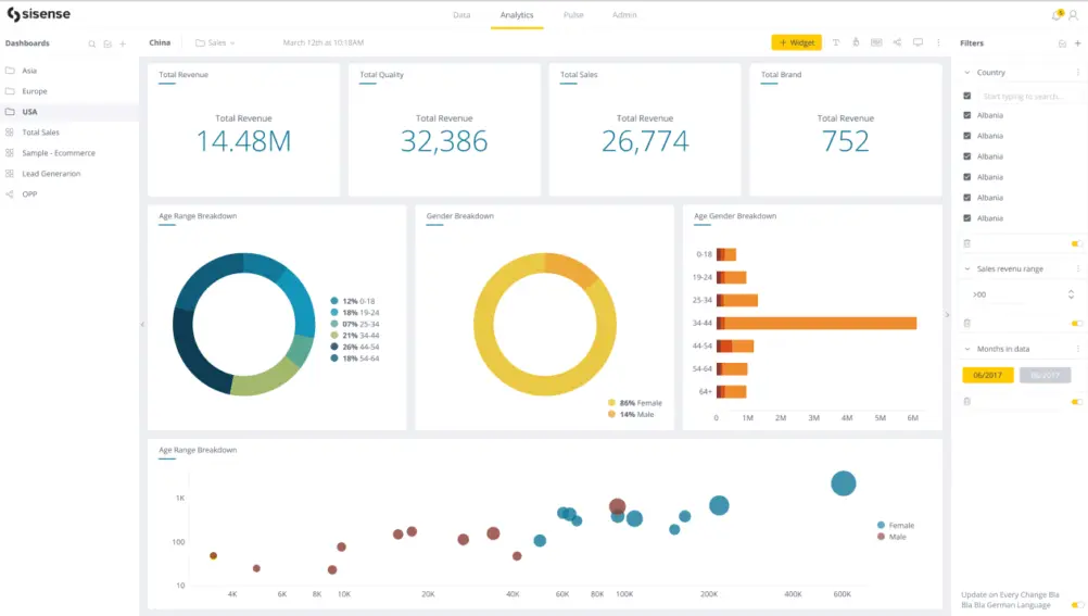
Dashboard example from Sisense BI, screenshot by author
Features
- Embedded Analytics: Integrate data analysis and visualizations directly into your applications, providing seamless user experiences.
- In-memory Analytics: Leverage in-memory technology for fast and responsive data exploration and analysis, even with large datasets.
- Self-Service BI: Empower users of all skill levels to explore and analyze data independently through an intuitive interface.
- AI-Powered Insights: Utilize built-in AI capabilities to uncover deeper insights, identify trends, and predict future outcomes.
- Mobile BI: Access and interact with data and insights from your mobile devices for on-the-go decision making.
- Scalability and Security: Sisense scales to meet the needs of businesses of all sizes and prioritizes data security with robust features like role-based access control and data encryption.
Pricing
- No free version or pricing page available, only information about demo
8. Domo
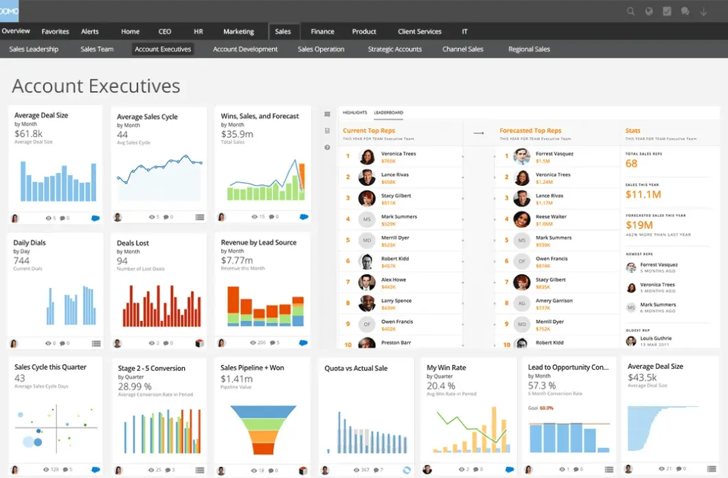
Dashboard example from Domo platform, screenshot by author
Features
Based on the Domo website, here are 6 of its top features:
- Data Unification: Connects and unifies data from various sources, including cloud applications, on-premises databases, and legacy systems.
- Self-Service BI: Empowers users of all skill levels to explore, analyze, and visualize data independently through an intuitive interface.
- Interactive Dashboards and Apps: Create interactive accounting dashboards and applications with drag-and-drop functionality.
- AI-Powered Insights: Leverages artificial intelligence (AI) to uncover hidden patterns, identify trends, and predict future outcomes.
- Mobile Access: Access and interact with data and dashboards on your mobile devices.
- Scalability and Security: Scales to meet the needs of businesses of all sizes and prioritizes data security with features like role-based access control, data encryption, and compliance certifications.
Pricing
- Free version includes 300 credits per month
- Standard version for 300$ allows you to add more credits
- To get information about other plans you must contact sales
- Get more detailed overview of domo and it’s alternatives in our article.
Full pricing is available at https://www.domo.com/pricing
9. Amplitude
Features
- Digital Analytics: Capture user behavior data across web, mobile, and other digital touchpoints.
- Product Analytics: Analyze user interactions within your product to gain insights into user engagement, feature adoption, and areas for product optimization.
- A/B Testing: Conduct A/B tests to compare different versions of your product features and determine which ones drive better user outcomes.
- Customer Segmentation: Create user segments based on different criteria and analyze their behavior to personalize the user experience and marketing efforts.
- Real-time Insights: Access and analyze data in real-time.
- Integrations: Integrate with various marketing, sales, and other business tools to bring all your data together for a unified view.
Pricing
- Free plan includes limited access to the platform
- Plus plan for 61$ includes basic access to the platform
- Growth plan with custom plan provides more advanced analytics and customized offer
Full pricing is available at https://amplitude.com/pricing
Conclusion
The landscape of dashboard visualization tools is ever-evolving, offering a diverse range of options for every need and budget. In this blog post, we explored nine popular analytics financial dashboard software: Ajelix, Klipfolio, Tableau, Power BI, Looker Studio, Databox, Sisense, Domo, and Amplitude.
As you’ve seen, each tool has its own strengths and weaknesses, catering to specific user types, data sources, and functionalities. When selecting the right BI tool, it’s crucial to consider your unique needs, resources, and technical expertise.
FAQ
Ajelix, Looker Studio and Databox are excellent options for non-technical users, as they offer intuitive interfaces and drag-and-drop functionality.
Ajelix, Tableau, Power BI, Sisense, and Domo all have built-in AI capabilities for deeper data analysis and uncovering hidden trends.
Looker Studio and Ajelix offer free plans with basic functionalities. Several other tools, like Databox and Klipfolio, also have free versions with limited features.
Here are some popular dashboard tools for data visualization: Ajelix, Microsoft Power BI, Tableau, Looker Studio (formerly Google Data Studio), Qlik Sense, and Domo.
Ready to create dashboard with Ajelix?
From data to report in one minute or less with Ajelix AI Agents