Top 5 Klipfolio Alternatives 2026 You Can’t Miss

In a study by MIT, researchers found that people are 65% more likely to retain information when it is presented visually compared to when it is presented textually. Because our brains are naturally wired to process visual information more efficiently.
This is where data visualization tools, such as Klipfolio and Ajelix, come in handy. Without the ability to transform meaningless data tables into interactive graphs, organizations can’t make data-driven decisions.
Klipfolio is one of the most popular business intelligence software out in the market. Providing metric-based reporting and helping organizations manage data better.
In this article, we’ll walk you through the 5 best alternatives to Klipfolio, comparing features and pricing plans. So you can easily decide which tools are the best for your business. Let’s dig in!
Change the way you work with agentic AI
One-click dashboards,KPI tracking, and AI-powered insights—for work that actually gets done.

5 Klipfolio Alternatives and Competitors
Quick Glance At Klipfolio
Klipfolio is like a digital artist for your data. It can transform your raw numbers into beautiful charts, graphs, and dashboards that are easy to understand and interpret. It’s like having a personal data assistant who can help you monitor your key performance indicators (KPIs) in real-time. And the best part is, it works with over 100 different data sources, so you can bring all your data together in one place.
Most Popular Features
- Create your own metrics
- Integrate data from over 100 sources
- Use pre-made dashboards for live data
- Generate data feeds using SQL or other methods
- Prepare data before reporting
- Visualize data with powerful tools
- Share your work easily with others
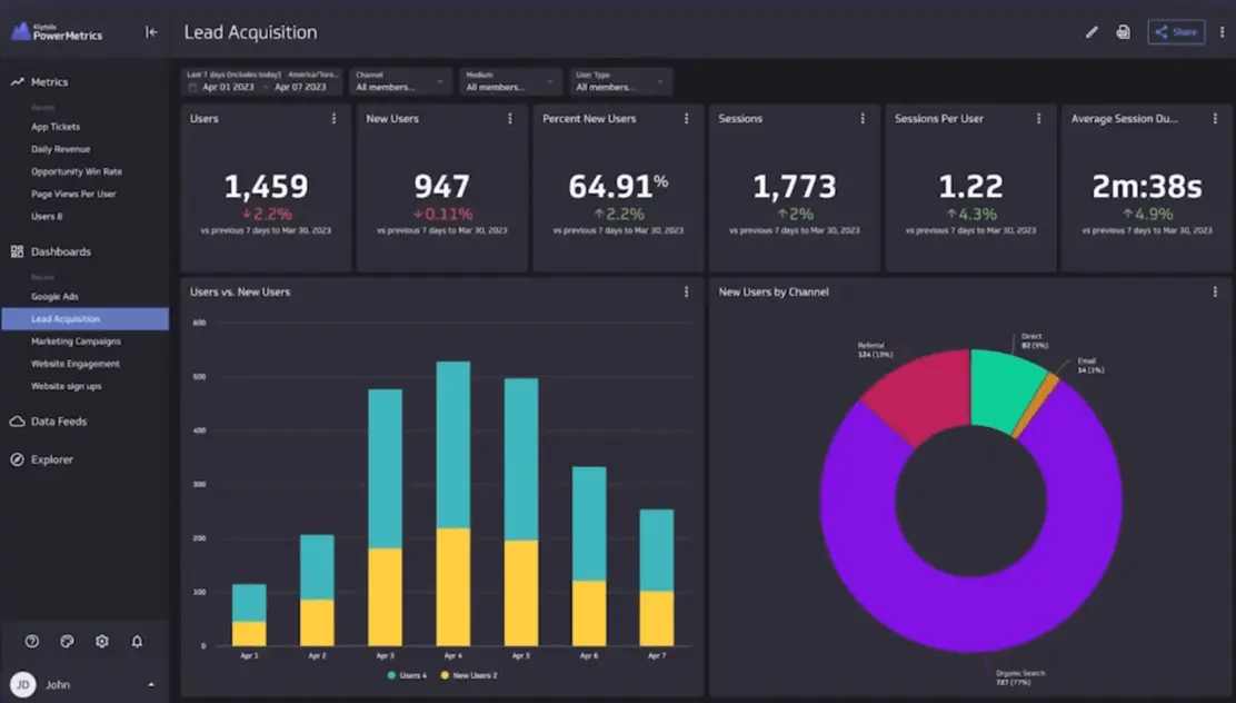
Klipfolio editor view screenshot from klipfolio youtube channel
Klipfolio Limitations & Cons
- Similar to other BI platforms, there might be occasional delays and performance issues.
- Missing user interactivity features such as drag-and-drop functionality could limit your experience.
- The support documents might be hard to navigate and not always accurate, making it difficult to resolve any issues.
- Creating a backend dashboard can be a complex process, which might require specialized technical knowledge.
- Several users have mentioned that creating custom reports beyond the pre-defined options can be challenging, requiring prior knowledge and technical skills.
- Setting up and renewing API connections might necessitate the assistance of an IT professional.
Who are The users?
- Suitable for businesses ranging from small to medium-sized enterprises.
- User-friendly for those without extensive technical expertise.
- Appropriate for data analytics tasks ranging from foundational to intermediate levels.
Klipfolio Pricing
Klipfolio offers three pricing plans to suit your specific needs and budget: Free, Standard and Custom. Each plan offers a variety of features and data sources, allowing you to create powerful dashboards and reports that can help you make informed decisions.
Free Plan:
- Suitable for small businesses or those exploring features
- Limited user numbers, dashboards, and data sources
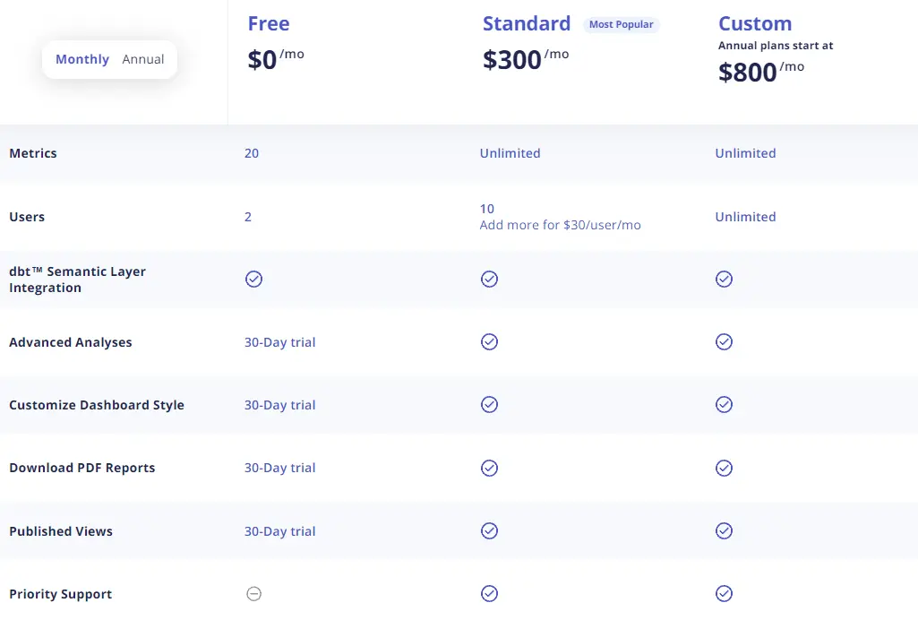
Klipfolio pricing plan screenshot from https://www.klipfolio.com/pricing
Standard
- Available for $300 per month
- Flexible user count (option to add more users for additional price) and data source management
- Additional features like data sharing, filters, and more
Custom Plan:
- Priced at $800 per month
- Extensive user count and data source management
- Includes Custom service agreement and vendor assessment as supplementary features
| Plan | Pricing | Metrics | Users | Customization |
| Free | Free | 20 | 2 | No |
| Standard | $300/mo | Unlimited | 10 (30$ per additional user) | Yes |
| Custom | $800/mo | Unlimited | Unlimited | Yes |
1. Ajelix
Ajelix is a game-changer in the business intelligence world. Unlike other complicated tools, Ajelix is built for simplicity and ease of use. With its no-code editor, you can create reports in no time, even if you don’t have any technical expertise.
The best part is, it’s so user-friendly that you don’t need to spend hours on training sessions. Just sign up and start creating reports right away!
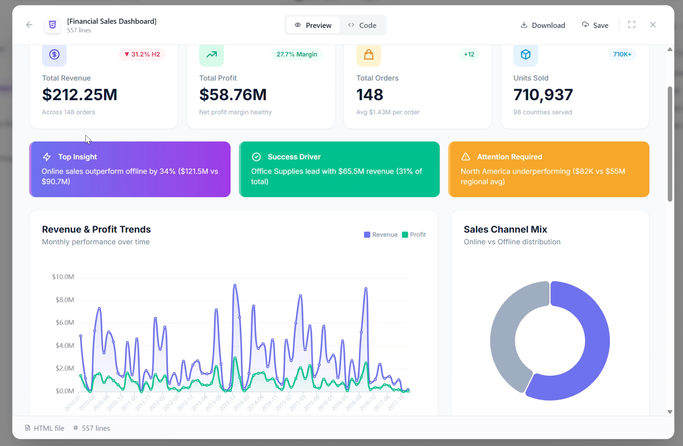
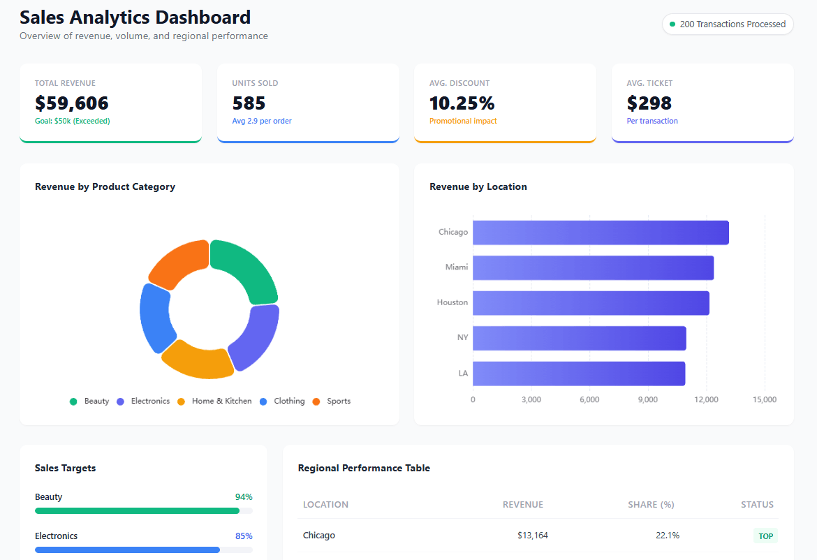
Ajelix Financial Sales analytics dashboard screenshot.
Popular Features
- Easy AI agent – describe what you need, get working assets instantly.
- No training required. Sign up and start creating immediately.
- Conversational AI for instant insights and visualizations.
- Import from Google Sheets, Excel, PDFs, CSVs, presentations and documents.
- AI dashboards in seconds. Upload up to 1GB, no manual formatting.
- Auto-clean data and calculate KPIs from any file.
- Share dashboards and apps with one-click links.
- Persistent workspace remembers your files across chats.
- AI explains trends and delivers actionable recommendations.
- Create dashboards, Excel files, presentations, and web apps in one click.
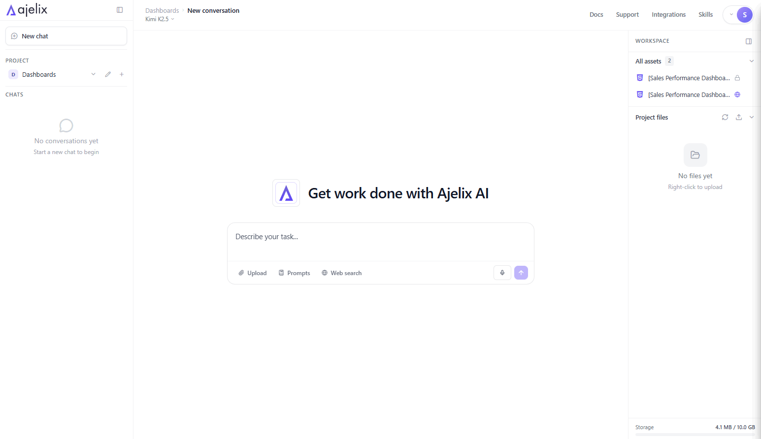
Ajelix chat interface.
Ideal Users
- Small business owners and solo entrepreneurs who need to make quick data-driven decisions.
- Small to medium-sized businesses looking for a simple and easy-to-use BI tool.
- Teams of users who don’t have a lot of technical expertise.
- People who are currently using Excel and want a more efficient way to create reports.
Ajelix Pricing Plan
Ajelix data visualization platform has a straightforward pricing structure including three pricing plans and the other freemium.
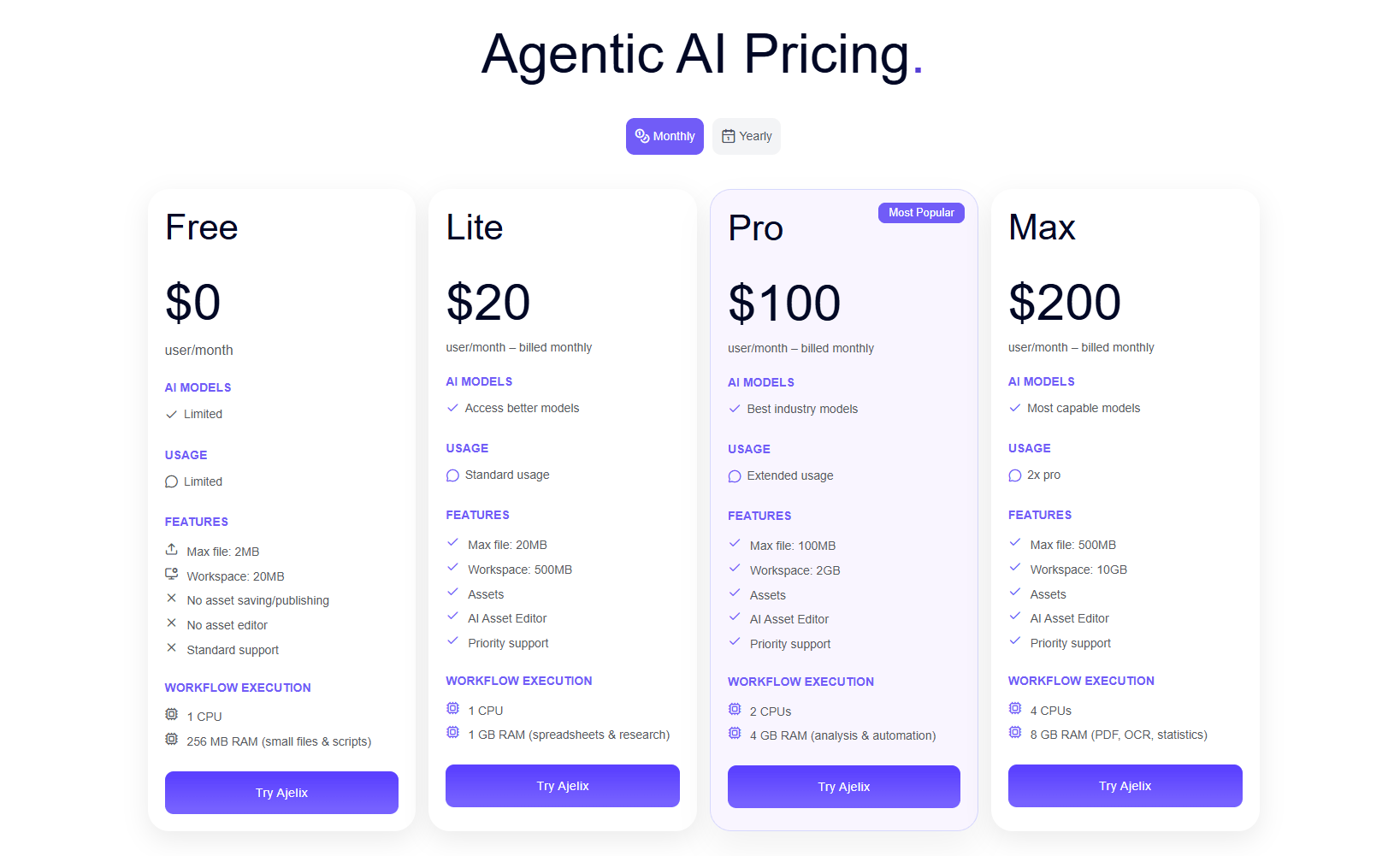
Ajelix pricing plan. View the full pricing
| Plan | Price | Features |
| Freemium | Free | Limited to testing purposes, no saving or sharing |
| Lite | $20 per month | Best for individuals who need more power. 20MB max files, 500MB workspace storage. Asset creation and AI Asset Editor included. Priority support. |
| Pro | $100 per month | Most popular for professionals and teams. 100MB max files, 2GB workspace storage. Best industry AI models with extended usage. 2 CPUs, 4GB RAM for analysis and automation. |
| Max | $200 per month | Built for heavy workloads and power users. 500MB max files, 10GB workspace storage. 2x Pro usage with most capable AI models. 4 CPUs, 8GB RAM for PDFs, OCR, and statistics. |
Reporting gives you a headache?
Upload your data and create professional reports with agentic AI
Start free
Try free and upgrade whenever
2. Zoho Analytics
Zoho Analytics, another data analytics software, stands out for its robust data connections and comprehensive data visualization capabilities. It seamlessly integrates with a wide range of data sources, enabling you to analyze and visualize your data from various platforms.
Popular Features
- Connect data from a variety of sources, including popular business applications, so you can analyze all of your data in one place.
- Prepare and clean your data before you create reports to ensure that your analysis is accurate.
- Use AI to gain insights from your data that you might not have noticed otherwise.
- Collaborate with colleagues to create reports and share them with others so that everyone can be informed.
- Embed analytics into your applications so that your users can see real-time data insights without having to leave your app.
Zoho analytics dashboard example from Zoho website
Ideal Users:
- Teams with minimal technical expertise.
- Users who are not well-versed in data analysis.
- Small- to medium-sized businesses.
- Analysts who are proficient in SQL.
Zoho limitations & cons
- Some users would like more training resources to help them get started with the software.
- The cost of Zoho Analytics can be high, but it is still more affordable than some other BI tools.
- Zoho Analytics has a bit of a learning curve, and some users may need to consult with an IT specialist for complex reports.
- The user interface could be more intuitive, and some embedded charts may take a while to load.
- To get the most out of Zoho Analytics, you may need to learn some SQL.
Pricing Plan
Zoho Analytics offers two pricing plans: cloud and on-premises. The on-premises plan is more expensive and comes in four tiers.
Cloud Pricing
| Plan | Price/per month | Users | Data Rows |
| Basic | €30 | 2 | 0.5 million |
| Standard | €60 | 5 | 1 million |
| Premium | €145 | 15 | 5 million |
| Enterprise | €575 | 50 | 50 million |
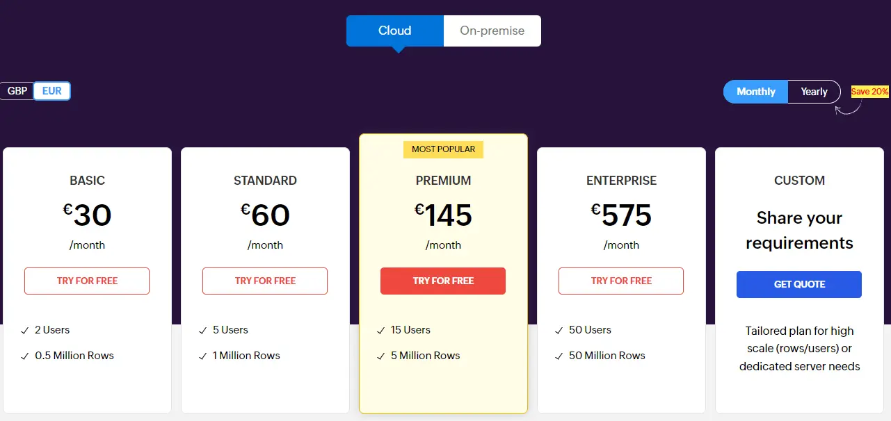
Zoho analytics pricing plan screenshot from website
On-premise pricing plan
| Plan | Price | Users | Data Rows |
| Freemium | Free | Unlimited | Unlimited |
| Professional | €30 per user/month | 5 | Unlimited |
Related Article: 5 Free And Budget Friendly Data Visualization Tools
3. Tableau
Tableau’s seamless blend of user-friendliness and scalability has made it a go-to choice for businesses seeking cutting-edge data visualization and analysis tools.
It’s a particularly great fit for enterprise-level companies aiming to elevate their data insights to the next level, as Tableau is one of the most advanced data visualization platforms available.
Popular features
- Harness the power of AI and machine learning to uncover hidden insights from your data.
- Analyze large datasets with ease, without worrying about performance issues.
- Experience a smooth and responsive platform, even when dealing with complex data analysis tasks.
- Access your data visualizations and insights whenever and wherever you need them, on your mobile devices.
Tableau dashboard screenshot from Tableau website
Tableau Limitation & Cons
- You’ll need to manually refresh your reports, which can be time-consuming.
- Tableau’s pricing is quite steep, with annual subscriptions and limited flexibility.
- To set up and maintain your reports effectively, you may need to hire an SQL expert, which can add to the costs.
- Tableau lacks version control, making it challenging to track changes and revert to previous versions if needed.
- Any changes you make to your reports will require manual approval before they become visible.
- Discover more detailed comparison on our article cons and pros of Tableau.
Ideal Users:
- Advanced data analysts
- IT Specialists
- Enterprise organizations with large datasets
- Experts in complex data analytics
Pricing plan
Tableau offers three pricing plans to meet the needs of different organizations. Please keep in mind that all plans are priced annually.
Viewer
This plan is for users who need to view and interact with dashboards and reports created by others. It includes a limited set of features, such as the ability to filter and slice data, but does not allow users to create or edit reports.
Pricing: $15 per user per month
Explorer
Users who need to create and edit dashboards and reports, as well as collaborate with others. It includes a wider range of features than the Viewer plan, such as the ability to connect to data sources, create custom visualizations, and share dashboards and reports with others.
Pricing: $42 per user per month
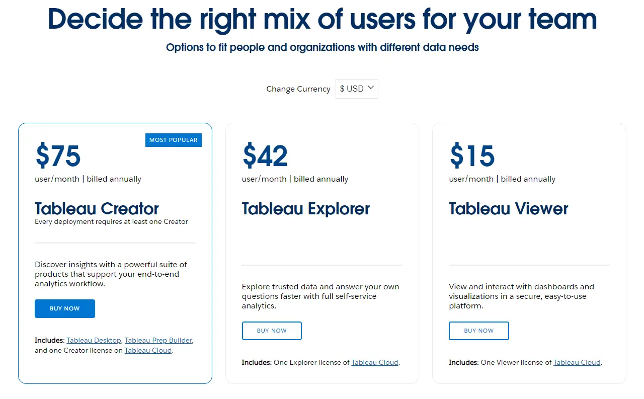
Tableau pricing plan screenshot from website
Creator
This plan is designed for users who need to create, edit, and share dashboards and reports, as well as manage data sources and users. It includes all of the features of the Explorer plan, plus additional features for managing data sources, users, and security.
Pricing: $75 per user per month
| Feature | Viewer | Explorer | Creator |
| Create and edit dashboards and reports | No | Yes | Yes |
| Pricing | $15 | $42 | $75 |
| Connect to data sources | Yes (limited) | Yes | Yes |
| Create custom visualizations | No | Yes | Yes |
| Share dashboards and reports | Yes | Yes | Yes |
| Manage data sources and users | No | No | Yes |
Related Article: 7 Best Self-Service Business Intelligence (BI) Tools
4. Databox
Databox offers a similar range of features as other popular data visualization and analysis tools. It’s easy to use, comes with automated reporting capabilities, and allows you to create data dashboards.
Plus, it offers a wide range of data source integrations to help you connect your data and gather insights. However, some users have reported occasional bugs, and the platform is still relatively new, so it may not have all the integrations and customization options that some users may need.
Despite some limitations, the free and paid Databox plans offer great value for the price.
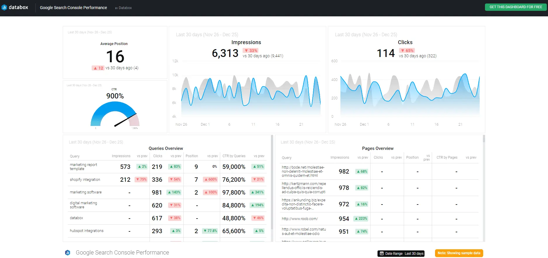
Databox dashboard example screenshot from website
Databox Features
- Track your progress towards important business objectives by monitoring real-time metrics.
- Connect to over 100 different data sources, including popular platforms like Google Analytics, Salesforce, and Shopify, to gain a comprehensive view of your business performance.
- Collaborate seamlessly with your team members to create and share dashboards, ensuring everyone is aligned on key performance indicators.
- Leverage numerous pre-built dashboard templates to easily visualize your data and gain insights without starting from scratch.
- Tap into Databox’s drag-and-drop interface and intuitive data visualization tools to create compelling and informative charts, graphs, and tables.
Pricing
Databox pricing plan is complex because it consists of 5 plans. This platform offers Free plan, Starter, Professional, Growth and Premium.
| Plan | Free | Starter | Professional | Growth | Premium |
| Users | 3 | 5 | 15 | Unlimited | Unlimited |
| Data updates | Daily | Every 4 hours | Hourly | Hourly | Hourly |
| Databoards | 3 | Unlimited | Unlimited | Unlimited | Unlimited |
| Historical data | 11 month | 11 month | 24 months | Unlimited | Unlimited |
| Custom metrics | Up to 50 | Up to 300 | Up to 1000 | Up to 10000 | Unlimited |
| Data sources | 3 | 3 | 3 | 3 | 100 |
| Price per month | Free | $59 | $169 | $399 | $999 |
- Free Plan: Designed for individuals and small teams
- Starter Plan: Suitable for startups and small businesses
- Professional Plan: Ideal for mid-sized businesses
- Growth Plan: Tailored for high-growth companies
- Premium Plan: Comprehensive solution for businesses with extensive data needs
Related Article: 8 Best Business Intelligence (BI) Tools For Small Businesses
5. Power BI
Power BI is a top-notch data visualization and analytics tool that’s helping organizations transform into data-driven powerhouses. In fact, according to a recent survey by Trust Radius, Power BI is the leading BI software in 2021, with a market share of a whopping 36%.
Popular Features
- Power BI seamlessly integrates with various data sources, including cloud-based platforms, relational databases, and even flat files.
- Power BI’s DAX formulas enable you to perform complex data calculations and aggregations, transforming your raw data into meaningful insights.
- Power Query editor provides a robust tool for data transformation. You can clean, transform, and reshape your data before visualizing it, ensuring that you’re working with accurate and consistent information.
- Power BI integrates seamlessly with other Microsoft products, such as Excel, SharePoint, and Dynamics 365.
- Power BI’s scheduled data refresh feature ensures that your data is always up-to-date. You can set up automatic data refreshes for your dashboards and reports, ensuring that you’re always working with the most current information.
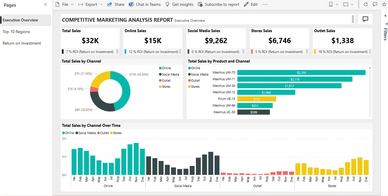
Power BI dashboard example screenshot from Microsoft website
Users
While Power BI offers a vast array of possibilities, it’s not for everyone. Here’s a list of who should consider using Power BI:
- Enterprise companies that handle large volumes of data
- Organizations with multiple data sources and need help unifying them
- Advanced professionals like data analysts with DAX formula expertise
- Workspaces already integrated with Microsoft’s ecosystem
Power BI Limitations & Cons
- Set-up and usage can be challenging: Power BI’s complex setup requires advanced knowledge of DAX formulas and may require assistance from data analysts.
- Mobile responsiveness is limited: Creating mobile-friendly reports can be difficult, potentially requiring separate reports for mobile devices.
- Learning curve can be steep: The vast array of features and functionality can overwhelm beginners, making it challenging to learn and use.
- Modifications are cumbersome: Changes to existing reports often necessitate the involvement of data analysts, limiting flexibility.
- File portability is restricted: Accessing reports on new devices requires installation, which can be inconvenient.
- Simultaneous editing is not supported: Multiple users cannot edit reports simultaneously, hindering collaboration.
- Troubleshooting can be slow: Resolving issues may take time due to a need for external consultants and the complexity of the tool.
- Cross-platform editing is not available: Editing reports is confined to desktop devices, excluding mobile and tablet access.
- Microsoft ecosystem dependence: While seamless integration with Microsoft products is an advantage for existing users, it may limit compatibility with other platforms.
- We’ve covered a detailed guide on Power BI cons and pros.
Pricing
Power BI offers 3 pricing plans: Free plan, Power BI Pro and Power BI Premium plan. The pricing is easy to understand and quite cheap:
- Free plan: Personal use only – lacks many features
- Power BI Pro Plan: Individual use with collaboration capabilities
- Power BI Premium Per User Plan: Enterprise-level data analysis and collaboration
| Feature | Free Plan | Power BI Pro | Power BI Premium (per user) |
| Purpose | Personal use | Individual use with collaboration | Enterprise-level data analysis and collaboration |
| Features | Create reports, view data visualizations | Create and share reports, advanced analytics, data insights | AI-powered analytics, insights, faster data refresh, and 23 additional features |
| Limitations | Cannot share reports or collaborate with others | Limited to individual use | None |
| Cost (per month) | Free | $10 | $20 |
Summary
Now, which is the best alternative, you ask? Well, that’s the question you must answer as every organization has different needs.
FAQ’s
The best way to choose the best Klipfolio alternative for your business is to carefully consider your needs and budget. Ask yourself the following questions:
– What are my most important data sources?
– What kind of visualizations do I need?
– How many users will be using the BI platform?
– What is my budget?
Here are the top 5 Klipfolio alternatives in 2026, based on customer reviews, pricing, and features:
– Ajelix
– Tableau
– Zoho Analytics
– Databox
– Power BI
Klipfolio is a data visualization and business intelligence (BI) platform that helps businesses create dashboards, charts, and graphs to track and analyze their data.
Ready to try Ajelix platform?
From data to report in one minute or less with Ajelix AI Agents