8 Best Ad Hoc Reporting Software 2026

Ad hoc reporting software empowers users to create custom reports and analyze data on-demand, without relying on pre-defined reports or IT assistance. It’s like having a self-service data analysis toolkit.
The ability to access information quickly and analyze information is crucial for any business. However, sifting through endless spreadsheets and reports can be a time-consuming nightmare. Ad hoc reporting software empowers you to ditch the wait for pre-scheduled reports and create custom reports on the fly. 🚀
TL;DR
Ad hoc reporting software lets users create custom reports on-demand without relying on IT, enabling faster insights and better decision-making. It’s ideal for exploring trends, investigating issues, and answering specific business questions quickly. Popular tools for 2026 include Ajelix, Zoho Analytics, Looker Studio, Power BI, Canva, Tableau, and Grow, each catering to different needs from simple, user-friendly dashboards to advanced analytics and data visualization. When choosing a tool, consider ease of use, data compatibility, collaboration features, and budget, with many offering free trials or plans for experimentation.
But with so many options on the market, choosing the right ad hoc reporting software can feel overwhelming. In this article, we will cover the 7 best ad hoc reporting software solutions of 2026, helping you find the perfect fit for your needs and budget.
Change the way you work with agentic AI
One-click dashboards,KPI tracking, and AI-powered insights—for work that actually gets done.

List of 7 Ad Hoc Reporting Tools
What is ad hoc reporting?
Ad hoc reporting is a type of business intelligence (BI) that allows users to create reports on an as-needed basis. These reports are typically designed to answer a specific question or investigate an issue that arises during business operations. Learn more about ad hoc reporting in our latest article.
ad hoc meaning
Ad hoc literally means “for this” in Latin. In English, it refers to something created or done for a specific purpose, often without prior planning. Here’s a breakdown:
- For a specific purpose: Ad hoc solutions address a particular need or solve a one-time problem.
- Unplanned: They’re often improvised or created on the fly, rather than following a pre-defined process.
Why Businesses Need Ad Hoc Reporting?
With ad hoc non-technical users can explore data on demand using reporting tools with user-friendly interface. Ever feel stuck waiting on reports when you need answers fast? Imagine a scenario: sales are down in a key region, and you need to know why – yesterday.
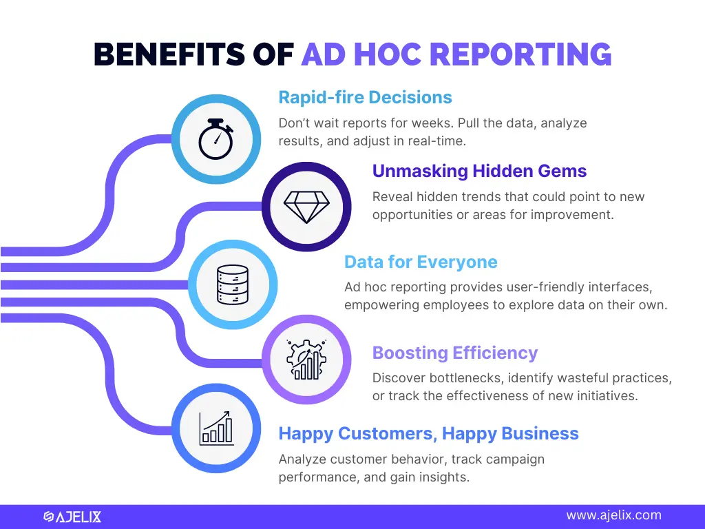
5 benefits why ad hoc reporting matters, infographic by author
Ad hoc reporting lets you ditch the wait and answer burning questions as they pop up. Here’s how ad hoc reporting can change your business process:
- Rapid-fire Decisions: Got a hunch about a new marketing campaign? With ad hoc reporting, you can pull the data, analyze results, and make adjustments in real time. So you don’t have to wait weeks for reports that might be outdated by then.
- Unmasking Hidden Gems: Scheduled reports focus on what you already know to track. Ad hoc reporting lets you dig deeper, unearthing hidden trends or patterns that could point to new opportunities or areas for improvement.
- Data for Everyone: Forget the days when data analysis was an IT department exclusive. Ad hoc reporting tools are designed with user-friendly interfaces, empowering employees to explore data on their own. This frees up IT for more complex tasks.
- Boosting Efficiency: Running a lean operation is key to success. Ad hoc reporting helps you pinpoint bottlenecks, identify wasteful practices, or track the effectiveness of new initiatives.
- Happy Customers, Happy Business: Understanding your customers is vital. Ad hoc reporting allows you to analyze customer behavior, track campaign performance, and gain insights into what makes your customers tick.
Difference Between Ad Hoc and Canned Reports
Selecting the best report type hinges on your specific needs for data analysis tasks. This table breaks down the key differences between ad hoc reports and canned reports to help you determine which option best suits your situation.
| Feature | Ad Hoc Reports | Canned Reports |
|---|---|---|
| Planning | Created on-demand | Pre-defined, pre-built |
| Flexibility | Highly customizable | Fixed data and format |
| Technical Expertise | May require some knowledge (becoming easier) | Less technical knowledge needed |
| Use Cases | Explore trends, investigate anomalies | Monitor KPIs, track progress |
By grasping the strengths and limitations of both ad hoc and canned reports, you can leverage them strategically to glean valuable insights from your data. Ad hoc reports empower you to dig deeper into specific questions, while canned reports provide a consistent view of pre-defined metrics over time. Utilize both options for a well-rounded approach to data analysis.
1. Ajelix
Features
- AI-Powered Dashboard Generation: Simply describe what you need in the Ajelix chat, and our AI agent builds your dashboard automatically, no coding, no drag-and-drop, no templates to configure.
- Instant Report Generation: Type your request and get a fully-formatted, presentation-ready report in one click. The AI handles layout, styling, and data formatting automatically.
- Intelligent Data Insights: AI agent uncovers patterns, anomalies, and trends in your data – surfacing insights you might have missed without manual deep-dives.
- Easy report sharing: Share your reports with colleagues for collaborative decision-making.
- Full Customization Refine any dashboard through natural language. Change colors, layouts, metrics, or branding with simple chat commands until it’s exactly right.
Who is it for?
Ajelix is suitable for small and medium-sized businesses (SMBs) looking for an easy-to-use and affordable ad hoc reporting solution. Its focus on user-friendly features and free tier makes it attractive to non-technical users who want to generate reports without relying on IT teams.
Ajelix Pros & Cons
| Pros | Cons |
|---|---|
| Easy to use, ideal for non-technical users | Limited data visualization customization compared to other BI leaders |
| Freemium plan available | May not be suitable for large enterprises with complex data needs |
| Intelligent Analytics & AI Capabilities | |
| Budget friendly solution |
Reporting gives you a headache?
Upload your data and create professional reports with agentic AI
Start free
Try free and upgrade whenever
2. Zoho Analytics
Ad hoc dashboard example from Zoho Analytics, screenshot by author
Features
- Data visualization: Create dashboards and reports with various charts and graphs (e.g., bar charts, pie charts, line graphs, funnels).
- Data blending: Combine data from multiple sources.
- Mobile access: Access and analyze reports from your mobile device.
- Collaboration tools: Share dashboards and reports with colleagues.
- Customization options: Customize dashboards and reports to fit your specific needs and branding.
- Workflows and automation: Automate tasks and workflows.
Who is it for?
This BI caters to a broad audience, including small and medium-sized businesses (SMBs) and larger enterprises. SMBs can benefit from its affordability and user-friendly interface for basic reporting needs. Larger enterprises can leverage its scalability and advanced features for more complex data analysis.
Zoho Analytics Pros & Cons
| Pros | Cons |
|---|---|
| User-friendly interface with a good balance of basic and advanced features | Limited data source connectivity compared to other industry leaders |
| Free plan available for basic needs | Steeper learning curve for advanced features compared to some competitors |
| Scalable to accommodate growing business needs | Embedded charts can experience loading delays |
| Some users mention the lack of onboarding & learning materials |
3. Looker Studio
Features
- Drag-and-drop interface: Easy-to-use interface for creating reports and dashboards visually.
- Data source connectivity: Connects to a wide variety of data sources, including Google products (BigQuery, Ads, Analytics), databases (MySQL, PostgreSQL), and flat files (CSV).
- Data visualization: Offers various charts and graphs (e.g., bar charts, pie charts, line graphs, geo maps).
- Collaboration tools: Share dashboards and reports with colleagues.
- Interactive features: Create interactive reports with filters and drill-down capabilities.
Who is it for?
Looker Studio is ideal for businesses and individuals seeking a user-friendly and free ad hoc reporting solution. It’s well-suited for non-technical users who want to create basic reports and digital dashboards without needing extensive training.
Looker Studio Pros & Cons
| Pros | Cons |
|---|---|
| Completely free, forever free tier | Limited functionalities compared to paid BI tools like Power BI |
| Very user-friendly interface with drag-and-drop functionality | Lacks advanced features like advanced automation and in-depth data analysis capabilities |
| Integrates well with other Google products (if applicable) | May not be suitable for large enterprises with complex data needs |
| Missing onboarding or learning materials |
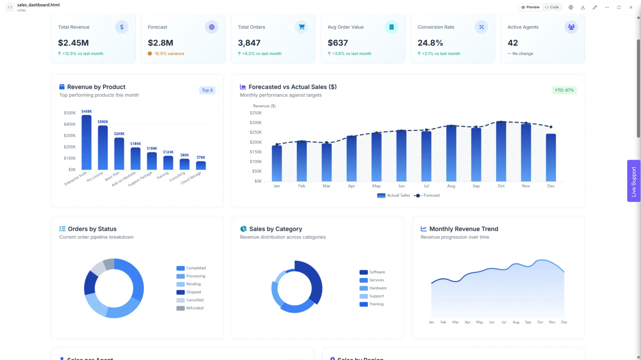
4. Power BI
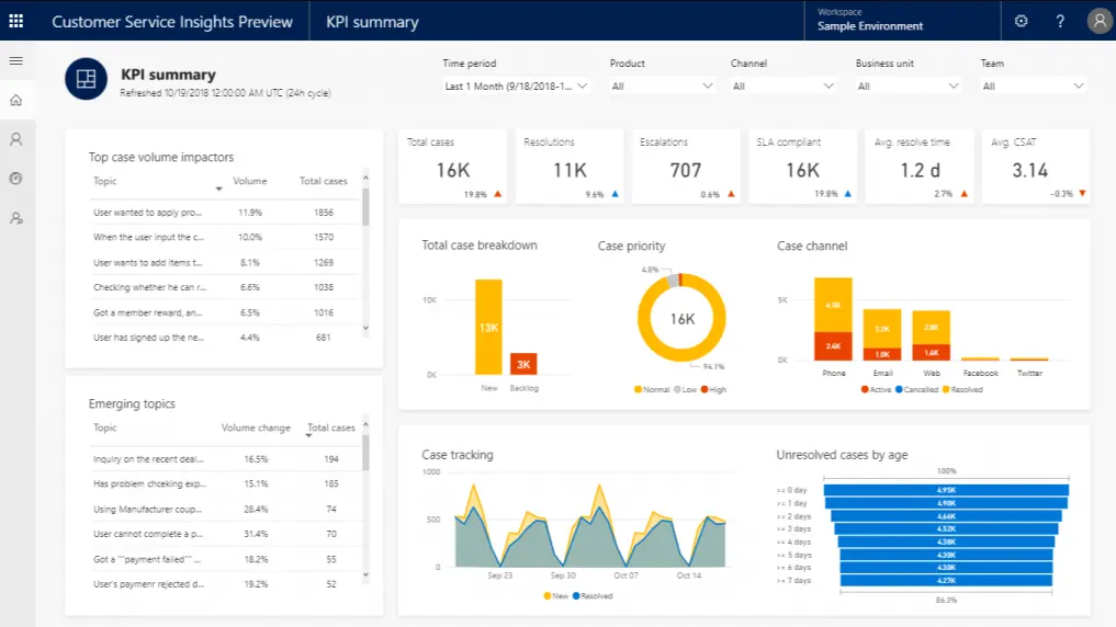
Ad hoc report example from Power BI dashboard, screenshot by author
Features
- Data visualization: Extensive library of data visualizations with high customization capabilities (charts, graphs, maps, etc.).
- Data source connectivity: Connects to a vast array of data sources, including cloud-based services, on-premise databases, and flat files.
- Business intelligence tools: Offers features like drill-down capabilities, data filtering, and advanced analytics.
- Collaboration tools: Enables secure report sharing, role-based access control, and collaborative report editing.
- Mobile access: Access and interact with reports and dashboards from mobile devices.
- Integration with Microsoft products: Integrates seamlessly with other Microsoft products.
- AI-powered insights: Leverages machine learning for automated insights and data pattern discovery.
Who is it for?
Power BI caters to a wide range of users, from individual data analysts to large enterprises. Its free tier makes it accessible for beginners and small businesses. Paid plans with advanced features are ideal for businesses of all sizes with complex data analysis needs, especially those already invested in the Microsoft ecosystem.
Pors & Cons of Power BI
| Pros | Cons |
|---|---|
| Widest range of data source connectors | Steeper learning curve, especially for non-technical users |
| Unmatched depth of data visualization options with high customizability | Paid plans can be expensive for complex needs |
| Advanced features like AI-powered insights | May not be the most cost-effective option for smaller businesses |
| Integration with Microsoft ecosystem | Requires advanced knowledge and training for reporting |
| Free desktop version for basic exploration |
5. Canva
Basic ad hoc report example from Canva template library, screenshot by author
Features
- Drag-and-drop interface: Easy to use for creating reports visually with minimal technical expertise.
- Pre-designed templates: Offers a variety of report templates to jumpstart your design process across various industries (e.g., marketing reports, sales reports).
- Data visualization: Integrates basic charts and graphs (e.g., bar charts, pie charts) to represent data visually.
- Design tools: Leverages Canva’s design capabilities for adding images, text, and branding elements to reports for a professional look.
- Collaboration tools: Enables report sharing and basic collaboration features.
Who is it for?
Canva Reports is ideal for non-technical users, small businesses, and individuals who need to create visually appealing and easy-to-understand reports without complex data analysis features. Perfect solution for designers and if you need to create one presentation with quick charts.
Canva Pros & Cons
| Pros | Cons |
|---|---|
| Very user-friendly, ideal for non-technical users | Limited data source connectivity and data analysis capabilities compared to dedicated BI tools |
| Strong focus on design and creating visually appealing reports | Lacks advanced automation features |
| Free plan available for basic needs | Free plan has significant limitations |
| Easy collaboration features | Doesn’t provide advanced analytics capabilities, like filtering |
| Can be confusing for those who don’t use visualization tools |
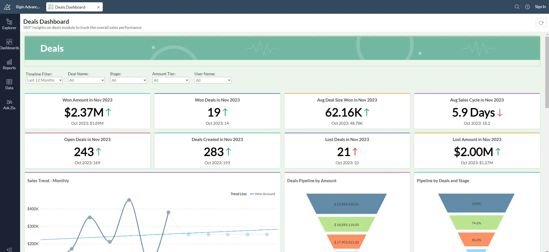
6. Tableau
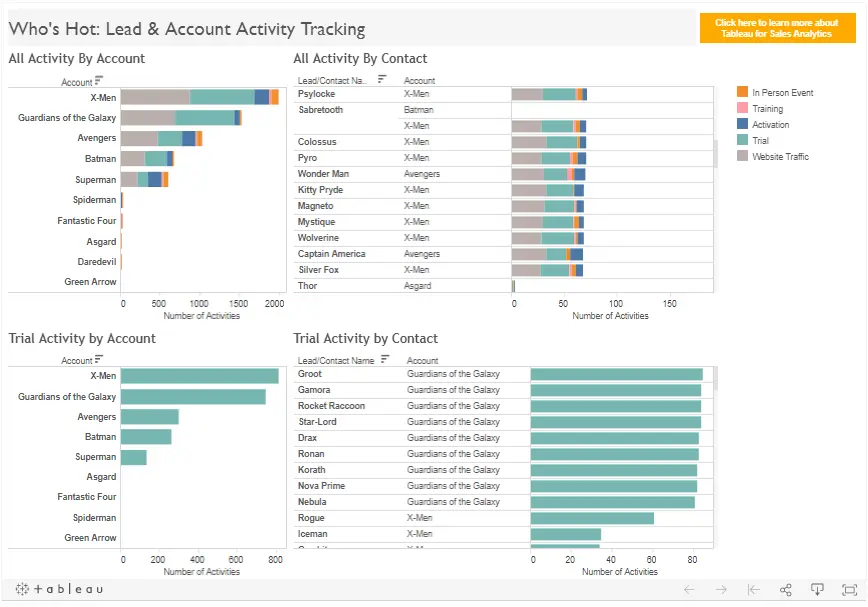
Dashboard example from Tableau, screenshot by author
Features
- Data visualization: Extensive library of customizable data visualizations (charts, graphs, maps, etc.) for creating interactive dashboards and reports.
- Data connectivity: Connects to a wide range of data sources, including cloud-based services, on-premise databases, and flat files.
- Drag-and-drop interface: Offers a visual interface for data exploration and report creation.
- Ad hoc analysis: Enables users to explore data from different angles, ask questions, and uncover hidden insights.
- Collaboration tools: Enables report sharing, collaboration, and data storytelling features.
- Mobile access: Access and interact with reports and dashboards from mobile devices (with Tableau Mobile).
Who is it for?
Tableau caters to a broad audience, including business analysts, data scientists, and executives. It’s suitable for businesses of all sizes that require powerful data visualization and ad hoc analysis capabilities. However, it’s not a great option for non-technical teams and businesses with small budgets.
Tableau Pros & Cons
| Pros | Cons |
|---|---|
| Powerful data visualization capabilities with a wide range of chart types and customization options | Steeper learning curve compared to drag-and-drop tools |
| Strong data connectivity to various sources | Paid plans can be expensive for smaller businesses |
| Enables ad hoc analysis and data exploration for deeper insights | Limited built-in automation capabilities |
| Collaboration features for effective data storytelling | Requires advanced IT knowledge to create dashboards |
| Mobile access for on-the-go data exploration (with Tableau Mobile) |
7. Grow
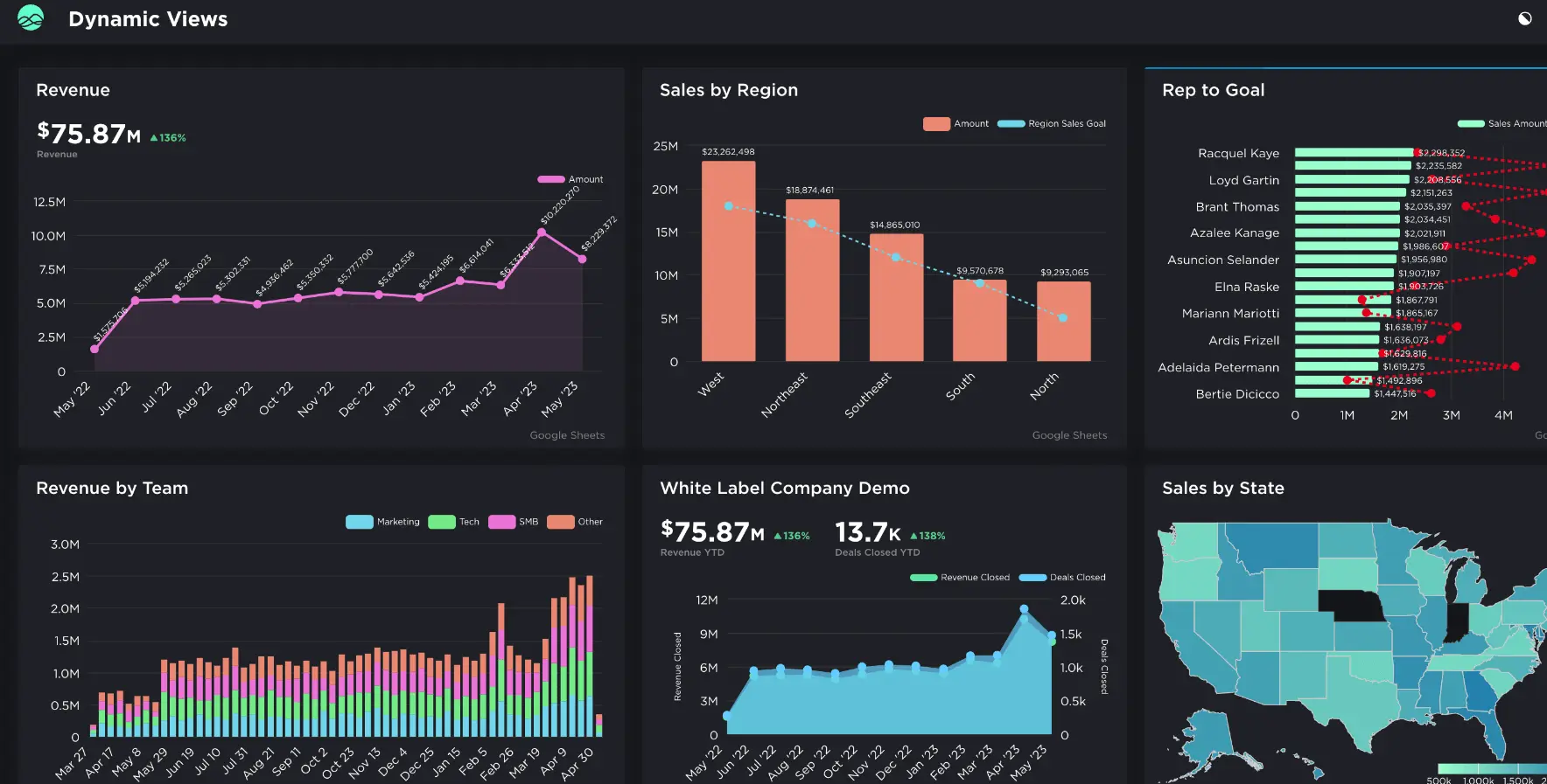
Dashboard example from Grow, screenshot by the author
Features
- Data integration: Connects to various data sources (databases, cloud applications) to centralize your data for analysis.
- Data transformation: Cleans, transforms, and prepares data for analysis using ETL (Extract, Transform, Load) processes.
- Data warehousing: Stores and manages data in a central repository for efficient querying and reporting.
- Data visualization: Offers a variety of charts and graphs (e.g., bar charts, pie charts, line graphs) to represent data visually.
- Self-service analytics: Empowers users to create reports and dashboards without relying on IT.
- Alerts and notifications: Set up automated alerts based on data insights to stay informed.
Who is it for?
Grow seems to target businesses of various sizes, particularly those seeking a comprehensive BI (Business Intelligence) solution. Its data warehousing and transformation capabilities cater to companies with complex data needs, while its self-service platform features benefit non-technical users.
Pros & Cons Of Grow
| Pros | Cons |
|---|---|
| Offers data integration, transformation, warehousing, and visualization capabilities | Unclear pricing structure (may require contacting Grow) |
| Self-service analytics empowers users for ad hoc reporting | May require some technical expertise for data transformation features |
| Offers alerts and notifications based on data insights | Might be overkill for very small businesses with basic reporting needs |
| Have to contact team to get a free trial |
Conclusion
The perfect ad hoc reporting tool empowers data discovery. Options like Ajelix and Looker Studio offer user-friendly interfaces for basic needs.
Businesses seeking advanced analytics or design elements can explore Zoho Analytics and Canva Reports respectively. Power BI and Tableau cater to complex data with their robust features, making them ideal for in-depth exploration.
Ultimately, consider ease of use, data needs, and budget when choosing. Most platforms offer free trials, so experiment and find the software that unlocks hidden insights within your data.
FAQ
Consider ease of use, data source compatibility, collaboration features, and budget requirements when choosing ad hoc software.
Ajelix, Looker Studio, Power BI and Canva Reports offer free plans with basic functionalities. These can be great starting points for exploring ad hoc reporting.
Ready to create ad hoc reports with Ajelix?
From data to report in one minute or less with Ajelix AI Agents