How to Add Tick Marks in Excel Graph
Tick marks matter in Excel graphs because they help convey information clearly, even though they might seem like a small detail. In this article, we’ll explore the significance of tick marks and how to use them to enhance your Excel graphs.
What are tick marks and why use them?
Tick marks, those little markers along the axes of your Excel graphs, work as handy reference points for your data values. They make your charts more readable and comprehensible, allowing your audience to interpret the data accurately.
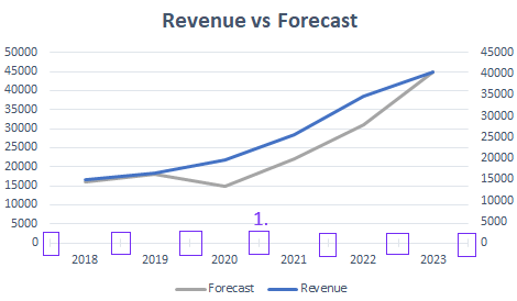
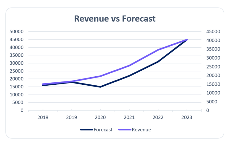
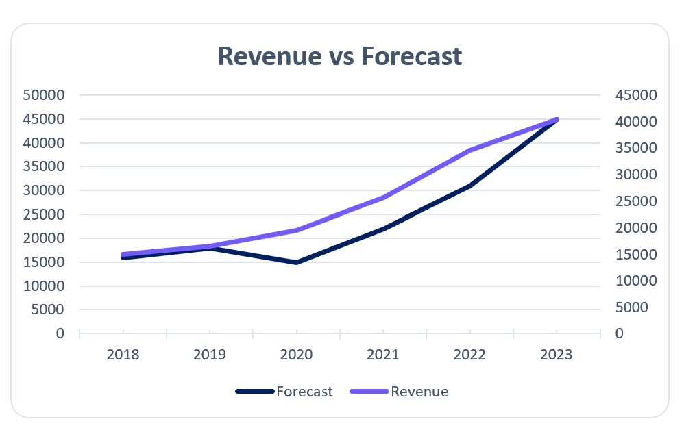
Excel graph with tick marks. Image Credit: Ajelix
The role of axis in Excel graphs
Axes are the foundation of any Excel graph. Axis provides framework for plotting data points for your chart. Before you dive into adding marks to your graphs, it’s important to get the hang of how axes function.
How To Add Tick Marks to Excel Graphs?
Tick marks are crucial for making your Excel graphs look good and easy to understand. These small but important elements on your chart’s axes can really boost how well your data comes across. In this guide, we will show you how to use tick marks in Excel graphs to improve your data presentation.
Time needed: 2 minutes
Step by step method to customize your axis marks in Excel graphs and charts.
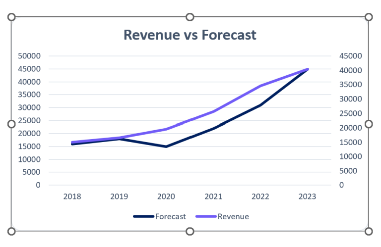
- Select Your Chart
Start by selecting the chart in which you want to add tick marks. Click on the chart type area to ensure it’s active.
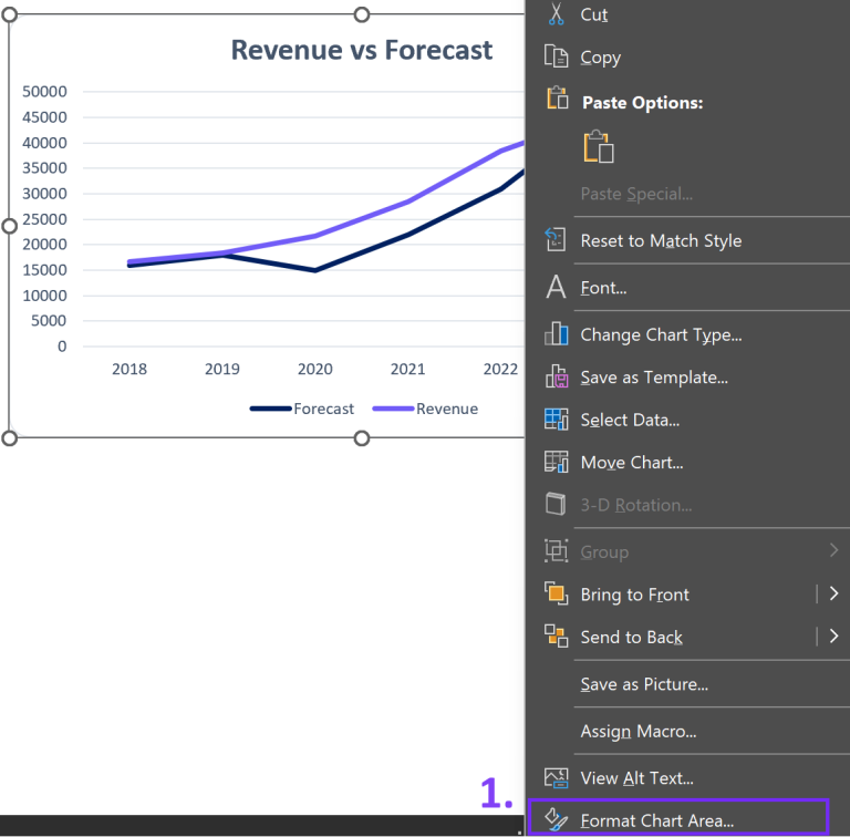
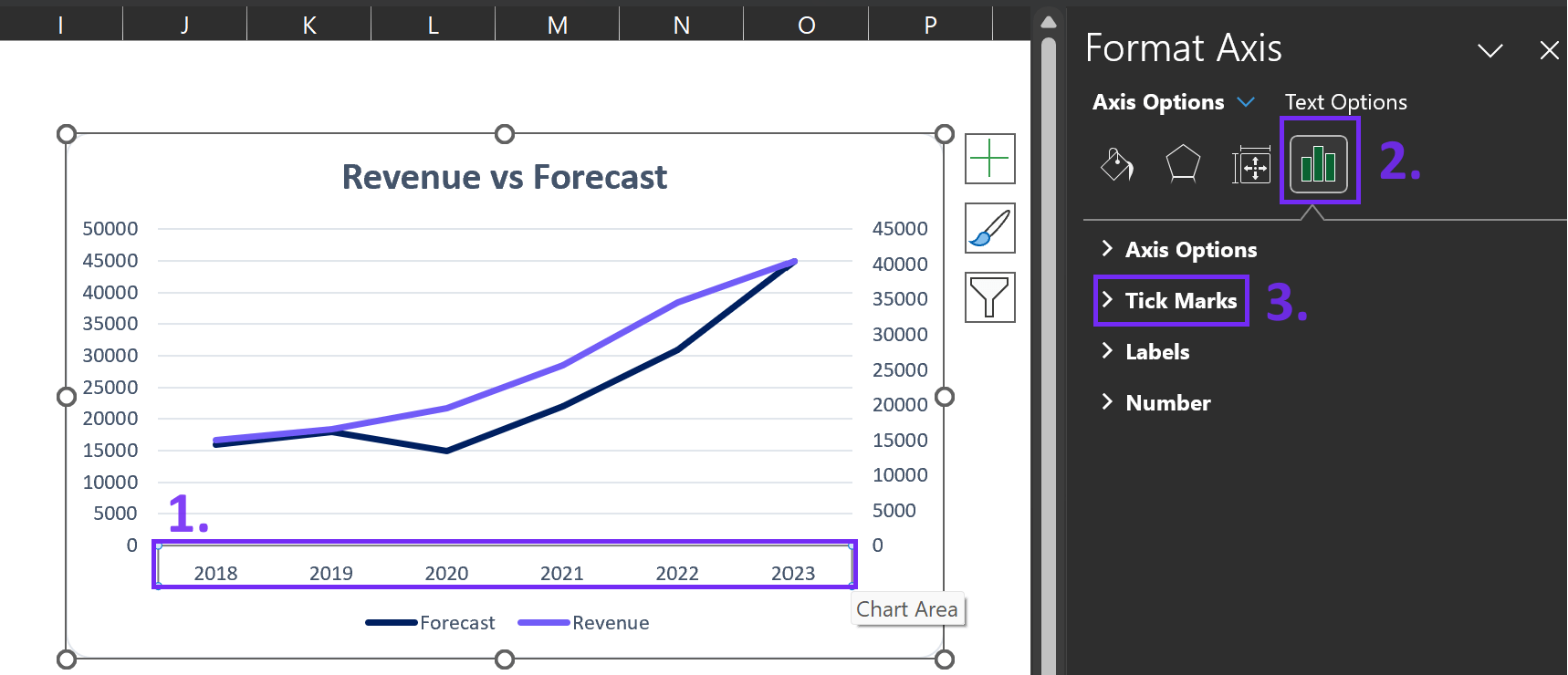
- Access Chart Elements
Right-click on the chart, and from the context menu, choose “Format Chart Area.” This will open a panel on the right side of your Excel window.
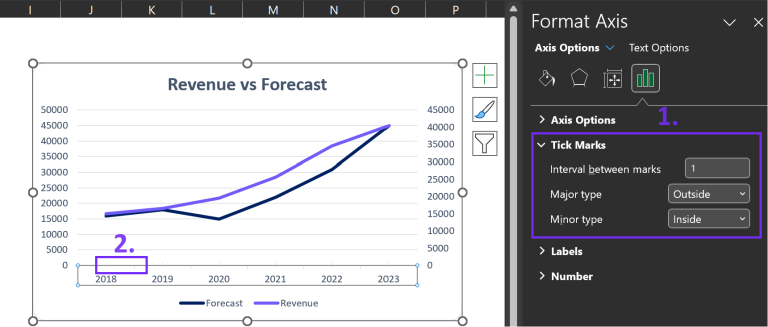
- Tick Marks Options
Click on the axis in the chart and navigate to the “Tick Marks” section. Here, you can find axis options tab for axis mark placement and style. You can opt for Inside, Outside, or Cross for their position and adjust their length as well.
- Fine-Tune Your Preferences
Excel offers further customization options like minor tick marks and logarithmic scale marks. Experiment with these settings to best suit your data visualization needs.
- Apply and Enjoy
To improve your Excel graph, adjust your axis mark settings. Then, click “Close” on the Format Axis panel which will allow you to see your graph with clear marks.
Related Article: Data visualization principles with good examples
Customizing Tick Marks
Now that you have the axis selected, it’s time to explore the various ways you can customize axis marks.
Types of tick marks
There are two main types of marks: major and minor. Major tick marks are the prominent ones that usually have labels.
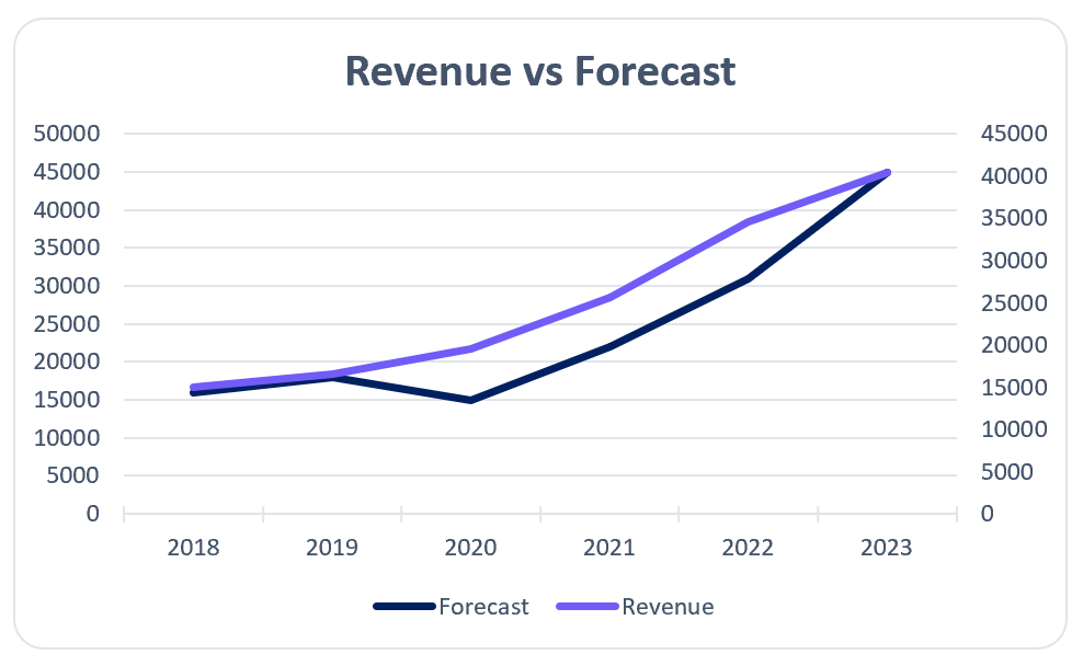
Major tick marks in Excel graph. Image Credit: Ajelix
Minor marks are smaller, however, they provide additional reference points without labels to your chart.
Minor tick marks in Excel graph. Image Credit: Ajelix
Related Article: How to explode a pie chart in Excel?
Adjust tick mark interval
Picking the right interval all comes down to how wide your data range is. A shorter interval gives more detail but may be messy, while a longer interval simplifies the chart but hides important trends.
Formatting Tick Marks
After customizing axis marks, you can format them to match your graph’s style.
Changing tick mark appearance
Excel lets you adjust tick marks’ size, color, and style to match your chart’s look and feel, offering flexibility.
Labeling tick marks
To add context to your tick marks, you can label them with data values. This is particularly helpful when you want to highlight specific data points or provide clarity to your audience.
Customizing label format
Excel lets you customize tick mark labels to match your graph’s visual theme.
Related Article: How To make bar graph in Excel?
Simplify Chart Creation With Automatic Data Visualization
Creating reports and charts in Excel spreadsheets can get tiring especially if you don’t enjoy it. Microsoft Excel requires special training to use it effectively. Just knowing each detail and how to add specific things can take hours and searching online for guides.
AI Excel Tools for Formula Writing
There are many solutions available in the market that can help you tackle spreadsheet tasks. Have you tried generating Excel formulas from your text? No mistakes or syntax issues. Write in your language and AI will create the formula for you.
Ajelix BI For Automatic Data Visualization
Reporting isn’t a pain anymore with Ajelix BI data visualization. Simply upload your Excel file, choose a template, and create professional-looking reports in seconds. Analyze your data with AI and get insights for your charts to share with your colleagues.
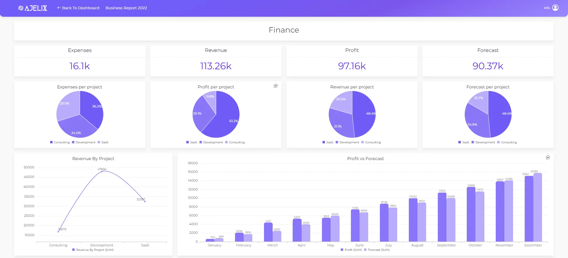
Easy data visualization and report creation with Ajelix BI. Image Credit: Ajelix
See how easy it is to create reports with our platform and start using it for free.
Conclusion
Tick marks may be small elements in your Excel graphs, but they have an impact on your data. By learning how to add and customize marks, you can improve your Excel graphs to show information accurately and stylishly. Remember, it’s the attention to detail that separates an ordinary chart from an extraordinary one.
Ready to test next-level reports with Ajelix BI?
Speed up your spreadsheet tasks with Ajelix AI in Excel