How to Add and Remove Gridlines in Excel Chart

In the ever-expanding universe of data-driven decision-making, Excel charts stand as celestial bodies illuminating our path. Among the celestial elements of these charts, gridlines play a pivotal role in guiding our understanding of the data constellations.
In this step-by-step guide, we will unravel the mysteries of adding and removing gridlines in Excel charts, equipping you with the power to shape your data visualizations with precision.
What Are Gridlines in Excel Charts?
Gridlines in Excel charts are horizontal and vertical lines that form a grid-like structure on the chart’s plot area. These lines serve as visual aids, helping users interpret and analyze data points more effectively. There are two main types of gridlines: major and minor.
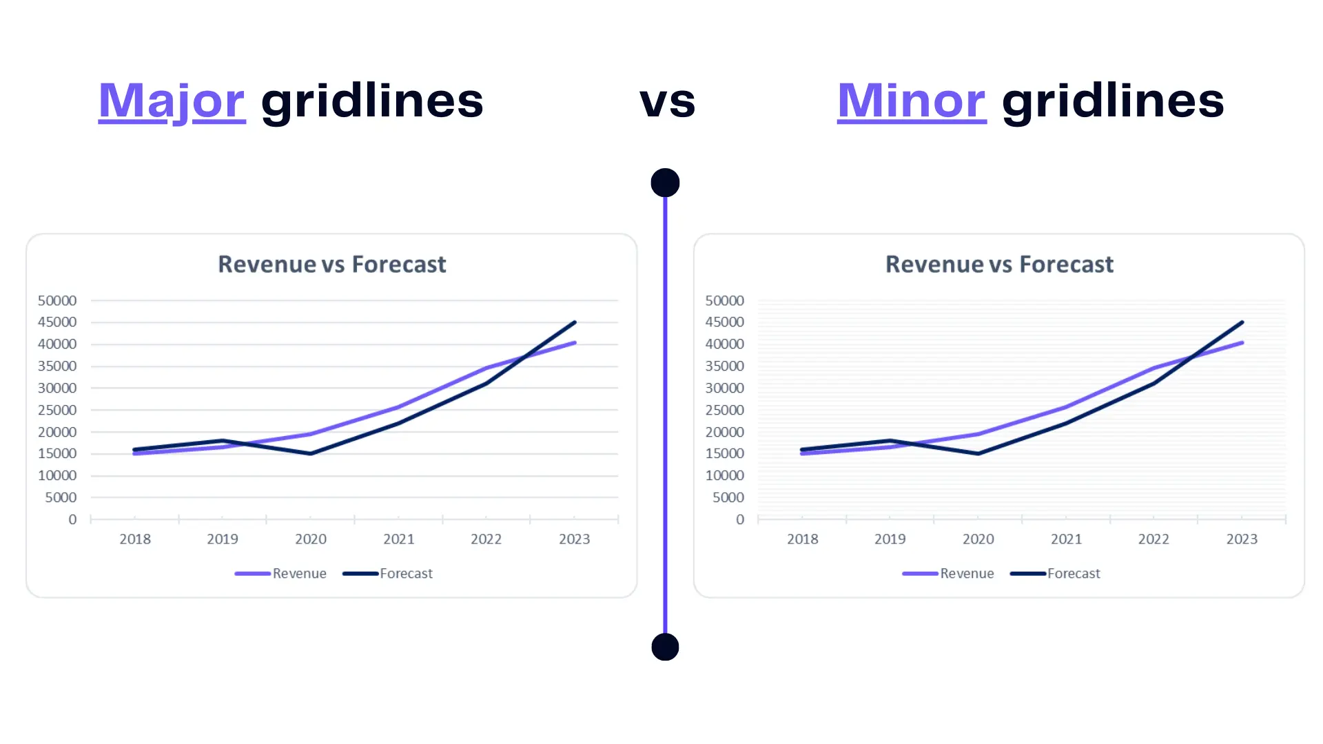
Infographic major gridlines and minor gridlines. Image Credit: Ajelix
Major gridlines are the bold strokes that help us discern primary data points, akin to the main roads on a map. On the other hand, minor gridlines, akin to the intricate alleys of a city, offer a finer level of detail, aiding in precise interpretation.
Related Article: How to add tick marks in Excel graph?
How To Add Major Gridlines?
Time needed: 2 minutes
Here are 3 steps you need to make to add a gridline in chart
- Select the chart
Begin by selecting the chart you want to enhance with major gridlines.
- Open chart settings
Navigate to the Chart Elements (+) button, typically situated on the chart’s periphery.
- Check the box
Check the box labeled “Major Gridlines,” and voila! Your chart is now adorned with prominent guides to steer your data expedition.
Related Article: How to explode a pie chart in Excel?
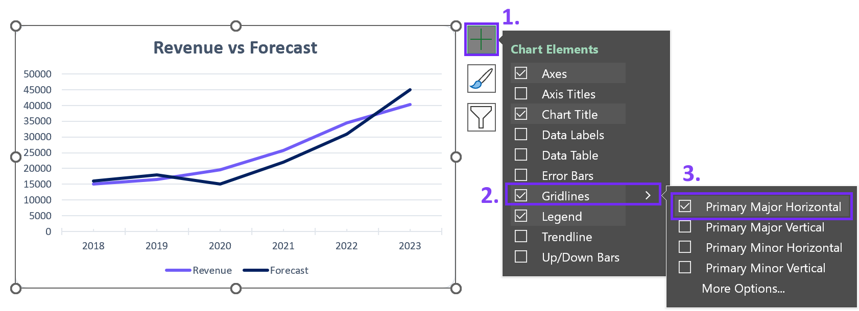
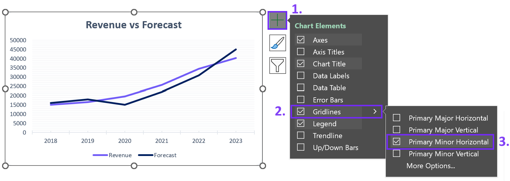
How To Add Minor Gridlines?
1. As before, select the chart that beckons for minor gridlines.
2. Head over to the Chart Elements (+) button, your gateway to chart customization.
3. This time, cast your gaze upon the “Minor Gridlines” box. Give it a click to activate the subtle yet vital network of guides.
Steps on how to add minor vertical gridlines in Excel chart. Image Credit: Ajelix
Related Article: How to add a secondary axis in Excel?
How To Remove Major Gridlines?
1. Select the chart that’s adorned with major gridlines.
2. Journey to the Chart Elements (+) button, as we’ve done before.
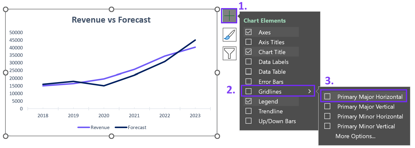
Screenshot from Excel with steps on how to remove major horizontal gridlines. Image Credit: Ajelix
3. Now, it’s time to uncheck the “Major Gridlines” box. Watch as the bold guides gracefully exit the stage, leaving your data to shine without obstruction.
Related Article: Top 9 data visualization trends 2024
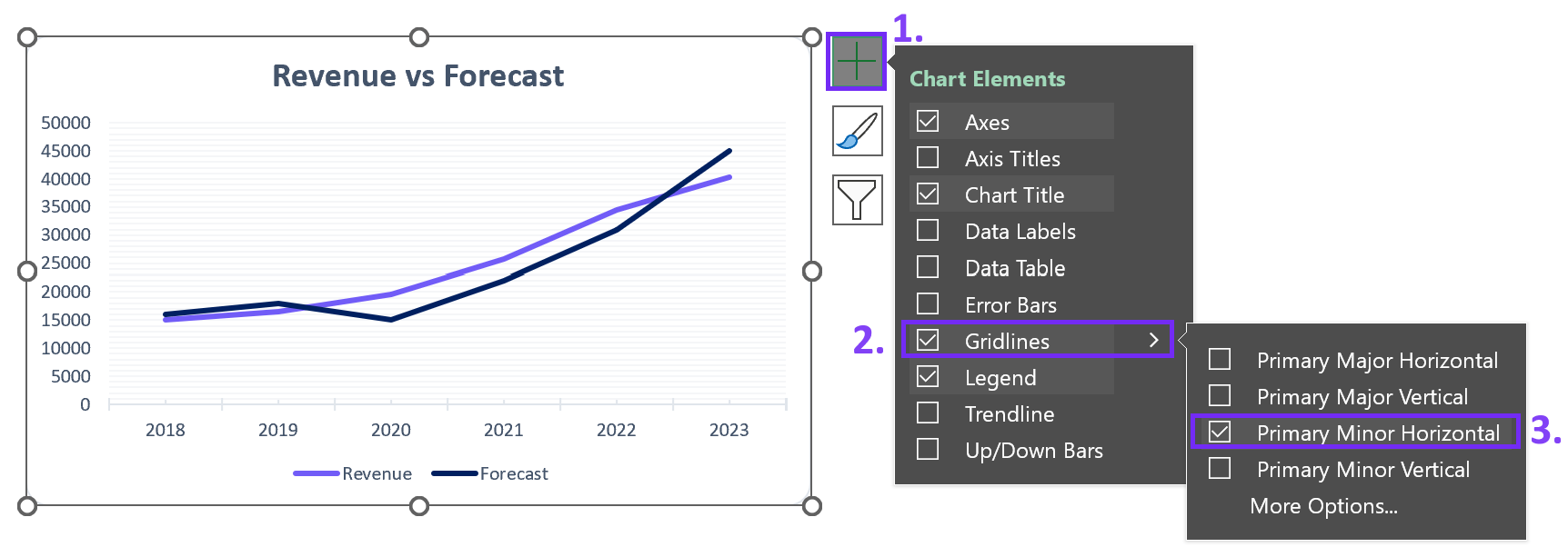
How To Remove Minor Gridlines?
1. Once again, select the chart from which you wish to part with minor gridlines.
2. Reach for the Chart Elements (+) button.
Remove minor horizontal gridlines from Excel chart. Image Credit: Ajelix
3. This time, uncheck the “Minor Gridlines” box, and with a subtle click, the intricate guides retreat, letting your data breathe freely.
Related Article: Data visualization principles with good examples
Chart Creation With Automatic Data Visualization
Crafting reports and designing charts within Excel spreadsheets can be a daunting task, especially if it’s not your favorite pastime. Utilizing Microsoft Excel effectively often demands specialized training. Familiarizing yourself with its intricate details and the art of incorporating specific elements can be time-consuming, and scouring the internet for instructional guides only adds to the effort.
Elevate Data Visualization with Ajelix BI
Bid farewell to the days when reporting felt like an arduous chore, thanks to Ajelix BI’s automatic data visualization capabilities.

Automatic reporting with Ajelix data visualization tool. Image Credit: Ajelix
With Ajelix BI, you can effortlessly upload your Excel files, select a template that suits your needs, and conjure up polished, professional reports in mere seconds. Empowered by AI, you can delve into your data, extracting valuable insights that effortlessly translate into impactful charts ready to be shared with your colleagues.
Here’s just one of the ways why create charts in Excel:
Create a double line chart in Excel vs. Ajelix BI comparison. Video Credit: Ajelix
Conclusion
In conclusion, gridlines in Excel charts are the unsung heroes of data visualization. They provide structure, clarity, and aesthetics to your data narratives. Armed with the knowledge of adding, removing, customizing, and using gridlines effectively, you are now equipped to embark on your data visualization odyssey.
Remember, the power of gridlines lies not just in their existence but in their judicious application. So, go forth and chart your data’s destiny with confidence and finesse.
Ready to create reports 10X faster?
Reference: Support Microsoft
Speed up your spreadsheet tasks with Ajelix AI in Excel