From data to report in one minute or less. Ajelix BI is launched! 🚀 Get started for free.
  • Home
  • Blog
  • excel
  • How to Insert a Clustered Column Pivot Chart in Excel

How to Insert a Clustered Column Pivot Chart in Excel

  • Author:
    Agnese
  • Published on:
    October 26, 2023
  • Category:
  • Last updated:
    June 17, 2024
How to insert clustered column pivot chart in excel banner

In the ever-evolving landscape of data analysis, pivot charts stand as indispensable tools. This article delves into the intricacies of creating a pivotal visualization – the clustered column pivot chart.

What is a Pivot Chart?

A pivot chart is a dynamic graphical representation of data created from a pivot table in Excel. To create a pivot chart you first need to create a pivot table. Once you have all set up you can make calculations in the chart or change data in the pivot table. The chart will change automatically making reporting interactive.

What’s the difference between a Pivot Chart and a Standard chart?

A pivot chart is a graphical representation of data created from a pivot table, offering dynamic analysis capabilities. While a standard chart is a static chart that represents data directly from a worksheet.

What's the difference between pivot chart and basic chart in Excel?
Difference between pivot chart and standard chart in Excel. Image Credit: Ajelix

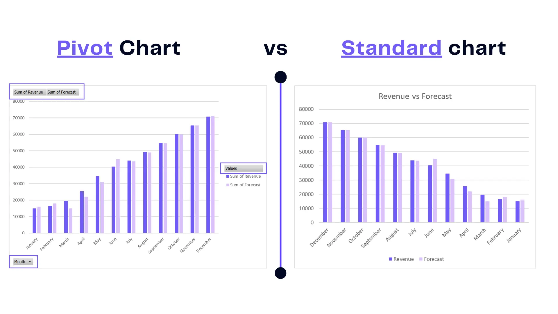
The key difference is the interactivity and flexibility offered by a pivot chart, making it easier to explore and summarize complex data compared to a standard chart. As you can see in the picture above pivot chart offers many filters and drop-downs so you can make calculations easier.

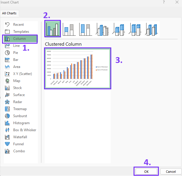
How To Insert a Clustered Column Pivot Chart?

Before you are trying to insert a pivot chart make sure you’ve created a pivot table, find the guide here. Once you have the pivot table, here’s how to add a clustered column pivot chart:

Time needed: 2 minutes

Add clustered column pivot chart in your Excel spreadsheet:
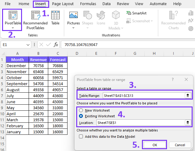
  1. Insert pivot table

    Simply choose your data table, go to Insert, and pick Pivot table. Confirm the data table and choose cells where you want to place the pivot table.
    Insert pivot table to make the clustered pivot chart, screenshot from excel

  2. Set up your Pivot Table

    Choose the calculations and values that should be visualized as rows or columns.

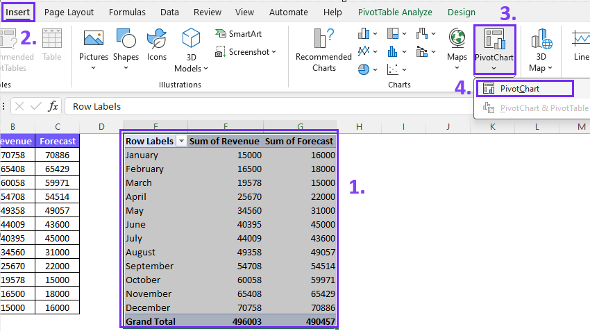
  3. Choose data for the Pivot chart

    Select the pivot table for your chart go to Insert and choose Pivot Chart.
    Insert clustered column pivot chart screenshot from Excel

  4. Pick the correct Pivot Chart

    Now you can pick any pivot chart style. To insert a clustered column graph go to column charts and pick the needed graph.
    Pick the column chart for data visualization

Author’s Note: You might also like data visualization principles for effective data storytelling. If you are an experienced Excel user you will find our guides useful and I strongly suggest trying out some of our tools such as AI data analytics and Excel formula generator.

Easy Data Visualization With Ajelix BI

Have you ever wondered how software can simplify the challenges of data visualization? As well as streamline your Excel skills, and significantly expedite the reporting process. Explore the report we’ve created in under 5 minutes to witness just how effortlessly you can commence your data visualization journey with Ajelix BI.

Here’s a quick demo to help you understand the power of Ajelix:

BI and Visualization Tools: Your Path to Data-Driven Decision Making -Tutorial by Ajelix
Create professional reports fast and pain-free. Join freemium.

Conclusion

In closing, this article serves as your guide in the realm of clustered column pivot charts. It’s an encouragement to embrace the power of data visualization, unlocking the doors to deeper insights and enhanced data reporting in Excel. Your data, your story, your insights – visualize them with clarity.

Speed up your spreadsheet tasks with Ajelix AI in Excel

Excel formula generator from Ajelix - more than 15 ai tools for spreadsheets

Similar posts

How to analyze data in Excel spreadsheet banner by author

How To Analyze Data In Excel Spreadsheet

April 4, 2024
Excel is the workhorse of data analysis in countless businesses. It can unlock valuable insights from spreadsheets, but for many, its pow…
How to add drop down list in Excel banner

How To Add Drop Down List in Excel

November 2, 2023
Let’s take a look at how to add drop down list to make your spreadsheets more professional and user-friendly. We’ll take a lo…
How to add checkbox in Excel banner

How To Add Checkboxes In Excel

October 31, 2023
This article will cover steps to add checkboxes in Excel with screenshots and tips to help you tackle this task. Learn how to enable the …

Online Calculators

10 equipment rental KPIs for rental business owners banner

10 Equipment Rental KPIs For Rental Business

July 25, 2024
Equipment rental KPIs are measurable values that track how well your rental business is using its equipment to generate profit and satisf…
15 financial KPIs for finance department to track banner

20 Financial KPIs For The Finance Department

July 23, 2024
Financial KPIs are quantifiable metrics that businesses use to track their financial health and performance. They provide valuable insigh…
15 ecommerce kpis for online business owners banner

15 Ecommerce KPIs Any Online Business Should Track

July 18, 2024
Ecommerce KPIs track how well your online store is performing. These metrics provide insights into different areas of your business, like…
Accounting KPIs for your accounting department banner

15 Accounting KPIs For Your Accounting Department

July 16, 2024
Accounting KPIs are measurable metrics that track how well an accounting department is performing. These metrics help accountants assess …
KPI For Quality Assurance calculate quality kpis formulas and examples banner

15 KPI For Quality Assurance: Calculate Quality KPIs

July 11, 2024
Quality KPIs are key performance indicators for quality management used to assess a company’s performance in delivering quality pro…
Free EBIT calculator online with formula and examples banner

Free EBIT Calculator Online With Formula Examples

July 4, 2024
An EBIT calculator is a tool that helps you calculate a company’s earnings before interest and taxes (EBIT). EBIT is a financial me…

Business Intelligence

15 financial KPIs for finance department to track banner

20 Financial KPIs For The Finance Department

July 23, 2024
Financial KPIs are quantifiable metrics that businesses use to track their financial health and performance. They provide valuable insigh…
15 ecommerce kpis for online business owners banner

15 Ecommerce KPIs Any Online Business Should Track

July 18, 2024
Ecommerce KPIs track how well your online store is performing. These metrics provide insights into different areas of your business, like…
Accounting KPIs for your accounting department banner

15 Accounting KPIs For Your Accounting Department

July 16, 2024
Accounting KPIs are measurable metrics that track how well an accounting department is performing. These metrics help accountants assess …
KPI For Quality Assurance calculate quality kpis formulas and examples banner

15 KPI For Quality Assurance: Calculate Quality KPIs

July 11, 2024
Quality KPIs are key performance indicators for quality management used to assess a company’s performance in delivering quality pro…
generative AI for data analytics banner blog article by ajelix

Generative AI For Data Analytics: What You’re Missing Out

April 18, 2024
Organizations across all industries are turning to data analytics to inform strategic decisions, optimize processes, and gain a competiti…
Hoe to calculate business growth rate with examples and formula banner by ajelix

How to Calculate Business Growth Rate? Formula & Examples

April 16, 2024
Whether you’re a seasoned entrepreneur or just starting, measuring progress is vital to identify areas of strength, pinpoint opport…