Management Reporting Best Practice & Report Examples
In the fast-paced landscape of modern business, effective management reporting stands as the cornerstone for informed decision-making and strategic advancements. 🎯
The more complex your business operation process becomes. The more important trustworthy data reporting becomes. Without digital dashboards, management is missing live data updates for metrics and KPIs that could help them make data-driven decisions.
In this article, we will delve into the best practices and provide examples to guide businesses toward a more robust reporting framework for management teams.
Change the way you work with agentic AI
One-click dashboards,KPI tracking, and AI-powered insights—for work that actually gets done.

What is Management Reporting?
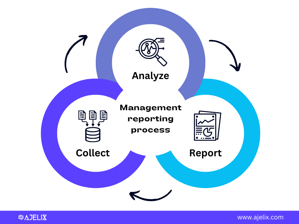
Management reporting is the process of collecting, analyzing, and disseminating information to managers and executives to help them make informed decisions about an organization’s operations and strategic direction. Here’s an infographic with a process overview.
The Purpose of Management Reporting
Management reporting is critical in driving organizations toward specific goals and objectives. With management dashboards, businesses can measure progress and notice any inconsistencies promptly.
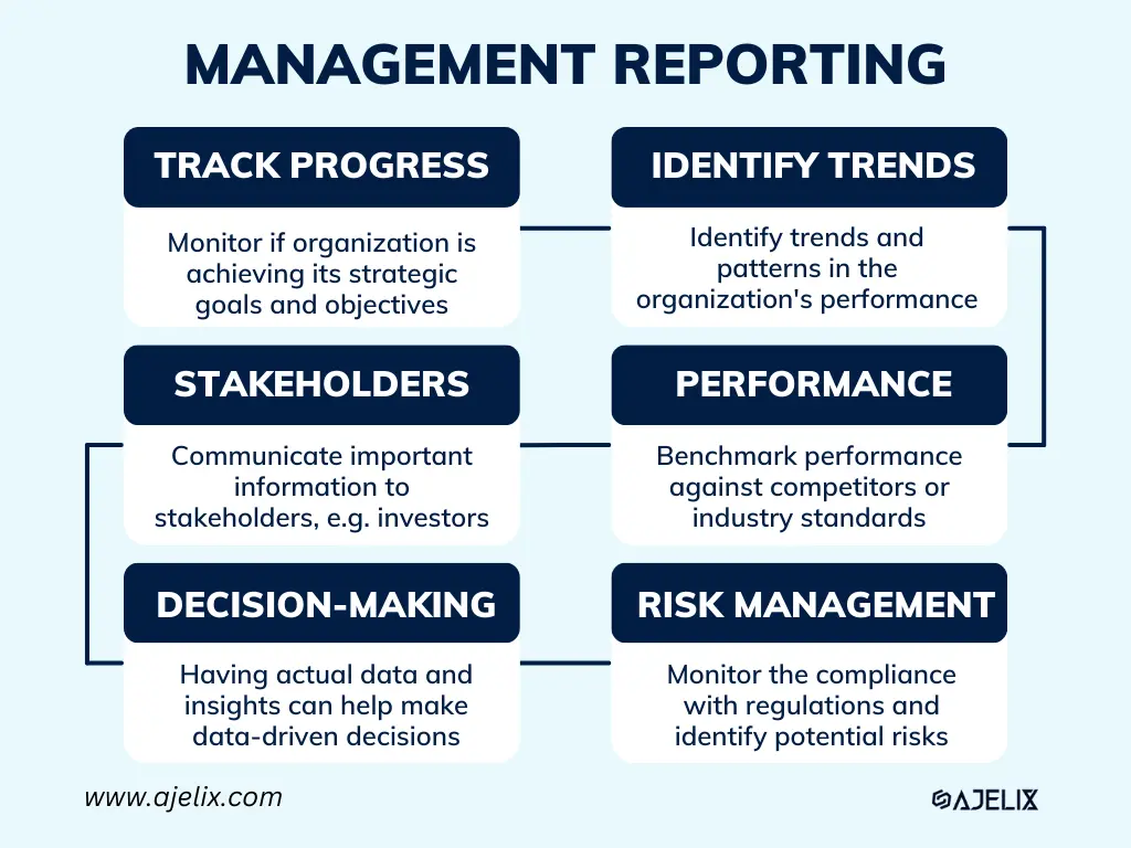
1. Track progress against goals and objectives
These reports can help managers monitor whether the organization is achieving its strategic goals and objectives. These metrics can be used to identify areas where the organization is excelling and areas where it needs to improve.
2. Identify trends and patterns
By analyzing historical data, reports can help managers identify trends and patterns in the organization’s performance. That will help make informed predictions about future performance and make strategic decisions.
3. Communication with stakeholders
Management reports are a way for managers to communicate important information to stakeholders, such as investors, board members, and employees.
This information can help stakeholders understand the organization’s performance and make informed decisions about their investment or employment.
4. Performance Benchmarking
These dashboards can be used to benchmark the organization’s performance against its competitors or industry standards.
Therefore managers can identify areas where the organization is excelling or falling behind and make necessary adjustments.
5. Decision-making support
Reports provide essential data and insights that can inform managers’ decisions about various aspects of the organization’s operations.
For example:
- Financial reports can help managers make decisions about budgeting, investment, and financing, while
- Operational reports can help managers make decisions about resource allocation, product development, and customer service.
6. Compliance and risk management
Management dashboards can be used to monitor the organization’s compliance with regulations and identify potential risks.
For instance:
- Financial reports can help identify instances of fraud or financial irregularities
- Operational reports can help identify potential safety hazards or compliance issues.
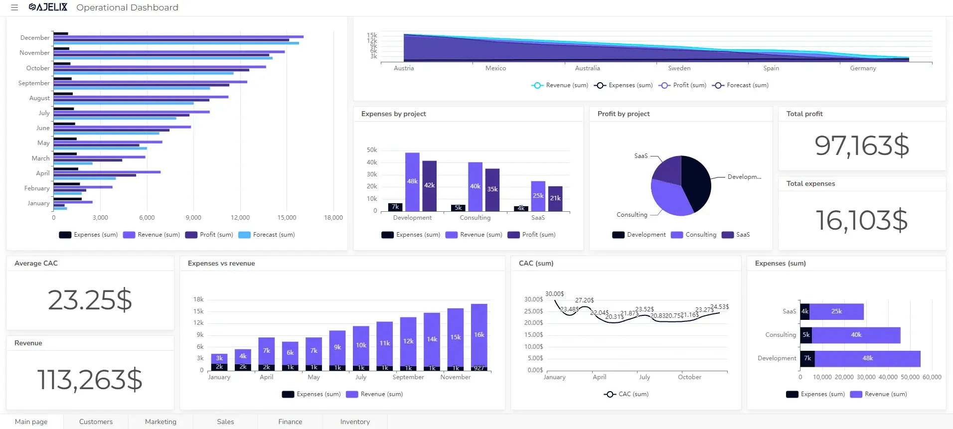
7 Types of Management Reporting: Dashboard Examples
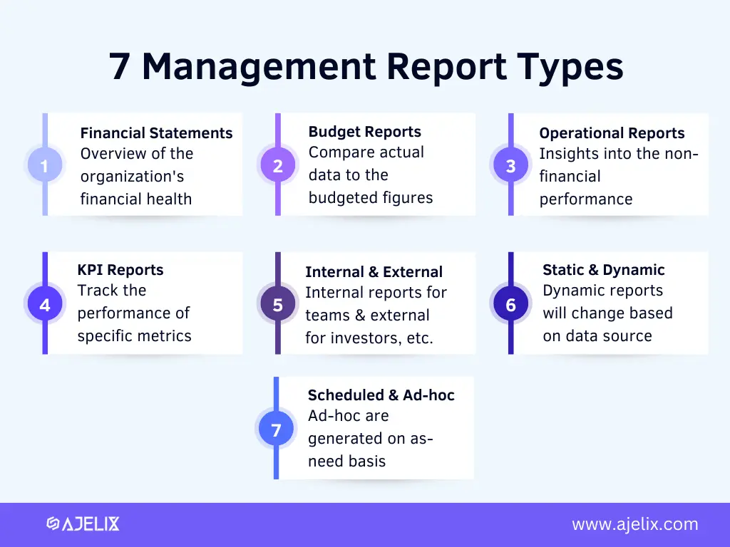
7 management report types infographic made by the author
Management reports are categorized into various types based on their content, purpose, and frequency of generation.
7 management reporting examples:
- Financial Reports
- Budget Reports
- Operational
- Key Performance Indicator Reports
- Internal vs External
- Scheduled vs Ad-hoc reports
- Static vs Dynamic Reports
1. Financial Statements For Management Needs
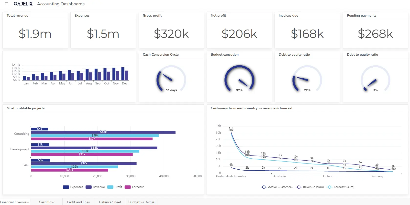
Financial statements are the foundation of management reporting, providing a comprehensive overview of the organization’s financial health. These reports can include:
- Balance Sheet: Indicates the organization’s financial position at a specific point in time, listing assets, liabilities, and equity.
- Income Statement: Tracks the organization’s financial performance over a specific period, summarizing revenue, expenses, and profits.
- Statement of Cash Flows: Details the movement of cash into and out of the organization, highlighting sources and uses of cash.
- Asset turnover ratio: Measures how efficiently the organization is using its assets to generate revenue.
- Debt-to-equity ratio: Assesses the organization’s financial leverage, indicating the proportion of debt financing relative to equity financing.
- Return on assets (ROA): Measures the profitability of the organization’s assets, considering net income and total assets.
- Return on equity (ROE): Determines the profitability of the organization for its shareholders, considering net income and shareholder equity.
- Net profit margin: Reflects the overall profitability of the organization, considering all revenue and expenses.
- Free cash flow: Represents the cash generated by the organization from its operations after deducting capital expenditures.
- Cash flow from operations: Measures the cash generated from the organization’s core business activities.
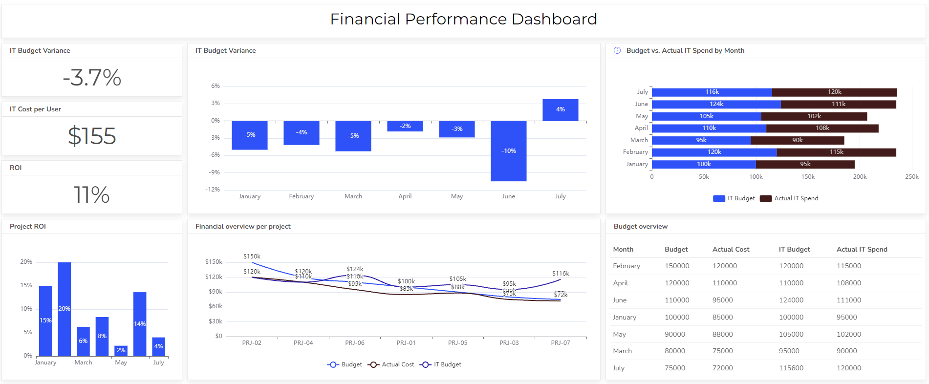
2. Budget Reports
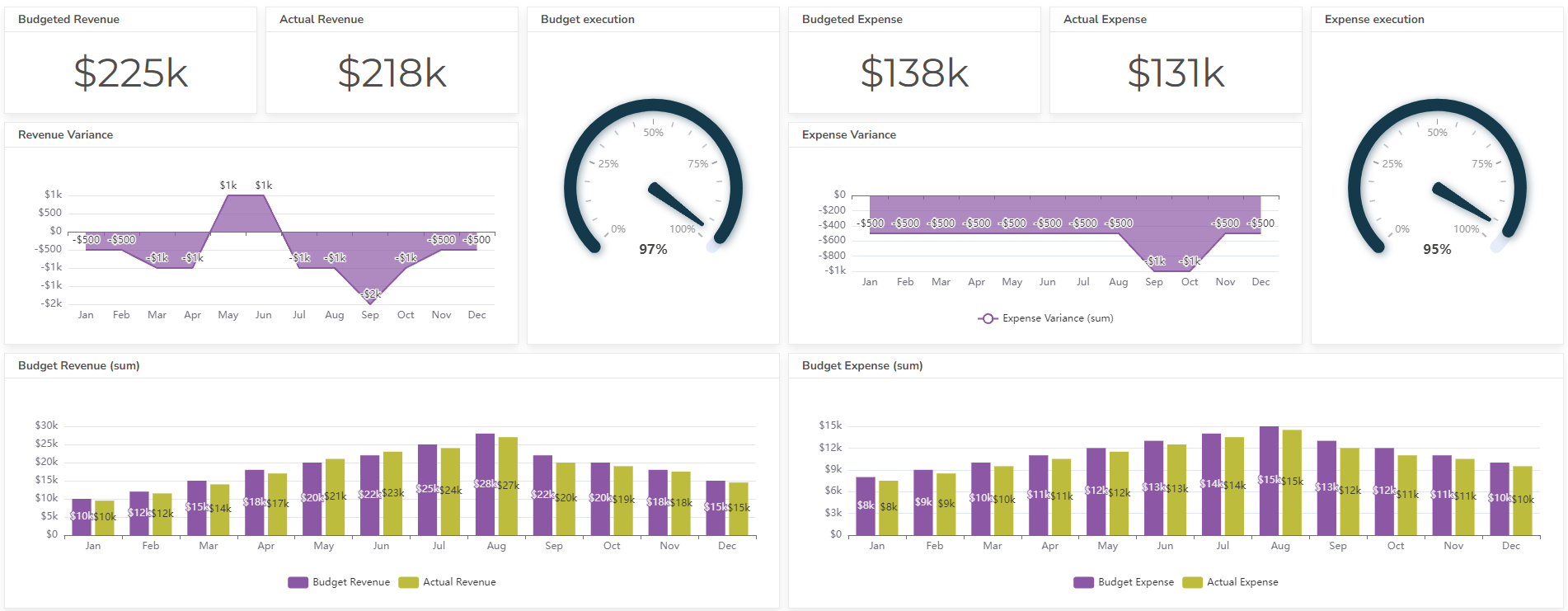
Budget reports compare actual expenses and revenues to the budgeted figures, identifying areas of overspending or understanding.
These reports can help managers track progress toward financial goals and identify areas for cost control or revenue improvement.
Here are some metrics that should be included in the budget report:
- Actual revenue vs. budgeted revenue: compare the organization’s actual revenue to its budgeted revenue for a specific period. It can help you identify areas where revenue is exceeding or falling short of expectations.
- Actual expenses vs. budgeted expenses: compare the actual expenses to budgeted expenses for a specific period. It can help identify areas where expenses are exceeding or falling short of expectations.
- Expense control ratio: This metric measures the percentage of expenses that are within budget. It indicates the organization’s ability to control its spending.
- Profit margin: This metric measures the profitability of the organization’s operations. It is calculated as net income divided by revenue.
- Return on investment (ROI): This metric measures the profitability of an investment. It is calculated as the net income from an investment divided by the cost of the investment.
Reporting gives you a headache?
Upload your data and create professional reports with agentic AI
Start free
Try free and upgrade whenever
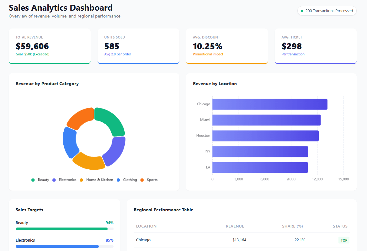
3. Operational Reports For Management
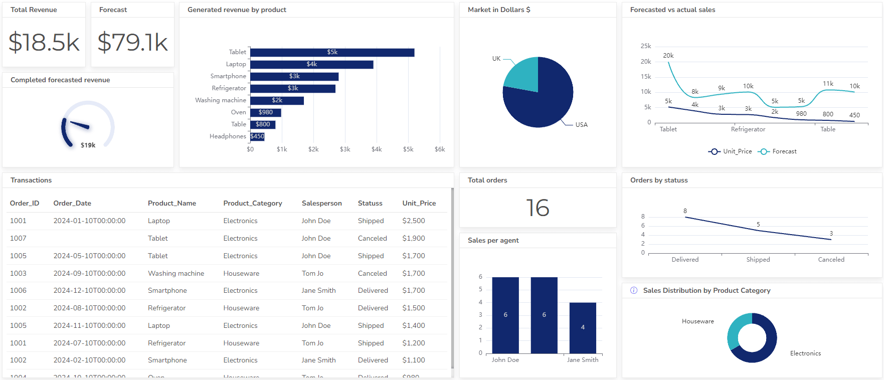
Operational reports provide insights into the organization’s non-financial performance, covering areas such as sales, production, customer satisfaction, and employee productivity.
They help managers monitor operational efficiency, identify areas for improvement, and assess the impact of operational decisions.
Here are the most important operational KPIs to include in the dashboard:
- Sales volume: total number of units sold or services provided during a specific period. It indicates the ability to generate sales and market its products or services.
- Sales growth rate: the percentage change in sales volume from one period to the next. It indicates the success in expanding its market share and generating new revenue.
- Average order value (AOV): the average amount of money spent per customer purchase. It helps managers assess the effectiveness of marketing and sales efforts in generating high-value transactions.
- Production volume: the total number of units produced during a specific period. It indicates the efficiency of production processes.
- Inventory turnover: measures how quickly the organization is turning its inventory into sales. It helps manage inventory levels and avoid stockouts or overstocking.
- Customer satisfaction rating: the satisfaction level of customers with the organization’s products or services. It helps identify areas where customer satisfaction can be improved.
- Net promoter score (NPS): the likelihood of a customer recommending the products or services to others.
- Employee output per hour: the amount of work that employees can produce in a given amount of time. It helps identify areas where productivity can be improved.
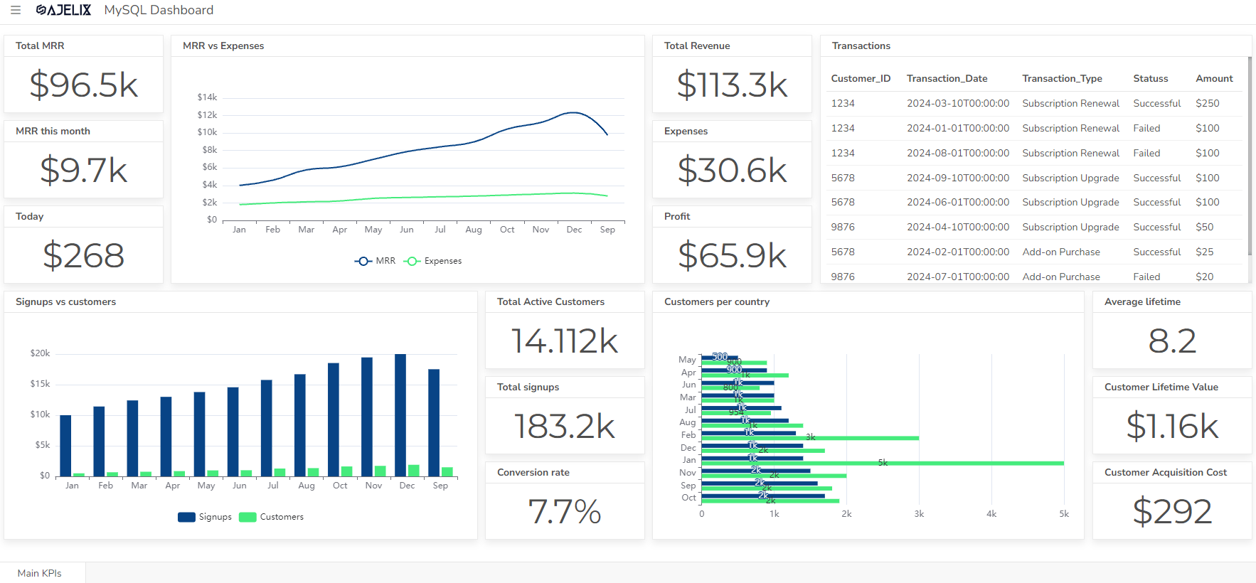
4. Key Performance Indicator (KPI) Reports
KPI reports focus on tracking the performance of specific metrics that are critical to the organization’s success. They provide a concise overview of the organization’s performance against its key objectives.
The metrics vary based on what departments you have. However, here’s the list of most important KPIs any manager should measure:
- Sales KPIs:
- Sales growth rate
- Average order value (AOV)
- Customer acquisition cost (CAC)
- Customer lifetime value (CLV)
- Repeat purchase rate
- Marketing KPIs:
- Website traffic
- Lead generation rate
- Conversion rate
- Cost per acquisition (CPA)
- Return on ad spend (ROAS)
- Product KPIs:
- Product adoption rate
- Product usage rate
- Product satisfaction rating
- Product churn rate
- Customer Service KPIs:
- Customer satisfaction rating
- Customer retention rate
- Net promoter score (NPS)
- Customer support resolution time
- Customer support cost per ticket
- Employee Engagement KPIs:
- Employee satisfaction rating
- Employee engagement score
- Employee turnover rate
- Employee absenteeism rate
- Operational Efficiency KPIs:
- Production volume
- Production lead time
- Product defect rate
- Inventory turnover
- Employee output per hour
- View more than 10 operational KPIs
- Innovation KPIs:
- Number of new product or service launches
- Number of patents or intellectual property filings
- Time to market for new products or services
- Customer adoption rate for new products or services
- Financial KPIs:
- Revenue growth rate
- Profit margin, calculate this metric using the profit margin calculator
- Return on investment (ROI)
- Gross margin
- Free cash flow
- Discover more than 20 financial KPIs
5. Internal vs. External Reports
Management reports can be classified as internal or external.
- Internal reports are intended for use within the organization, providing information to managers and executives for decision-making purposes.
- External reports are issued to external stakeholders, such as investors, creditors, and regulatory bodies.
6. Scheduled vs. Ad-hoc Reports Examples
Scheduled reports are generated regularly, such as monthly or quarterly, providing routine updates on the organization’s performance.
Ad-hoc reports are generated on an as-needed basis to address specific inquiries or investigate particular issues.
You can create these reports using ad hoc reporting tools.
7. Static vs. Dynamic Reports
Static reports are prepared in advance and typically remain unchanged, providing a snapshot of the organization’s performance at a specific point in time.
Dynamic reports are generated in real-time or near real-time, reflecting the latest data and changes in the organization’s performance.
9 Best Practices For management Reporting
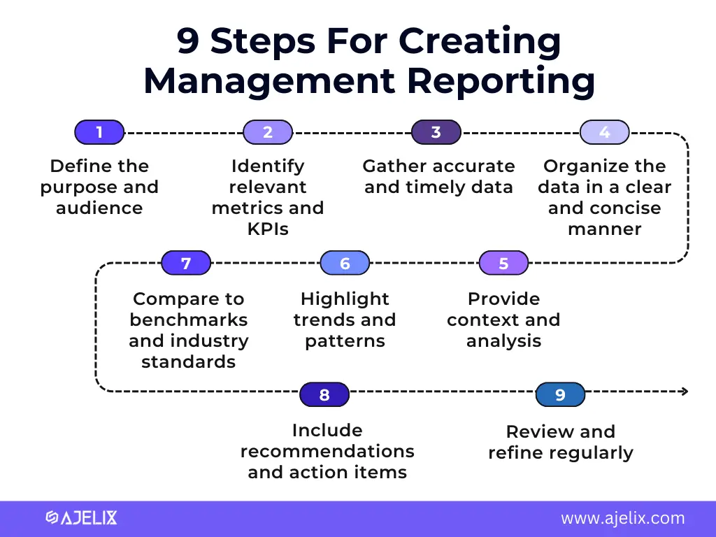
Creating effective management reports requires a strategic approach that focuses on providing relevant, actionable insights to decision-makers.
Time needed: 30 days
Here are 9 steps for creating good management reporting system
- Define the purpose and audience
Identify the purpose of the report and the audience it is intended for. This will help you tailor the content, format, and level of detail to meet the specific needs of the recipients.
- Identify relevant metrics and KPIs
Select the metrics and key performance indicators (KPIs) that are most important to tracking progress towards strategic goals. These metrics should provide insights into the organization’s performance in critical areas, such as sales, operations, financials, and customer satisfaction.
- Gather accurate and timely data
Ensure that the data used in the report is accurate, up-to-date, and relevant to the reporting period. This may involve gathering data from various sources, such as accounting systems, operational databases, and customer feedback surveys.
- Organize the data in a clear and concise manner
Present the data in a visually appealing and easy-to-understand format. Use charts, graphs, tables, and other visuals to effectively communicate the key findings.
- Provide context and analysis
Don’t just present raw data; provide context and analysis to explain the findings and their implications. This will help decision-makers understand the underlying reasons for trends.
- Highlight trends and patterns
Identify trends and patterns in the data over time. This will help decision-makers understand the overall direction and performance of the organization.
- Compare to benchmarks and industry standards
Compare the organization’s performance to industry benchmarks and internal targets to assess its competitive position and identify areas for improvement.
- Include recommendations and action items
Provide specific recommendations and action items based on the analysis of the data. This will help decision-makers take informed steps to improve performance.
- Review and refine regularly
Regularly review and refine your management reporting process to ensure that the reports are meeting the needs of the organization and its decision-makers.
How To Choose the Right Management Reporting Tool?
Choosing the right reporting tool for management reporting can be a daunting task, with a wide range of options available. However, to make an informed decision, consider 7 following factors.
1. Functionality
The tool should be able to generate reports that meet the specific needs of your organization. This includes
- The ability to track relevant metrics and KPIs
- Organize data clearly and concisely
- Provide insights into trends and patterns.
2. Data Integration
The tool should integrate well with your existing data sources, such as:
- accounting systems
- operational databases
- customer relationship management (CRM) systems.
This will ensure that you have access to the most up-to-date and accurate data for your reports.
3. User Interface (UI) and User Experience (UX)
Data visualization software should have a user-friendly interface that is easy to navigate and use. This will make it more efficient for your team to generate reports and analyze data.
4. Reporting Frequency
BI tool should be able to generate reports on a variety of frequencies, such as daily, weekly, monthly, or quarterly. This will allow you to track performance over time and identify trends.
5. Scalability
This software should be able to scale to meet the needs of your organization as it grows. This includes the ability to handle large amounts of data and accommodate multiple users.
6. Security
The tool should have robust security features to protect your data from unauthorized access. This may include encryption, access controls, and data audit trails.
7. Cost
Consider the cost of the tool and its features compared to your budget. There are a variety of options available, from freemium to enterprise-level tools.
6 best Tools For Management Reporting
Here are some specific reporting tools that you may want to consider:
- Ajelix BI: is a user-friendly self-service BI platform that let’s you create reports with AI, developed to meet the needs of managerial roles.
- Tableau: is a popular data visualization tool that is known for its ease of use and powerful features. It can be used to create a wide variety of charts, graphs, and dashboards.
- Qlik Sense: is another popular data visualization tool that is known for its scalability and ability to handle large datasets. It offers a variety of data integration options and a wide range of features for data analysis.
- Microsoft Power BI: is a cloud-based reporting tool that is part of the Microsoft Power Platform. It is easy to use and integrates well with other Microsoft products, such as Excel and SharePoint.
- Looker Studio: is a freemium data visualization tool that is part of the Google Cloud Platform. It is a good option for businesses that are looking for a cost-effective solution.
- Domo: is a cloud-based reporting tool that is known for its ability to connect to a wide variety of data sources. It offers a variety of features for data analysis and visualization.
Ultimately, the best reporting tool for your organization will depend on your specific needs and budget. Consider the factors outlined above to narrow down your choices and select the tool that is best suited for you.
Conclusion
In conclusion, we looked at key takeaways from the exploration of management reporting best practices. From the importance of clarity and context to the integration of cutting-edge technologies, the article provides a comprehensive guide for organizations striving to elevate their reporting practices.
The journey towards effective management reporting is a continuous evolution. Better start today then tomorrow, so try the tools and create your reporting process.
Ready to create a management reporting process with Ajelix BI?
From data to report in one minute or less with Ajelix BI