SaaS Dashboard Examples & KPIs

Are you struggling to track and optimize your SaaS business’s performance? A well-designed SaaS dashboard can be a vital part of your business. Any founder knows how important it is to track key metrics and insights to identify growth opportunities, find new marketing strategies, and troubleshoot potential issues. 📊
In this article, we’ll explore a variety of SaaS dashboard examples, showcasing the most effective KPIs to track. Whether you’re a startup founder or a seasoned SaaS veteran, these examples will provide valuable inspiration for creating your customized dashboard.
Change the way you work with agentic AI
One-click dashboards,KPI tracking, and AI-powered insights—for work that actually gets done.

What is a SaaS Dashboard?
A SaaS dashboard is a centralized interface that provides real-time visibility into the performance of a Software as a Service (SaaS) business. It’s designed to display key performance indicators (KPIs) and other relevant metrics in a visually appealing and easy-to-understand format.
Key features of a SaaS dashboard include:
- Customization: The ability to tailor the dashboard to specific needs and preferences.
- Data visualization: Clear presentation of metrics through charts, graphs, and other visual elements.
- Real-time updates: Constant synchronization with data sources to ensure accurate and up-to-date information.
- Interactivity: The ability to drill down into specific metrics for more detailed analysis.
By using a SaaS dashboard, businesses can:
- Monitor performance: Track key metrics such as customer acquisition cost, monthly recurring revenue (MRR), and customer lifetime value (CLTV).
- Identify trends: Spot patterns and trends in data to make informed decisions.
- Optimize operations: Identify areas for improvement and take corrective actions.
- Facilitate collaboration: Share insights and data across teams to foster better teamwork.
Metrics & KPIs For SaaS Dashboard
A well-crafted SaaS dashboard is built on a foundation of carefully selected metrics and KPIs. These key performance indicators provide valuable insights into your business’s health, helping you make data-driven decisions and optimize your operations.
Here are some essential metrics and KPIs to consider for your SaaS dashboard:
#1 Customer Acquisition Cost (CAC)
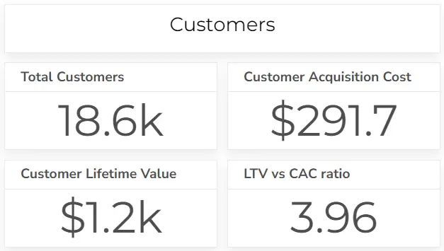
Measures the total cost of acquiring a new customer. A lower CAC is generally better, indicating that you’re acquiring customers efficiently. However, it’s important to balance CAC with customer quality and lifetime value.
Formula: CAC = Total Sales & Marketing Expenses / Number of New Customers Acquired
Looking for more marketing-related KPIs? Visit our CMO dashboard example.
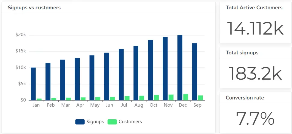
#2 Lead-to-Customer Conversion Rate
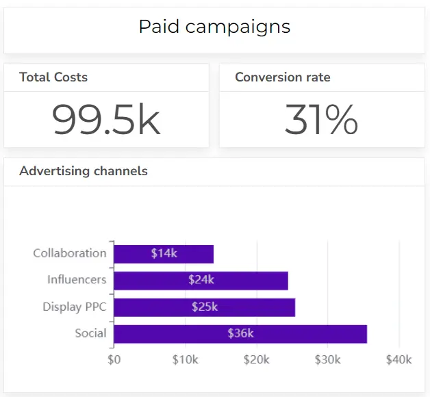
Tracks the percentage of leads that become paying customers. A higher conversion rate is generally better, indicating that your sales and marketing efforts convert leads into customers. Implementing strategies for effective lead distribution can significantly improve these conversions by optimizing your lead flow.
Formula: Conversion Rate = Number of Customers / Number of Leads
#3 Customer Churn Rate
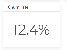
Measures the percentage of customers who stop using your product or service. A lower churn rate is generally better, indicating that you’re retaining customers effectively.
Formula: Churn Rate = Number of Customers Lost / Total Number of Customers
#4 Customer Lifetime Value (CLTV)
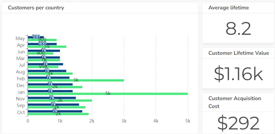
Calculates the total revenue generated by a customer over their lifetime. A higher CLTV is generally better, indicating that your customers are generating significant revenue over time.
Formula: CLTV = Average Revenue Per User * Customer Lifetime
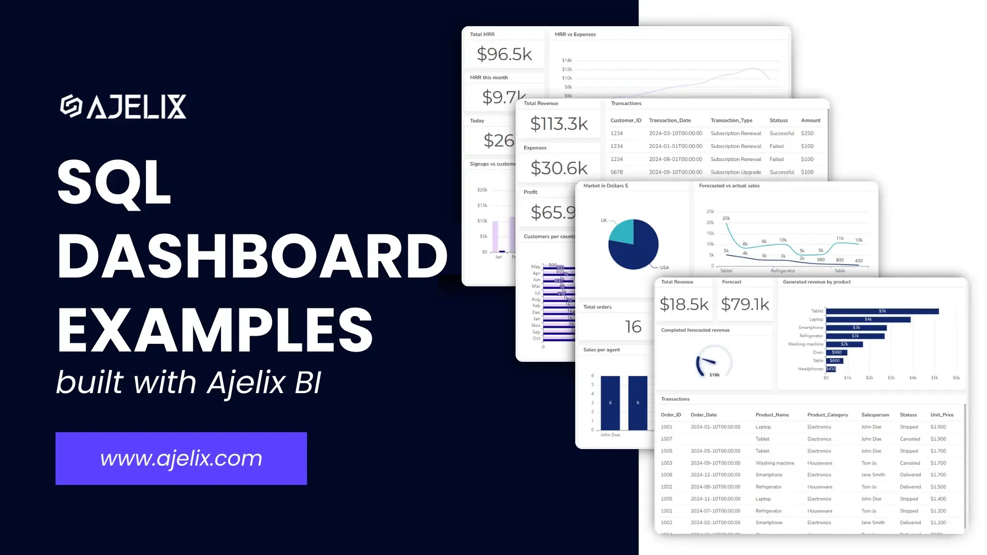
Startups that store data on SQL servers, you can easily create real-time data reporting using SQL dashboards.
#5 Net Promoter Score (NPS)
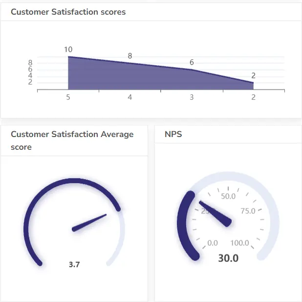
Measures customer satisfaction and loyalty. A higher NPS is generally better, indicating that your customers are satisfied and likely to recommend your product.
Formula: NPS = % Promoters – % Detractors
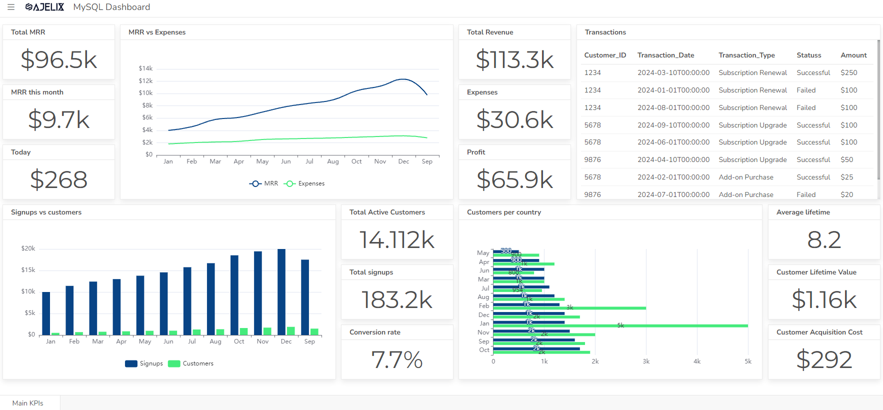
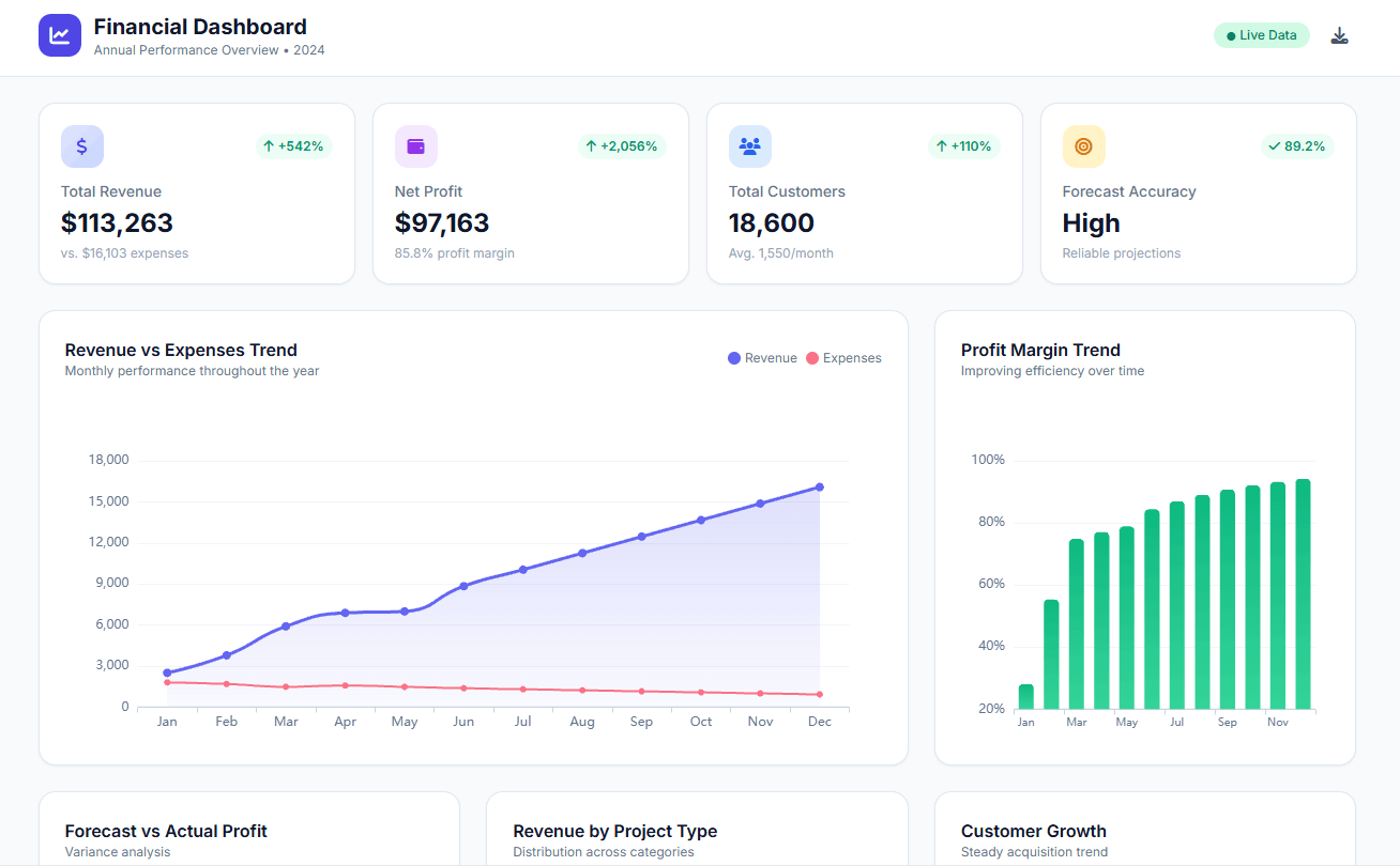
#6 Monthly Recurring Revenue (MRR)
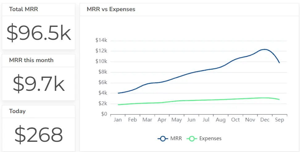
Represents the recurring revenue generated each month. A higher MRR is generally better, indicating that your business is generating consistent revenue.
Formula: MRR = Average Monthly Revenue Per Customer * Number of Customers
Struggling with manual calculations & tiring setups?
Let agentic AI do the heavy lifting.
Start free
Fast sign up & easy setup
#7 Annual Recurring Revenue (ARR)
Indicates the total recurring revenue generated annually. A higher ARR is generally better, indicating that your business has a strong foundation of recurring revenue.
Formula: ARR = MRR * 12
#8 Average Revenue Per User (ARPU)
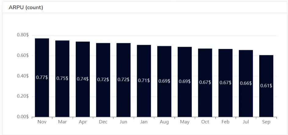
Measures the average revenue generated per customer. A higher ARPU is generally better, indicating that your customers are generating significant revenue.
Formula: ARPU = Total Revenue / Number of Customers
#9 Daily Active Users (DAU)
Tracks the number of users who actively use your product daily. A higher DAU is generally better, indicating that your product is being used frequently.
Formula: DAU = Number of Daily Active Users
#10 Monthly Active Users (MAU)
Measures the number of users who actively use your product monthly. A higher MAU is generally better, indicating that your product has a strong user base.
Formula: MAU = Number of Monthly Active Users
#11 Feature Usage
Monitors how frequently users interact with specific product features. Higher feature usage is generally better, indicating that your features are valuable and being used by customers.
Formula: Feature Usage = Number of Interactions with Feature / Total User Interactions
#12 Gross Margin
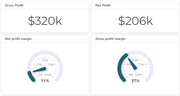
Indicates the percentage of revenue remaining after deducting the cost of goods sold. A higher gross margin is generally better, indicating that your business is generating a higher profit margin on each sale.
Formula: Gross Margin = (Revenue – Cost of Goods Sold) / Revenue
Explore accounting dashboard examples for your finance needs.
#13 Operating Expenses
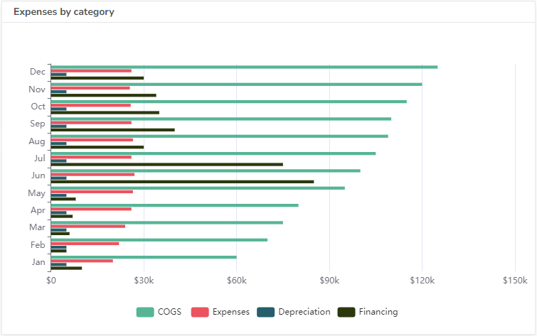
Tracks the costs associated with running your business, such as salaries and rent. Lower operating expenses are generally better, indicating that your business is operating efficiently. Operating expenses can be lowered further with SaaS management software and similar platforms.
Formula: Operating Expenses = Total Operating Costs
Learn how to build an operational dashboard and view more than 15 operational KPIs.
#14 Profit Margin
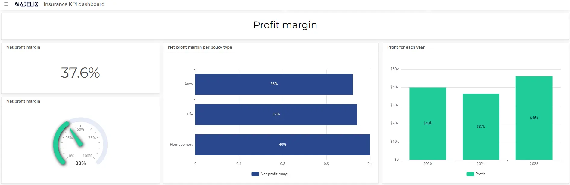
Measures the percentage of revenue remaining after deducting all expenses. A higher profit margin is generally better, indicating that your business is generating a higher profit on each sale.
Formula: Profit Margin = (Net Income / Revenue) * 100
Need more financial KPIs? Visit our guide with more than 20 finance-related KPIs for your business.
Tools for SaaS KPI Tracking
Here are some popular tools that can help you effectively track and analyze SaaS KPIs:
Business Intelligence (BI) Tools
- Ajelix BI: A comprehensive platform with data modeling and AI analytics capabilities, including data visualization, and real-time reporting.
- Tableau: A powerful and flexible BI platform that offers a wide range of visualization options.
- Power BI: Microsoft’s cloud-based BI service, tightly integrated with the Microsoft ecosystem.
- Looker: A cloud-based BI platform known for its data modeling and exploration capabilities.
Customer Relationship Management (CRM) Tools
- Salesforce: A leading CRM platform with robust analytics and reporting features.
- HubSpot: A popular CRM platform that offers a free version with basic analytics.
- Zoho CRM: A cloud-based CRM solution with a wide range of features and integrations.
- Pipedrive: A visually intuitive CRM platform that focuses on sales pipeline management. You may also want to hire CRM developer experts to tailor these tools to your specific business needs and optimize performance.
Product Analytics Tools
- Mixpanel: A product analytics platform that tracks user behavior and engagement.
- Amplitude: A product analytics platform that provides insights into user journeys and retention.
- Heap: A product analytics platform that automatically captures all user interactions.
When choosing a tool, consider the following factors:
- Ease of use: The tool should be intuitive and easy to learn.
- Integration capabilities: The tool should integrate seamlessly with your existing systems.
- Scalability: The tool should be able to handle your growing data volumes and user base.
- Cost: The tool should fit within your budget.
Reporting gives you a headache?
Upload your data and create professional reports with agentic AI
Start free
Try free and upgrade whenever
Explore other dashboards


Ready to create your dashboard?