- Home
- Product
- Tools
- AI Data Analyst
- Excel Formula Generator
- Excel Formula Explainer
- Google Apps Script Generator
- Excel VBA Script Explainer
- AI VBA Code Generator
- Excel VBA Code Optimizer
- Excel VBA Code Debugger
- Google Sheets Formula Generator
- Google Apps Script Explainer
- Google Sheets Formula Explainer
- Google Apps Script Optimizer
- Google Apps Script Debugger
- AI Excel Spreadsheet Generator
- AI Excel Assistant
- AI Graph Generator
- Pricing
Explore other articles
- How To Use AI as Business Analyst
- 7 Best AI Presentation Makers in 2026 (Tested & Ranked)
- AI Assistant vs AI Agent: Differences & Top Business Use Cases
- The 10 Best AI Chatbots of 2026: The Ultimate Comparison Guide
- How To Use AI In Excel: Top 5 Agentic AI Use Cases
- AI Agents Explained: What They Are and How To Use Them
- The 8 Best AI Agents in 2026 (Reviewed By Our Team)
- Agentic AI vs AI Agents: What’s the Difference and Why It Matters
- What AI Studies Say About Agentic AI ROI & Stats (And What They Don’t)
- Google Sheets AI Agents That Autonomously Perform Tasks
Try AI in Excel
Excel’s statistical analysis is a powerful way how advanced users gain insights from their data. These functions allow you to perform complex calculations and analyses, making it possible to extract valuable information from even the most complex datasets.
In this article, we will provide a detailed guide on how to use Excel’s statistical functions, specifically focusing on functions such as KURT, VARP, STDEV, and SLOPE to master your data analysis and take your Excel skills to the next level. As a bonus, we have created an Excel Statistic Function Cheat Sheet to help you with your work in spreadsheets.
Excel Statistical Analysis with Functions
First things first, if you’re new to the world of Excel functions, it might be useful to read more about them before you dig into this article. Feel free to check out our Excel resource library which is filled with the most different Functions in Excel with detailed examples and screenshots.
KURT Function in Excel
The KURT function in Excel is used to calculate the kurtosis of a data set, which is a measure of the “peakedness” of the data. A positive kurtosis indicates that the data has a higher peak and thinner tails, while a negative kurtosis indicates that the data has a flatter peak and wider tails. The syntax for the KURT function is =KURT(range of cells). This function is useful for identifying if a data set is skewed in any direction and or to identify outliers. More about the KURT function.
VARP and STDEV Function in Excel
The VARP function in Excel is used to calculate a population’s variance, which measures how spread out the data is. The syntax for the VARP function is =VARP(range of cells). A detailed guide of the function usability is here. This function can be useful for identifying patterns or trends in your data, particularly when used in combination with other statistical functions such as STDEV. The STDEV function in Excel is used to calculate a sample’s standard deviation, which measures how spread out the data is. The syntax for the STDEV function is =STDEV(range of cells). Learn more about the STDEV function.
SLOPE Function
Use the SLOPE function to calculate a linear regression line and identify trends or patterns in your data. The syntax for the SLOPE function is =SLOPE(known_y’s, known_x’s). This function is particularly useful when you’re working with large datasets and need to make predictions based on historical data. See more detailed examples of the SLOPE function in Excel.
When using these functions, it’s important to keep in mind that they are based on different assumptions and can produce different results. For example, the VARP function assumes that the data represents a population. While the STDEV function assumes that the data represents a sample. Choose the appropriate function based on the nature of your data and the analysis you are trying to perform.
The Most Common Functions in Excel Statistical Analysis
The AVERAGE function calculates the average of a range of cells. It’s syntax is =AVERAGE(range of cells). It’s helpful in finding the central tendency of your data. The STDEV function calculates the standard deviation of a range of cells. Its syntax is =STDEV(range of cells). It’s useful for measuring the variability of your data.
Another important statistical function is the COUNT function, which you can use to count the number of cells that contain numbers in a range of cells. Its syntax is =COUNT(range of cells). It’s useful for counting the number of valid observations in your data set.
The MAX and MIN functions are used to find the maximum and minimum values in a range of cells, respectively. Their syntax is =MAX(range of cells) and =MIN(range of cells). These functions are useful for identifying the highest and lowest values in your data set.
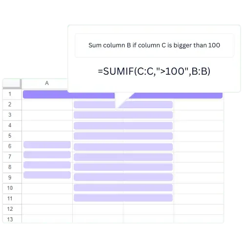
COUNTIF and SUMIF functions allow you to count or sum cells that meet specific criteria. For example, you can use the COUNTIF function to count the number of cells that contain a specific value. Or the SUMIF function to sum cells that meet a certain condition. These functions can be very useful when you want to perform complex calculations or extract specific information from your data.
Combining different statistical functions in Excel
One of the most powerful features of Excel’s statistical functions is the ability to use them in combination with other functions to create more complex formulas. For example, you can use the AVERAGE function with the IF function to create a formula that calculates the average of a range of cells only if a certain condition is met. This can be useful when you want to perform calculations on a subset of your data.
For example, if you want to calculate the average of a range of cells only if the values are greater than a certain value, you would use the following formula: =AVERAGE(IF(range of cells>value, range of cells))
This formula checks if the values in the range of cells are greater than a certain value and only includes those values in the calculation of the average. This type of formula can be very useful when you want to perform calculations on a subset of your data.
Excel also has a wide range of other statistical functions that you can use for more advanced data analysis. For example, the CORREL function calculates the correlation coefficient between two ranges of cells. This function can be useful for identifying trends and patterns in your data. The CHITEST function performs a chi-squared test to determine if there is a significant difference between two sets of data.
Conclusion
Functions are a powerful tool for users looking to gain insights from their Excel statistical analysis. By understanding the different functions and how to use them, you can perform complex calculations and extract valuable information from your data. The functions such as KURT, VARP, STDEV, SLOPE that we discussed in this article are particularly useful for identifying patterns or trends in your data. With this guide and a bit of practice, you’ll be able to effectively use Excel’s statistical functions to master your data analysis and take your Excel skills to the next level.
Learn more about Excel and Google Sheets hacks in other articles. Stay connected with us on social media and receive more daily tips and updates.
Excel Statistical Functions Cheat Sheet I Free PDF
Download the Excel Statistical Analysis Cheat Sheet PDF with useful formulas for free here:
Speed up your spreadsheet tasks with Ajelix AI in Excel
