Quality Dashboard Examples For Quality Control
Quality control is one of any business’s top priorities. Maintaining high standards is critical, but with so many moving parts: production, customer feedback, compliance, and more. How do you keep track of everything efficiently? That’s where a quality dashboard comes in.
Quality dashboards are centralized tools that give you real-time insights into key performance indicators (KPIs). They’re designed to help you make smarter, faster decisions, spot trends before they become problems, and ultimately ensure that your products and services consistently meet the highest standards.
In this article, we’ll explore quality dashboard examples that can change your approach to quality control, allowing you to visualize complex data at a glance and take proactive steps when needed.
Whether you’re in manufacturing, retail, or tech, these examples will showcase how to elevate your quality management processes for long-term success.
Change the way you work with agentic AI
One-click dashboards,KPI tracking, and AI-powered insights—for work that actually gets done.

What is a quality dashboard?

A Quality Dashboard is a digital tool that helps businesses monitor and visualize key performance indicators (KPIs) related to quality control. It provides real-time data on various product or service quality aspects, allowing teams to assess how well they meet predefined standards.
Typically, these dashboards compile data from different sources, such as production lines, customer feedback, or compliance reports, and present it in an easy-to-understand format like charts, graphs, and tables.
This centralized view allows businesses to track performance, identify trends, and spot potential quality issues before they escalate.
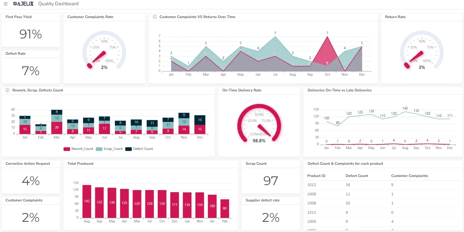
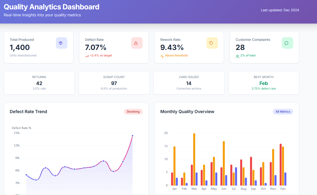
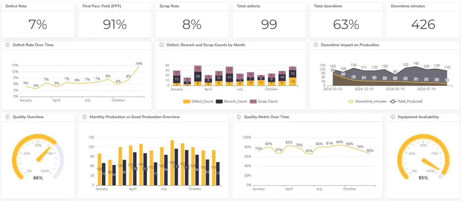
1. Manufacturing Quality Dashboard

Manufacturing is one of the most quality-sensitive industries, where even minor defects can lead to high costs or product recalls. These dashboards allow businesses to closely monitor production efficiency, defect rates, and overall equipment effectiveness.
Key Metrics for a Manufacturing Quality Dashboard:
- Defect Rate: Measures the percentage of products with defects out of the total produced.
- First Pass Yield (FPY): Tracks the percentage of products that meet quality standards without needing rework.
- Scrap Rate: Monitors the percentage of raw materials wasted during production.
- Overall Equipment Effectiveness (OEE): Combines availability, performance, and quality to assess the efficiency of manufacturing equipment.
- Downtime Tracking: Measures how often machines are idle, impacting production quality and timeliness.
Here’s a more detailed guide on data analytics in manufacturing.
Example Dashboard Layout:
- Real-time Defect Tracking: A widget showing the number of defects per hour, visualized in a line graph.
- Production Efficiency: A speedometer-style gauge showing the plant’s current OEE score.
- Scrap Rate History: A bar chart comparing scrap rates over the past 30 days, helping identify trends and issues.
- Downtime Alerts: Instant notifications on equipment downtime, helping engineers quickly troubleshoot the problem.
A manufacturing dashboard helps leaders keep production quality high by tracking data at every stage of production. When quality slips, corrective action can be taken immediately, preventing costly recalls or delays.
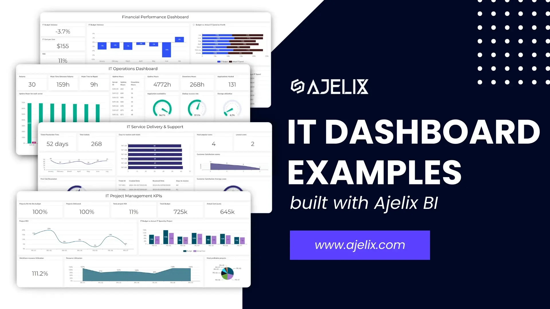
2. IT/Software Development Quality Dashboard
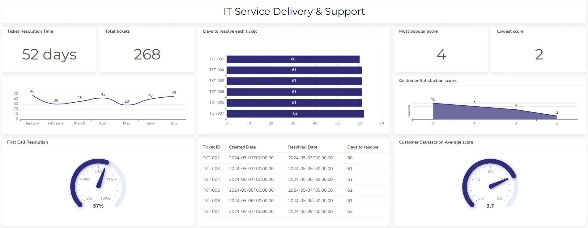
In the IT and software development industry, maintaining high code quality and ensuring uptime are critical to delivering a seamless user experience. Quality dashboards for IT help teams monitor bug rates, system performance, and adherence to development timelines.
Key Metrics for an IT/Software Development Quality Dashboard:
- Bug Rate: Tracks the number of bugs found per 1,000 lines of code (KLOC).
- Release Stability: Monitors the percentage of successful releases with no major issues or rollbacks.
- Code Coverage: Measures how much of the codebase is covered by automated tests.
- System Downtime: Tracks the duration of system outages or downtime during critical operations.
- Customer Reported Issues: Measures the volume of quality-related issues reported by end users.
Explore a more detailed IT KPI list in our article.
Example Dashboard Layout:
- Bug Rate Monitoring: A chart showing the number of bugs discovered and fixed in recent builds.
- Release Stability: A pie chart representing the percentage of successful releases versus those requiring rollback.
- Code Coverage Visualization: A percentage gauge showing how much of the current codebase is covered by automated tests.
- System Downtime Tracker: A real-time counter of any unplanned outages, including duration and recovery actions.
View other IT dashboard examples here.
This dashboard provides IT and development teams with crucial insights into code quality, release performance, and user-reported issues, allowing them to deliver robust software products while minimizing downtime and bugs.
Struggling with manual calculations & tiring setups?
Let agentic AI do the heavy lifting.
Start free
Fast sign up & easy setup
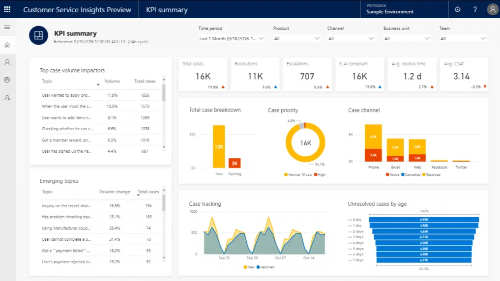
3. Retail/Customer Service Quality Dashboard
In the retail and customer service industries, the focus of a quality dashboard is on customer satisfaction, product returns, and service efficiency. Ensuring that customer expectations are met consistently is crucial for maintaining brand loyalty and profitability.
Key Metrics for a Retail/Customer Service Quality Dashboard:
- Customer Satisfaction (CSAT) Score: Measures customer happiness based on post-interaction surveys.
- Net Promoter Score (NPS): Tracks how likely customers are to recommend your brand or product.
- Return Rate: Measures the percentage of products returned compared to the total sold.
- Average Resolution Time: Tracks how quickly customer service teams resolve issues.
- Order Accuracy: Monitors the percentage of orders fulfilled correctly the first time.
Example Dashboard Layout:
- Customer Satisfaction Overview: A visual CSAT score represented by customer feedback from multiple touchpoints (in-store, online, support).
- Net Promoter Score (NPS): A graph showing how customer loyalty has fluctuated over time.
- Return Rate Tracking: A bar chart breaking down return rates by product category, helping identify issues with specific items.
- Service Efficiency Metrics: A gauge showing the average time taken by support staff to resolve customer issues.
For retail and customer service operations, this dashboard helps monitor and improve customer satisfaction, identify common product or service issues, and enhance operational efficiency.
Dashboard Tools For Quality Control Tracking
Here’s a list of popular tools you can use to create quality dashboards, including the newest technologies like agentic AI, general business intelligence (BI) platforms, and specialized tools for quality control.
1. Ajelix Agentic AI
- Overview: Ajelix Agentic Chat uses autonomous AI agents to create complete quality dashboards through conversational prompts. Unlike traditional BI tools requiring manual configuration, this agentic AI chatbot builds interactive dashboards from 20+ data sources including Google Sheets, Excel files, CSVs, PDFs, and web search data, no technical skills or setup required. (Read how our teams create a dashboard from 1 prompt)
- Key Features: Conversational dashboard creation, connects to Google Sheets, Excel, CSV, PDF, and 20+ data sources, automated chart selection and formatting, data analysis, interactive visualizations with drill-down capabilities, AI-powered insights, and anomaly detection.
- Best For: Businesses of all sizes looking for instant quality dashboard creation without BI tool complexity. Ideal for teams that need production-ready dashboards in minutes through simple chat commands rather than hours of manual configuration.
2. Power BI (Microsoft)
- Overview: Power BI is a popular business intelligence platform that offers comprehensive data visualization and reporting tools. It’s highly flexible, integrates with many data sources, and allows users to create custom dashboards for quality control.
- Key Features: Drag-and-drop functionality, real-time data monitoring, and strong integration with other Microsoft products like Excel and Azure.
- Best For: Businesses looking for robust analytics with wide compatibility and real-time reporting.
3. Tableau
- Overview: Tableau is a powerful data visualization tool known for its ease of use and ability to create interactive, dynamic dashboards. It supports multiple data connections, making it ideal for complex quality management use cases.
- Key Features: Interactive visualizations, drag-and-drop analytics, and advanced data blending capabilities.
- Best For: Teams that need visually stunning and interactive dashboards with minimal coding.
5. Looker (Google Cloud)
- Overview: Looker is a cloud-based BI platform with a focus on real-time data exploration. It allows teams to build custom dashboards using SQL-based queries and integrates seamlessly with Google Cloud.
- Key Features: Data modeling, built-in analytics, and real-time collaboration features.
- Best For: Data-driven organizations already using Google Cloud or needing real-time insights.
5. Zoho Analytics
- Overview: Zoho Analytics is a self-service BI and analytics platform that allows users to create dashboards with minimal technical expertise. It’s part of the Zoho ecosystem, integrating with other Zoho products.
- Key Features: Drag-and-drop interface, AI-powered analytics, and a wide range of data source integrations.
- Best For: Small to medium-sized businesses looking for a budget-friendly yet powerful BI tool.
Explore other dashboards


Ready to create your dashboard?