Online Profit And Loss Dashboard Example: P&L Template
A well-designed online profit and loss dashboard can be a game-changer for businesses. By visualizing key metrics, you can quickly assess your financial health and make data-driven decisions.
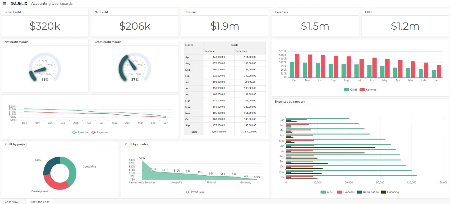
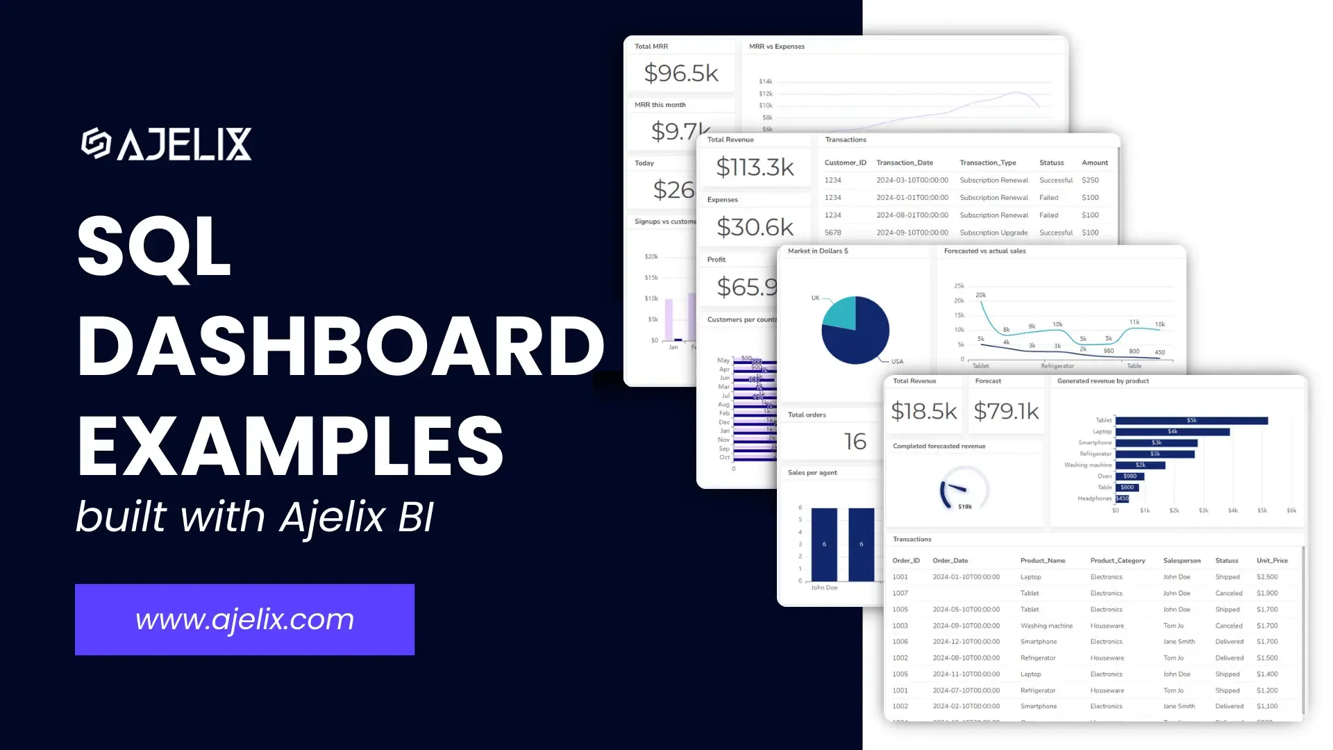
An online profit and loss (P&L) dashboard is a powerful tool that can provide you with real-time insights into your company’s revenue, expenses, and overall profitability.
This article will explore the essential components of a P&L dashboard and provide a practical example to help you get started.
Change the way you work with agentic AI
One-click dashboards,KPI tracking, and AI-powered insights—for work that actually gets done.

What is a profit and loss dashboard?

A profit and loss (P&L) dashboard is a visual representation of a company’s financial performance. It provides a clear and concise overview of revenue, expenses, and overall profitability. By presenting financial key performance indicators (KPIs) in an easily digestible format, P&L dashboards help businesses:
- Monitor financial health: Track revenue growth, expense control, and profit margins.
- Identify trends: Spot patterns and anomalies in financial data.
- Make informed decisions: Use data-driven insights to optimize operations and improve profitability.
Typically, a P&L dashboard includes metrics such as:
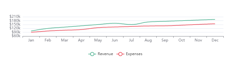
- Revenue: Total income generated from sales.
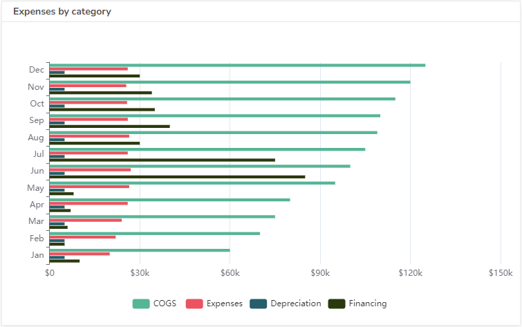
- Cost of goods sold (COGS): The direct costs associated with producing or selling products.
- Gross profit: Revenue minus COGS.
- Operating expenses: Indirect costs related to running the business.
- Operating profit: Gross profit minus operating expenses.
- Net profit: Operating profit plus or minus other income and expenses.
Key Metrics Visualized on a Profit and Loss Dashboard
A profit and loss (P&L) dashboard typically visualizes the following key metrics:
Revenue Metrics
- Total Revenue: The overall income generated from sales.
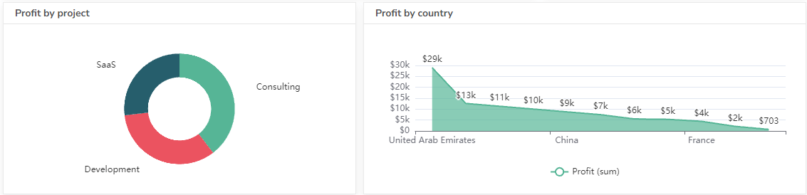
- Revenue by Product/Service: A breakdown of revenue based on different offerings.
- Revenue by Region/Market: Revenue performance across geographical areas.
Expense Metrics
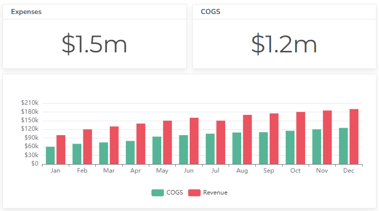
- Cost of Goods Sold (COGS): Direct costs associated with producing or selling products.
- Operating Expenses: Indirect costs related to running the business (e.g., salaries, rent, utilities).
- Selling, General, and Administrative (SG&A) Expenses: Costs related to marketing, sales, administrative functions, and other overhead.
Profitability Metrics
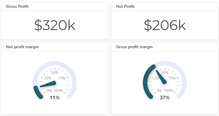
- Gross Profit: Revenue minus COGS.
- Operating Profit: Gross profit minus operating expenses.
- Net Profit: Operating profit plus or minus other income and expenses.
- Profit Margin: The percentage of revenue that turns into profit.
Trend Analysis Metrics
- Year-over-Year (YoY) Growth: Compares current performance to the previous year.
- Month-over-Month (MoM) Growth: Compares current performance to the previous month.
- Forecasted vs. Actual: Compares projected performance to actual results.
Additional Metrics
- Key Performance Indicators (KPIs): Specific metrics relevant to the business (e.g., customer acquisition cost, customer lifetime value).
- Financial Ratios: Metrics used to assess financial health (e.g., debt-to-equity ratio, current ratio).
How To Create a Profit and Loss Dashboard?
Time needed: 5 hours
Create a profit and loss dashboard in minutes using a business intelligence tool. This guide will walk you through 6 steps to create a digital dashboard using Ajelix BI.
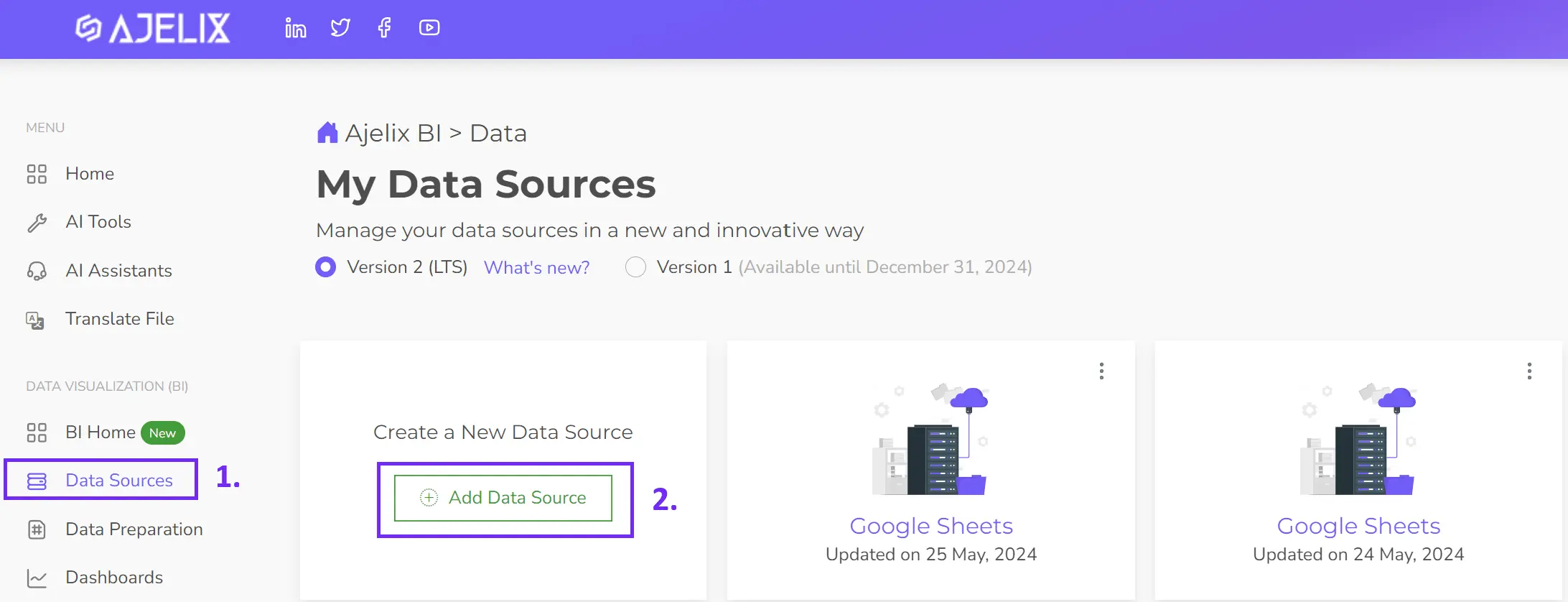
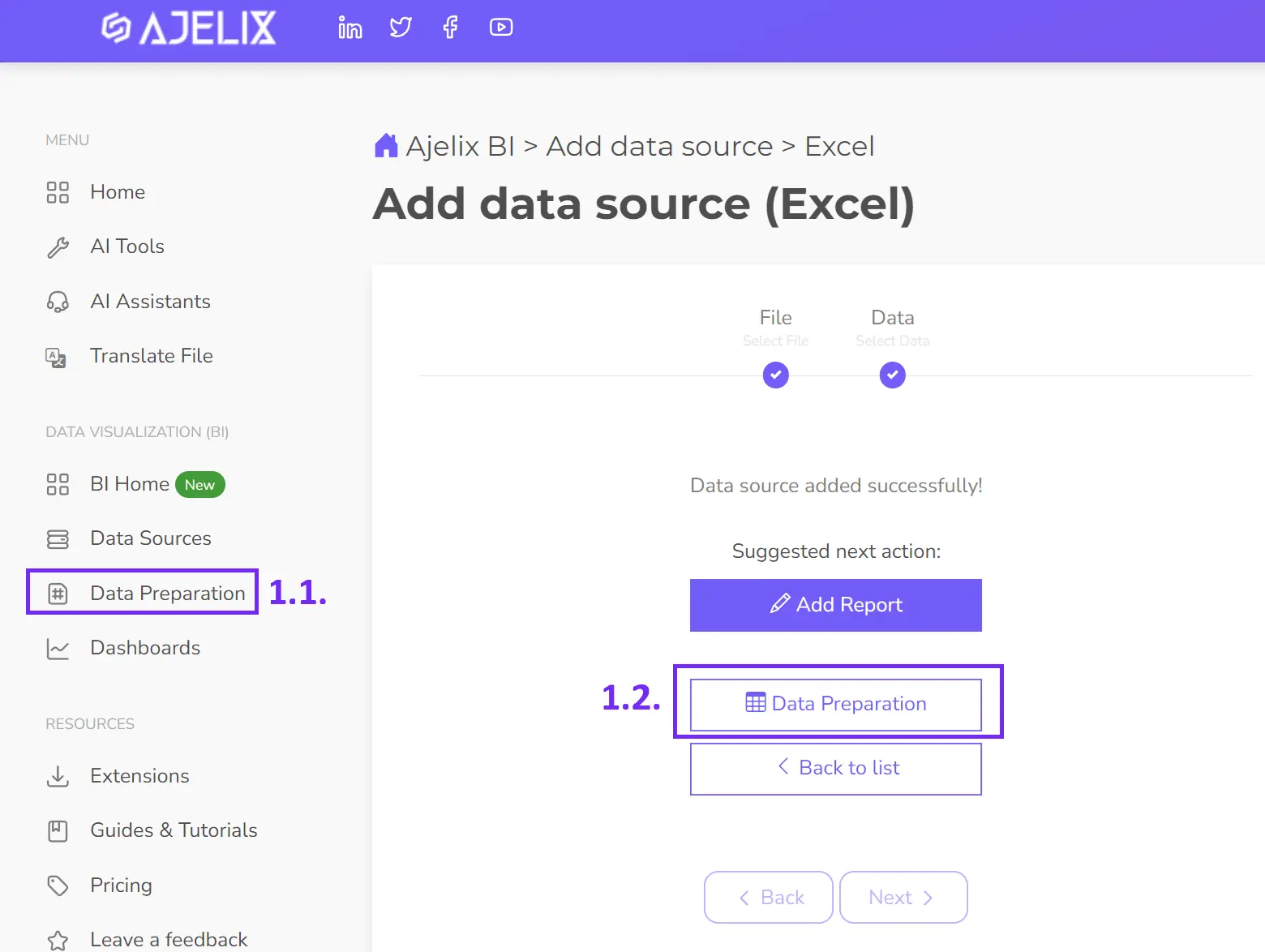
- Connect your data source
Select the data source on Ajelix BI you can upload Excel or CSV files, and connect with Google Sheets or an SQL server. For more advanced users you can customize and connect your API, for example from accounting software.
- Clean and transform your data (optional)
Ajelix BI allows you to clean or transform your data (e.g., converting formats, filtering). This ensures accuracy and consistency. It’s not a mandatory step but recommended for better analytics especially if you want to calculate KPIs.
- Create calculated fields (optional)
Using a data prep tool you can calculate KPIs such as gross profit and later visualize them in a profit and loss dashboard. In the picture below you can see steps to create your KPI using data modeling.
1. Select the data source
2. Select Add measure
3. Name your metric
4. Insert Excel-like function or SQL function
5. Press the apply button to calculate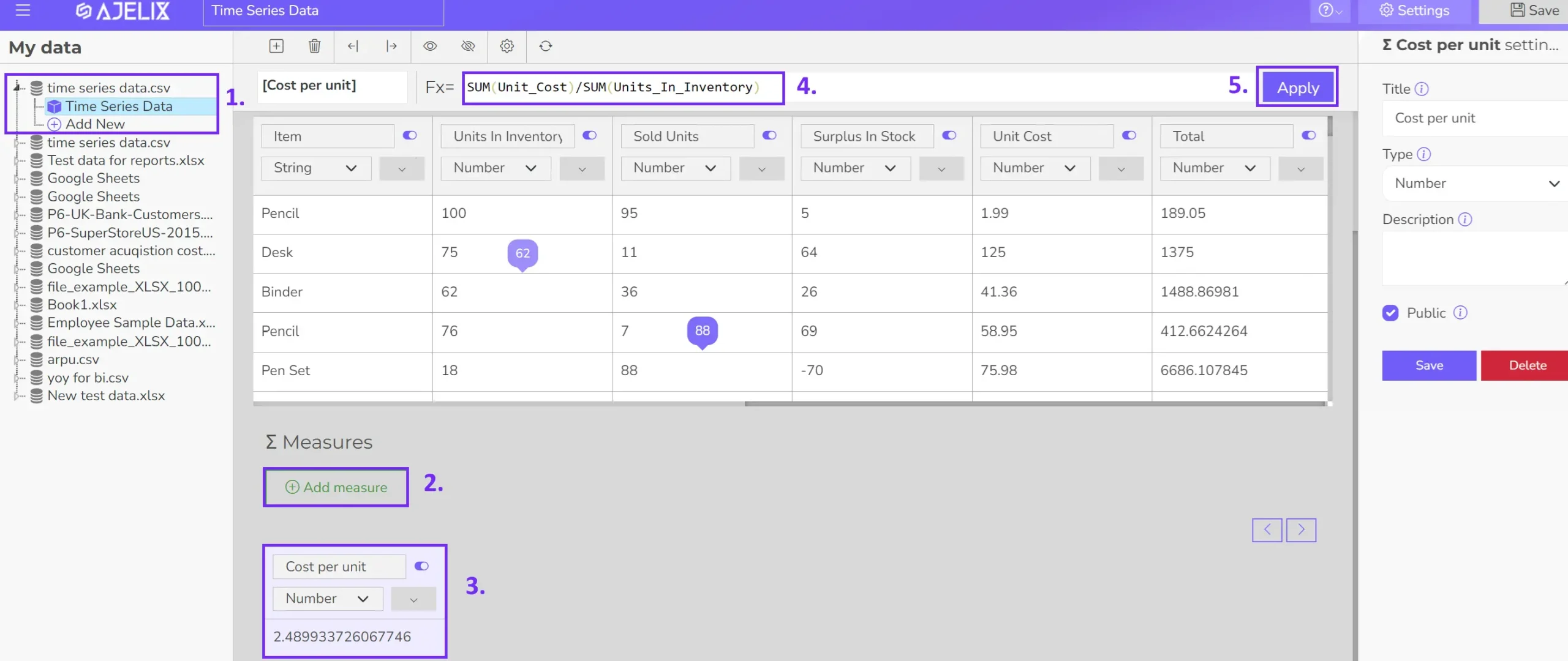
- Build your visualizations
Choose the visual format for each KPI (e.g., card, gauge chart, line graph). Drag and drop data fields into the visualization tool. Ajelix BI offers an AI dashboard generator that automatically creates charts based on your data. Give it a try and watch the magic! If you need help with editing you can visit our documentation.
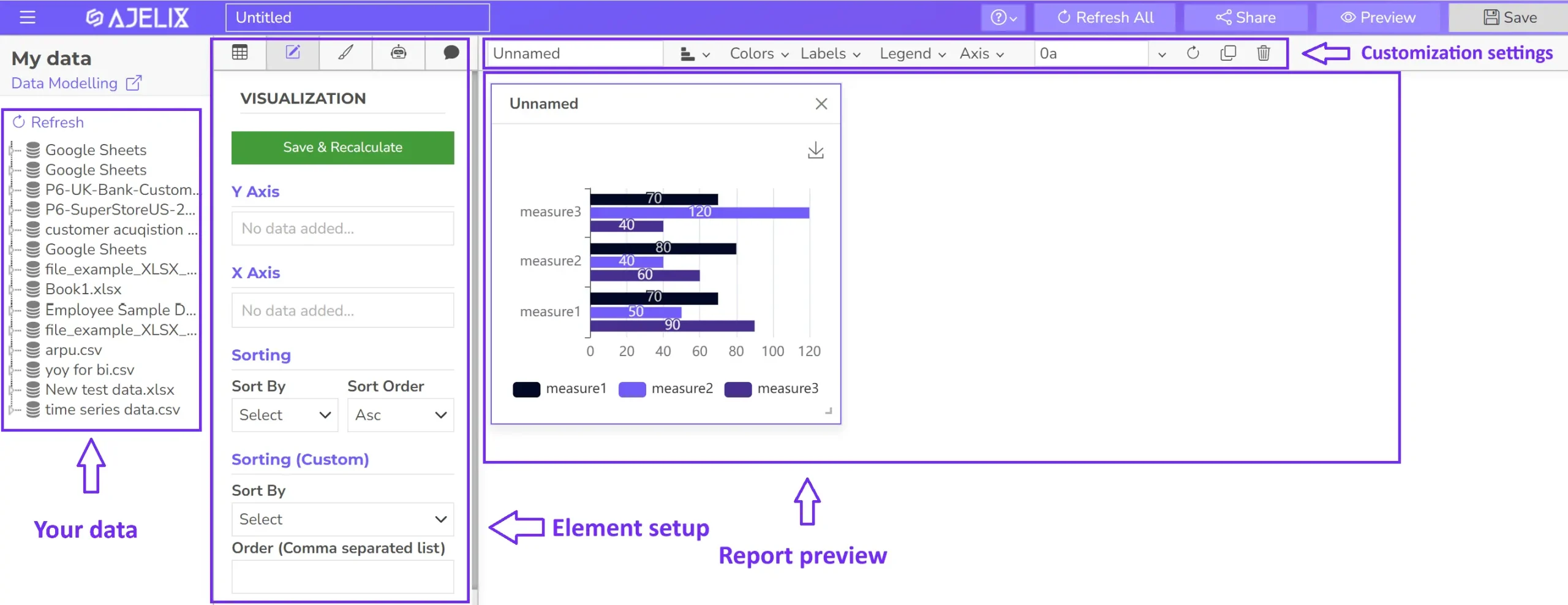
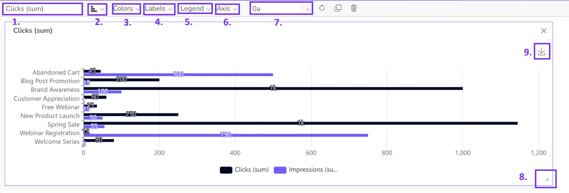
- Customize your dashboard
Add titles, and descriptions, and format the layout for clarity and visual appeal.
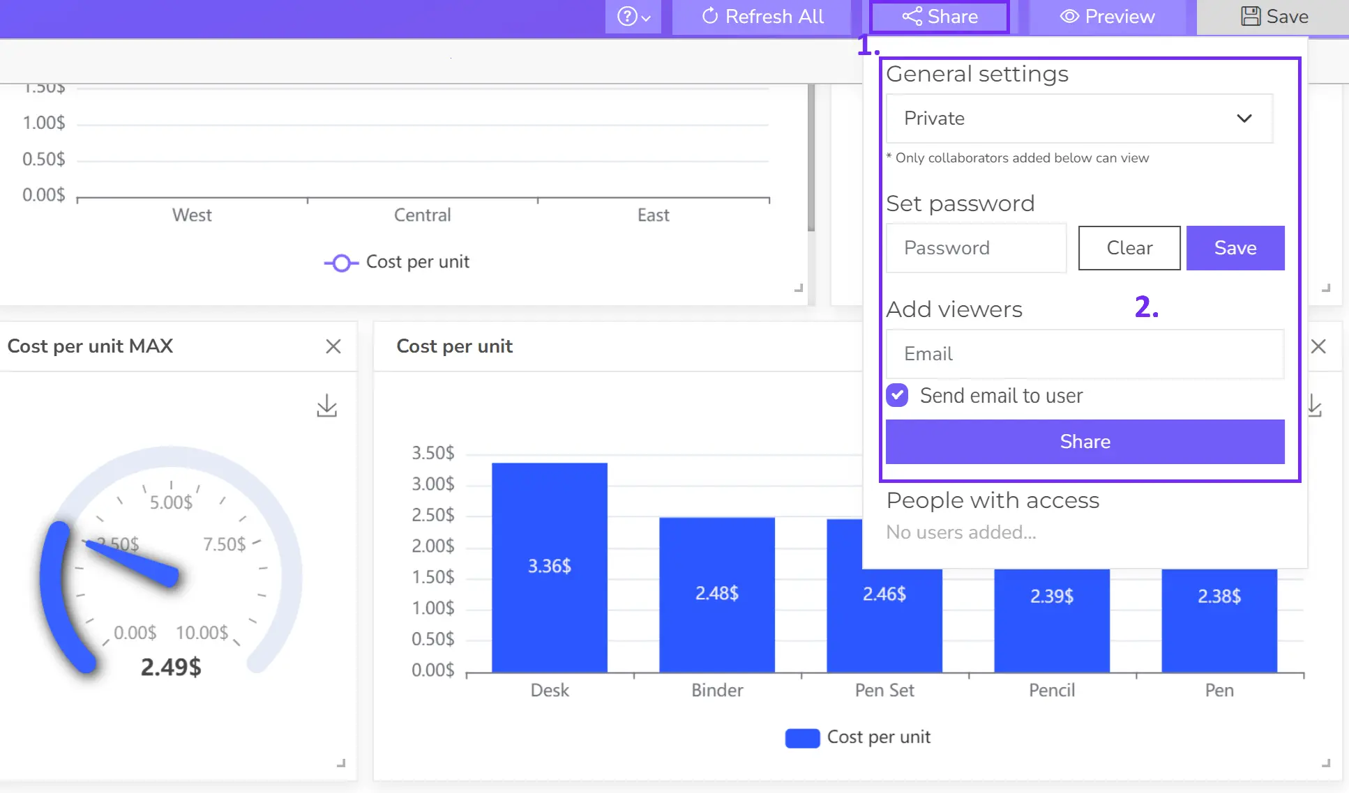
- Share your dashboard
Once happy, publish your dashboard and share it with relevant users for real-time insights.
Conclusion
An online profit and loss dashboard provides a powerful tool for visualizing key metrics, tracking trends, and making data-driven decisions. Follow the steps in this article and create your accounting dashboard that represents a P&L overview.
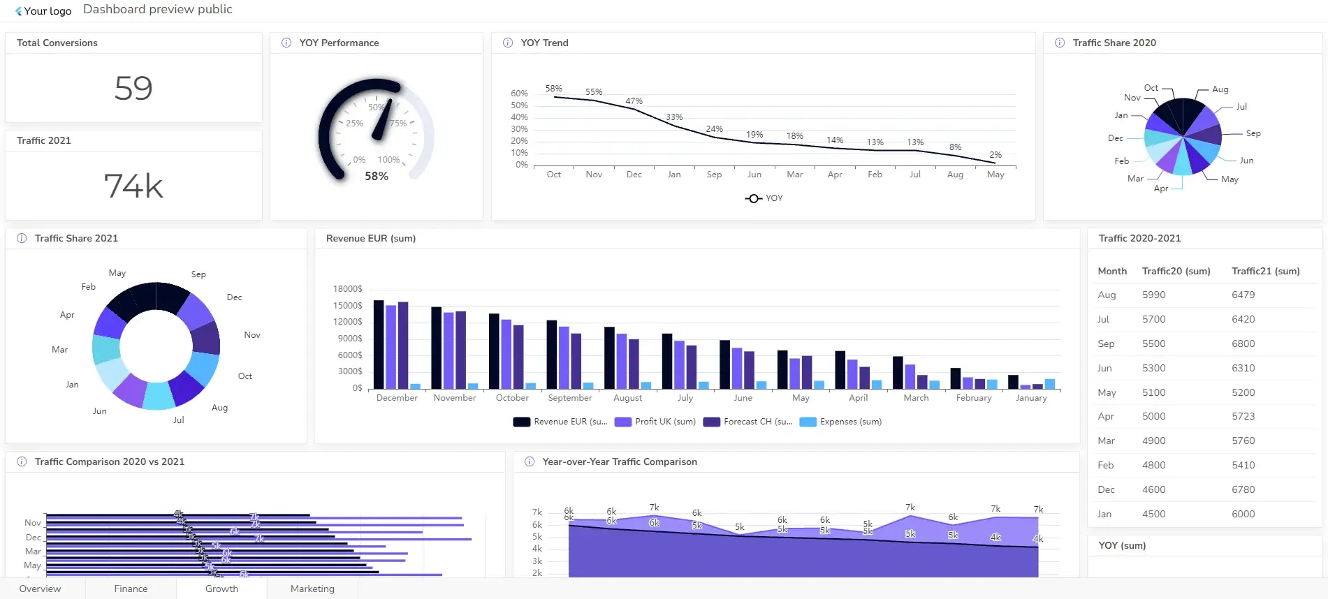
Explore other dashboards


Ready to create your dashboard?