Manufacturing Dashboard Examples & KPIs
A well-designed manufacturing dashboard offers real-time insights into critical metrics like production efficiency, defect rates, and overall equipment effectiveness (OEE).
Dashboards help teams to quickly identify bottlenecks, reduce downtime, and ensure product quality. However, to unlock their full potential, focusing on the right Key Performance Indicators (KPIs) is crucial.
This article explores the power of KPI dashboards tailored for the manufacturing sector, showcasing compelling dashboards examples and highlighting essential metrics. We’ll delve into the functionalities of industrial dashboards and production KPI dashboard setups, revealing how they enable real-time monitoring and optimize production processes.
Discover how a real time manufacturing dashboard can revolutionize your operations, and learn about the capabilities of advanced manufacturing analytics solutions and manufacturing business intelligence platforms. Finally, we’ll examine the importance of generating comprehensive production report manufacturing outputs for informed strategic planning.
What is a manufacturing dashboard?

A manufacturing dashboard is a visual tool that provides real-time insights into a manufacturing operation’s key metrics and performance indicators.
Change the way you work with agentic AI
One-click dashboards,KPI tracking, and AI-powered insights—for work that actually gets done.

It consolidates data from various sources, such as production lines, machines, and quality control systems, into an easy-to-understand format, typically using charts, graphs, and tables.
The purpose of a manufacturing dashboard is to help managers monitor and analyze manufacturing data important factors like production efficiency, equipment performance, defect rates, and overall equipment effectiveness (OEE).
10 Manufacturing KPIs & Metrics For Dashboards
To truly harness the power of a manufacturing operations dashboard, it’s crucial to understand the specific key performance indicators in manufacturing that drive success.
This section explores the key manufacturing performance metrics that should populate your dashboards, offering actionable insights for operations managers. We’ll explore a range of KPIs, from production key performance indicators such as production planning KPIs and KPIs for production scheduling, to crucial quality control metrics and asset utilization KPIs.
Whether you’re focused on packaging KPIs, food manufacturing KPIs, or seeking KPI for production planning department insights, we’ll provide kpi manufacturing examples and examples of kpi in manufacturing that are vital for informed decision-making.
These metrics for operations managers will empower you to optimize processes, improve efficiency, and ultimately enhance your manufacturing output.
1. Production Output
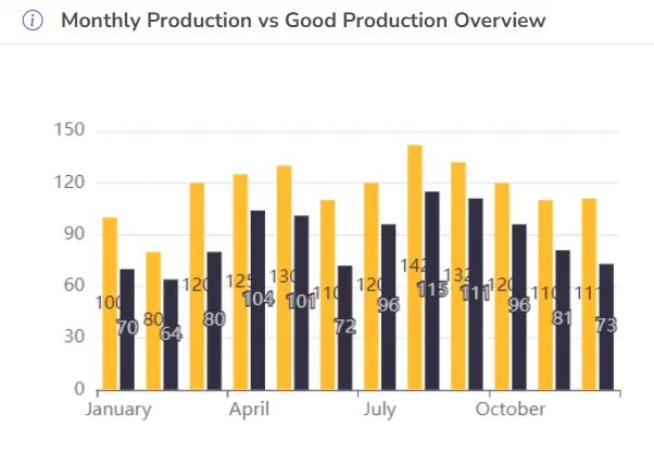
- Description: Measures the total quantity of products produced within a given time frame.
- Good Result: High production output indicates efficient manufacturing processes and strong demand.
- Bad Result: Low production output may signal inefficiencies, equipment failures, or insufficient workforce.
- Formula: Total Units Produced / Time Period
2. On-Time Delivery (OTD)
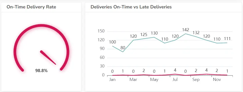
- Description: Measures the percentage of orders delivered on or before the promised date.
- Good Result: A high OTD rate indicates strong supply chain management and customer satisfaction.
- Bad Result: A low OTD rate can lead to customer dissatisfaction, lost sales, and penalties.
- Formula: On-Time Deliveries / Total Deliveries * 100
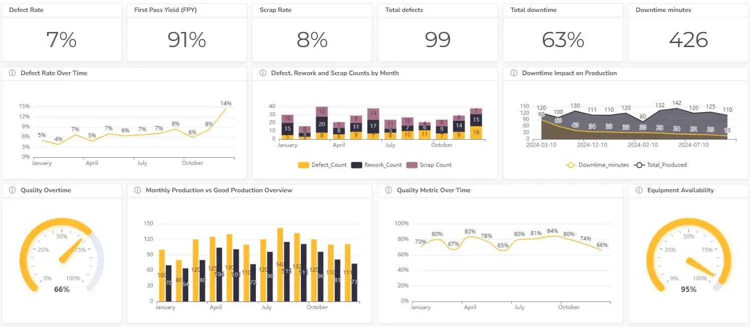
3. Defect Rate
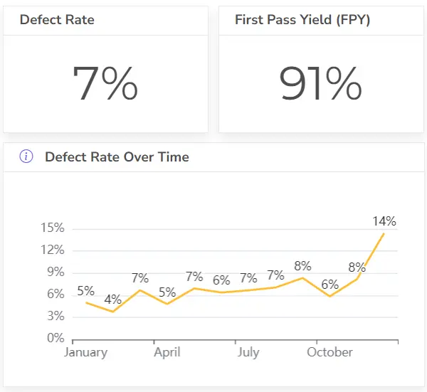
- Description: Measures the percentage of products that do not meet quality standards.
- Good Result: A low defect rate indicates high product quality and efficient manufacturing processes.
- Bad Result: A high defect rate can lead to customer dissatisfaction, rework costs, and increased scrap.
- Formula: Defective Units / Total Units Produced * 100
4. First Pass Yield (FPY)
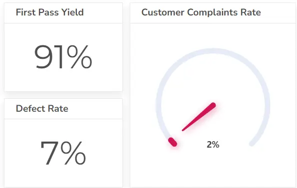
- Description: Measures the percentage of products that pass quality checks without needing rework.
- Good Result: A high FPY indicates efficient manufacturing processes and reduced costs.
- Bad Result: A low FPY can lead to increased costs, longer lead times, and reduced customer satisfaction.
- Formula: Units Passing Inspection / Total Units Produced * 100
5. Overall Equipment Effectiveness (OEE)

- Description: Combines availability, performance, and quality to assess the efficiency of manufacturing equipment.
- Good Result: A high OEE indicates efficient equipment utilization and minimal downtime.
- Bad Result: A low OEE may signal equipment failures, inefficient processes, or poor maintenance.
- Formula: Availability * Performance * Quality
6. Inventory Turnover
- Description: Measures how efficiently inventory is used and replenished.
- Good Result: A high inventory turnover indicates effective inventory management and reduced carrying costs.
- Bad Result: A low inventory turnover may signal excess inventory or slow-moving products.
- Formula: Cost of Goods Sold / Average Inventory
7. Cycle Time
- Description: Measures the average time it takes to produce one unit.
- Good Result: A short cycle time indicates efficient production processes and faster delivery times.
- Bad Result: A long cycle time can lead to delays, increased costs, and reduced customer satisfaction.
- Formula: Total Production Time / Units Produced
8. Scrap Rate
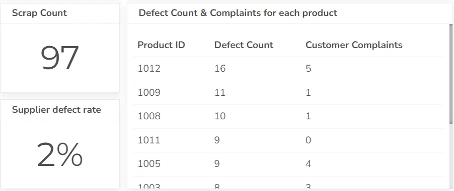
- Description: Measures the percentage of materials wasted during production.
- Good Result: A low scrap rate indicates efficient material usage and reduced costs.
- Bad Result: A high scrap rate can lead to increased costs, environmental impact, and reduced profitability.
- Formula: Scrap Quantity / Total Materials Used * 100
9. Employee Productivity
- Description: Measures the output of employees per unit of time.
- Good Result: High employee productivity indicates efficient workforce utilization and increased output.
- Bad Result: Low employee productivity may signal training issues, low morale, or inefficient processes.
- Formula: Total Units Produced / Total Labor Hours
View more than 12 HR KPIs and explore hr dashboard examples.
10. Cost of Poor Quality (COPQ)
- Description: Measures the total cost associated with defects, rework, scrap, and other quality-related issues.
- Good Result: A low COPQ indicates effective quality management and reduced costs.
- Bad Result: A high COPQ can significantly impact profitability and customer satisfaction.
- Formula: Sum of costs related to quality issues
Improve your production quality by tracking quality KPIs and exploring quality dashboard examples you can easily create.
Struggling with manual calculations & tiring setups?
Let agentic AI do the heavy lifting.
Start free
Fast sign up & easy setup
5 Manufacturing dashboard types
Manufacturing dashboards come in several types, each tailored to track and visualize specific aspects of production processes.
Depending on the focus of your operations, different dashboard types can provide targeted insights to improve efficiency, quality, and overall performance. Here are the main types of manufacturing dashboards:
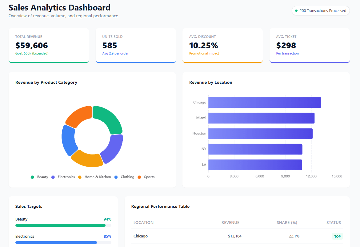
1. Production Dashboard
- Purpose: Focuses on monitoring the efficiency and output of the production line.
- Key Metrics:
- Production Output: Total units produced.
- Cycle Time: Time taken to complete one production cycle.
- First Pass Yield (FPY): Percentage of products that pass quality checks without rework.
- Best For: Plant managers and production teams aiming to improve manufacturing throughput and cycle times.
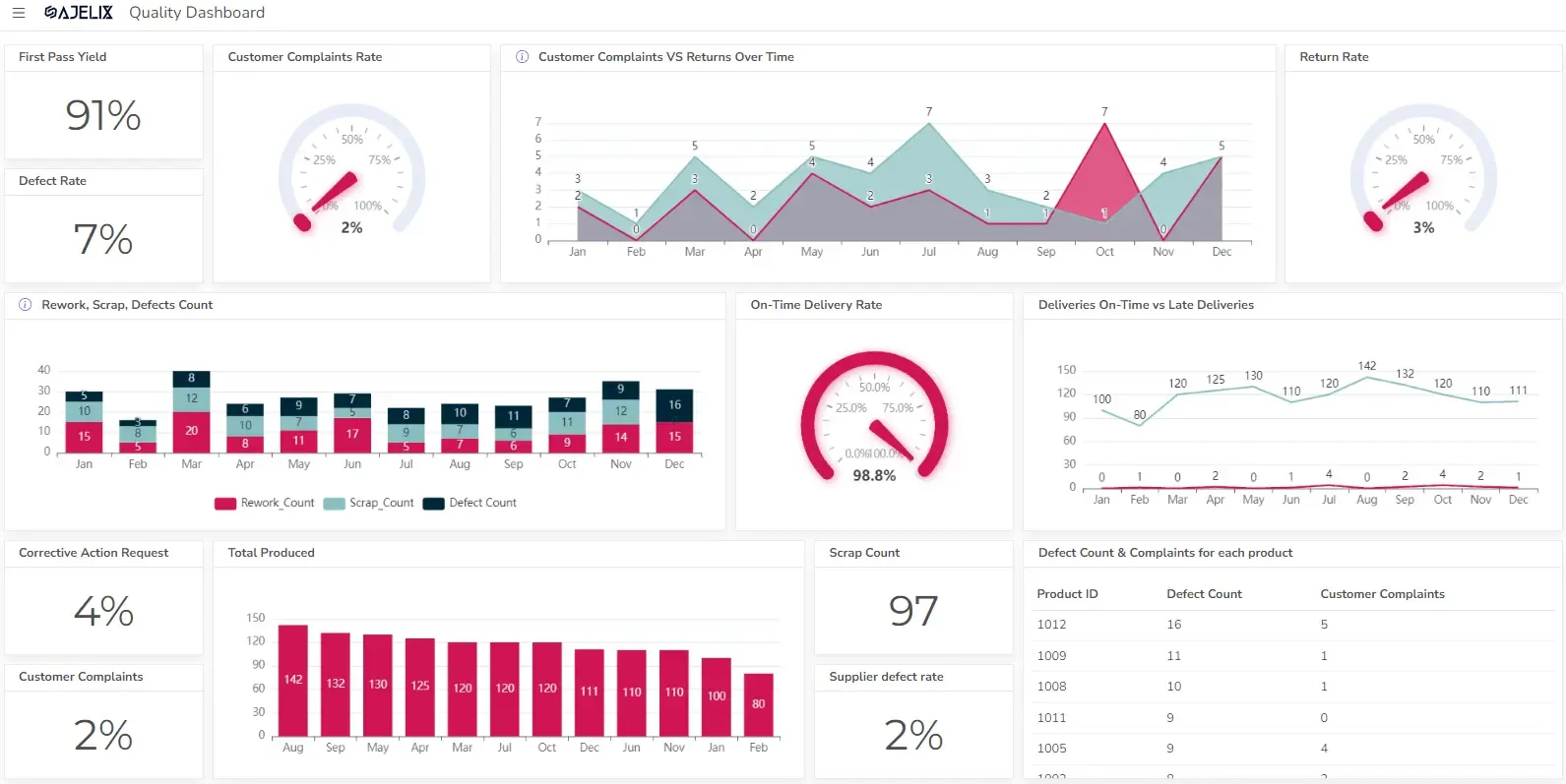
2. Quality Control Dashboard

- Purpose: Tracks product quality and identifies issues that could affect product standards.
- Key Metrics:
- Defect Rate: Percentage of defective products.
- Scrap Rate: Amount of material wasted during production.
- Corrective Actions: Number of quality issues addressed.
- Best For: Quality assurance teams monitoring product defects and ensuring quality compliance. To further support daily performance tracking and team accountability, consider implementing an SQCDP board, a visual management tool that helps teams communicate effectively, escalate issues, and drive continuous improvement.
3. Overall Equipment Effectiveness (OEE) Dashboard
- Purpose: Measures how effectively equipment is being used in production.
- Key Metrics:
- OEE Score: Combines availability, performance, and quality into a single efficiency score.
- Downtime Tracking: Duration of machine downtime.
- Performance Loss: Identifies inefficiencies in machine speed or operations.
- Best For: Maintenance teams and production supervisors optimizing machine performance and reducing downtime.
4. Inventory Management Dashboard
- Purpose: Manages raw materials, work-in-progress (WIP), and finished goods inventory.
- Key Metrics:
- Inventory Turnover: Rate at which inventory is used and replenished.
- Stock Levels: Current amount of raw materials and finished products.
- Order Fulfillment: Tracking order completions versus backlogs.
- Best For: Supply chain and inventory managers looking to maintain optimal stock levels and reduce carrying costs.
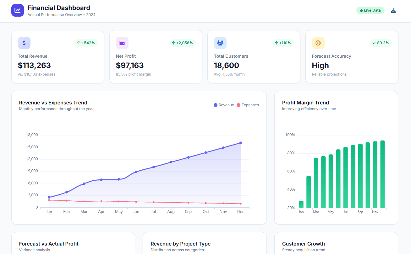
5. Financial Dashboard
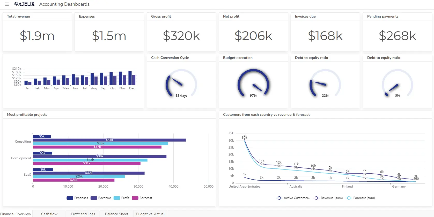
- Purpose: Monitors financial performance related to manufacturing operations.
- Key Metrics:
- Cost Per Unit: Total cost of producing a single unit.
- Profit Margin: Revenue minus production costs. Use a profit margin calculator.
- Return on Investment (ROI): Profitability of machinery and production investments. Calculate ROI using calculator.
- Discover more than 20 financial KPIs for business finance tracking.
- Best For: Financial controllers and manufacturing executives monitoring costs and profitability.
Reporting gives you a headache?
Upload your data and create professional reports with agentic AI
Start free
Try free and upgrade whenever
Conclusions
In conclusion, implementing robust manufacturing analytics solutions and leveraging manufacturing business intelligence through well-designed manufacturing dashboards is crucial for modern manufacturers.
By utilizing KPI dashboards and industrial dashboards, companies can gain real-time visibility into their operations. The power of a real time manufacturing dashboard enables swift responses to changing conditions, while production KPI dashboard setups provide granular insights into production efficiency.
From production planning KPI and KPI for production scheduling to quality control metrics and asset utilization KPI, these key performance indicators in manufacturing offer a comprehensive view of performance.
Manufacturing performance metrics, including packaging KPIs and food manufacturing KPIs, provide valuable metrics for operations managers to optimize processes. By examining kpi manufacturing examples and examples of kpi in manufacturing, and generating thorough production report manufacturing outputs, businesses can make informed decisions.
Furthermore, understanding the needs of a kpi for production planning department is vital. By effectively utilizing these tools and insights, manufacturers can drive efficiency, reduce costs, and enhance overall productivity.
FAQ
A production KPI dashboard specifically focuses on metrics related to the production process, such as output, efficiency, and quality. A general manufacturing dashboard provides a broader view of the entire manufacturing operation, including inventory, maintenance, and logistics.
Manufacturing BI platforms provide the tools and capabilities to gather, analyze, and visualize data from various sources. This allows for the creation of comprehensive and insightful dashboards that support strategic decision-making.
Explore other dashboards


Ready to create your dashboard?