How to Rotate a Chart in Excel? (Pie & Bar Graph)
This blog article will walk you through the steps on rotating charts in Excel. Whether it’s a pie chart or bar chart we will show you how it’s done and help you do this in your spreadsheet. In this guide, we will take you through the art of chart rotation in Excel, uncovering its significance, and setting the stage for your journey to becoming a data visualization maestro.
How To Rotate Pie Charts In Different Angles
When you want to display the proportional distribution of categories within a dataset you will use a pie chart. Especially when you have a small number of categories (typically less than 6 or 7) and need to highlight the relationship of parts to the whole. To emphasize the data relationship and add data values correctly there might be a need to rotate the pie chart.
Here’s how to rotate pie chart in Excel
Time needed: 1 minute
Step by step guide on rotating pie chart
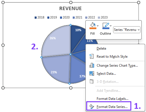
- Right-click on the pie chart area to open the settings
Simply right-click on the pie chart shape and a dropdown will show. Click on the Format Data Series to access rotation settings.
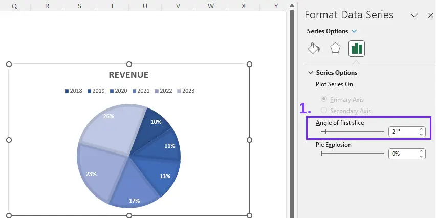
- Access Series Options and change the “Angle of first slice”
Check the Series Options and adjust the degree settings under the Angle of first slice. You will see how your chart starts rotating.
Related Article: How to explode a pie chart in Excel?
Authors Note: Customizing your pie chart is crucial to get great data visualization results. We have also covered how to left-align your pie chart. In case you missed it – take a look at the tutorial on how to create a pie chart in Excel vs Ajelix BI.
How To Rotate Bar Charts?
Use bar charts when you want to compare different categories or values, show trends over time, or visualize data that can be categorized and displayed as bars. Just as pie charts benefit from rotation, bar charts can be enhanced by adjusting their orientation. Not sure what’s the practical reasoning behind the need to rotate bar charts (besides creating cool charts) but still covered this topic.
Here’s a summary of how to rotate 3D bar charts
1. You need to create a 3D bar chart to enable the rotation option. You can’t rotate the standard bar chart.
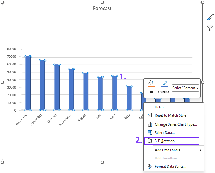
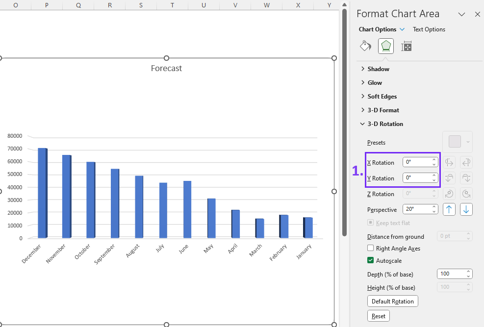
2. Once you’ve created a 3D bar chart right-click on the bars to open the dropdown menu. Once the dropdown menu pop-up click on 3-D rotation.
3. Once you have opened Format Chart Area settings, look under 3-D Rotation and choose X Rotation and Y Rotation. Change the degrees and you will see how bar charts start rotating.
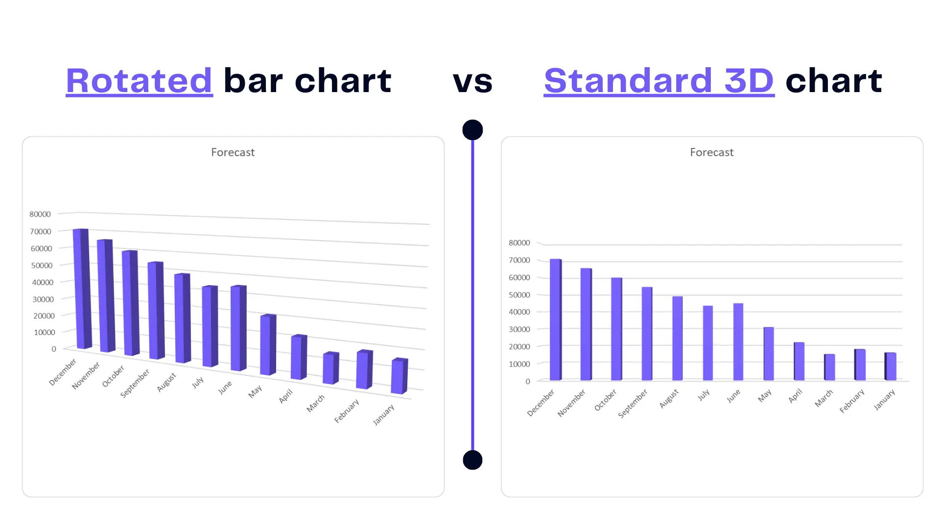
Here’s a comparison between a rotated 3-D bar chart and vs standard chart:
Authors Note: If you find this article helpful you might also like the guide on creating double bar charts as well as how to sort bar charts in descending order. Our team has created a 60-second guide on creating bar charts in Excel, take a look:
Quick and Easy Data Visualization With Ajelix BI
Have you ever considered that data visualization can be done with software that will ease the struggle, Excel training, and help you finish reports much faster? Take a look at the report we created and see how easy it is to start building.
Conclusion
Hope this guide helped you answer the questions and master your Excel spreadsheet tasks faster. Try new ways to tackle reporting tasks and let us know if you have any more questions or need additional help. Meanwhile, take a look at the other blog articles and check our social channels where we post Excel tips and tutorials every week.
Ready to build reports with Ajelix BI?
Speed up your spreadsheet tasks with Ajelix AI in Excel


