How To Left Align A Pie Chart In Excel: Step-by-Step Guide

In the intricate realm of Excel, where precision and presentation converge, aligning elements takes center stage. In this step-by-step guide, we will explain how to left-align a pie chart in Excel.
What is a Pie Chart?
A pie chart is a circular graph divided into slices to represent numerical proportions. Each slice, or “pie,” corresponds to a specific category, and the size of the slice reflects the proportion of that category within the whole.
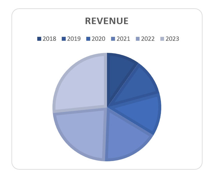
The pie chart in an Excel screenshot from a spreadsheet. Image Credit: Ajelix
How To Create a Basic Pie Chart in Excel
Creating a left-aligned pie chart begins with the basics. Here’s how to start:
- Select the data you want to represent in the pie chart.
- Navigate to the “Insert” tab.
- Click on “Pie Chart” and choose the desired style (e.g., 2D or 3D).
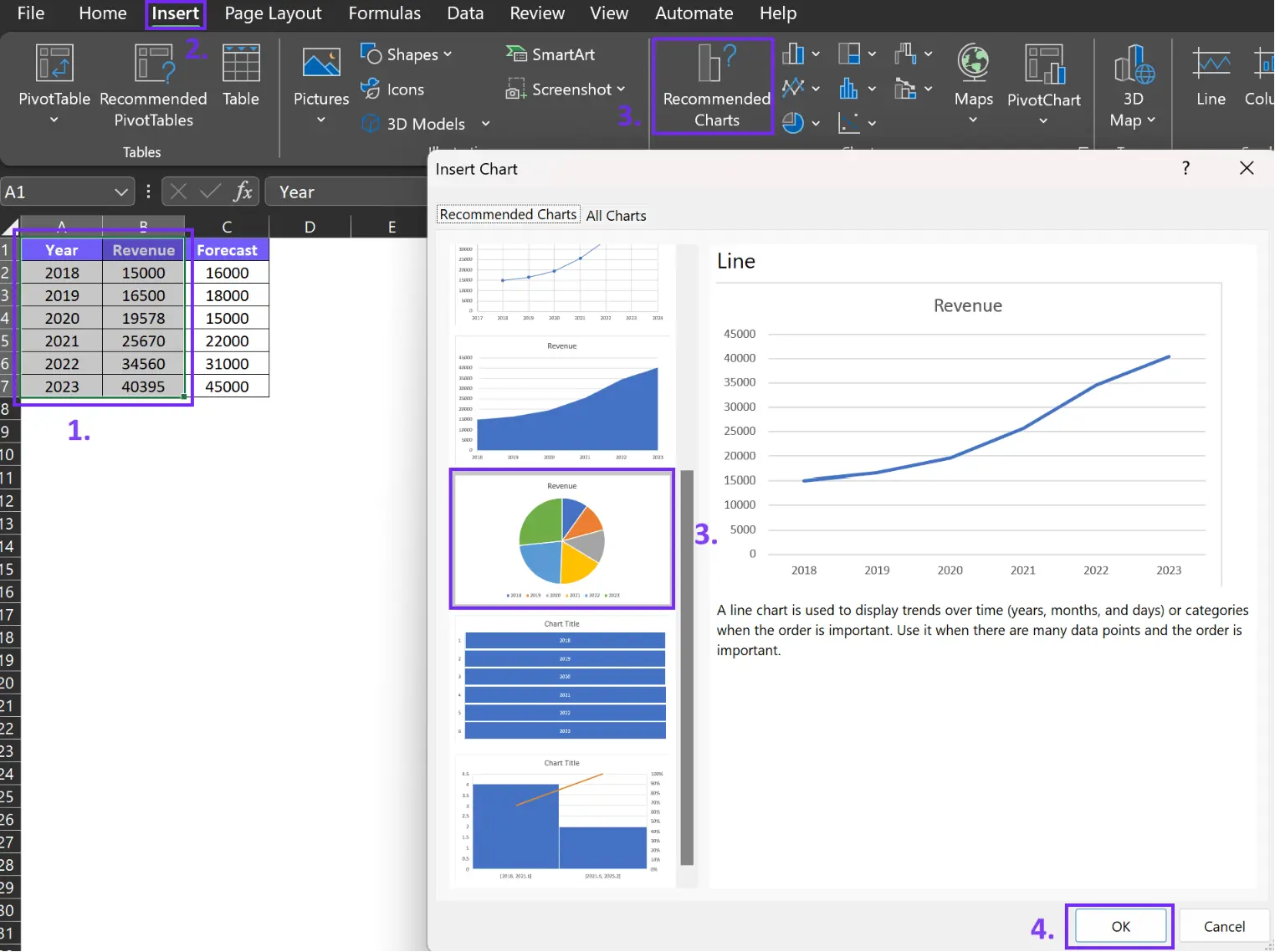
How to create a pie chart in Excel screenshot with step-by-step guides. Image Credit: Ajelix
Selecting the right data is pivotal. Your pie chart’s effectiveness hinges on the accuracy and relevance of the data you choose.
Excel offers myriad customization options, such as colors, labels, and chart titles, allowing you to tailor your chart to your specific needs.
Related Article: How to create a bar chart in Excel
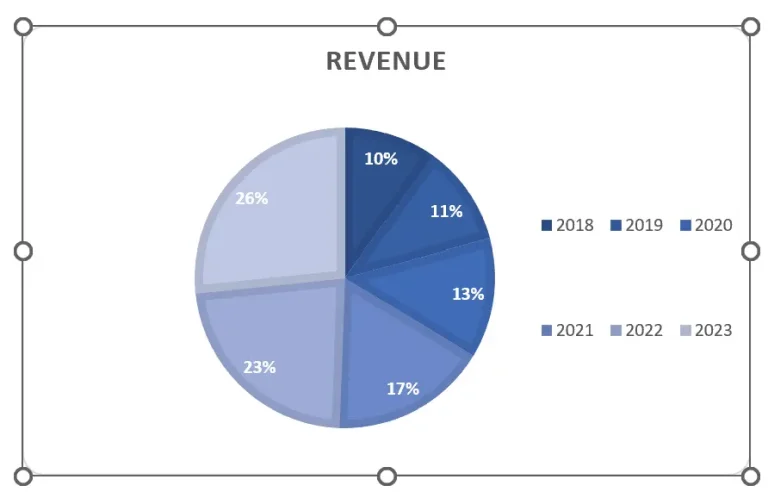
How To Left Align A Pie Chart
To master the art of alignment, you must acquaint yourself with Excel’s formatting capabilities. Once you have created a pie chart you can customize it and align it to meet your needs.
Time needed: 1 minute
Here’s how to left-align your pie chart:
- Activate your pie chart
Once you’ve created a chart, click on it to activate and you’ll see 8 dots appear on the chart borders. Like this:
- Activate only the pie area
Click near the pie chart to activate the movement for this element, see the example below:
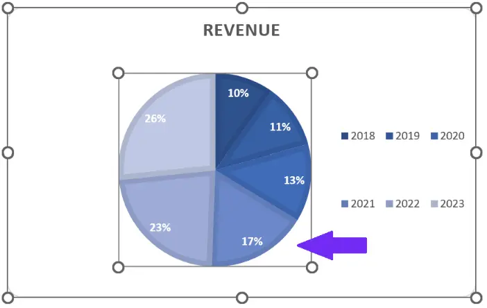
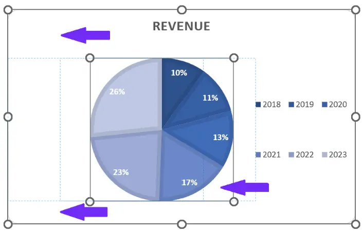
- Move the pie chart to the left
Once you have activated the pie element, you’ll be able to move it around the chart area. Click on the pie area and drag it to the left side.
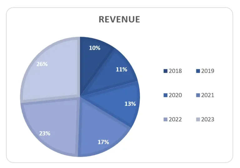
- Adjust the pie chart to fit your needs
Now you know how to move your pie graph. You can drag it to the left, up, down, change the size, and customize it to fit your needs. Here’s an example of left aligned pie chart:
Related Article: How to explode a pie chart in Excel?
How To Left Align Two Pie Charts
Everyone hates cluttered Excel spreadsheets when all the graphs are misaligned and data is scattered around the sheet. Take a look at the screenshot below. Don’t you just hate messy spreadsheets?
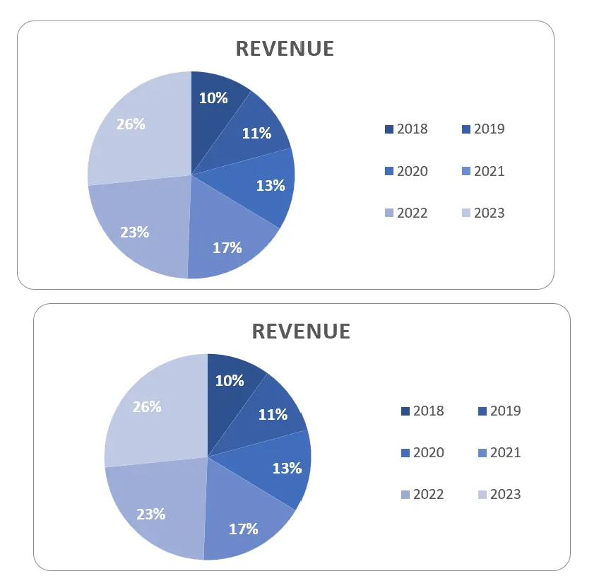
Example of misaligned pie charts in Excel. Image Credit: Ajelix
Here’s how to align one graph to another:
1. Select both of the charts by holding the Shift keyboard
2. Go to the Excel toolbar select Shape Format, click on Align, and choose Align Left. Like in the example below:
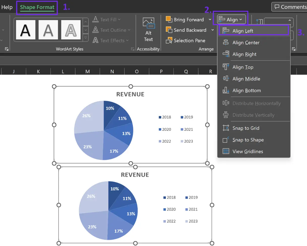
How to left align two pie charts with Align settings. Image Credit: Ajelix
3. Now your charts are aligned
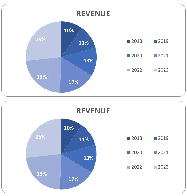
Left aligned charts in Excel spreadsheet. Image Credit: Ajelix
Related Article: Create effective data visualization dashboard
Effortless Data Visualization with Ajelix BI
Tackling the creation of reports and crafting charts within Excel spreadsheets may seem like a daunting endeavor, especially if it’s not your preferred activity. The effective use of Microsoft Excel often requires specialized training.
Grasping its intricate nuances and mastering the art of integrating specific elements can consume a significant amount of your time. Furthermore, scouring the internet for instructional guides only adds to the complexity. Here’s just one of the examples of how effective data visualization is in Excel vs. Ajelix BI:
Create a donut chart in Excel vs. Ajelix BI. Video Credit: Ajelix
Ajelix BI: Transforming Data Visualization
Bid farewell to the days when the process of creating reports felt like an arduous chore, all thanks to the automatic data visualization prowess of Ajelix BI.
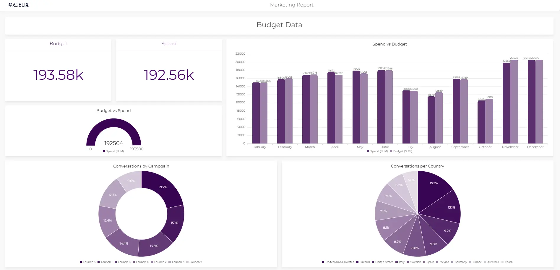
Marketing data report dashboard with Ajelix BI. Image Credit: Ajelix
With Ajelix BI at your disposal, the tedium of uploading Excel files and painstakingly selecting templates that match your requirements becomes a thing of the past. In mere seconds, you can effortlessly conjure up polished, professional reports.
Empowered by the capabilities of artificial intelligence, you gain the ability to dive deep into your data, extracting valuable insights that seamlessly transform into impactful charts, ready for effortless sharing with your colleagues.
Conclusion
In conclusion, left-aligning a pie chart in Excel is a valuable skill for anyone seeking to enhance their data presentations. Alignment is not merely about aesthetics; it’s about ensuring that your data communicates effectively.
Ready to transform data visualization with Ajelix BI?
Speed up your spreadsheet tasks with Ajelix AI in Excel