- Home
- Product
- Tools
- AI Data Analyst
- Excel Formula Generator
- Excel Formula Explainer
- Google Apps Script Generator
- Excel VBA Script Explainer
- AI VBA Code Generator
- Excel VBA Code Optimizer
- Excel VBA Code Debugger
- Google Sheets Formula Generator
- Google Apps Script Explainer
- Google Sheets Formula Explainer
- Google Apps Script Optimizer
- Google Apps Script Debugger
- AI Excel Spreadsheet Generator
- AI Excel Assistant
- AI Graph Generator
- Pricing
Explore other articles
- The 10 Best AI Chatbots of 2026: The Ultimate Comparison Guide
- How To Use AI In Excel: Top 5 Agentic AI Use Cases
- AI Agents Explained: What They Are and How To Use Them
- The 8 Best AI Agents in 2026 (Reviewed By Our Team)
- Agentic AI vs AI Agents: What’s the Difference and Why It Matters
- What AI Studies Say About Agentic AI ROI & Stats (And What They Don’t)
- Google Sheets AI Agents That Autonomously Perform Tasks
- Advanced Agentic Research With AI Agents
- GLM-5 is Now Available on Ajelix AI Chat
- AI Spreadsheet Generator: Excel Templates With AI Agents
Try AI in Excel
Customizing the legend in Excel charts is a crucial aspect of creating visually appealing and informative data visualizations. This article will guide you through the process of changing the legend in Excel. Exploring various customization options, and providing best practices for creating compelling legends.
What is Legend in Excel Charts?
The legend in an Excel chart serves as a key that helps viewers interpret the data being presented. Chart Legends in chart provides you with the a visual representation of the series so you could better understand the data.
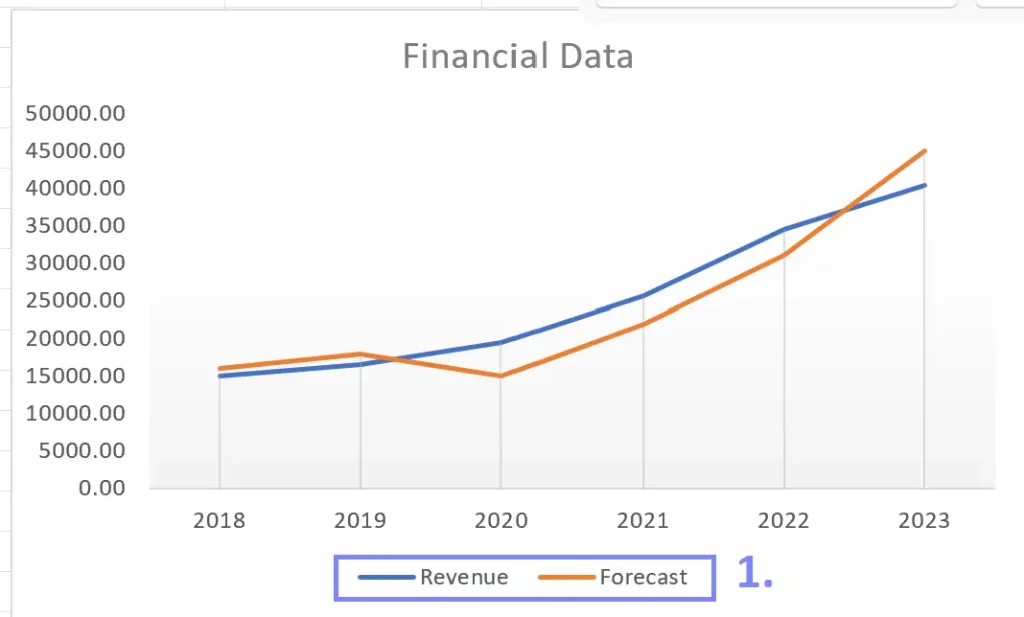
The screenshot represents where the legend is located in the chart
Related Article: How To Make Bar Chart Bars Wider?
What is Default Legend in Excel?
When you create a chart in Excel, it automatically generates a default legend based on the data series or categories. The default legend settings are created to provide you with a basic information about your data. They may not always align with your specific requirements.
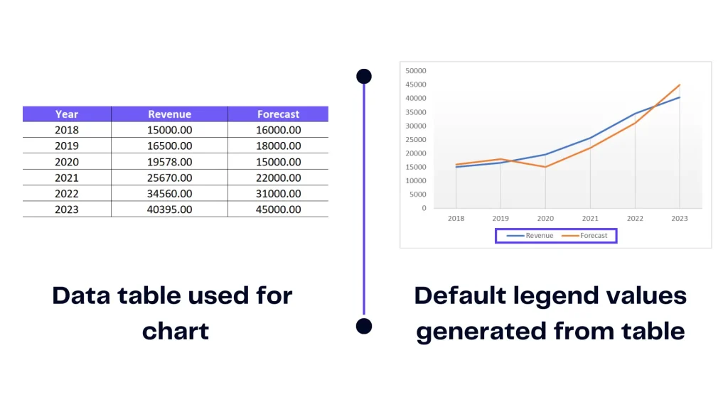
The infographic represents how default legends are generated from the data table by Excel.
Related Article: How To Make Bar Graph in Excel
How To Rename Legend in Excel Chart?
Time needed: 3 minutes
Change Default Legend in Excel Chart
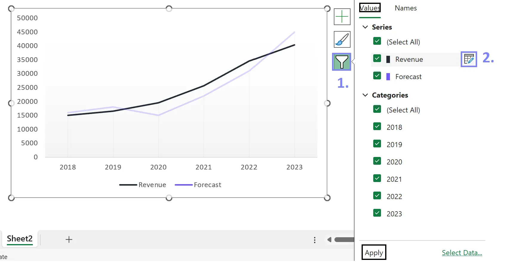
- Click on the chart and choose Chart Filters
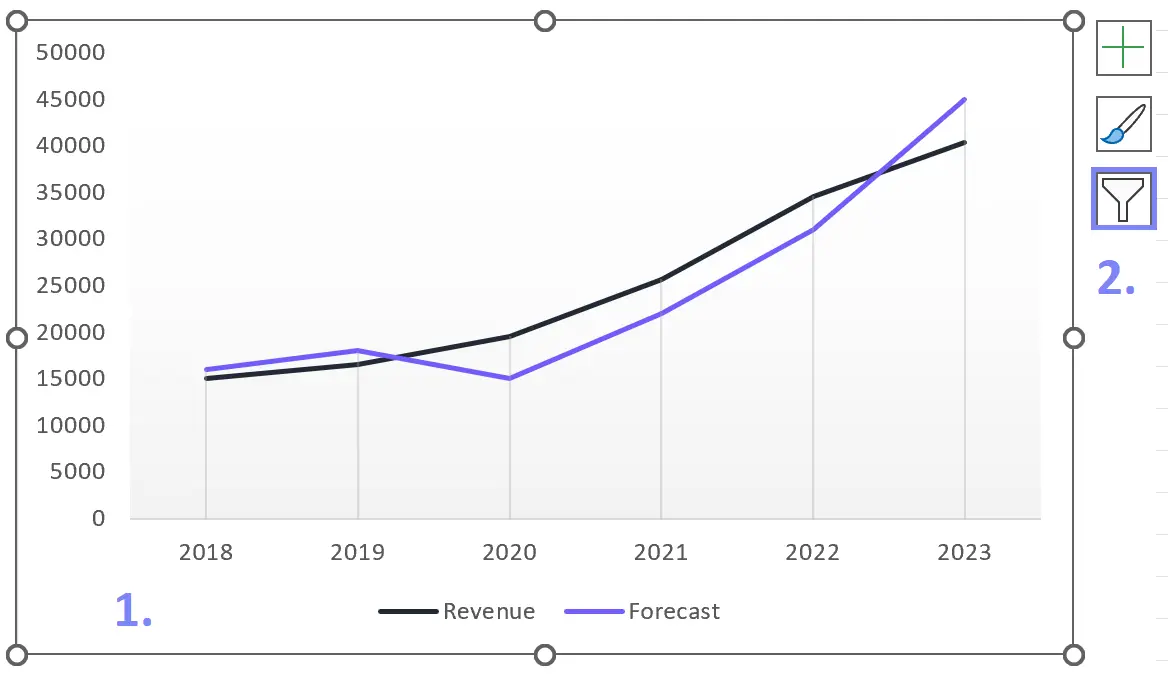
- In the additional menu choose which legend you want to edit and click Edit Series
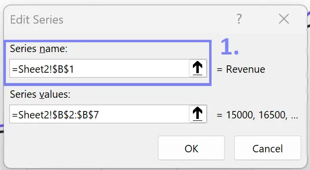
- In Edit Series tab you can edit Series Name and pick the cell with the new legend name from your sheet. The new name will show up in the chart.
Related Article: How To Center Horizontally in Excel
How To Format the Legend?
Formatting the legend enhances its visual impact and improves readability. You can adjust the font style, size, and color to match your chart’s overall design and chart titles. By applying different formatting options such as bold, italics, or underline you can highlight important elements.
To edit the legend just click on it and head to Home settings to change the formatting.

How To Change Legend Position in The Chart?
- Click on the chart sheets, additional chart settings Chart Design tab will appear;
- In the Excel toolbar choose Add Chart Element;
- Select the Legend and choose which position you want the legend to be placed;
Changing the text alignment in the legend offers three options: aligning it to the left, right, or center. You can select whichever you prefer.
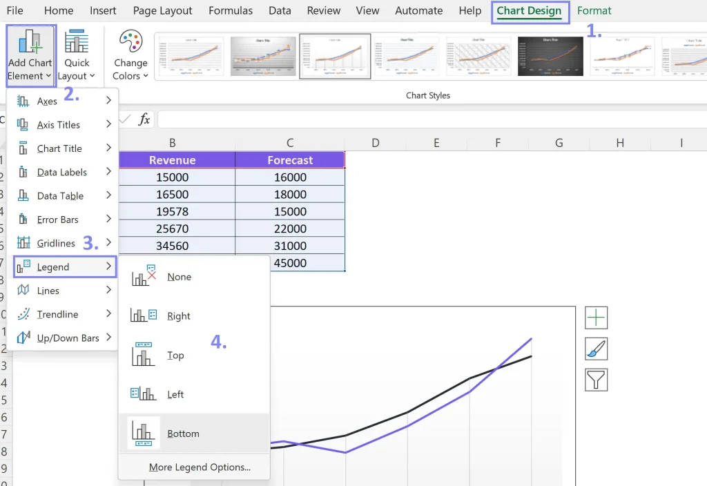
Screenshot that includes all the steps needed to take in order to change the Legend position
Related Article: How To Delete A Chart in Excel?
How To Remove or Hide the Legend from the Chart?
In some cases, it may not be necessary to include a legend on a chart. If this is the case, it is best to remove the legend entirely.
Hiding the legend temporarily can give a clearer visual appearance. This is especially useful when you have limited space. Or the legend is not necessary for understanding the chart.
To delete the legend just select the chart, pick legend, and press the Delete key.
Related Article: How To Switch Row and Column in Excel?
Conclusion
This article aims to empower users. It does this by emphasizing the importance of customizing legends. It also encourages readers to explore different options. This will help them create column charts group with visually appealing and informative legends that effectively communicate their data.
Frequently Asked Questions
To reorder legend entries in Excel, you can follow these steps:
1. Right-click on any part of the chart that displays the legend.
2. Click “Select Data” from the context menu.
3. In the “Select Data Source” dialog box, click on the “Legend Entries (Series)” section.
4. Click on the dialog box. Look for the up and down arrows on the right side. Use the arrows to alter the order of the legend entries.
5. Click “OK” to apply the changes and see the updated legend order in the chart.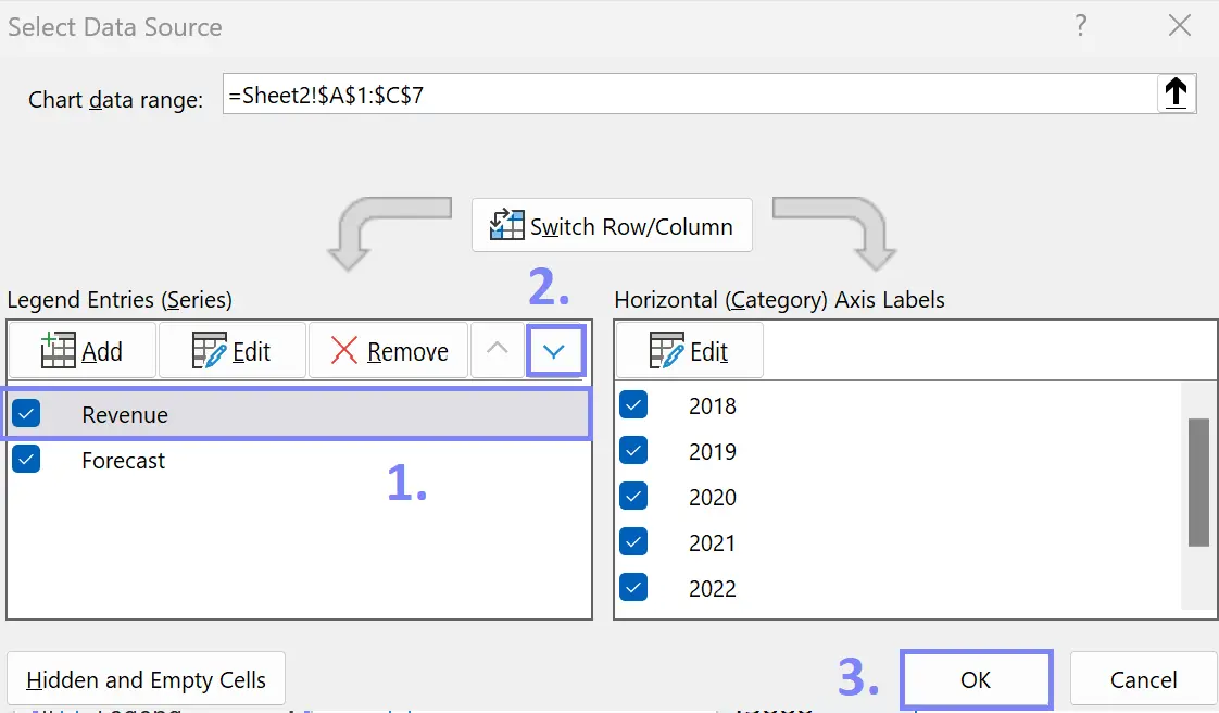
To change the legend symbols or icons in Excel, you can use the following method:
1. Right-click on any part of the chart that displays the legend.
2. Select “Format Legend” from the context menu.
3. In the “Format Legend” pane, navigate to the “Legend Options” section.
4. To change the legend symbols, click on the “Legend Keys” option and choose the desired symbol style.
5. To use custom icons or images as legend symbols, click on the “Image Fill” option and select the appropriate image.
6. Adjust any additional formatting options as desired, such as size, color, or border.
7. Close the “Format Legend” pane to see the updated legend symbols or icons in the chart.
Learn more about Excel and Google Sheets hacks in other articles. Stay connected with us on social media and receive more daily tips and updates.
Speed up your spreadsheet tasks with Ajelix AI in Excel
