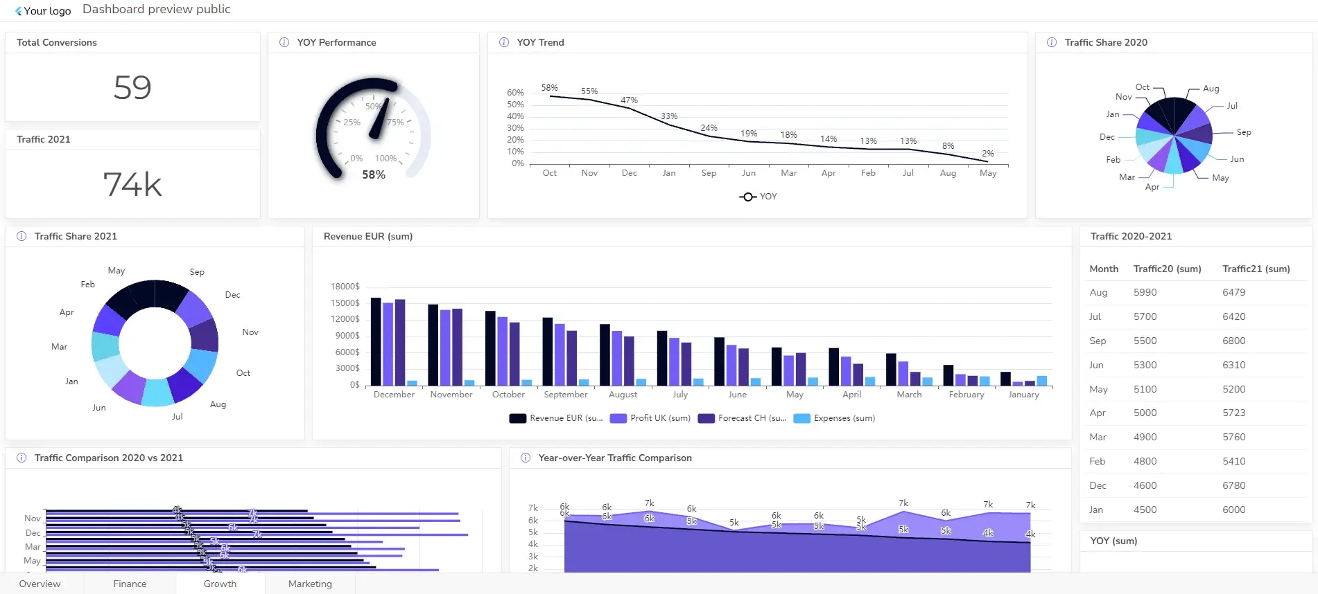
Budget vs Actual Dashboard Example: Variance Analysis
A robust budgeting and reporting system is essential to track and analyze financial health. One crucial tool that can help you do that is the budget vs actual dashboard. By visually comparing budgeted figures against actual results, businesses can quickly identify variances, make adjustments, and plan accordingly.
This article will explore key components of a budget vs actual dashboard, explore essential KPIs, and provide practical guidance on building a dashboard that delivers actionable insights.
Change the way you work with agentic AI
One-click dashboards,KPI tracking, and AI-powered insights—for work that actually gets done.

What is budget vs actual dashboard?

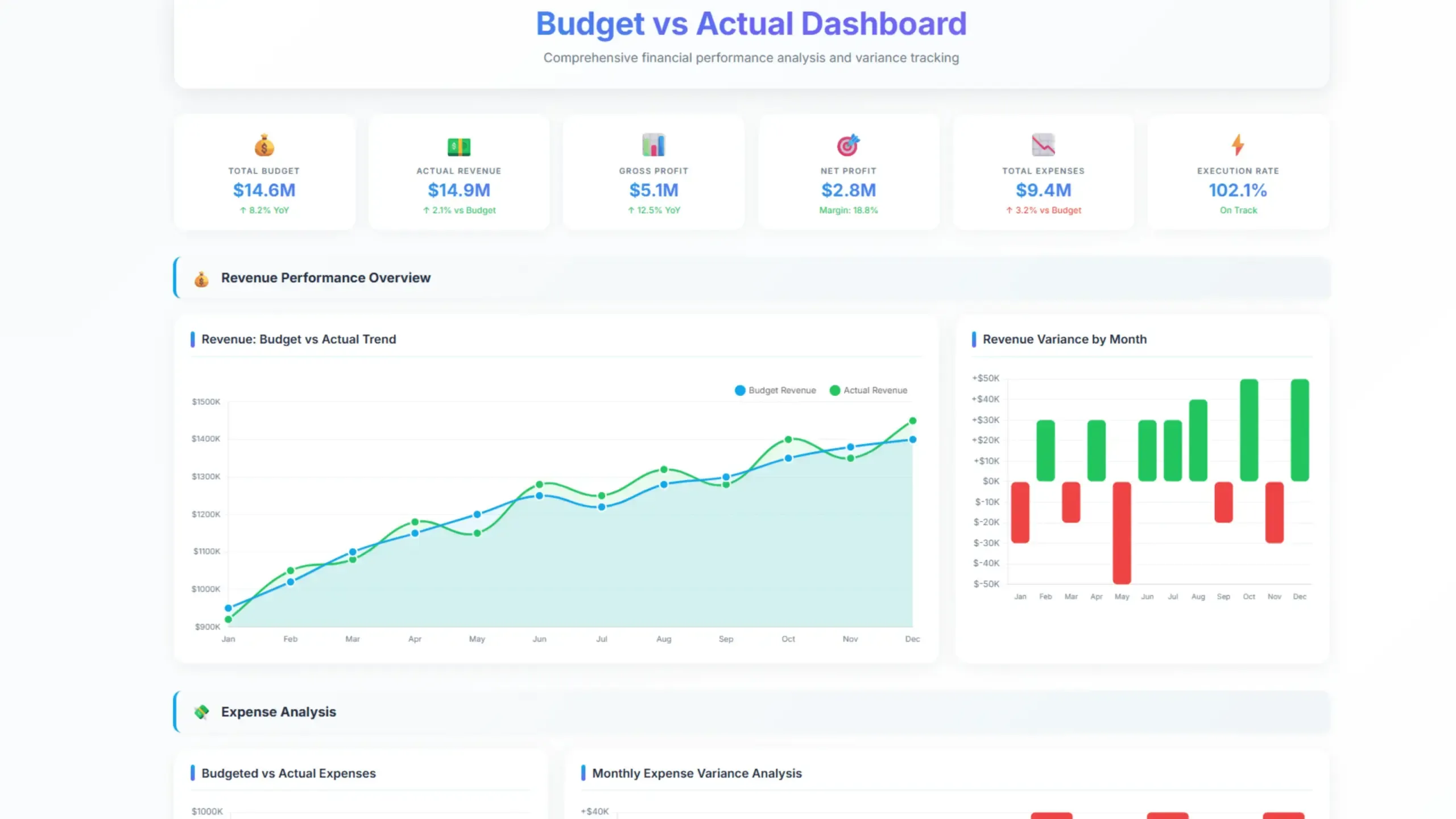
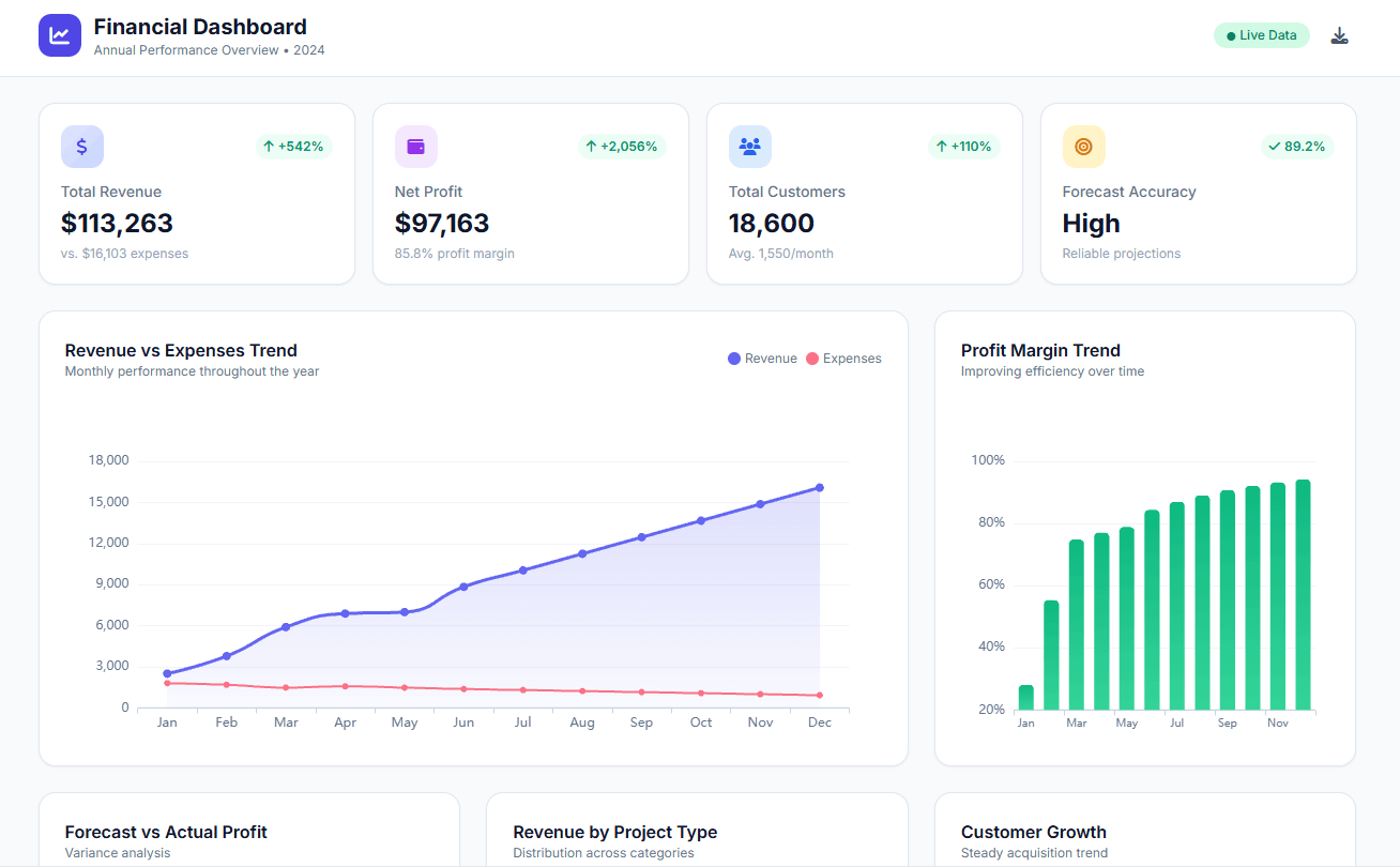
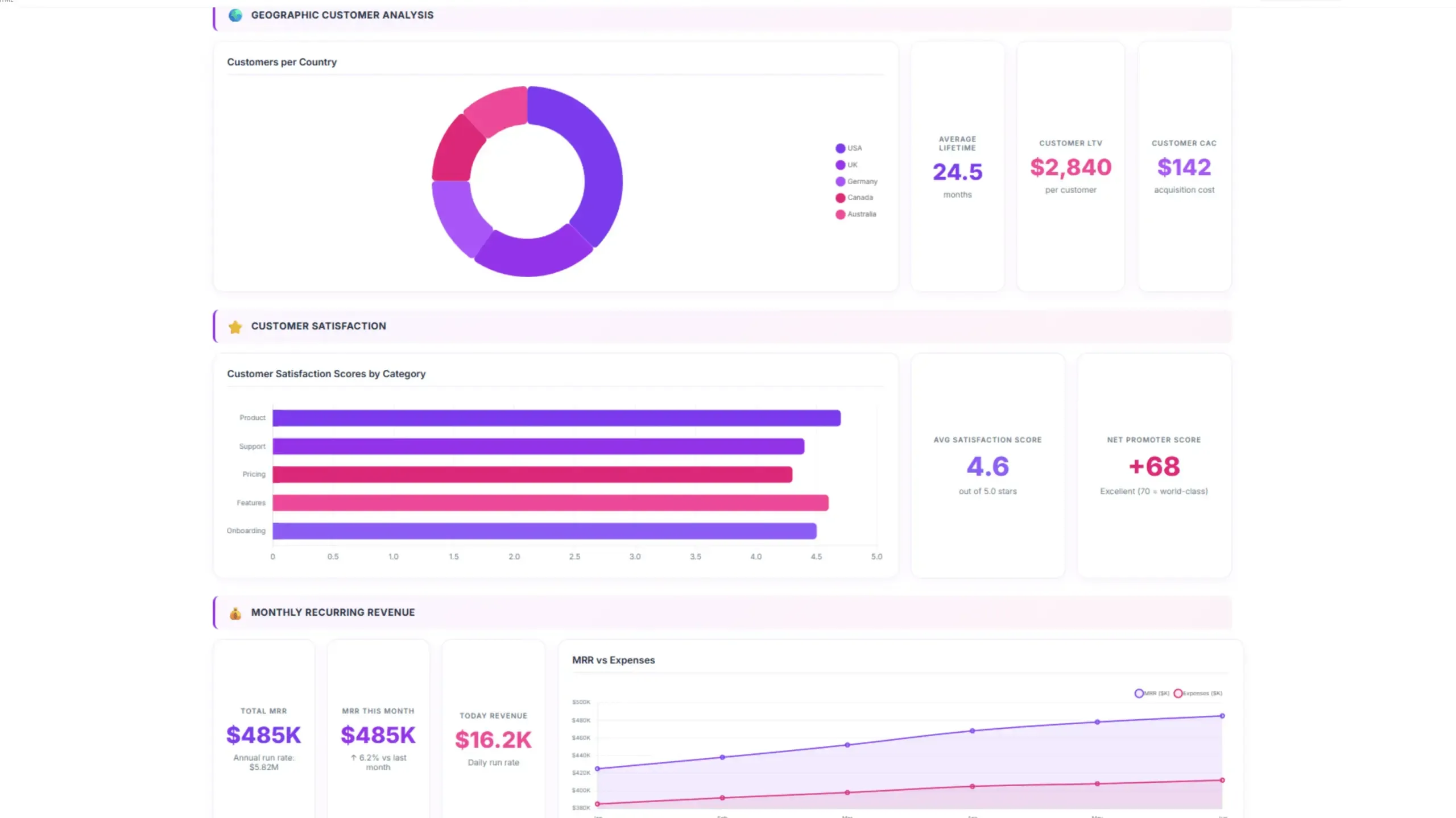
A budget vs actual dashboard is a visual tool that compares a company’s budgeted financial performance with its actual results. It provides a clear and concise overview of how well the company is performing against its financial goals.
By visualizing the differences between budget and actual figures, businesses can:
- Identify variances: Pinpoint areas where spending is exceeding or falling short of expectations.
- Analyze trends: Spot patterns and understand the reasons behind variances.
- Make informed decisions: Use the insights to make adjustments to budgets, operations, or strategies.
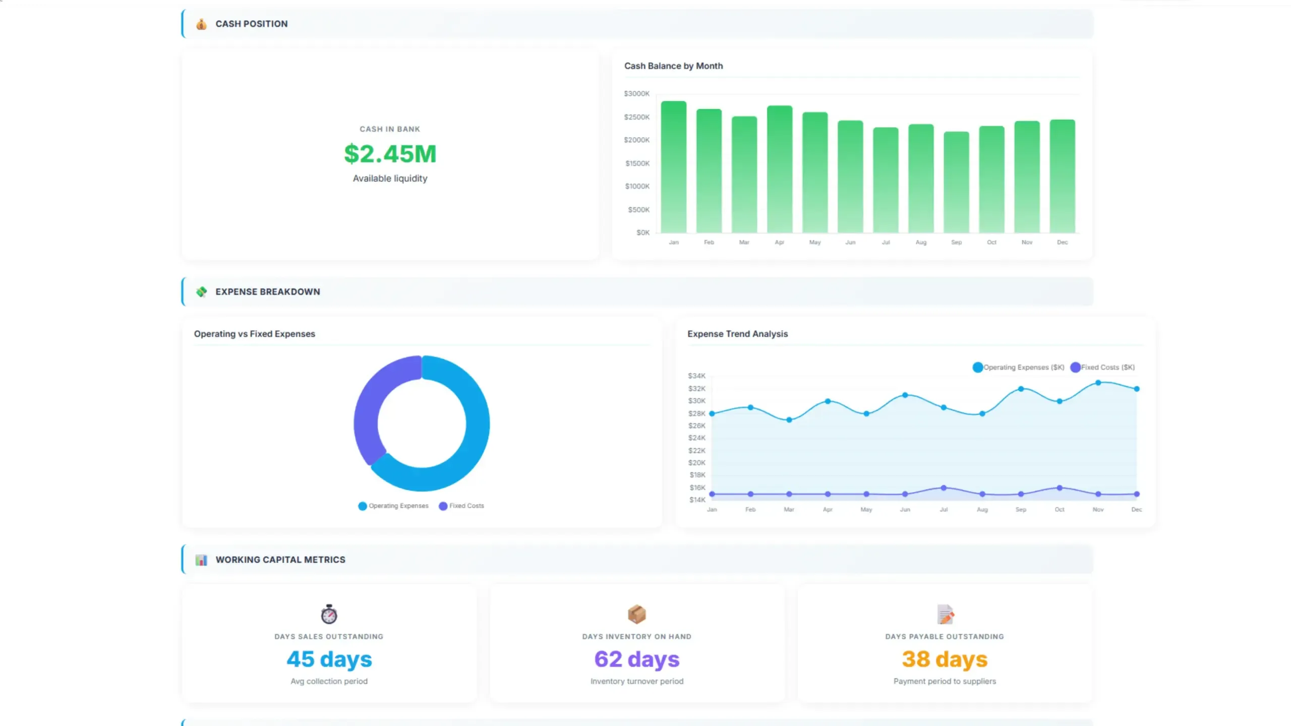
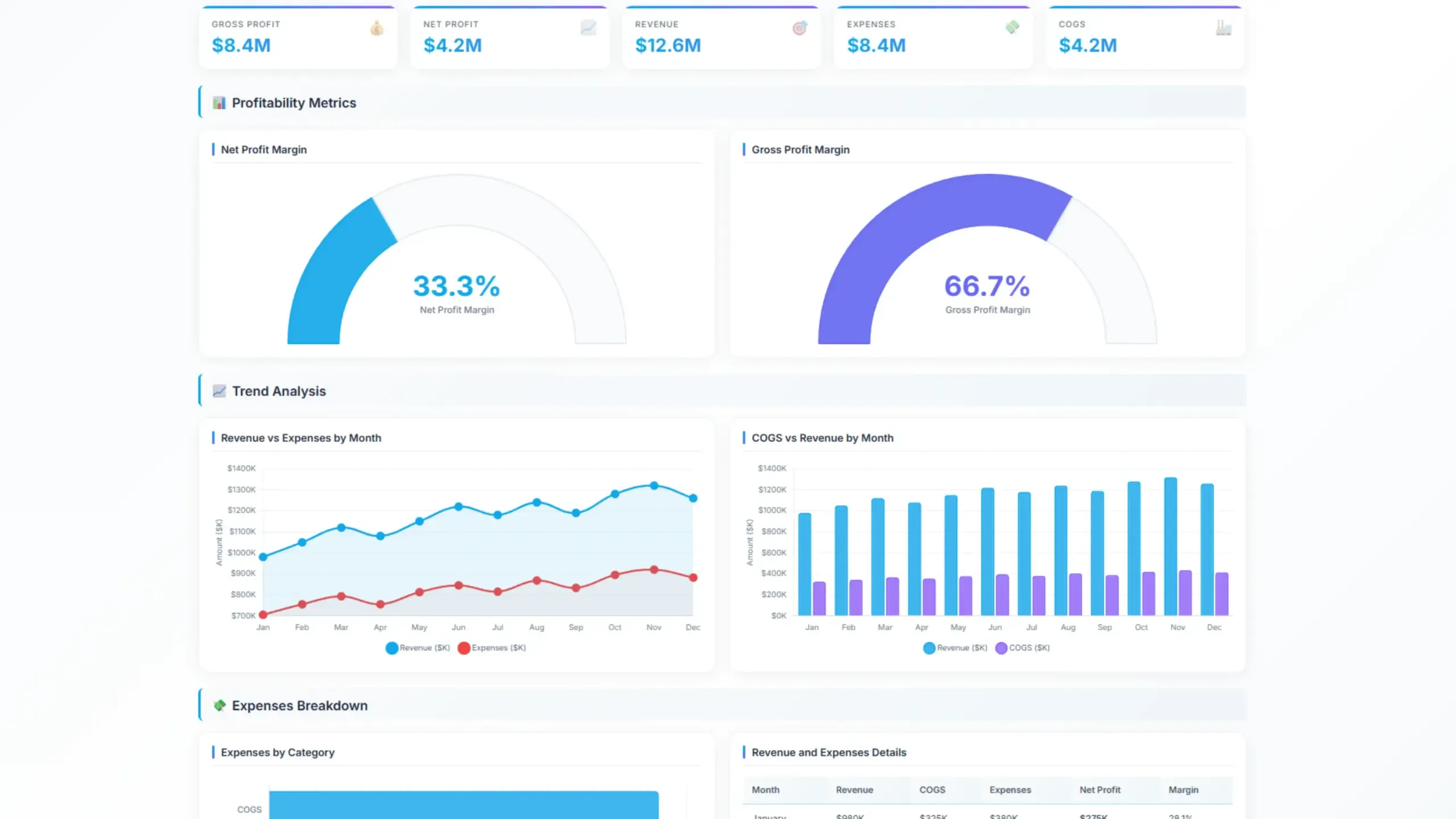
These dashboards typically include key metrics like revenue, expenses, profit, and cash flow, presented in charts, graphs, or tables for easy interpretation.
Key Metrics for a Budget vs Actual Dashboard
A comprehensive budget vs actual dashboard should include business financial performance metrics. Here are some essential metrics to consider:
Revenue Metrics
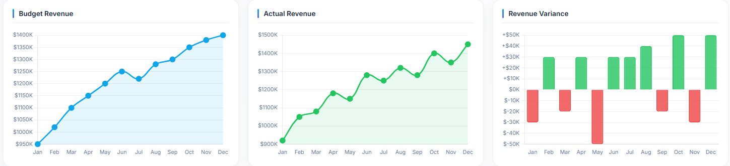
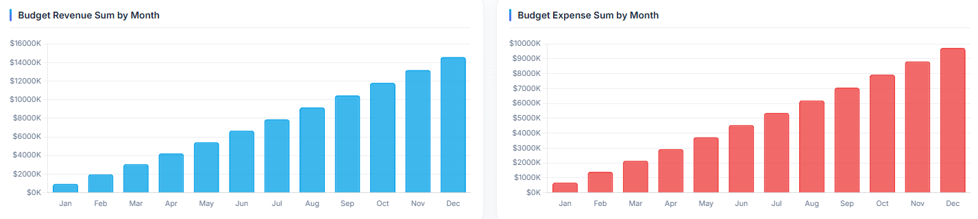
- Total Revenue: Compare budgeted and actual revenue to assess overall sales performance.
- Revenue by Product/Service: Analyze revenue performance for specific offerings.
- Revenue by Region: Evaluate sales performance across different geographic areas.
Expense Metrics
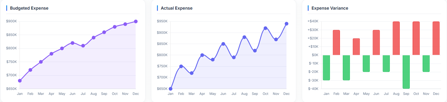
- Total Expenses: Compare budgeted and actual expenses to identify cost overruns or underruns.
- Expenses by Category: Analyze spending in various categories (e.g., labor, materials, overhead).
- Expense Variances: Highlight significant differences between budgeted and actual expenses.
Struggling with manual calculations & tiring setups?
Let agentic AI do the heavy lifting.
Start free
Fast sign up & easy setup
Profitability Metrics
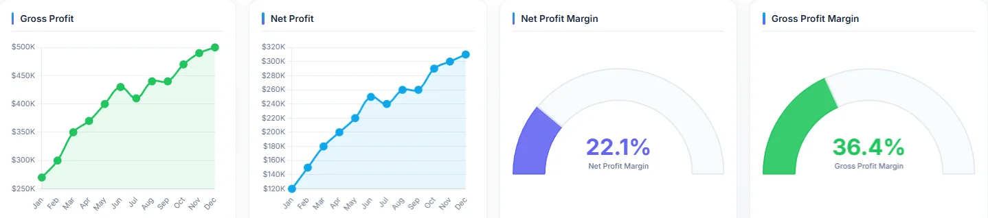
- Gross Profit: Calculate the difference between revenue and cost of goods sold. You can also use a gross profit calculator.
- Operating Profit: Determine profit before interest and taxes.
- Net Profit: Calculate the company’s overall profitability. Or use an online net profit calculator.
Cash Flow Metrics
- Cash Flow from Operations: Assess cash generated or used by core business activities.
- Cash Flow from Investing: Analyze cash flows related to investments.
- Cash Flow from Financing: Evaluate cash flows from borrowing or repaying debt.
Key Performance Indicators (KPIs)
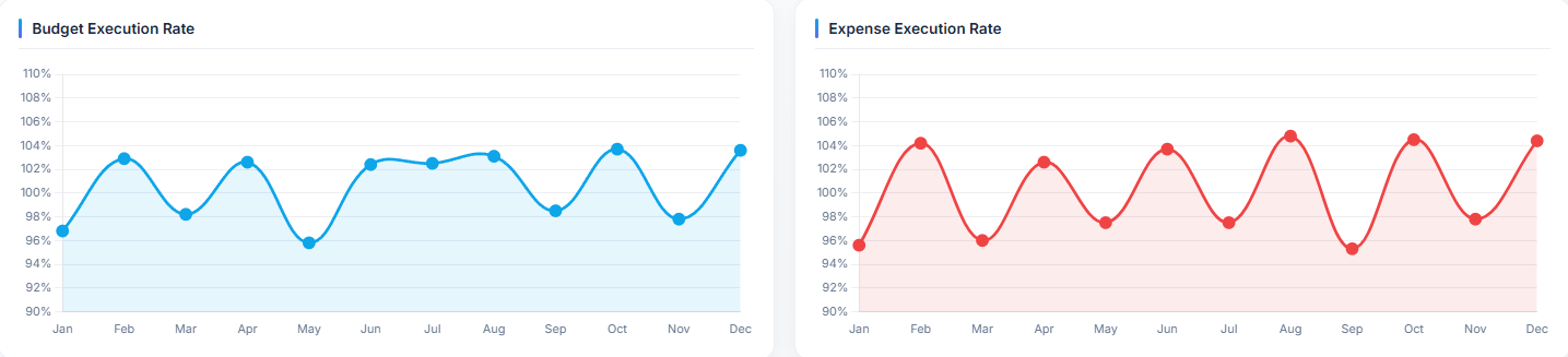
- Budget execution: Percentage indicating how big part of the budget was completed
- Budgeted vs actual: Correlation charts visualizing
- Profit Margin: Measure profitability relative to revenue.
- Expense Ratio: Assess the efficiency of expense management.
- Return on Investment (ROI): Evaluate the effectiveness of investments.
- Days Sales Outstanding (DSO): Measure the average time it takes to collect receivables.
- Inventory Turnover: Assess the efficiency of inventory management.
How To Create Budgeted vs Actual Dashboard?
Time needed: 20 minutes
Create a profit and loss dashboard in minutes using a business intelligence tool. This guide will walk you through 5 steps to create a digital dashboard using Ajelix.
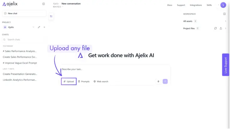
- Connect your data
The first step in creating your digital dashboard is providing your data. With Ajelix, you can easily upload Excel spreadsheets, CSV files, PDFs, and other documents directly into the chat, allowing the AI agent to analyze and visualize your data right away.
- Clean and transform your data (optional)
For the best results, you can ask AI agent to clean and organize your data before generating visualizations. Ajelix can automatically fix formatting inconsistencies, remove duplicate records, filter irrelevant data, and restructure datasets as needed. While optional, this step helps improve data quality and ensures more accurate, reliable insights.

- Build your visualizations
Once your data is ready, simply tell the AI agent which metrics, KPIs, or trends you want to track. Ajelix automatically selects the most effective visualization types, such as KPI cards, gauges, line charts, bar charts, and tables. AI builds a complete dashboard tailored to your data, without any manual setup.
- Customize your dashboard
You can personalize your dashboard by telling the AI agent exactly what you need. Add or adjust titles, descriptions, layouts, colors, formatting, and other design elements, and the AI will update everything automatically. No manual design or setup is needed.
- Share your dashboard
Once happy, share your dashboard with your team via link or export/download it for presentations and reports.
Reporting gives you a headache?
Upload your data and create professional reports with agentic AI
Start free
Try free and upgrade whenever
Conclusion
A well-constructed budget vs actual dashboard is an invaluable tool for businesses seeking to understand their financial performance, identify areas for improvement, and make data-driven decisions.
FAQ
Variance analysis is the process of comparing budgeted amounts to actual results and investigating the differences (variances). It helps understand why performance deviated from the plan and allows for corrective action.
It depends on the context. For revenue, a positive variance is favorable (actual revenue exceeded the budget). For expenses, a positive variance is unfavorable (actual expenses exceeded the budget).
Again, it depends on the context. For revenue, a negative variance is unfavorable (actual revenue was below budget). For expenses, a negative variance is favorable (actual expenses were below budget).
The frequency depends on the business needs. Generally, reviewing it monthly is a good practice. Some businesses may need weekly or even daily reviews, especially during critical periods.
First, investigate the root cause. Gather data, talk to relevant team members, and analyze the situation. Then, develop a plan of action to address the issue, which might involve adjusting budgets, changing strategies, or implementing corrective measures.
Explore other dashboards


Ready to create your dashboard?