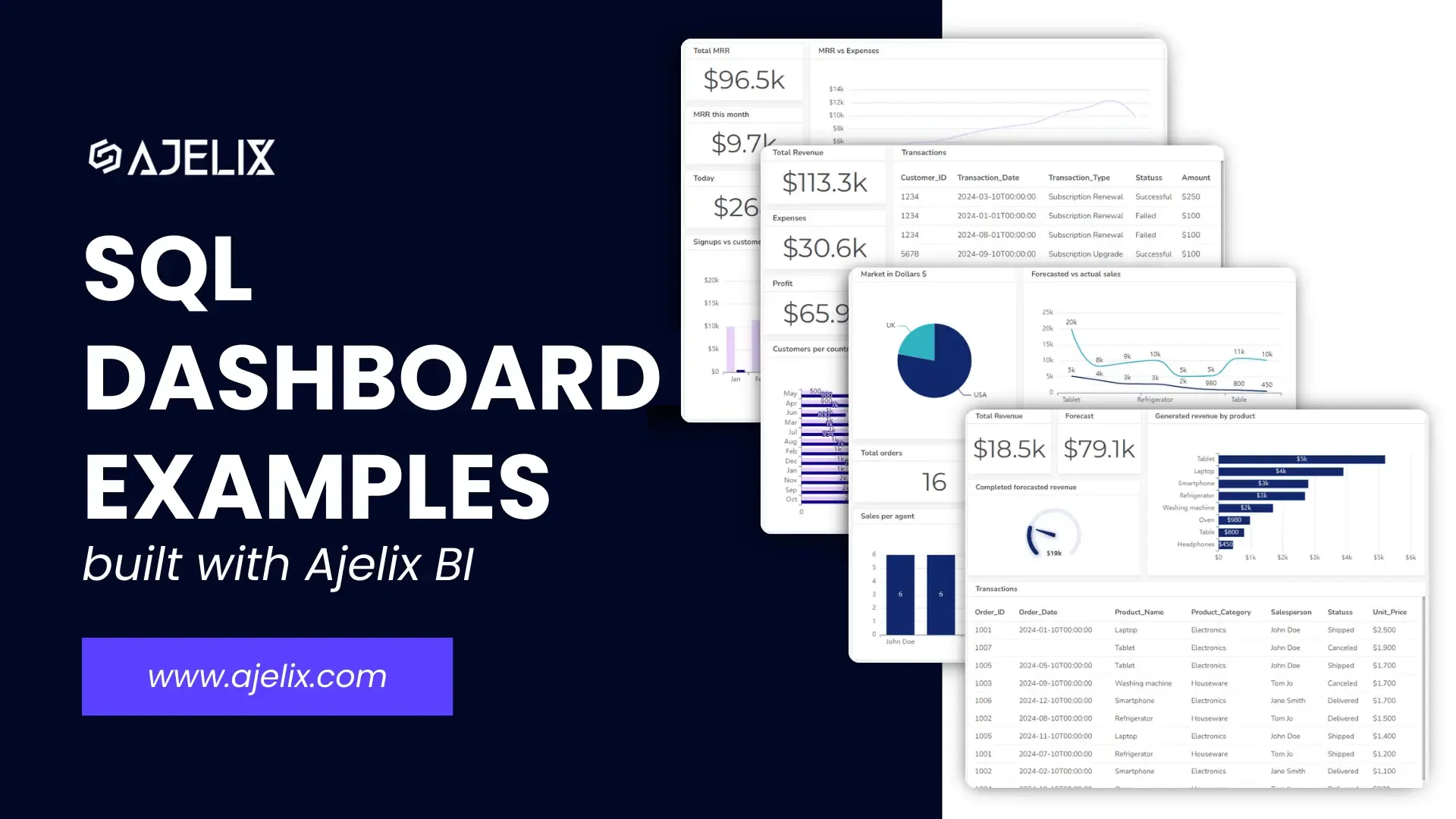
CFO Dashboard Example & KPIs (Created With Agentic AI)

Tired of sifting through endless spreadsheets? Imagine a dashboard that provides a real-time snapshot of your company’s financial health. Our CFO Dashboard example that was created with agentic ai showcases essential KPIs to help you make informed decisions and create a dashboard for your business needs.
Financial dashboards can help identify potential issues before they escalate, allowing you to take proactive measures and mitigate risks.
TL;DR
A CFO dashboard provides an overview of a company’s financial health to quickly spot trends, risks, and opportunities. It includes essential KPIs like revenue, profit margins, cash flow, liquidity ratios, working-capital metrics, turnover ratios, and debt indicators.
This article explores the essential components of an effective CFO financial dashboard, highlighting key performance indicators (KPIs) and metrics that empower CFOs to drive profitability and growth.
Change the way you work with agentic AI
One-click dashboards,KPI tracking, and AI-powered insights—for work that actually gets done.

What is a CFO dashboard?
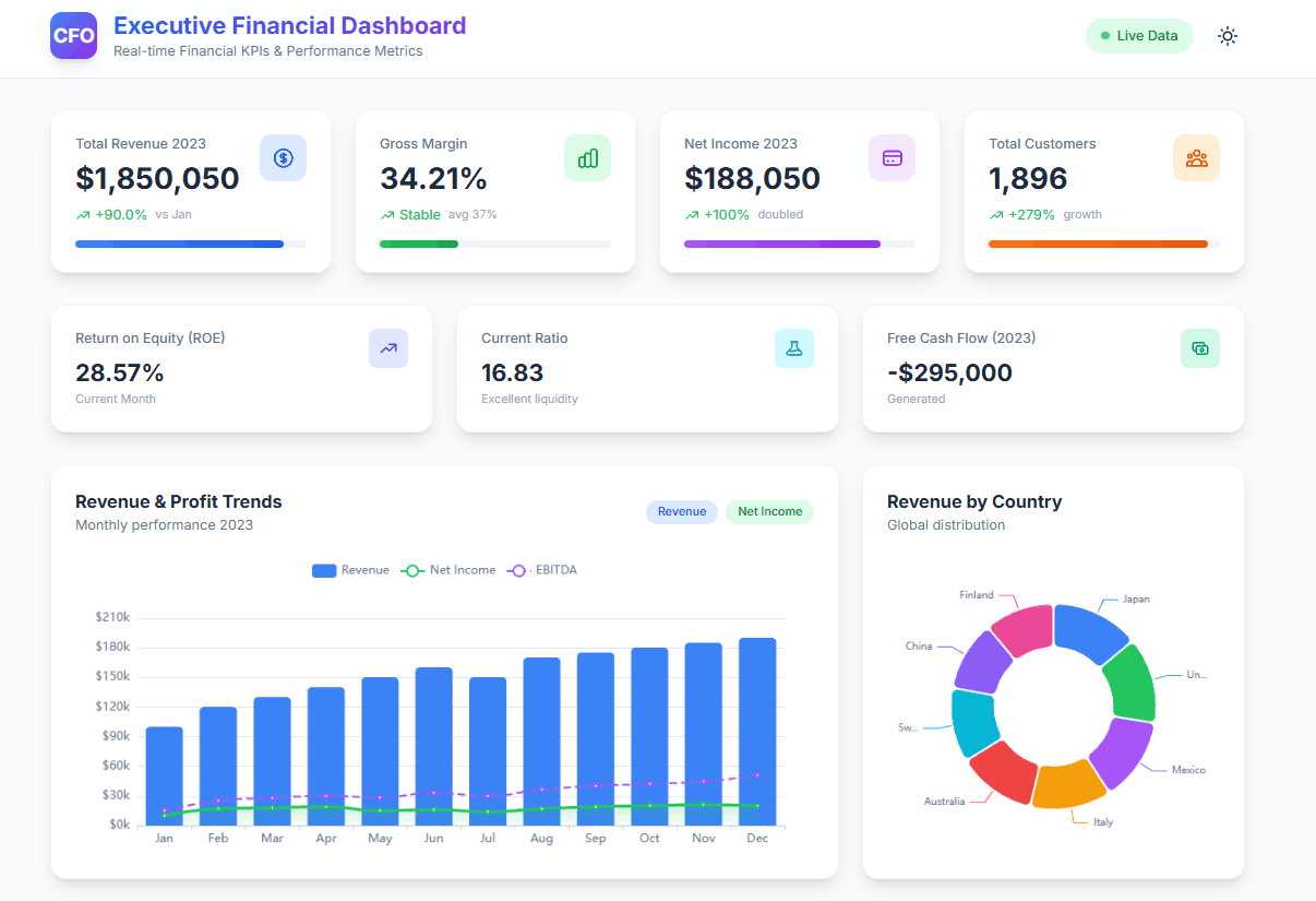
A CFO dashboard is a visual tool that provides a real-time snapshot of a company’s financial performance. It typically includes key performance indicators (KPIs) that are relevant to the CFO’s role, such as:
- Revenue: Total revenue, revenue growth, revenue by product or service
- Profitability: Gross profit, net profit, profit margin
- Expenses: Costs of goods sold, operating expenses, overhead costs
- Cash flow: Cash inflows, cash outflows, cash balance
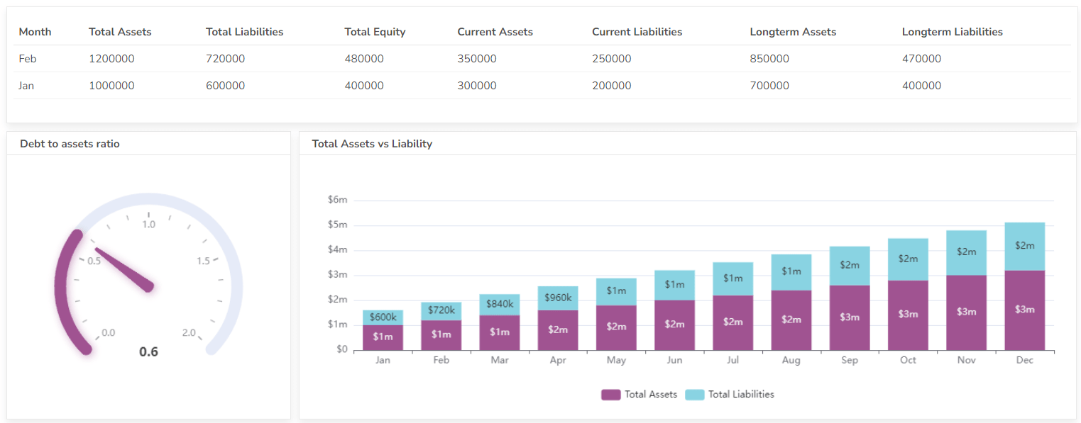
- Debt: Debt levels, debt-to-equity ratio, interest expense
- Inventory: Inventory levels, inventory turnover, days sales outstanding
- Accounts receivable: Accounts receivable balance, days sales outstanding
- Accounts payable: Accounts payable balance, days payable outstanding
CFO dashboards can be customized to meet the specific needs of individual CFOs and their organizations. They can be used to identify trends, identify potential issues, and make data-driven decisions.
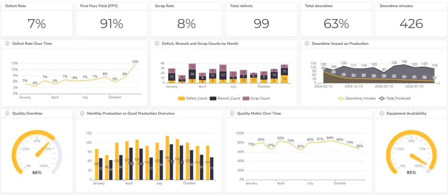
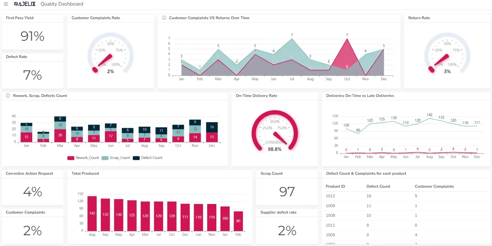
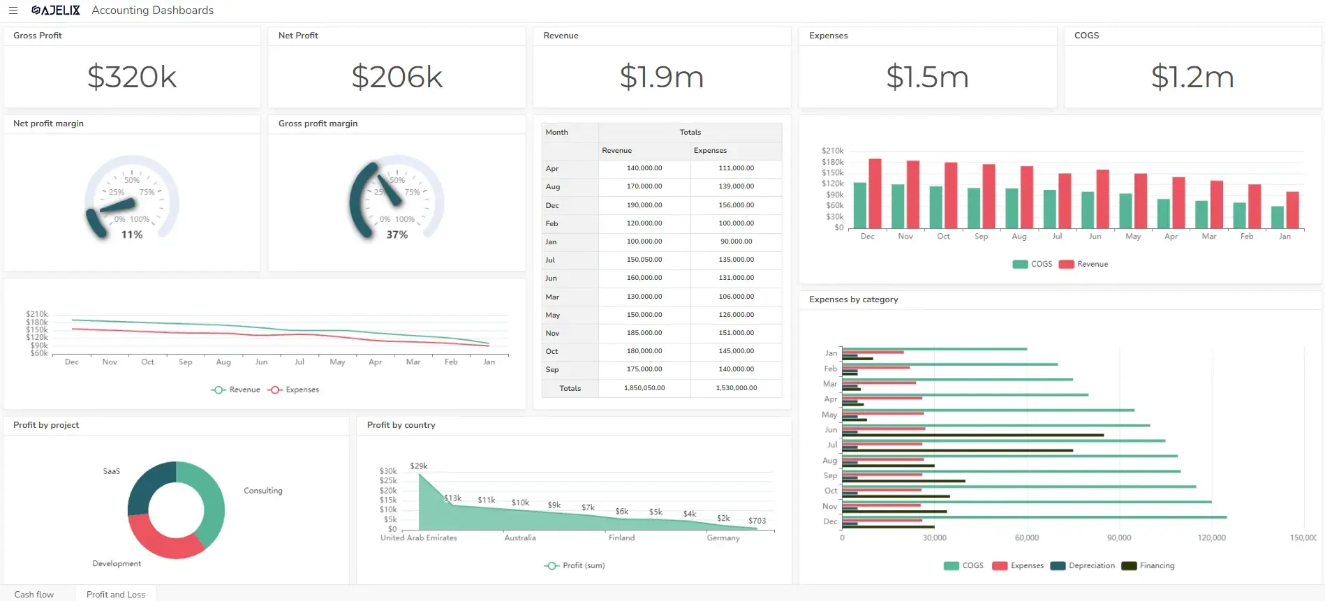
KPIs and metrics for the CFO dashboard
The effectiveness of a CFO KPI dashboard hinges on the selection of relevant metrics that align with overall CFO goals. This section delves into the core CFO KPIs that provide a comprehensive view of financial performance.
We’ll explore a range of CFO KPI examples, from profitability ratios and liquidity metrics to cash flow analysis and capital expenditure tracking.
By focusing on metrics that directly reflect strategic objectives, CFOs can leverage their dashboards to monitor progress, identify potential risks, and make informed decisions that drive sustainable growth. Here are some key examples:
#1 Gross Profit Margin
Measures the percentage of revenue remaining after deducting the cost of goods sold. A higher gross profit margin indicates that a company is more efficient in managing its production costs.
Formula: Gross Profit Margin = (Gross Profit / Net Sales) * 100
Calculate this metric using a net gross calculator.
#2 Net Profit Margin
Indicates the percentage of revenue remaining after all expenses are deducted. A higher net profit margin indicates that a company is more effective in managing its costs and generating profits.
Formula: Net Profit Margin = (Net Income / Net Sales) * 100
You can calculate this metric using an online net profit margin calculator.
#3 Return on Investment (ROI)
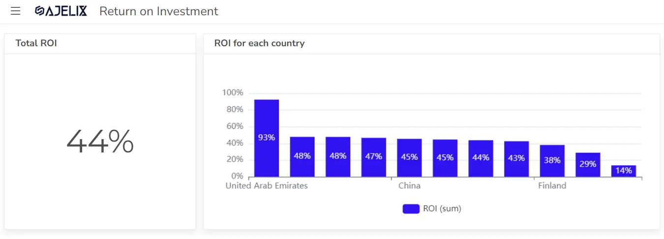
Calculates the profitability of an investment relative to its cost. A higher ROI indicates that an investment generates a good return for the company.
Formula: ROI = (Net Profit / Investment Cost) * 100
Calculate this metric using the ROI calculator.
#4 Earnings Per Share (EPS)
Measures the amount of profit attributable to each common share. A higher EPS indicates that a company is generating more profits for its shareholders.
Formula: EPS = (Net Income – Preferred Dividends) / Weighted Average Common Shares Outstanding
#5 Current Ratio
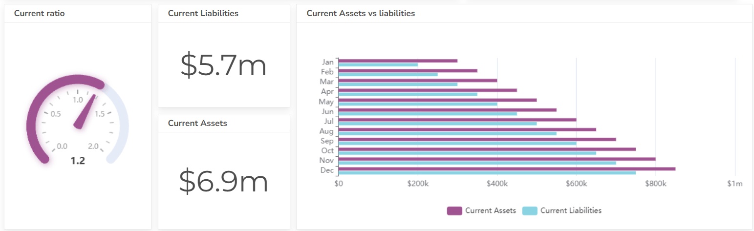
Measures a company’s ability to pay short-term debts with its current assets. A ratio greater than 1 indicates that the company has sufficient current assets to cover its short-term obligations. Learn more about other accounting KPIs.
Formula: Current Ratio = Current Assets / Current Liabilities
#6 Quick Ratio
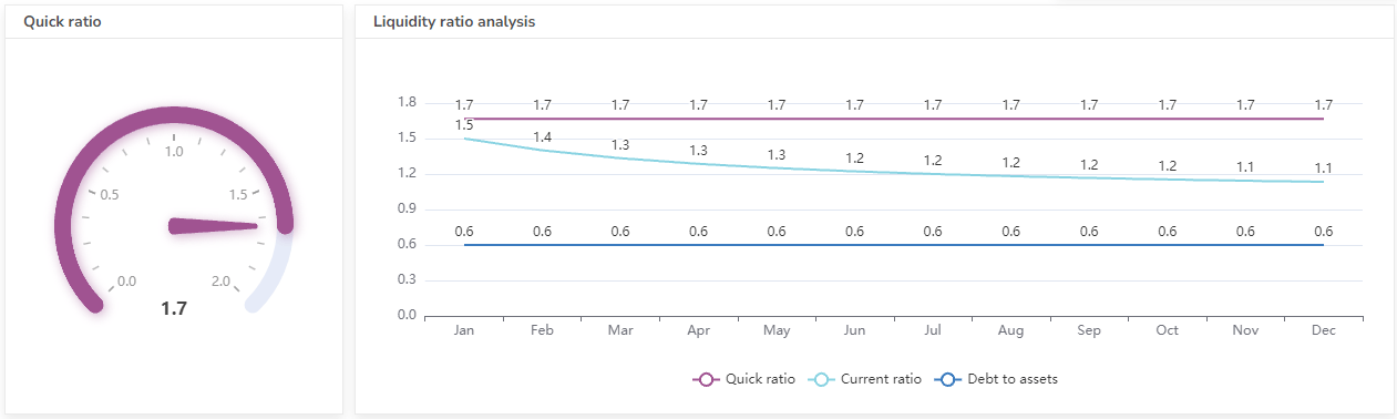
A more conservative measure of liquidity that excludes inventory from current assets, as inventory may not be easily converted to cash. A ratio greater than 1 is generally considered healthy.
Formula: Quick Ratio = (Current Assets – Inventory) / Current Liabilities
#7 Cash Conversion Cycle
Measures the average number of days to convert inventory into cash, minus the average number of days to pay suppliers. A shorter cash conversion cycle is generally better, as it indicates that the company is efficiently managing its working capital. Check the cash flow dashboard example here.
Formula: Cash Conversion Cycle = Days Inventory Outstanding + Days Sales Outstanding – Days Payable Outstanding
View the profit and loss dashboard example here.
#8 Inventory Turnover
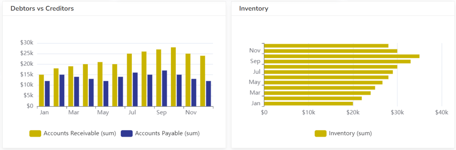
Measures how efficiently a company manages its inventory. A higher turnover ratio indicates that the company is selling inventory quickly and minimizing storage costs.
Formula: Inventory Turnover = Cost of Goods Sold / Average Inventory
#9 Accounts Receivable Turnover
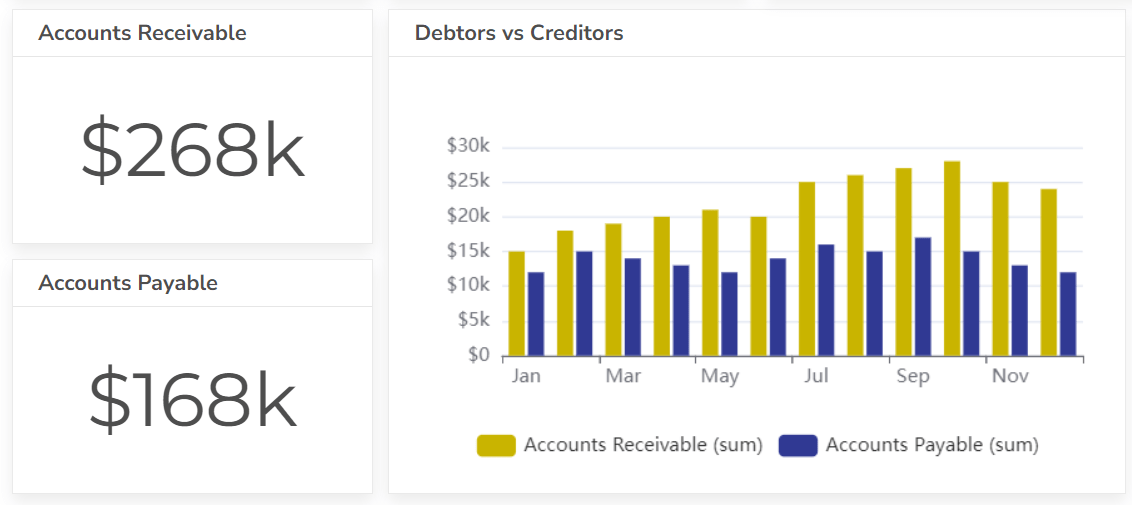
Measures how quickly customers pay their invoices. A higher turnover ratio indicates that customers are paying their debts promptly.
Formula: Accounts Receivable Turnover = Net Sales / Average Accounts Receivable
#10 Accounts Payable Turnover
Measures how quickly a company pays its suppliers. A higher turnover ratio indicates that the company is taking advantage of payment terms and minimizing interest costs.
Formula: Accounts Payable Turnover = Cost of Goods Sold / Average Accounts Payable
Also, view budgeted vs actual dashboard example.
#11 Asset Turnover
Measures how efficiently a company uses its assets to generate revenue. A higher turnover ratio indicates that the company is effectively utilizing its assets.
Formula: Asset Turnover = Net Sales / Average Total Assets
#12 Debt-to-Equity Ratio
Measures the proportion of debt financing to equity financing. A higher ratio indicates that the company is relying more heavily on debt to finance its operations.
Formula: Debt-to-Equity Ratio = Total Liabilities / Total Equity
#13 Interest Coverage Ratio
Measures a company’s ability to cover its interest payments with its earnings. A higher ratio indicates that the company is more likely to meet its debt obligations.
Formula: Interest Coverage Ratio = Earnings Before Interest and Taxes (EBIT) / Interest Expense
Calculate EBIT and EBITDA here.
#14 Leverage Ratio
Measures the extent to which a company uses debt to finance its operations. A higher leverage ratio indicates that the company is more highly leveraged.
Formula: Leverage Ratio = Total Liabilities / Total Assets
#15 Free Cash Flow
Measures the cash available for reinvestment or distribution to shareholders after accounting for capital expenditures. A positive free cash flow indicates that the company has excess cash to invest in growth or return to shareholders.
Formula: Free Cash Flow = Operating Cash Flow – Capital Expenditures
Conclusion
In conclusion, a robust CFO financial dashboard is indispensable for modern financial leadership. By leveraging a well-designed KPI financial dashboard, CFOs can gain real-time visibility into critical financial data, enabling proactive decision-making.
The selection of relevant CFO kpis and CFO dashboard metrics directly impacts the dashboard’s effectiveness, ensuring alignment with overarching CFO goals. Utilizing a comprehensive kpi for cfo dashboard and exploring diverse CFO kpi examples allows for the creation of a tailored system that reflects specific business needs.
Furthermore, the use of a structured cfo report template ensures clear and concise presentation of financial results dashboard data, facilitating effective communication with stakeholders. Ultimately, a strategically implemented CFO kpi dashboard empowers CFOs to drive financial performance, mitigate risks, and contribute to the overall success of the organization.
FAQ
A CFO dashboard provides a real-time, visual overview of key financial metrics, while a general financial report is typically a static document that provides a more detailed analysis of financial performance over a specific period. Dashboards are meant for quick analysis, reports for deep dives.
Yes, most modern dashboarding tools allow for customization. You can select the KPIs that are most relevant to your business, design the layout, and set up alerts for critical thresholds.
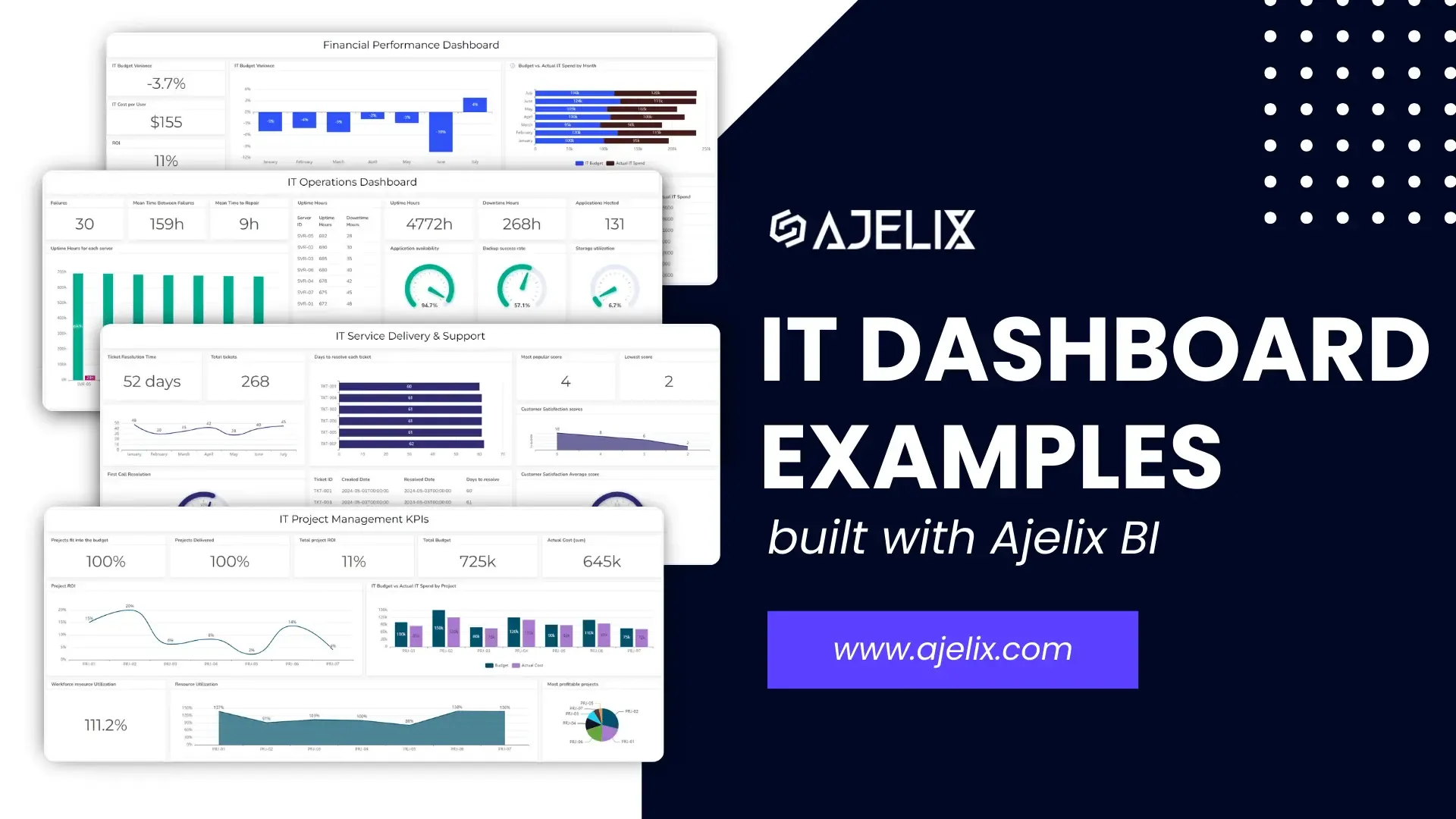
Explore other dashboards


Ready to create your dashboard?