
In a world full with big data, SQL’s, IT specialists and advanced applications it can get overwhelming to find something simple and easy enough to use for data visualization. The short answer—yes, there are BI tools that doesn’t make you feel stupid or contact data analyst to create a simple dashboard.
For any non-technical teams the solution for visualization usually is Excel or Google Sheets. Yes, spreadsheets are multifunctional, but even these tools require some skill to create pretty reports. (that you’re not ashamed to share with colleagues)
But don’t you worry, we got you covered. This blog will compare the best self-service BI tools that non-tech teams can use to create professional reports seamlessly.
The 7 Best Self-Service BI Tools 2024
Let’s empower all the teams with self-service BI. Here’s our pick:
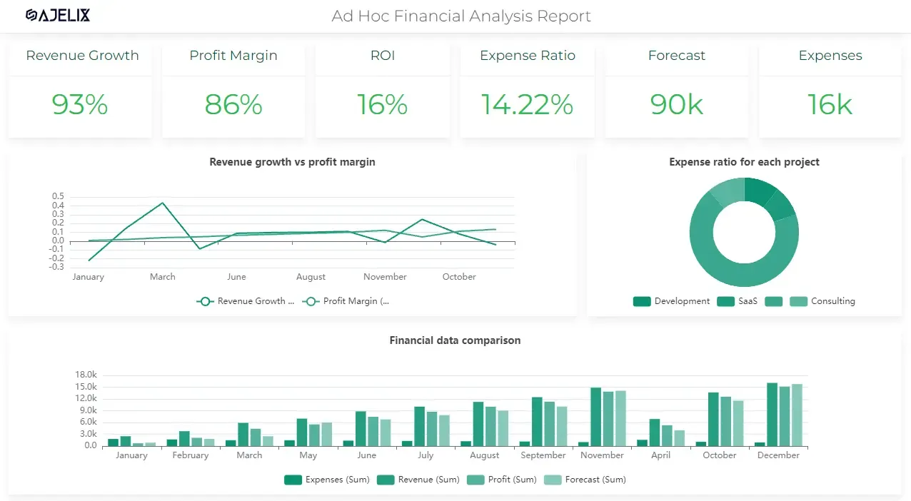
1. Ajelix BI
Ajelix BI is specifically created for users who are not advanced analytics experts. Moreover, it’s well know for it’s ease of usability combined with easy setup and seamless editing.
“We created a business intelligence tool that is not only intelligent but simple enough to use for everyone.”
– Ajelix founders
The best part about Ajelix platform is that you don’t need help from IT expert or data analysts to analyze data. It’s a true self-service platform for small businesses, solo entrepreneurs and non-technical teams.
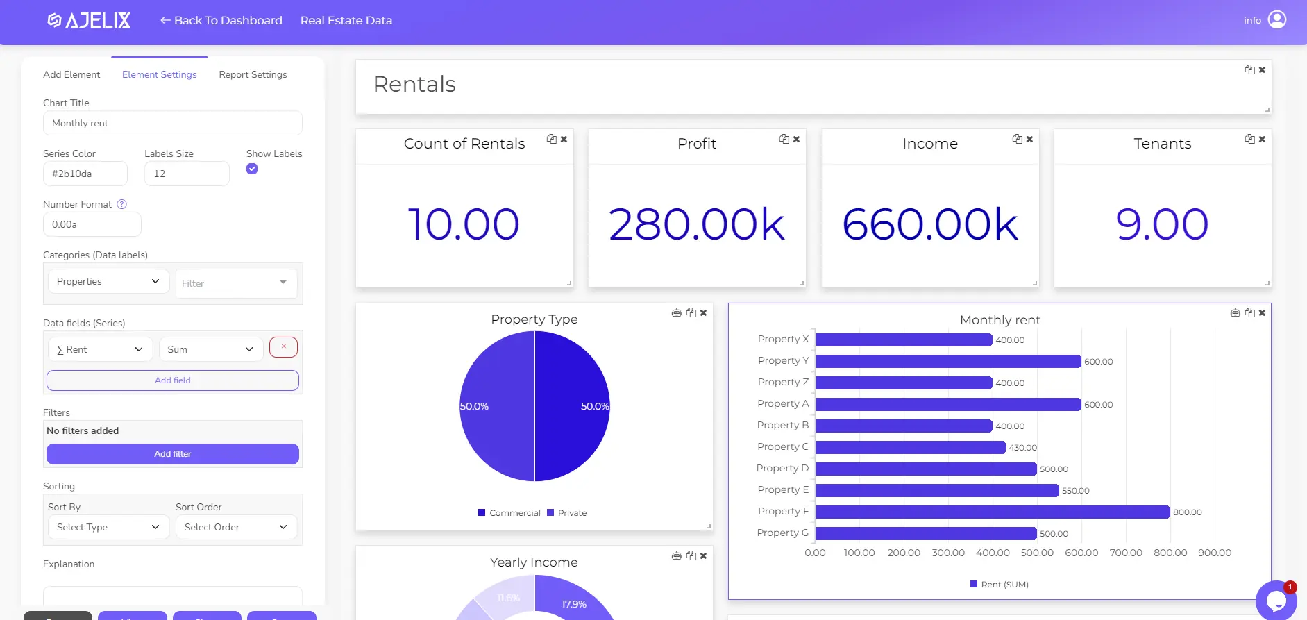
Ajelix BI dashboard real estate template editor view. See the live report here.
Ajelix BI Pros
- User-friendly editing and no-code editor that is easy to use
- No complex setups or trainings needed
- Easy collaboration you can simply add editors and viewers via link
- Sharing is available via link, password or by adding viewer email
- You can get automatic report refreshing with Google Sheets
- Once you create a report it’s interactive, equipped with filters and responsive for all devices
- You can analyze charts with AI to reveal insights
- Comment charts to explain main data points to other users
- Offers freemium plan and budget friendly pricing with one plan that costs 19$/per month
2. Klipfolio
Klipfolio is another self-service platform that provides data analytics and visualization. The main focus for this platform is based on KPI tracking. They offer more than 100 data sources and connections from SQL queries to simple integrations.
Klipfolio Pros
We tested this platform ourselves and here’s what we think are the best pros:
- You can create unique metrics to track progress
- Connect data with more than 100 sources. Setup is relatively easy for most integrations.
- Live reporting
- Custom data feeds using SQL (although this is not a real pro for this top)
- Easy sharing settings
- Provides freemium plan
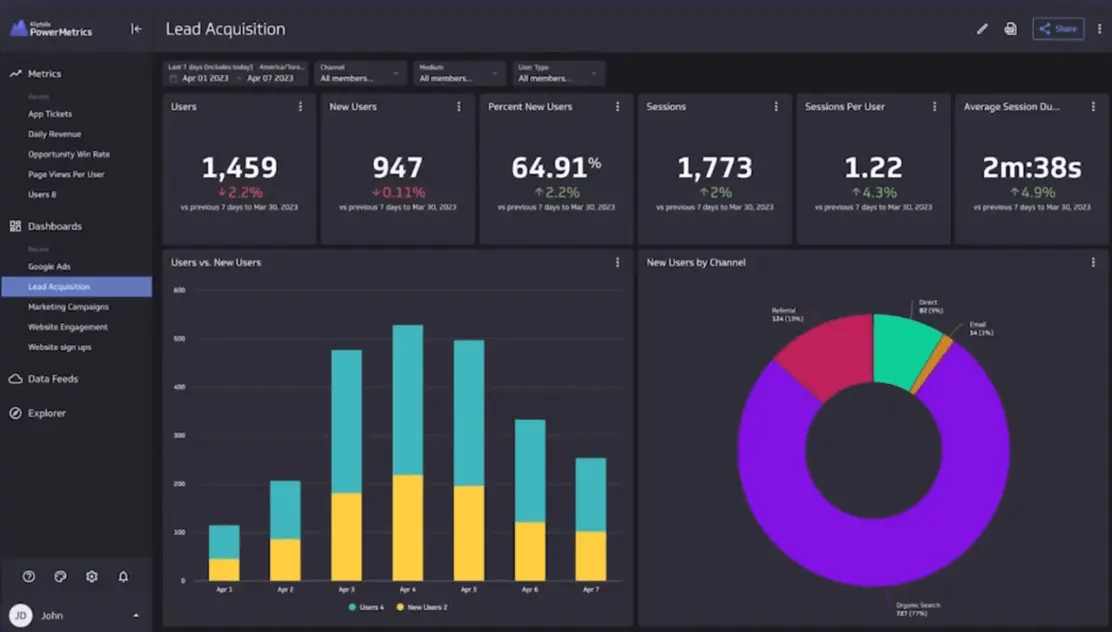
Klipfolio dashboard editor screenshot from https://www.klipfolio.com/v3
Klipfolio Cons
- You may encounter some speed issues and delays
- There’s no drag and drop interface 🙁 That could complicate customization.
- Support materials are challenging to navigate and understand
Here are some cons that Klipfolio users pointed out:
- It can be tricky to create a content outside or the predefined reports. So for ease of usability you should stick to the templates.
- API connection renewal my require help from IT. Although, it depends on what are your data sources.
Related Article: 8 Best Business Intelligence (BI) Tools For Small Businesses
3. Trevor
Trevor offers no-code data analytics solutions as well as fast reporting setup. This platform inquires that you don’t need an SQL knowledge. It’s created for users who just need a nice-looking dashboards with easy usability. Let’s take a look at the pros & cons.
Trevor Pros
We tested this platform and here are the pros:
- As mentioned earlier you don’t need a SQL knowledge
- The visualization options aren’t extensive but good enough
- User-friendly editing and drag and drop functionality
- Setup is straight-forward
- Several data connections and sources
- Offers freemium plan
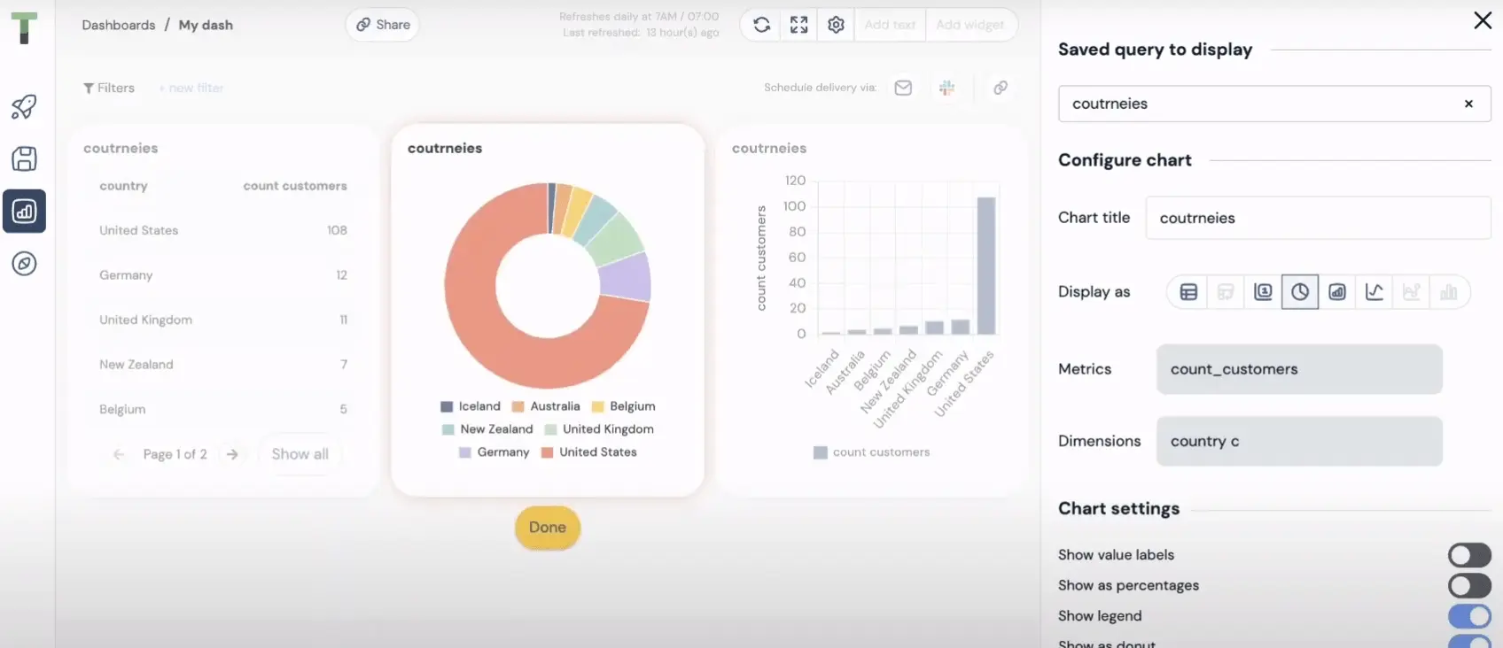
Trevor editor screenshot from https://guide.trevor.io/hc/en-us/articles/6095850482589-7-Build-dashboards-
Cons
- Manual data uploads via files are not supported! It means that you need to create connections with different applications. And might likely need some help from IT.
- Although, editing is user-friendly, it misses resizing option all the charts are standard size.
- Data sources are limited.
Related Article: 5 Free And Budget Friendly Data Visualization Tools
4. Looker Studio
Looker studio is a self-service platform that is under Looker (advanced big data analytics platform) from Google. This platform may require SQL knowledge if you want to set up reports with specific applications. Just like any other product it has many benefits and some downsides.
Looker Studio Pros
Our team tested also this tools and here’s our summary with pros:
- There are many premade templates, that you can purchase for additional cost
- Platform offers many data sources
- Relatively easy setup if you need pre-made report with premade integration, such as, Google Analytics 4 or Google Ads manager
- There’s report embedding available
- Offers freemium plan
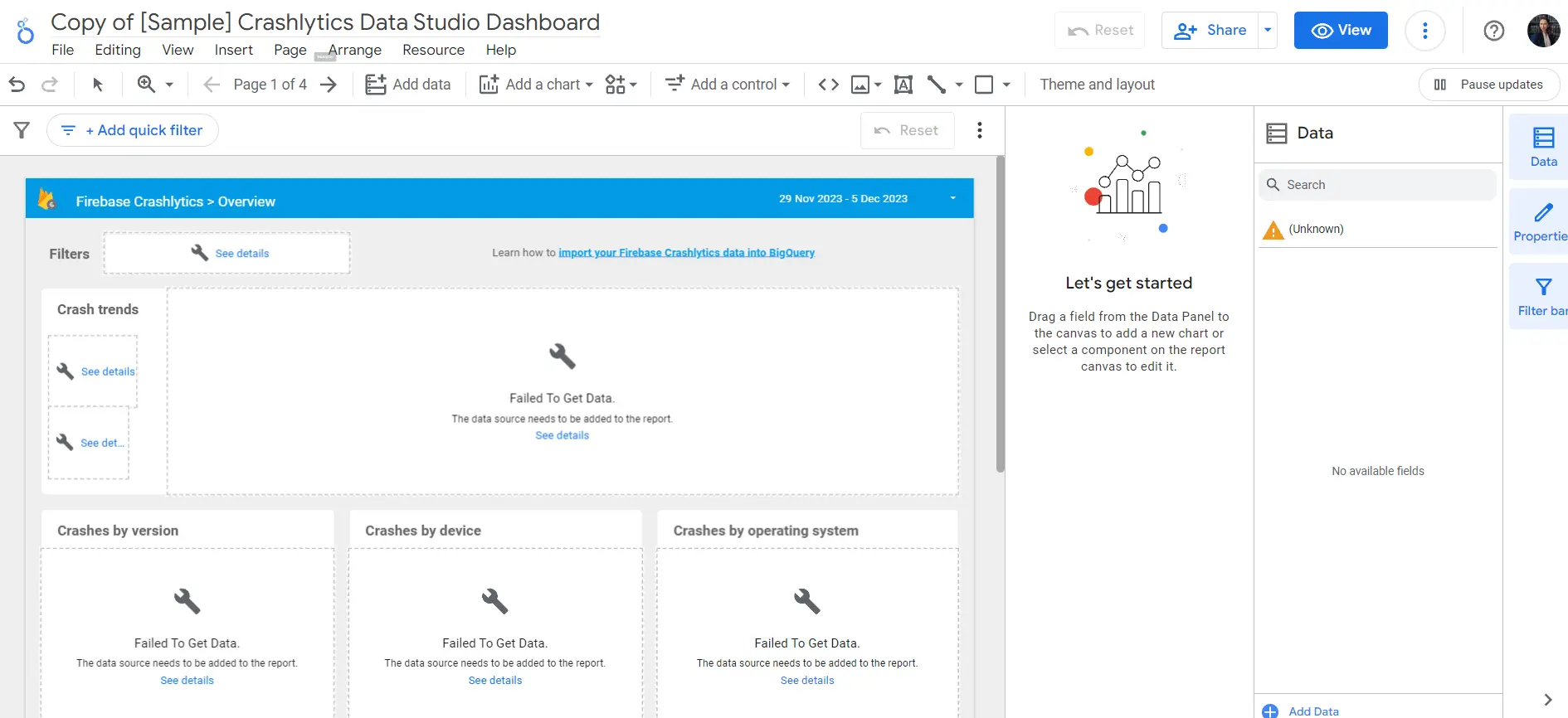
Looker studio template editing view screenshot from https://lookerstudio.google.com/gallery
Cons
- Data branding is very limited
- Setup is easy for premade templates but once you want to customize something better choose other tools
- User management is complicated especially for team projects
- Blending different data sources can be challenging and require additional IT knowledge
- There are speed issues and lag problems once you change anything
This platform still is too advanced for simple visualization.
Here are some cons that users mentioned:
- Customer support is lacking with unclear guides
- Embedding functionality is limited
Related Article: Top 5 Looker Alternatives For Non-Tech Teams
5. Zoho
Zoho Analytics is another data analytics software that provides many data connections as well as data visualization.
Zoho Analytics Pros
Our team reviewed tried to create a dashboard with this tool and here are our thoughts:
- They offer big variety of data connections
- You can cleanse and prepare data before report creation
- Drag and drop functionality that improves editing
- AI analytics using chat
- Easy sharing settings
- Embed analytics using no-code solutions
- Offers freemium plan
- Flexible pricing plan
Zoho editor screenshot from https://www.zoho.com/analytics/help/creating-reports.html
Cons
- Steep learning curve, it might take some time learn how to navigate
- The mobile version is not compatible and are missing some functionality
- There’s a notable loading times for embedded charts
- You still need some knowledge with connection requests and some tasks may require SQL.
Here’s what Zoho users mention:
- There’s absence of learning video and guides for onboarding process
- Some complain about the customer support
Related Article: Top 9 Data Visualization Trends 2024
6. Power BI
Most likely you have already heard about this tool several times, as it’s one of the biggest BI platforms in the market. Power BI is one of the most advanced used by big companies and advanced analysts. However, it’s widely used between individual users who don’t have an advanced knowledge.
Power BI pros
- Variety of data connections
- DAX formulas
- Integration into Microsoft’s ecosystem
- Scheduled data refreshing
- Custom visualization
- Offers freemium plan
Power BI report example screenshot from https://learn.microsoft.com/en-us/power-bi/create-reports/sample-store-sales
Cons
- Complex setup and knowledge of DAX function writing
- Hard to create a responsivity for mobile application, because you need to create 2 reports for each device.
- Steep learning curve, you need to learn a lot to work with Power BI
- Sharing settings are not flexible
- Several user editing is not supported
- You might need a professional who will set up the reports for you
- You’re dependent from Microsoft environment
- Real time data refresh is not instant
Related Article: The Top 7 Power BI Alternatives For Data Visualization
7. Datapine
Another BI platform that is used for data analytics. This platform requires deep analytics knowledge, and IT assistance, however, it also possible to create simple charts from your data.
Datapine pros
- Interactive reports
- Customized dashboards
- Multilingual dashboard
- Collaboration features
- Good user interface
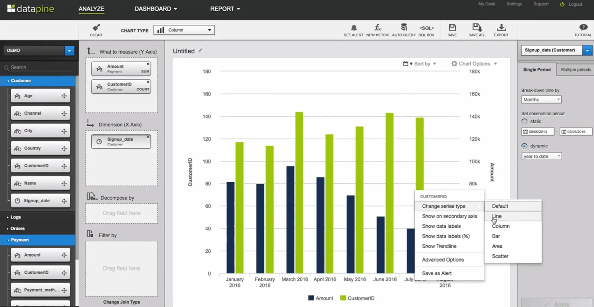
Datapine editor screenshot from https://www.youtube.com/watch?v=S4oauiFoUYI&ab_channel=datapine
Cons
- Missing documentation and video guides
- Mobile dashboard design lacks some functionality and isn’t compatible
- Free trial is too short and doesn’t offer freemium
- Still requires IT specialist and help from analytics to set up everything
- For some functionality you might need SQL knowledge
Summary
Hope this article helped you decide which tools are the best option for self-service BI platform. All of the mentioned tools are great for specific case study. Before deciding you need to ask yourself a question: “What are my needs?” “What do I want to visualize?” and “What are my data sources?”. Once you answer all of the questions you understand which tool will be the best choice.
If you’re still confused we advise you to play around and test some of the tools mentioned in this list. Once you try you’ll get the feeling which tool fits your needs the best.
Ready to test Ajelix BI?
From data to report in one minute or less with Ajelix BI
Similar posts

Generative AI For Data Analytics: What You’re Missing Out

How to Calculate Business Growth Rate? Formula & Examples